False Spring

Twice a year the gallery where i take my oil painting lessons has what they call their “6 x 6 Show”. Anyone in the community who wishes to participate can purchase a wooden square cradle board with dimensions 6” x 6’. Then you can do any kind of decoration you wish with the board —- painting, drawing, fabric, textiles, etc. I have entered this show several times over the past several years. All entries are for sale and are shown at the gallery for a month.

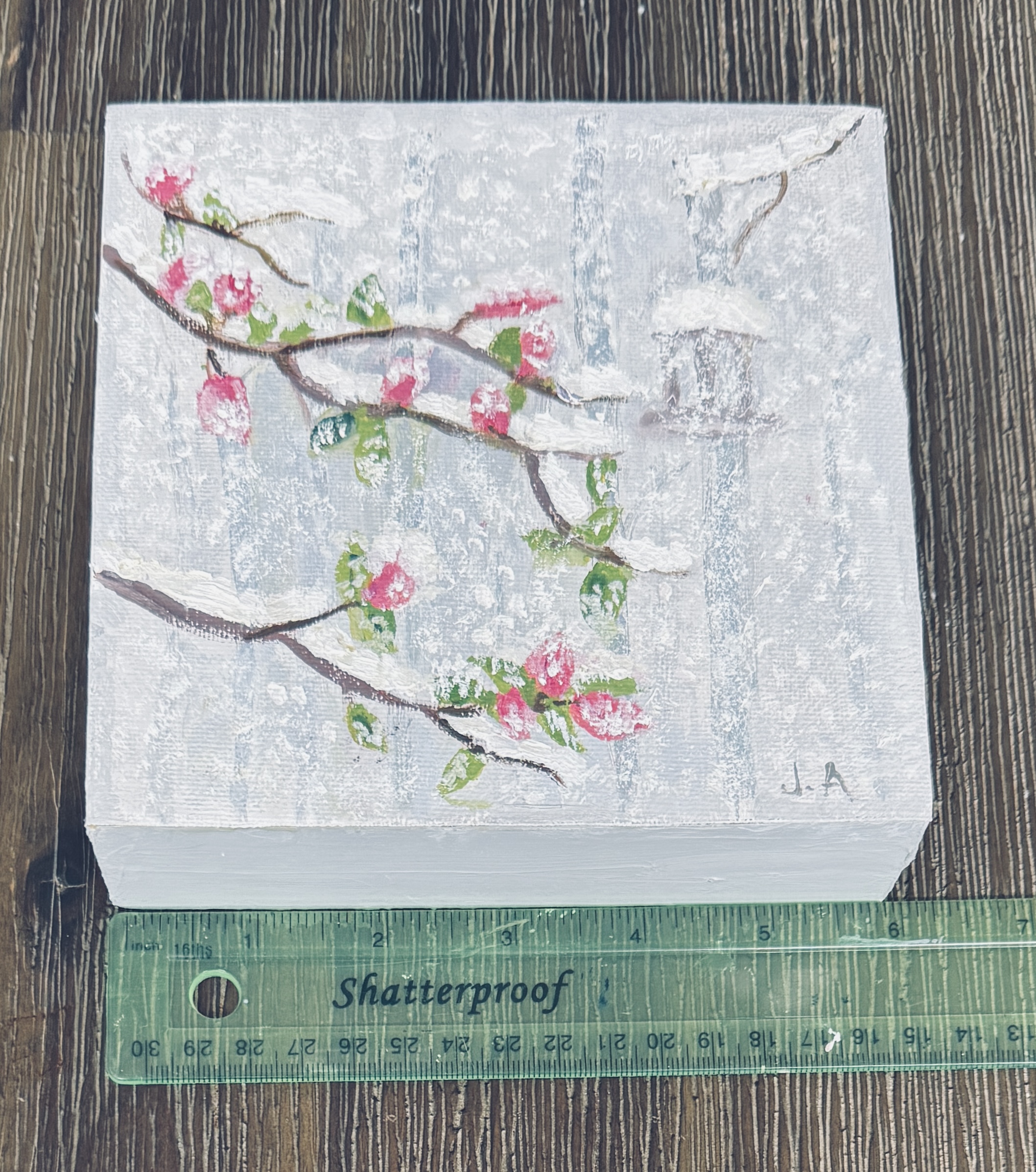
This year for my project i wanted to do something i’d call “false spring” because this happens so often here in Colorado. the trees think it’s Spring, which it is by the calendar; but that does not mean winter is really over. So we get trees with beautiful blooms which then are compromised by a spring snowstorm.

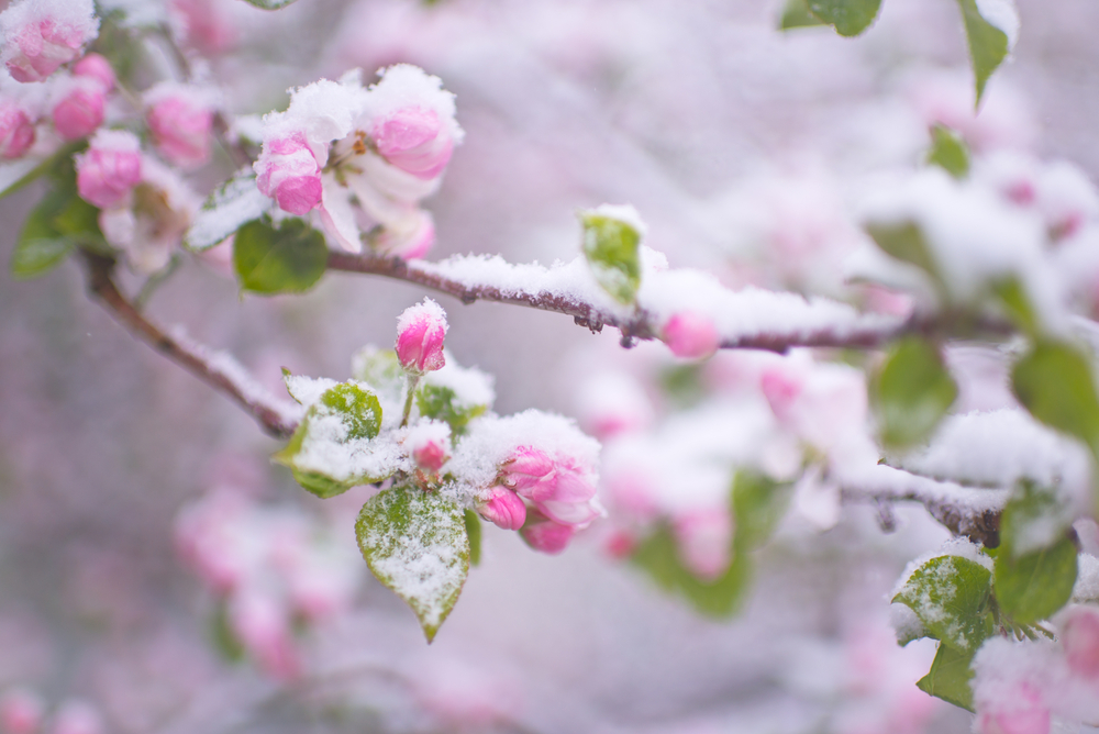
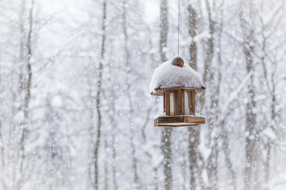
I painted my project in oils, on canvas paper and then glued the little painting to the face of the cradle board. You are certainly permitted to paint directly on to the board but when i’ve tried that in the past i find it awkward to do because you have to work around the “cradle”. I used two photos for reference and combined them to create my “false spring”. Both photos are shown, separately, below, and the painting is the third photo down. I wanted to emphasize the winters aspect of the scene, which is why i set the bird house back and made a lot of the painting kind of blurry, to show what it’s like when it is snowing heavily.
Do-Over: Field in New Zealand

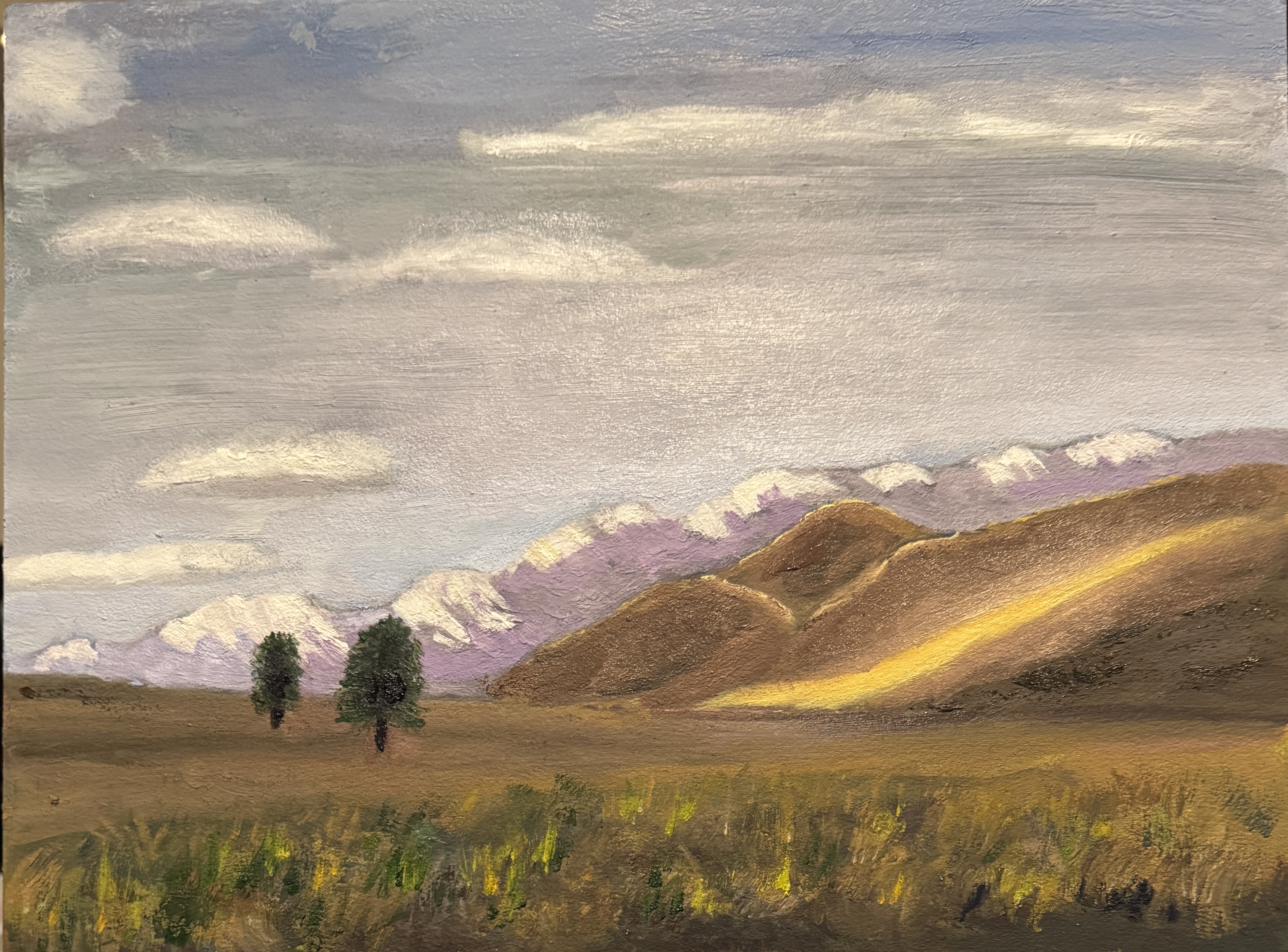
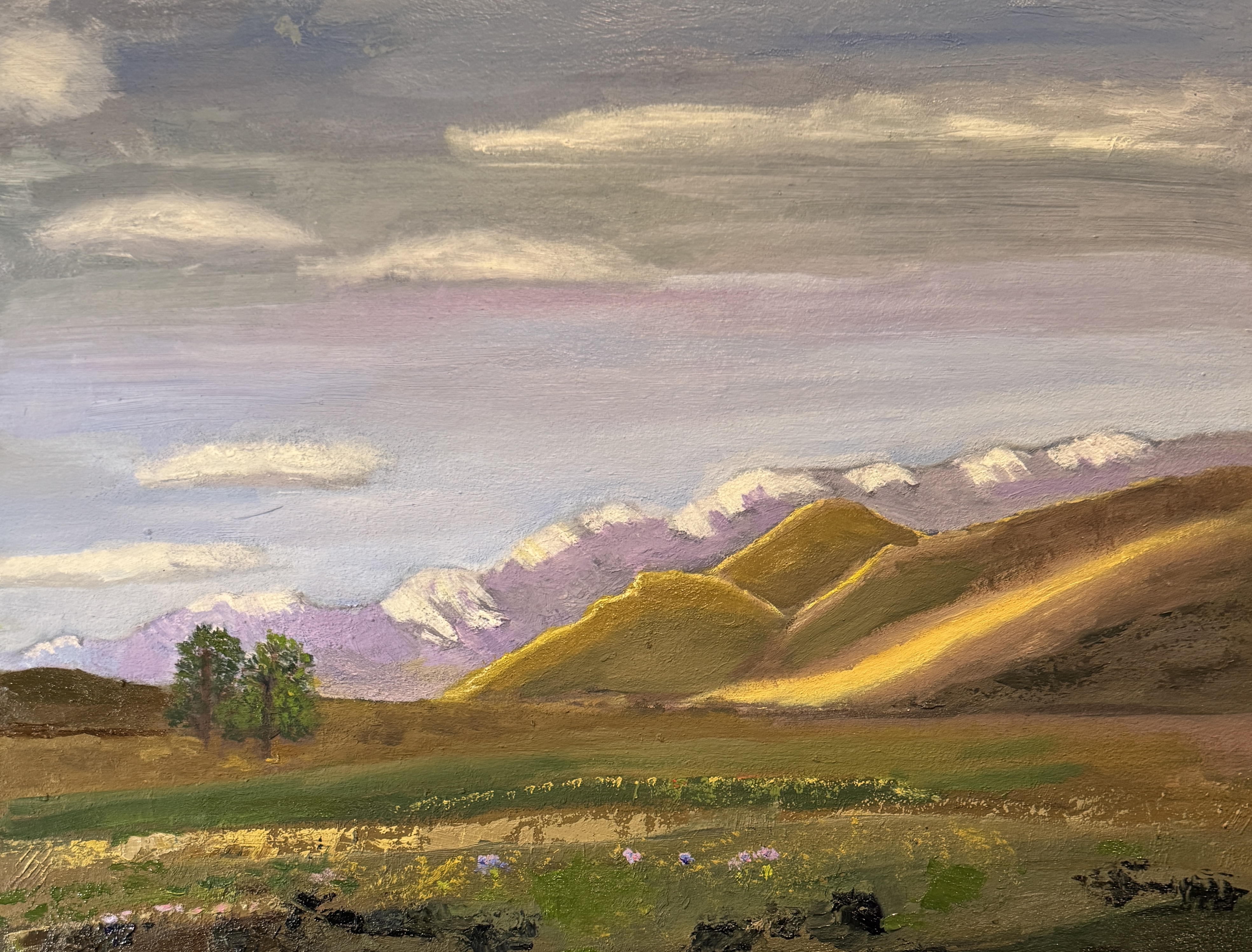
A few weeks ago i posted the third of my paintings based on a visit last fall to the South Island of New Zealand. the work didn’t feel quite right to me at the time i posted, but i decided to go ahead and post and then return to the painting when i had a better idea about where i needed to make improvements. Eventually i came up with some ideas and worked to get them down on canvas. Part of the problem with the original post — at least to me —was the way the foreground was placed, with so much prominence when it was not meant to be a focus of the painting. Another issue was the trees. I liked the way they came out but wasn’t crazy about their placement in perspective. Third, the field was pretty bare. While i wanted some attention to go to the light on the right-side mountain, i think i needed to spruce up that field with at least something in it.

It’s important to me that the viewer think about the painting as a stand-alone piece. I’m wanting with my work to move from exact copying of a scene/subject to an interpretation of what the scene feels like to me. In this case, although i do love painting cloudy days (it was pretty cloudy the day the photo was taken). i wanted to lighten this one up just a bit — but without destroying the feeling of open space and vastness.

In the two photos below, the top one is the one i posted in February. The bottom one is the newer one. I have purposely left out the reference photo this time (although you can find it easily enough) in order to decrease one-to-one comparisons of painting (s) with original setting .

11’ x 14” oil on panel (both)