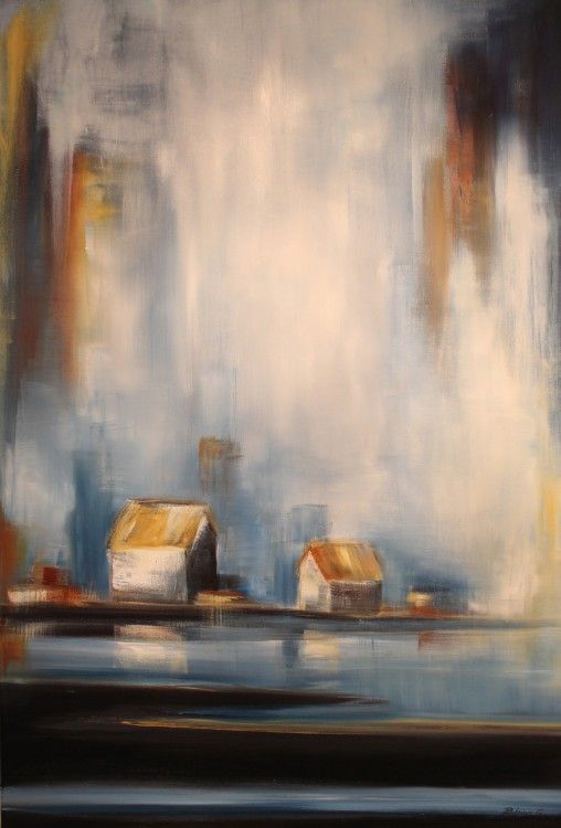
When we were in Reykjavik this summer i was quite taken with the work of an Icelandic artist by the name of Birna Smith. I want to try to learn how she creates the effects (kind of semi-but-not-quite impressionistic). So this week I’ll do a beginning layer of thin paint and see what happens next. I’m attaching a couple of photos from this artist’s portfolio.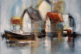
Month: September 2017
Moving on — from this painting
Well, i’m ready to let go of this painting. This week i put on a layer of oil over parts of the top half that were looking kind of flat. (That helped some other parts of this painting a couple of weeks ago.). I also worked a bit on the very thin branches on the left side of the painting. Teacher thought i should give them a “dappling” effect, so tried to do that. And finally, i used a new technique: the corner of a small fan brush and a very light stroke — to give some “sparkle” to some of the water, and to show some droplets. That was fun — never tried that before.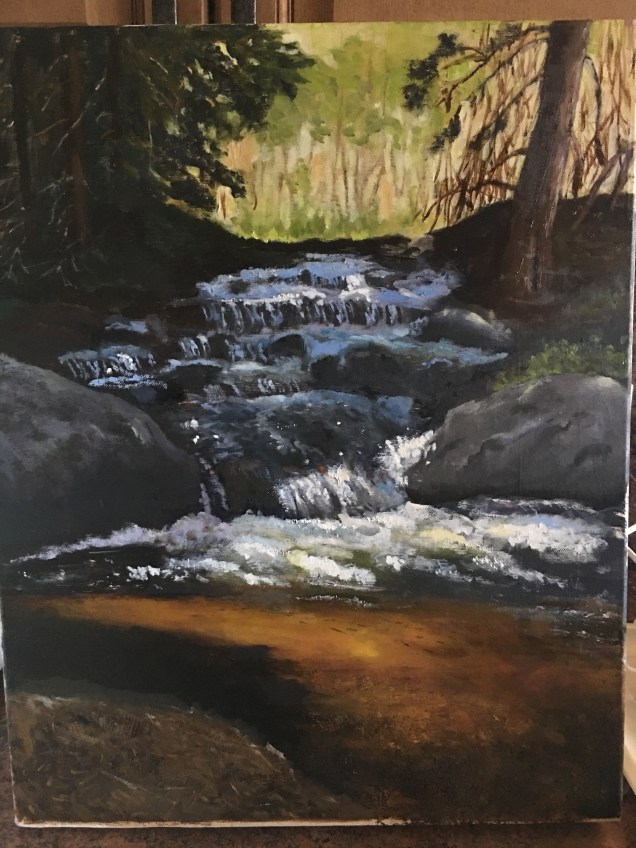
new photo of pitcher
Here is the pitcher, reflecting more the angle at which i was working. Mimi’s and Bern’s comments also made me realize that i kept changing MY position during the drawing sessions to see some little area better; followed by distorting some other area!!!Thank you both!!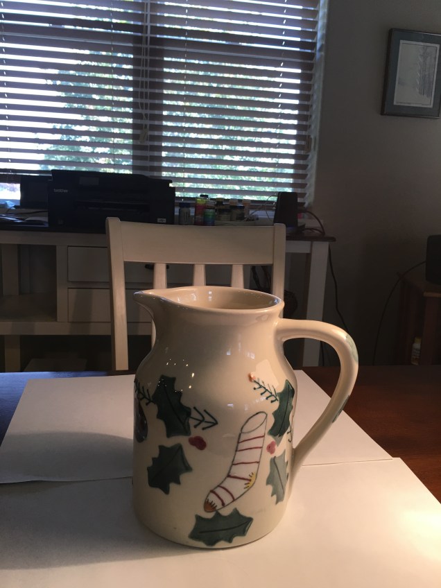
Drawing: 3 tries
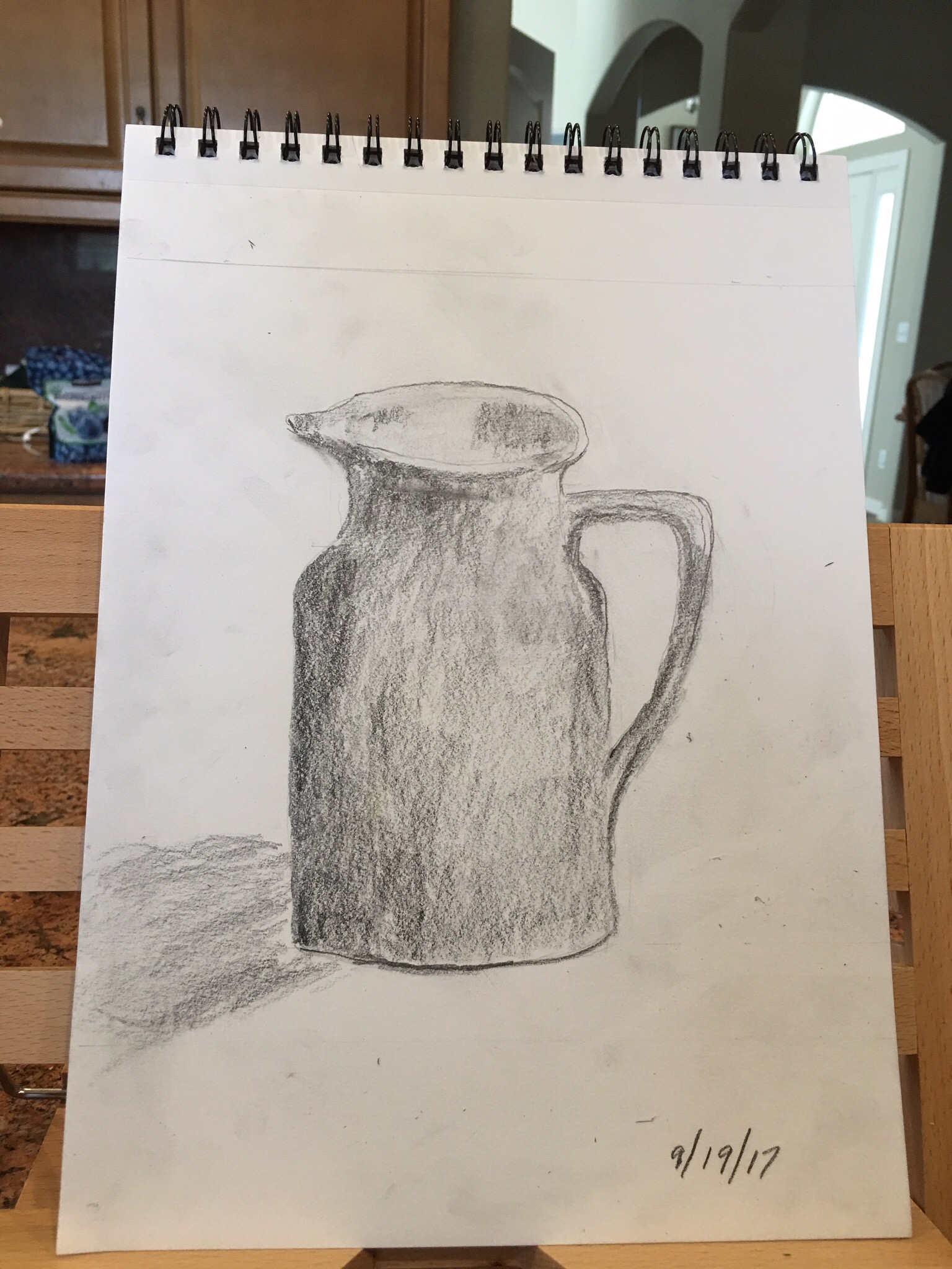
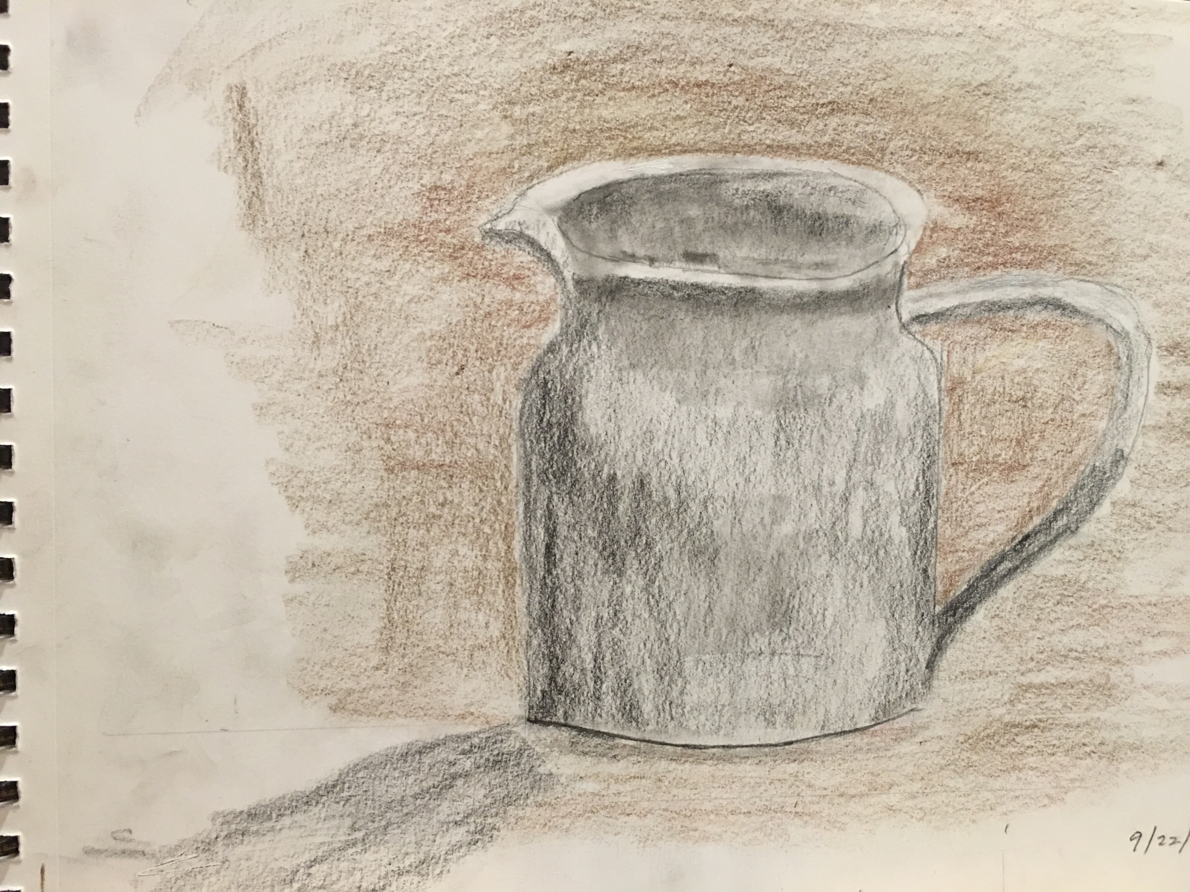
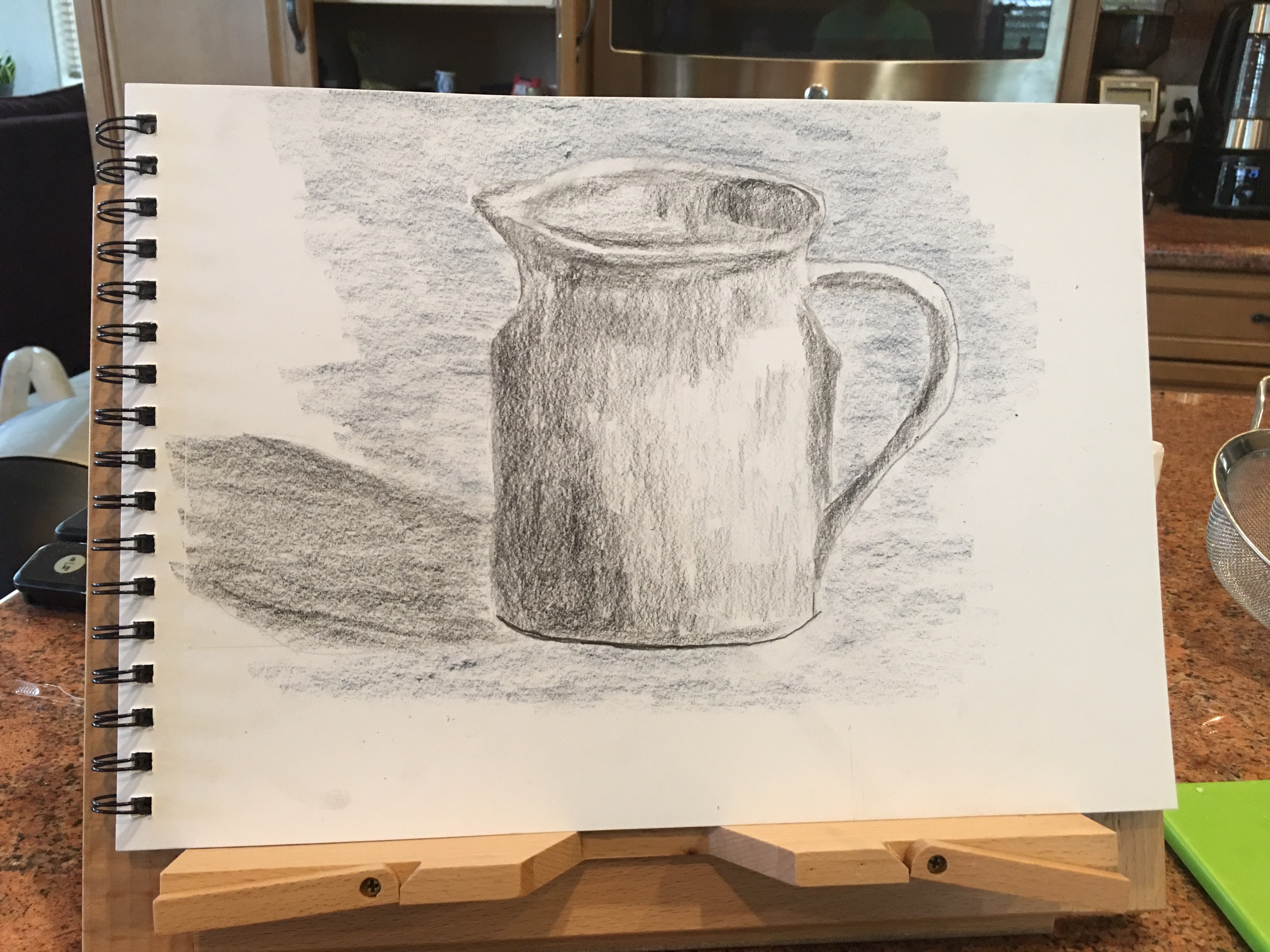
Last week i decided to try drawing a pitcher. My first attempt looked nice but not much like the subject. So i tried again a couple of days later. The shape was a little more realistic, but i still couldn’t figure out how to draw the highlights. (Note: For each session I set up the pitcher on a table, sitting on top of white paper. I shined lamp light on the pitcher so i could practice drawing shadows and highlights — and there were quite a few of each.). For the second session i thought maybe if i added in a darker background around the pitcher the highlights would show up. but no. Anyhow, so i decided to try yet a third time — today. It’s a little better: the highlights on the body of the pitcher are beginning to come through; but the ones on the lip of the pitcher do not. I’ve had it with this pitcher at this point. I’m going to try something next that is not so light, and perhaps I’ll be better able to figure things out.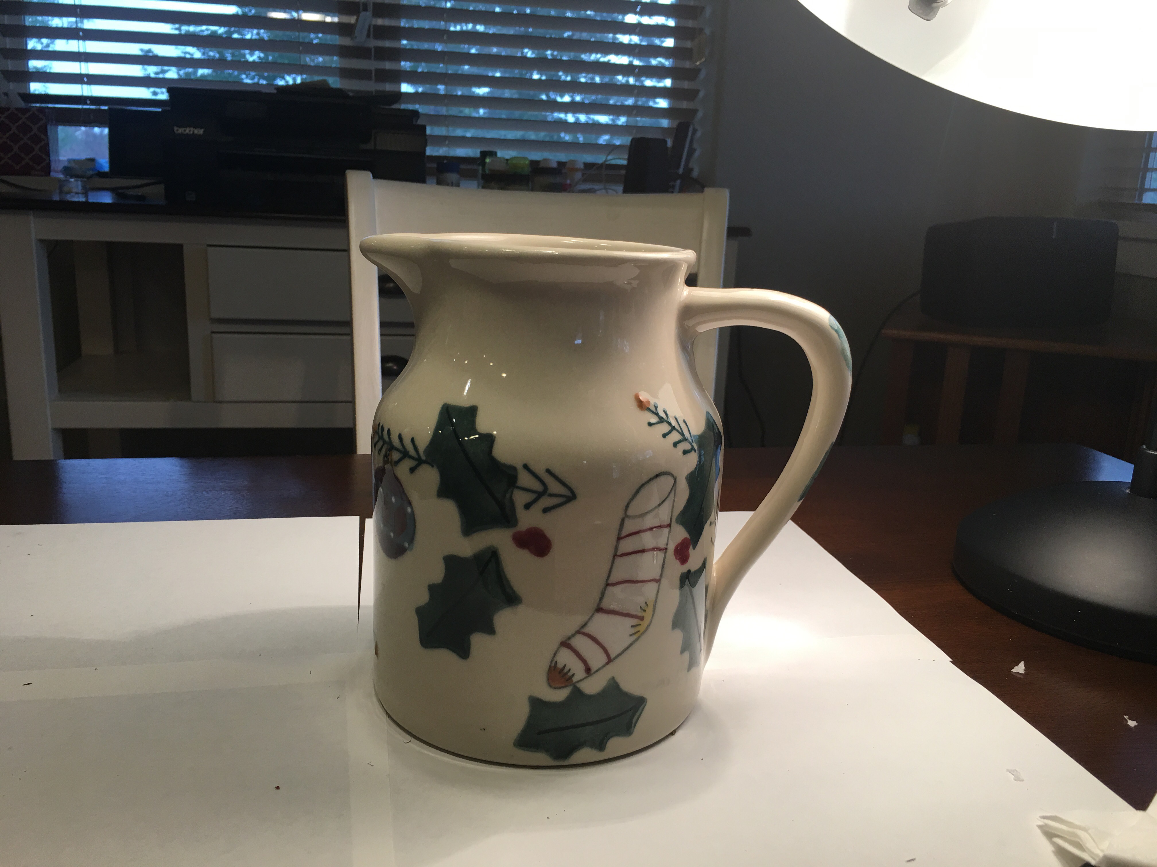
Getting close to done
This week i worked on several different parts of this “water” painting. I added highlights to some of the branches on the left side of the painting; made a couple of edges softer so they would be more realistic; added some bright areas to the waterfall – areas where water is more active and where sunlight is reflected in the water; also repainted some of the background. In class (yesterday) teacher had me repaint the plant vegetation and also fix the big tree trunk so it fit in better into the painting. Still a few more minor things to do, but in the next week i’m calling this one done.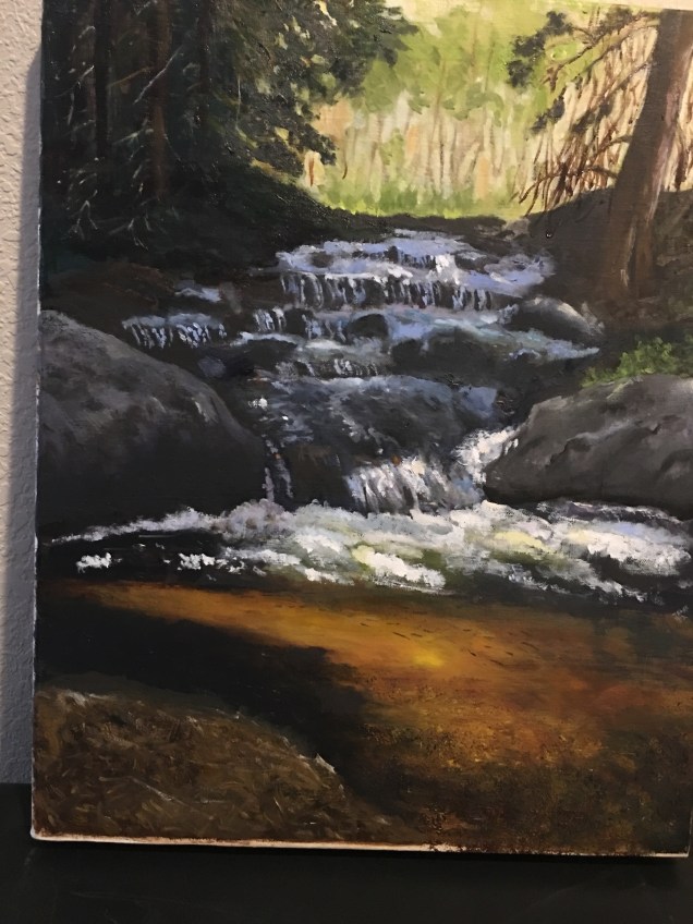
This week’s 2 drawings
I”ll post something tomorrow from my current painting. For tonight I’m posting my drawing efforts for this week — continuing with my self-imposed assignment of doing 2 drawings of one hour each each week. Posting helps make me accountable (to myself). So one of the drawings is of a little decorative bird house we keep in our living room. I realized, belatedly, that i should have posed the bird house at an angle, in order to give viewer a better idea of the depth. Another time! The other drawing is part of a photo i took of my sister, Mimi, walking in front of me on a beach. That drawing actually took me more than an hour, because i spent the first half hour trying my hand at drawing in my sister. No go. So she got erased out, and i worked on putting together the other parts of the scene.


Water not so calm after all
My “calm water” painting is coming along. Teacher returned this week after over a month away, and (of course) he had some suggestions about areas for improvement. The two main ones i worked on in class were: (1) water flowing over rocks in the lower waterfall part of the painting. He (teacher) thought I’d painted that area to look like the water was rushing, and that’s not how it was in real life (or, in the photo). So i attempted to fix that. (2) top part of the painting. This is hard for viewer to see, i think, but the idea is that i need to address the issue of depth, as in, the big evergreens are closer than the lighter part in the middle. I didn’t get to finish this part, either, but you can see, perhaps, where I’m going.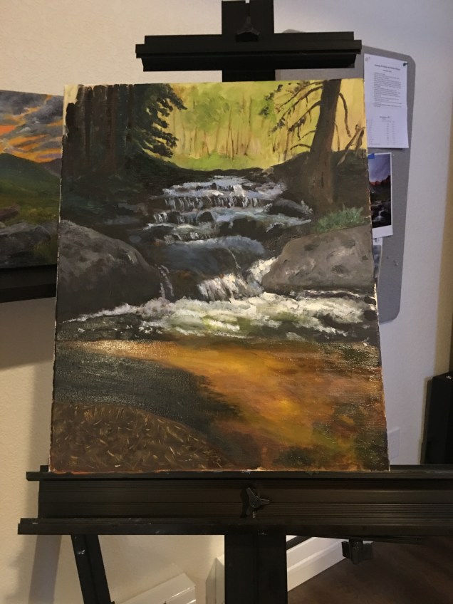
Drawing exercises I


I decided a few weeks ago that i wanted to improve my (rudimentary) drawing skills. So i made a commitment to myself to do two one-hour drawing sessions a week. the three drawings I’m posting here represent my beginning efforts. The first two were done in charcoal. I had forgotten how messy that can be, so for last week’s efforts i switched to graphite pencils and then added a bit of color. I had to keep within the one-hour self-assigned time frame, so obviously there could be quite a number of improvements made, had i taken more time. Nevertheless, i am pleased that i am learning as i go. References for the first two drawings were photos from various sources., For the third i was outdoors at a local state park for a plein air art day.
Note: I have a 4th drawing — actually the first — but forgot to photograph it for this post. Another time.
Moving along with “Calm Water”
Since i last posted i was out of town again for over a week. Now back and back to working on this painting. I’ve worked on several different areas, making various mistakes and doing several re-do’s. So — i worked on the waterfall, changing some of the shapes of the falling water. Also tried to refine a few of the rocks. Also worked on the water in the stream, in the lower part of the painting. Here i was trying to get the colors right and also get the rocks to look like they are under water, which they are supposed to be. In the photo, the water is incredibly clear in this section. When i tried to duplicate that effect, it didn’t work; so decided in the painting the water would be a little blurred so that i could blur the rocks — artistic license? The area in the lower left hand corner of the painting is supposed to be land (bare shore-line( strewn with pine (or some other evergreen ) needles. This was tricky, and i redid it 3 times. (Haven’t had class for over a month, so what I’ve done here has been on my own. That, in itself, has been interesting: in the past, when I’ve been stumped after trying to get some effect, i might end up saying oh well, I’ll just wait till teacher sees it and points out how i can fix it. Couldn’t do that this time, as teacher has been out of the country for a month.
 LJ and NJ