Lower Falls – Done!

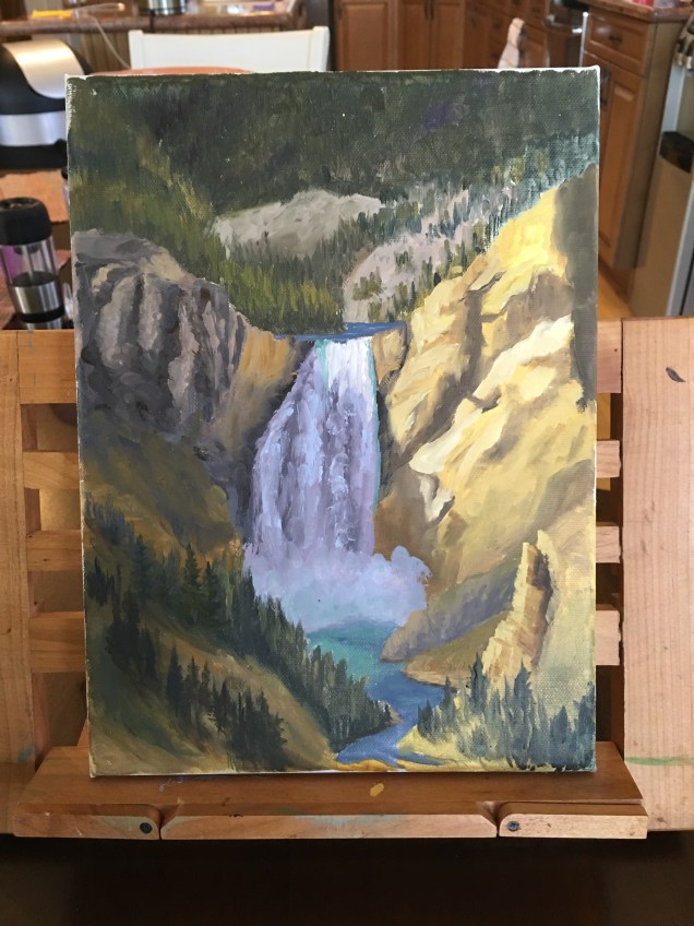
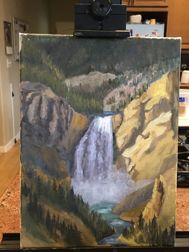
Today in my Monday class I worked on finishing up my “Lower Falls at Yellowstone” painting.  This included: adding spray to the lower part of the falls; making the top part of the falls look brighter – because that area is hit by the sun; adding whitewater (rapid) areas to the lower part of the falls; adding another row of trees — barely suggested because in dark shaded area; and smoothing our the dark area on the upper right side of the painting (by suggesting rock face).

I was most excited about adding the spray, which turned out to be pretty simple: zinc white paint (which is transparent) with a bit of medium (I used walnut oil alkoid).

For the white water areas I used an opaque white paint mixed with a little blue.

For the top of the waterfall I used straight white opaque (titanium) white.

I’m pleased with the result and now , once I get this one signed, will move on to next project.image.jpeg
Red Boat House: beginning value study

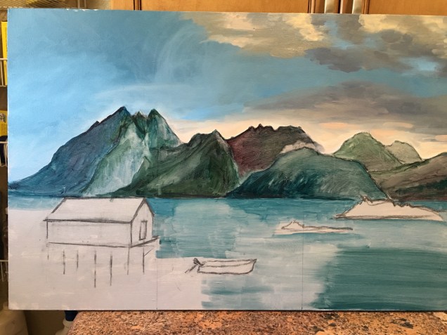
This week I worked both at home and in class on the :red boat house” painting.  At home what I decided to do was to make a stab at figuring out values and hues for some of the clouds. I spent a couple of hours mixing colors to try to get a good grey that would work for a first layer and a pink?/orange?/light for some of the clouds which are reflecting sunrise (or was it sunset?) light.  Then I tried putting paint to canvas and, predictably, had to start over again as, of course, the colors on the blue canvas background (aka “sky”) are different from how they look on the palette.

when I got to class this week, teacher (Ed) said enough with the clouds for the time being.  He suggested I do a values study of the whole canvas to get a better feel for how everything is going to eventually fit together.  I started by working from left to right on the mountain sides.  For the lighter values within a hillside I thinned out the paint (which was thin to begin with,as this is really just a wash).  I was told not to worry about the colors being true — just get a feel for the values.  This is only a first layer.  As you can see, I certainly did follow this piece of advice!  There wasn’t enough time in class to cover the whole canvas, and that will be my goal for my work at home this week.image.jpeg

Beginning — Red Boat House

Beginning a new painting — this one based on a photo Norma took on her recent photographic adventures in Norway.  I”m calling it the Red Boat House, and I’m getting instruction in this one in my “regular” Thursday class.  So, starting in last week’s class and continuing during this past week, I tried to do an initial drawing.  It took me a long time, mainly because the photo dimensions are something like 9″ x 18″ (I’m guessing – don’t have all the information in front of me.). Anyhow, my canvas is 18″ x 30″.  So I had to do a lot of figuring how I was going to address the canvas. If I could have found a canvas in which the horizontal dimension was twice the length of the vertical, I would have bought it.  But the one I bought was the closest I could find.

So — today I brought in the drawing.  Teacher fussed with it a little and then I finally started mixing paints to see how I was going to do sky and clouds.  The plan is to cover the sky area with various shades of blue and gray and then layer on the clouds.  All I got done today was to do the first layer for the sky.

I include below my beginning effort as well as the reference photo.

“Lower Falls” – almost done

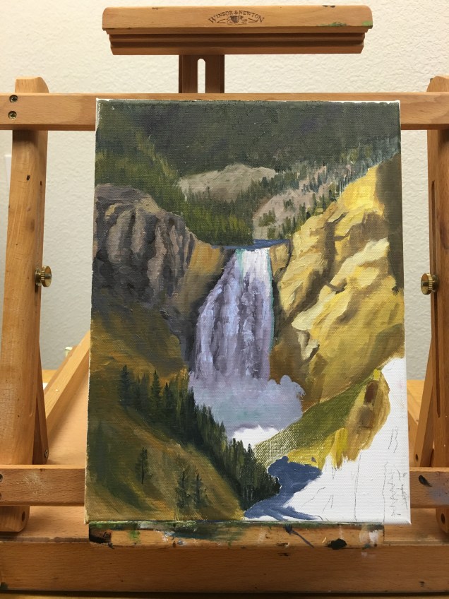
This week I worked on the lower part of the Yellowstone Lower Falls painting.  That included the river, the rocks on the lower right side, and trees on the lower left side.  At this point teacher says the main thing left is to paint the spray/mist from the falls.  I have to wait at least a week for that, as the painting underneath has to be dry.  I’ll use a transparent white (zinc white) to do this part.  Very excited to see how that will look!image

Voila – here comes a waterfall!

This week in Monday class I began to paint (finally!) the waterfall from the title of the piece, “Lower Falls at Yellowstone”.  Marianne , teacher, suggested that the way she wanted me to do this was to paint in the dark areas first and then paint the various lighter shades .  By then softening the edges you can begin to see the “water” feeling.  I have to wait till this part of the painting is dry before the next – to me the most exciting step! – of using a very transparent white to give the feeling of spray from the waterfall.

It is worth noting that this approach is not the one that would have been suggested in my other class by my other teacher.  imageAll roads lead to Rome, perhaps?


Lacking only a boat

This is my first post on Norma’s and my new joint (“shared”) site.  I plan to post art/painting updates here, as I have been doing on “blog of Judy A”. I will redirect those of you who have been following my other blog, and hope it is a smooth  transition for all.

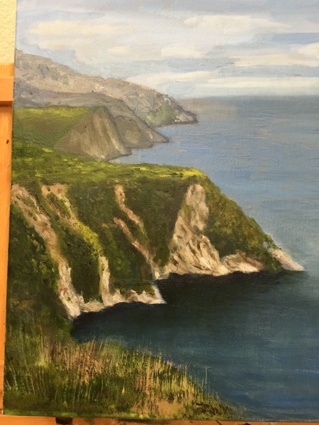
With that said, back to my Cinque Terre painting.  This week I worked some more on the hillsides.  Also added a little yellow to one of the flat areas to indicate some sunlight perhaps in that area.  I decided that the lower front area would be grasses, rather than the somewhat distracting bushes in the original photo.  I used a fan brush with a kind of upward flicking motion to create the effect of different colored grasses.  I did some adjusting of the hue of the water that is close to the shoreline, making the shade darker to indicate how I think the water would look.  I’m feeling pretty done with this one (as I said in my last post), EXCEPT that I’ve decided, after some deliberating, to add in the little white boat that is in the original photo.  I’ll do that this week after the “water” I painted yesterday is a bit more dry.

image.jpeg