This week I worked both at home and in class on the :red boat house” painting. At home what I decided to do was to make a stab at figuring out values and hues for some of the clouds. I spent a couple of hours mixing colors to try to get a good grey that would work for a first layer and a pink?/orange?/light for some of the clouds which are reflecting sunrise (or was it sunset?) light. Then I tried putting paint to canvas and, predictably, had to start over again as, of course, the colors on the blue canvas background (aka “sky”) are different from how they look on the palette.
when I got to class this week, teacher (Ed) said enough with the clouds for the time being. He suggested I do a values study of the whole canvas to get a better feel for how everything is going to eventually fit together. I started by working from left to right on the mountain sides. For the lighter values within a hillside I thinned out the paint (which was thin to begin with,as this is really just a wash). I was told not to worry about the colors being true — just get a feel for the values. This is only a first layer. As you can see, I certainly did follow this piece of advice! There wasn’t enough time in class to cover the whole canvas, and that will be my goal for my work at home this week.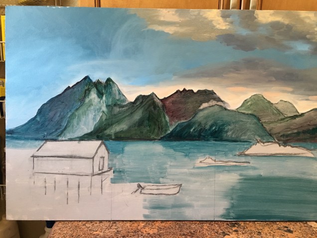


I look forward to seeing how this one evolves. It has some interesting challenges.
LikeLike
All great paintings seem to start out looking like a kindergarten project. Values rule!
LikeLike