Back to snow…..

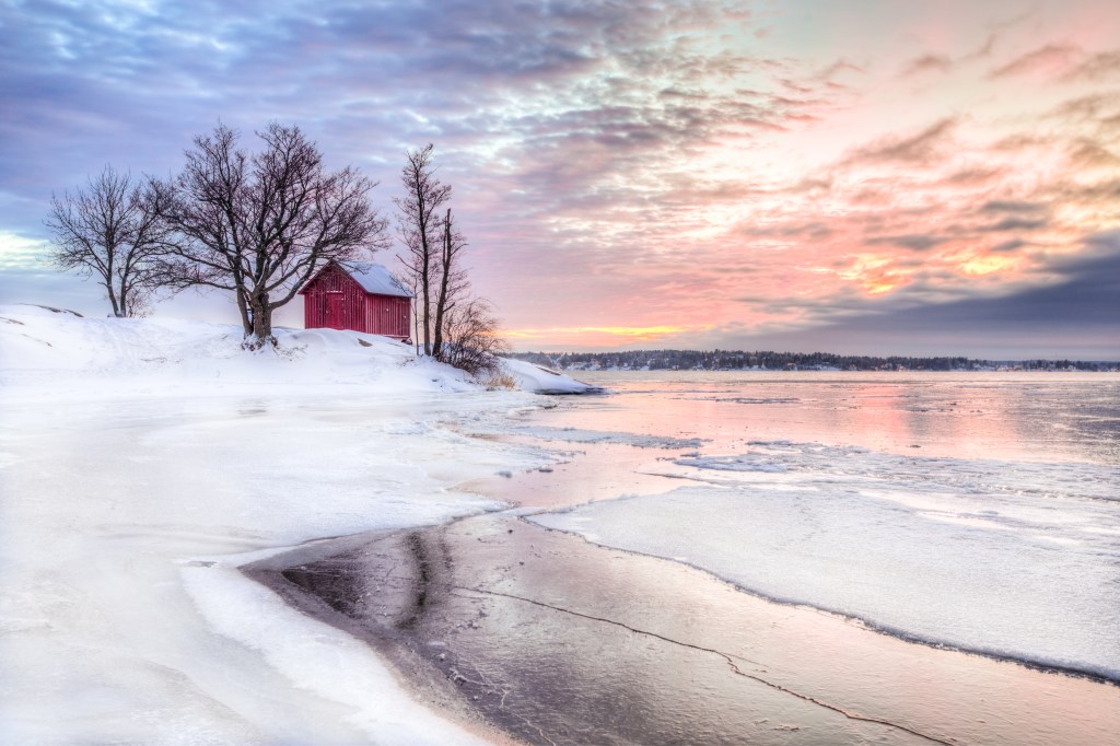
I’ve started a couple of new paintings. After all that bright, varied, colorful fall project this more austere picture somehow appealed to me. The sky provides most of the color, with the snow and ice providing quite a contrast. As usual i’ve struggled with the building, but it’s now better than it was. Just doesn’t work for me to draw buildings free-hand: again with this one had to go in and figure out vanishing points/perspective —after first go-round had dried.

The canvas i chose created another issue, in that apparently i failed to pretreat it with gesso and so it took 3 rounds/layers of paint just to get the snow to look vaguely white instead of a pale burnt sienna (which was the underpainting ).

There is quite a bit to do yet to manage to convey some better reality to the snow/ice and to handle the reflections of sky in the water. More to come…….

Barn in Snow
Reference photo for “Barn in Snow”

Another try with a Bird House

I’m getting ready to start a new painting. I’ve got several ideas for landscapes — one in summer, one in winter. Will show photos later. But before i get going on them, i thought i’d give another try to learning how to paint a bird house on a tree trunk. (Note: I worked and reworked one of these last summer, and never got it right.) Now in a painting class and teacher is focusing on values this month. So yesterday she had us do an underpainting — just using one color (i used burnt sienna); covering the canvas with a thin layer of paint and then working on the image by just changing the values of that hue, either by thickening or thinning the paint. I’ll show below the original reference photo and then my effort at an underpainting AKA Value Study.

reference photo for Bird House
value study/underpainting for Bird House

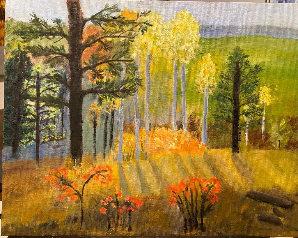
Fall in Colorado — calling it done!

This past week i worked on finishing touches of light and texture. Added more leaves to trees; added more interest in the foreground. I showed painting to teacher to request some help with issue of backlighting. She reminded me it’s all in the values, so i darkened the Aspen tree trunks and lightened the Aspen leaves. Then darkened the parts of the forest that seemed to be in deep shadow.

ON the Trail in Golden Gate Canyon State Park

Fall in Colorado – 2

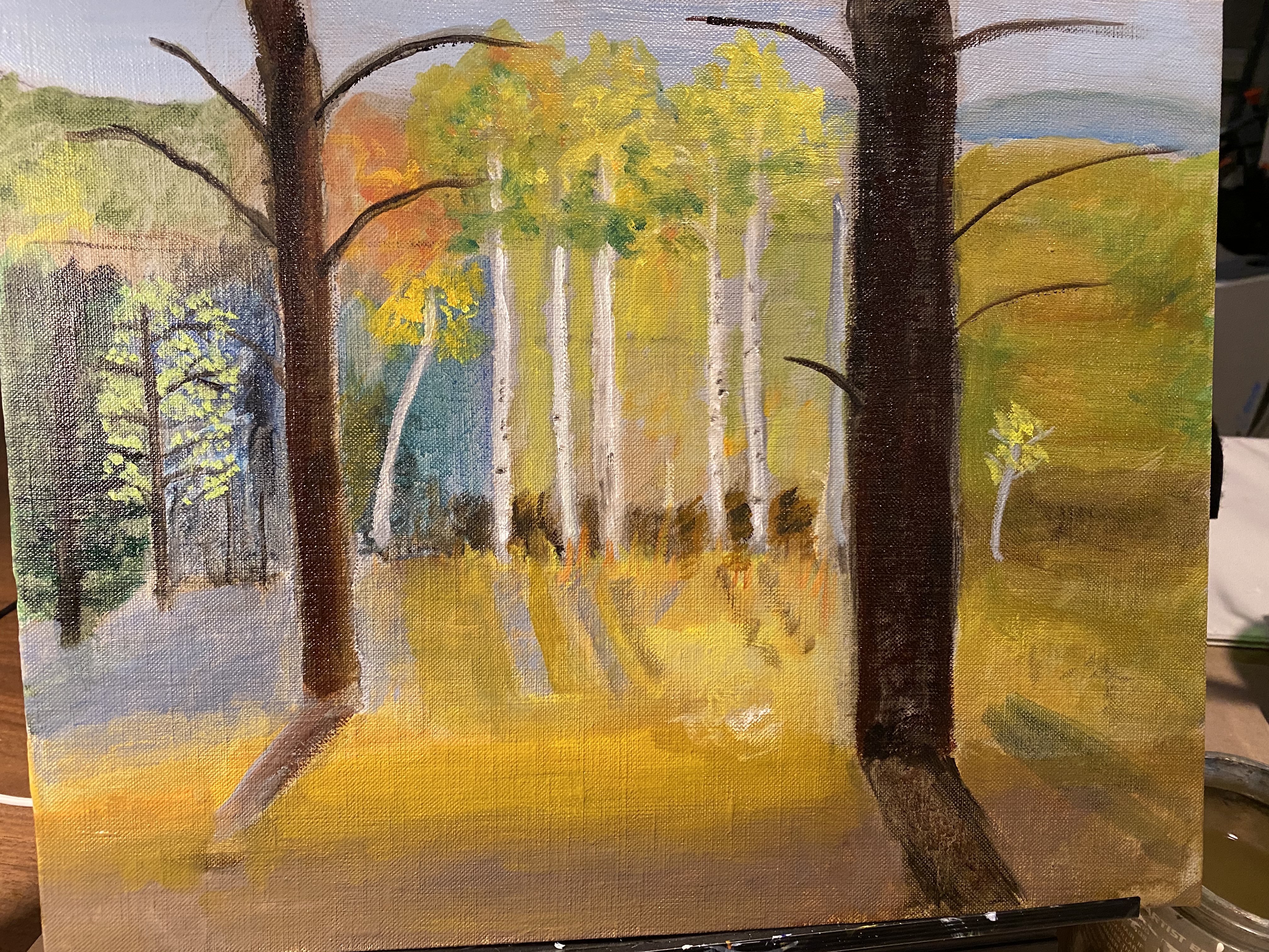
This painting has “evolved” – because the design i started with was not working all that well. I experimented with ways to improve “movement” — how the eye moves through the painting. This should have been done in the design before i ever started painting. But i guess i fooled myself into thinking that i could make the reference photo work for the painting. Didn’t happen. It’s not finished, but this progress note at least gives an idea of my current direction.

New Project — change of scenery!

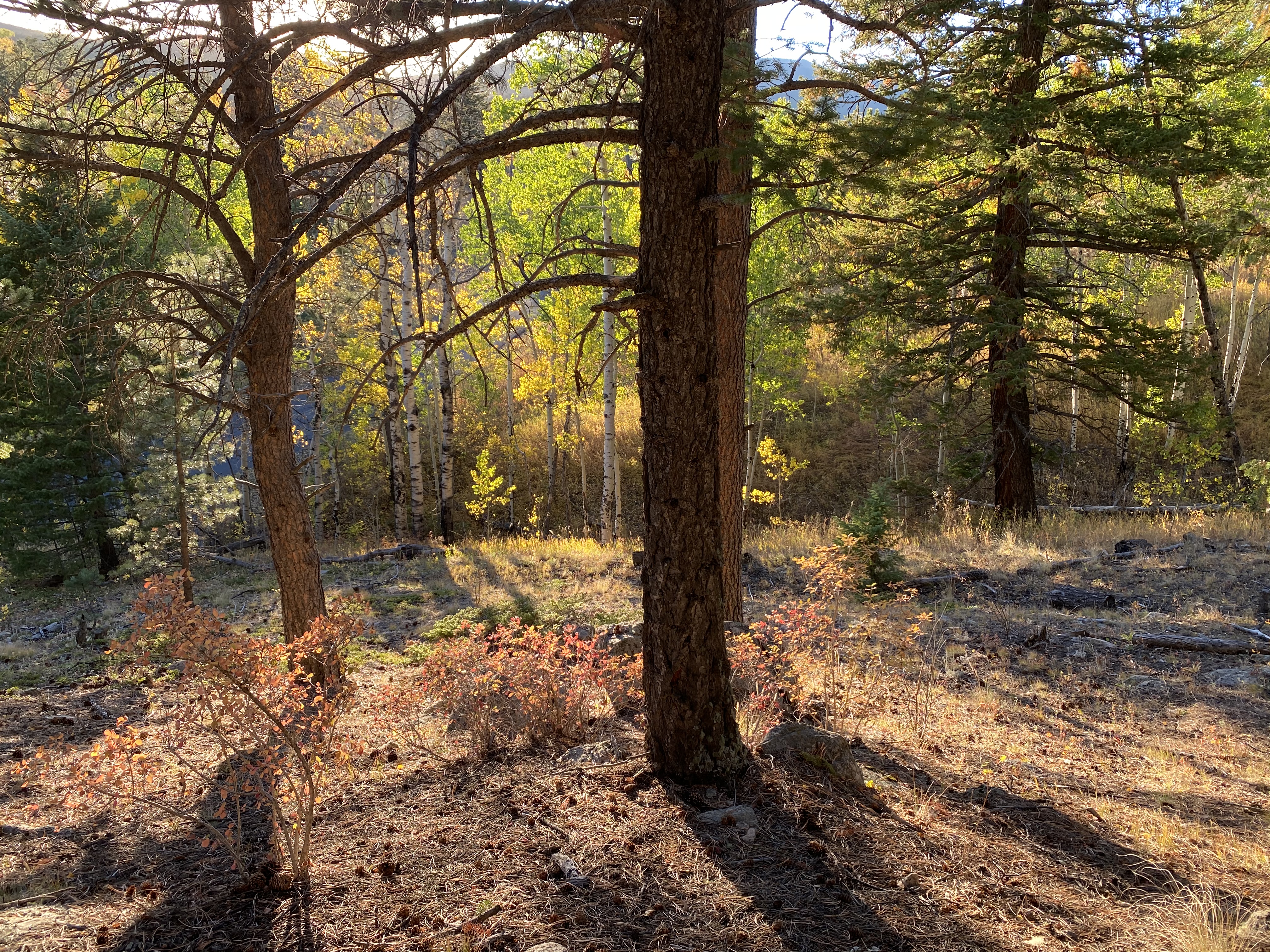
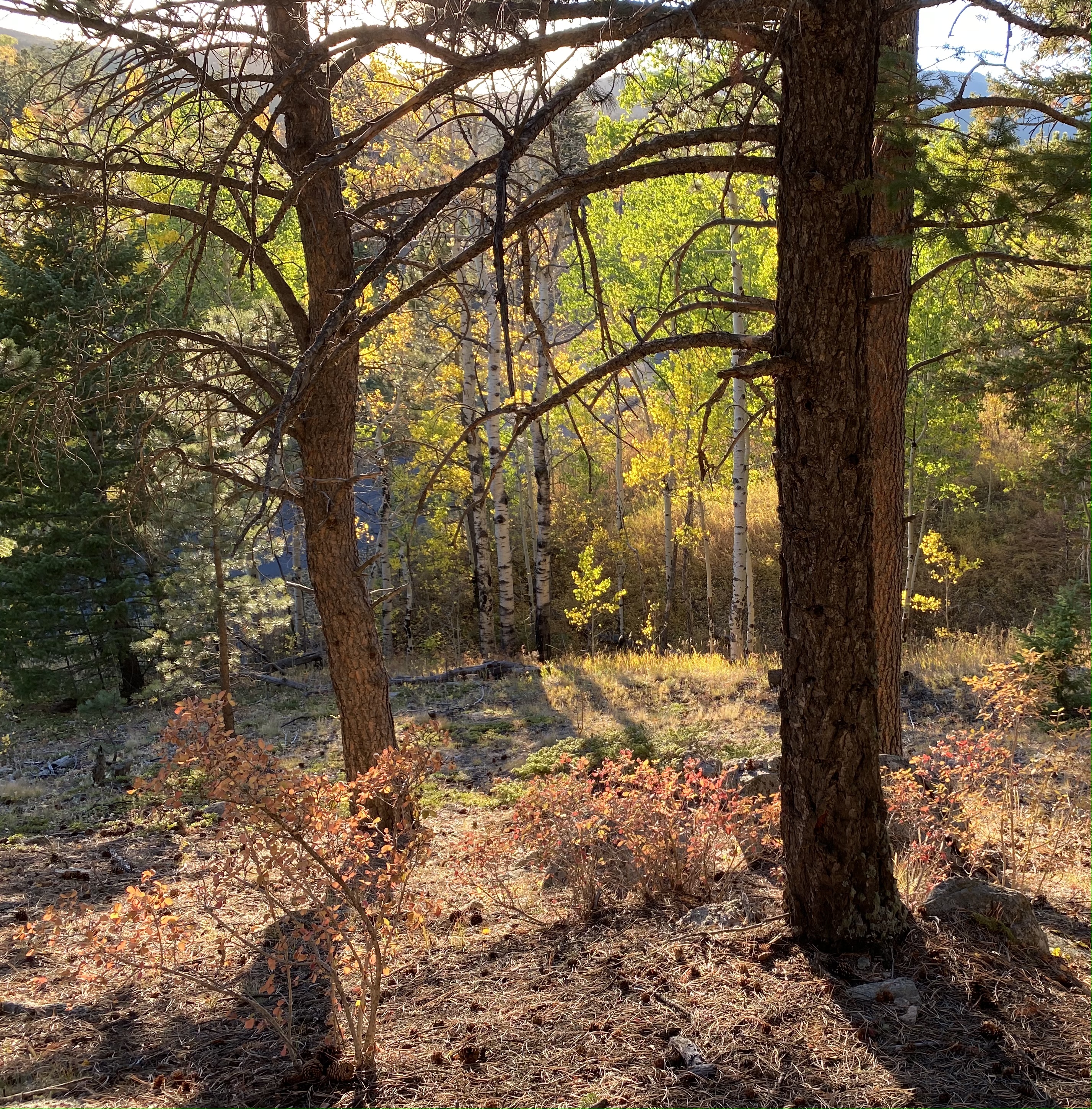
OK enough with Antarctica and ice and snow and so much white and gray. I needed a new palette and decided fall colors in Colorado would definitely fit the bill. So i’ve begun a new painting. Reference photo is from a hike we took in Golden Canyon Gate Canyon State Park a few weeks ago. This is a gorgeous area at about 8-9,000 feet only about 1/2 hour from our home — wonderful hiking trails, views, etc. We were there late afternoon and when looking west the trees were backlit with sunlight — just beautiful. So i’m attaching the reference photo and my beginning efforts. I changed the composition so that the two large trees would not be so centered. That meant the large evergreen on the far right would have to go. Obviously this project is going to require quite a number of layers, which is why i need to wait till i finish working on some of the background to put in all the large branches. Below are attached the original photo; the edited photo and the start of the painting.

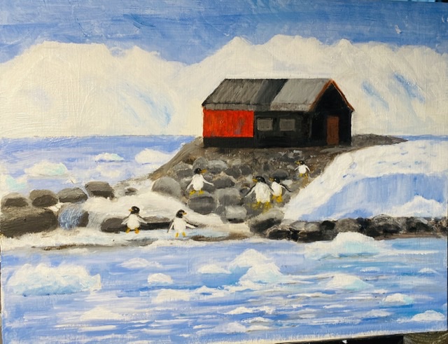
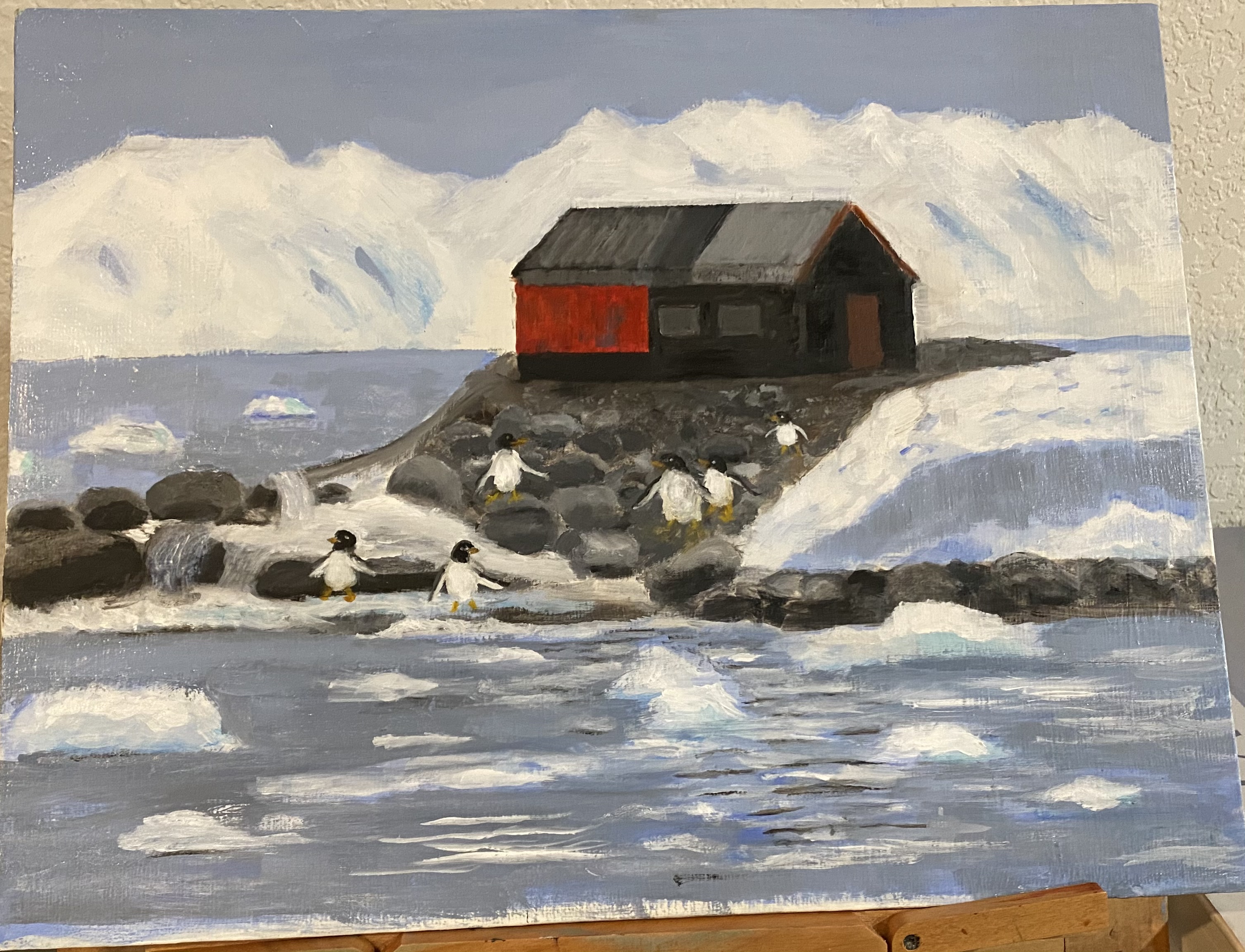
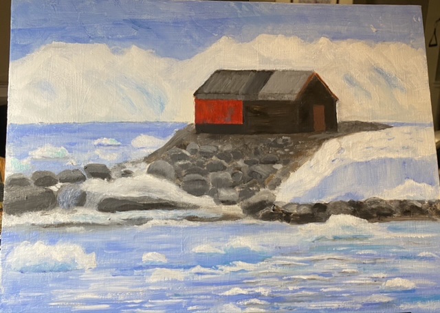
Port Lockroy -update: more on rocks, water

A few days ago i decided i was really sick of the particular blue color i’d been using for water and sky. So i repainted those areas with hues that are more blue-gray and also a little darker. I also repainted a few of the rocks on the upper left part of the land so that they were less regular/same. Also added some more floating ice pieces arranged more in a diagonal than straight horizontal, as most had been initially. I’m attaching photo from last week and also one from today to show especially the differences in water/sky color. (Note ; new way of comparing photos – i’ve not tried this before. Hopefully you can move back and forth between the two photos.)

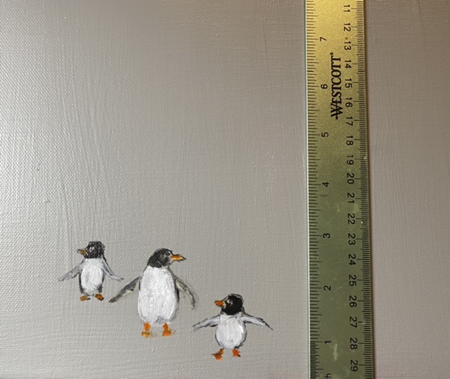
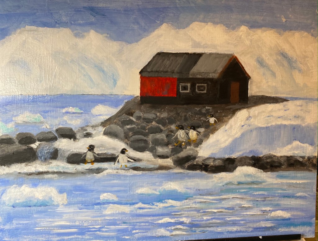
Refining rocks, painting penguins —

For the past few painting sessions i worked on refining the rocks so that there was more differentiation between them and so the shapes looked more life-like (i.e., rock-like). Also worked on the water, trying to get the waves and all the little floating ice pieces to be more realistic.

Also worked on the building, and finally decided to try (once again !) to get the windows to “work”. And once again, it’s’ not happening.

Finally i decided to practice painting penguins. I knew i was going to have difficulty getting them small enough — among other things. In photos, penguins often look much bigger than they are in real life. Most of the species are really pretty small.

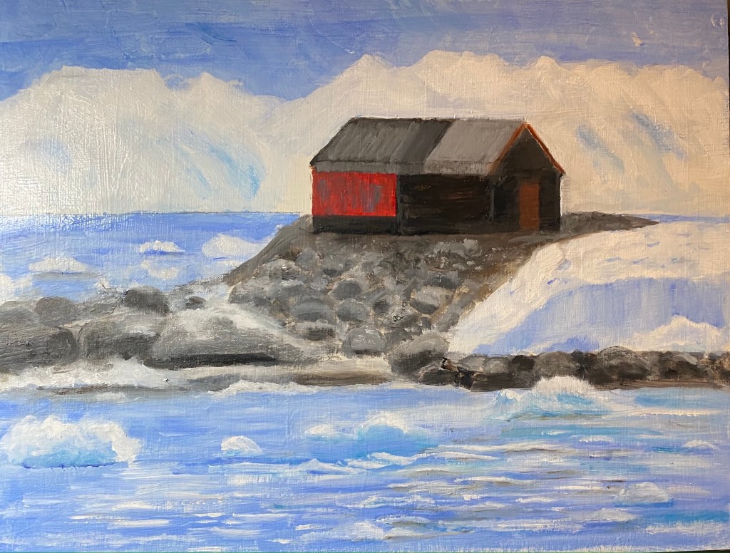
Port Lockroy – 3

This week i’ve been trying to get the building proportions in better proportion. As usual, this has turned out to be more of a challenge than anticipated. Also worked on water and icebergs floating in water. I think i’ll take a short break from working more on the building and refine the rocks. They (rocks) will need to be in their best shape before i try — if i do! — to paint some little penguins on them — the rocks.

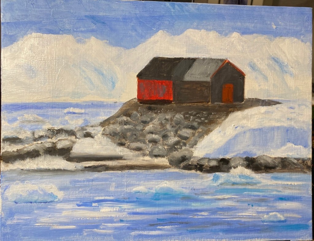
Port Lockroy —2

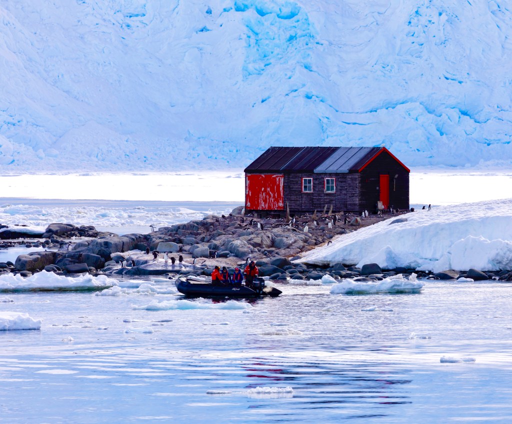
I realized pretty quickly after my first post of this painting that it was highly unlikely that i would be able to capture the ice background in a way that would allow the viewer to see it as the wall of ice it is and not some distorted sky. So i revised the composition a little and just made that ice into snow/ice- covered mountains (which are, in fact, everywhere in the Antarctic) and add in some sky at the top of the painting. That seemed to help some. Otherwise i’ve worked on all the different areas. It’s pretty tricky to try to delineate icebergs and ice covered landscape when all around is snow and ice. Clearly a good learning experience.

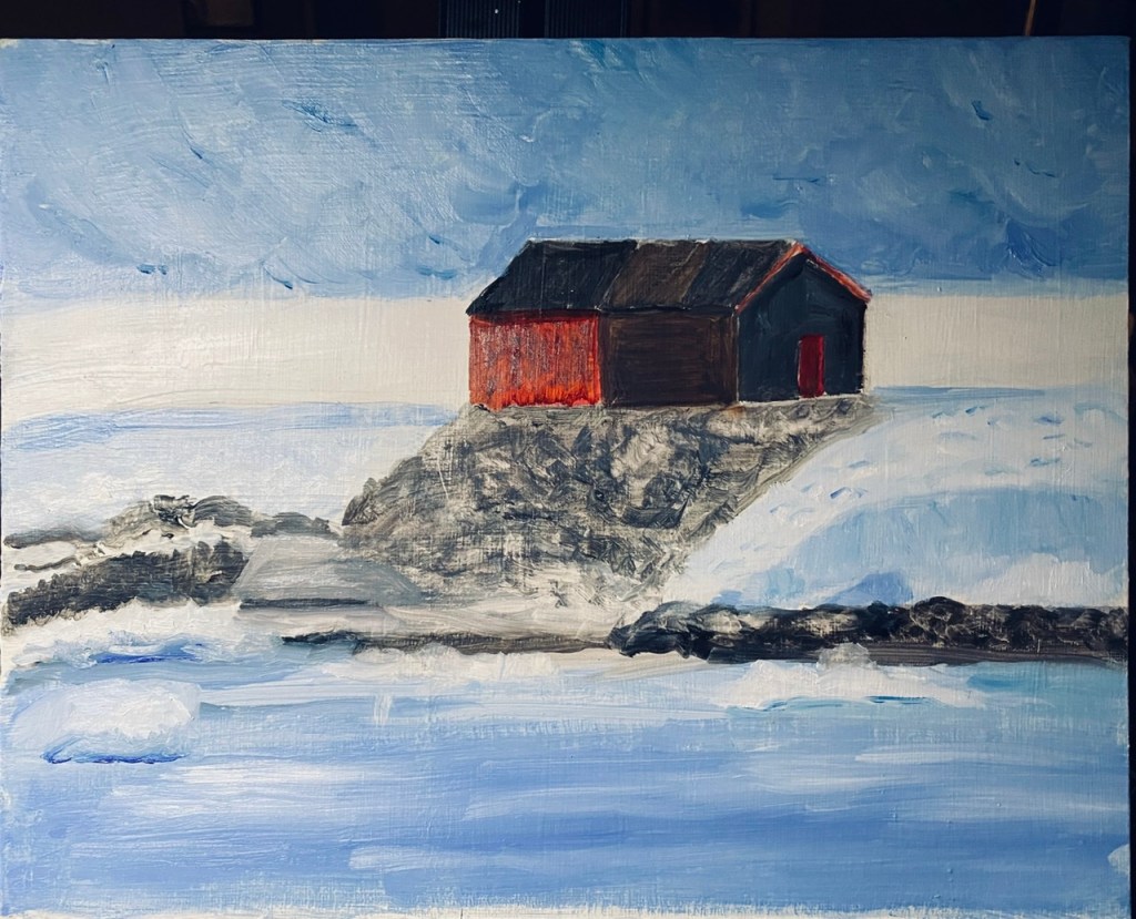
New Project — Port Lockroy, Antarctica

We are now settled happily into our new house, and i have just begun painting in my new studio. I did a little drawing while i was in the process of unpacking all my painting supplies, and had a little time to think about what to paint. At the point i realized i needed to get started on something, i decided on a photo taken on our trip to Antarctica last December. One of the stops was at Port Lockroy, a British historical base which featured the most southern post office in the world. This was the only “commercial” place we saw on the trip. As i am always attracted to old buildings, i loved this one. The contrasting colors of the buildings with all the surrounding ice, will be a challenge. What you see at the top half of the photo is all ice — NOT sky.—we were in a caldera, so surrounded by ice. The bare white parts are land, but i need to figure out a way to present that so it doesn’t look like low sky. I don’t know if the way the reference photo looks is an artifact of what the camera did, or not. I may have to change all that significantly. To be determined.

The painting is just getting beyond the blocking -in phase, so no details for a while yet. Multiple layers required to get the feel of the ice and no doubt the rocks, as well. So no penguins till close to the end!