As i noted in the post i just published, there were no classes for a month. And the rules for the Monday class are that students are told NOT to work at home on paintings that are being studied in class. So the only update i have on the “pumpkin” painting is from class, which resumed yesterday. The canvas is small and there is a lot of detail in this one, so I’m getting quite a bit of practice with small brushes and working in small areas. Most of my time yesterday was spent trying to paint the grass in areas around the pumpkins. This was pretty tedious and i soon tired of it; so switched back to working on the pumpkins and the wagon. all still very preliminary, but should pick up in the next couple of weeks.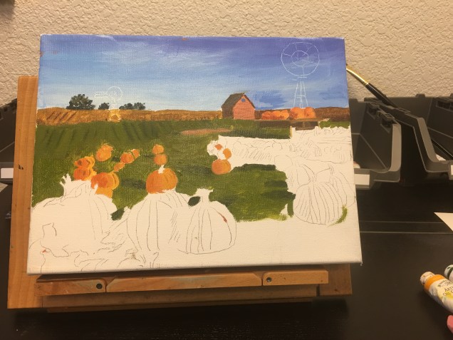
Author: 2pianojudy
New Year, new approach
Through December i didn’t have either class this year, so i was on my own with painting practice. I decided to do something i hadn’t previously done — which was to start from scratch a new painting, without any teacher input, at least for the beginning stages. I chose to work on another stunning photo that Norma took in Norway. I tried to be careful with measuring and drawing, and color mixing, and then began laying on some paint. I’m attaching here both the reference photo and my very preliminary efforts to date. You can’t tell from painting at this time how the colors will end up, but you can see the general layout of the composition.


Field of Pumpkins
I’ve begun a new painting in my Monday (aka “weird” class). I’m including a photo here of the original (photo from a calendar) and my very beginning efforts. This is the class where we trace lines from the photo, transferred on to the canvas. I think you can see the trace lines so you can see what i’m talking about. Canvas is small — 9″ x 12″ (compared to 18″ x 32″ for the red boat house painting). So part of what i’m needing learn is painting in small spaces. (By the way, don’t pay any attention to the sky in the original. The photo is on very glossy paper and it reflected too much light from the ceiling. I think you can still get the idea. I’ll include a better reference photo next time.)


Enough with the boat house!
I didn’t realize it has been a month since i posted anything on this site. I’ve been working on both the red boat house painting and the painting from my other class (which i’ll note in my next post.
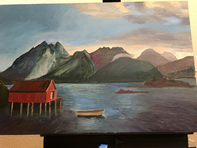
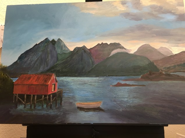
For the red boat house work, i’m calling it done. There are surely improvements to be discovered or made but for now i’m over it! I’ve learned a good bit during these 3 months (yes, it’s been that long on this piece!) and i think i’ve reached the point of diminishing returns. I’ve reworked a lot of the painting in the past month. i don’t think the amount of effort i’ve put in is reflected very well in the photos, but on the other hand what i’ve learned isn’t reflected too well in the painting either. that is in part because i repainted several areas several times to try to get a better feel for what i was doing. For example, most of the sky has been repainted. That “green mountain” has been done and redone 4 or 5 times. Etc. I did a lot of the work at home, trying out various techniques, and then requested feedback in class. Today i told teacher i wanted to paint (well, repaint, of course!) the little islands in front of the mountains; and i wanted to add mist in the mountains. ( I see from my November 10th posting that this painting had mist in one of its prior iterations. Just take my word — it’s been taken out and put back in a couple of times since! — Ah, the beauty of working in oils!)
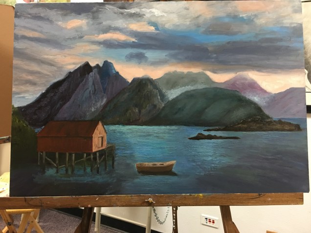
Getting close (red boat house painting)
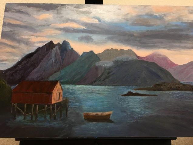 This past week I’ve been working on the mountains — as I have lo these several weeks!. I feel like I’ve now made some progress in the direction I’d like to be going. Here’s what i did:
I changed both value and hue of two of the mountains because neither was terribly realistic. The large mountain towards the right side of the painting, which was green, is now not so bright and not so green. The mountain behind it which was kind of purplish is now toned down (because it’s further away) and grayer.
I put a second coat of paint on the mountain which is furthest to the right side of the painting.
I put another coat of paint on the two little brownish islands in front of the mountains.
I did more work on the clouds and sky. It’s very hard to tell from the iphone photos, but take my word for it, the sunrise (or is it sunset?) colors are much deeper peachy color on the painting itself.
I shortened the boat a bit. (My teacher told me last week he thought it was too big).
Added a little mist over a couple of the peaks. That part didn’t work so well; i’ll redo.
Norwegian Countryside
This posting is about the painting i’ve been working on in my Monday class for the past few weeks. It’s from a photo Norma took while on her adventure in the Lofoten Islands this past July. You can see the reference photo below (it will be tothe right of my painting photo — obviously!).
So i used a 9″ x 12″ canvas. Would much preferred to use much larger one, but as i think i’ve mentioned before, this teacher wants me to use small ones. I changed the composition just a little. As of last week teacher declared the work finished. I didn’t argue, but it certainly does not look at all finished. So i will continue to work on it at home. The paint layers are too thin; the fence posts never made it in to the painting; (i had painted over them and then forgot about them!) and the colors, except for the sky and clouds, are not very pleasing to me. that said, i am pleased with the overall shapes and the color contrasts. I’ll see what i can do to make the overall painting more vibrant!


Mountains and boat
Well, i just looked at the date of my last posting and realized that it’s been a while — though in between this posting and the one on October 1st i did post something on the blog of judy A site.
Anyhow, what with one thing and another i’ve gotten behind in posting. So — with the red boat house painting i’ve worked over the past couple of weeks mainly on the mountains and the boat. Boat has now been repainted several times while i tried to get the shape, size and reflections to work. It’s improved but i’m not crazy about the color of the boat itself. For the mountains, I’ve focused primarily on getting 3-dimensional feel to them. The one which gave me the most trouble was the green one – towards the mid-to-right side of the painting. It’s come along, i think, and i’m not sure how much more i’ll tweak it. today i spent a little time revisiting the boat house itself. It needs some fixing up but i think i have a pretty good idea how to go about it. 
Mountains
The red boat house — this week i decided to do some work on the boat and the mountains. I ended up repainting the boat 3 times and am getting ready to do #4. I was trying to fix the shape and the color. Not there yet. When i first started the painting, i did a very thin layer of paint over the whole canvas, as part of an initial values study. Hadn’t touched the mountains since. So i went back and started working on those mountains, beginning on the left side of the canvas. Teacher had some helpful hints in class yesterday about ways to make the mountains look more 3-dimensional. Tonight I did some work on lower part of the sky.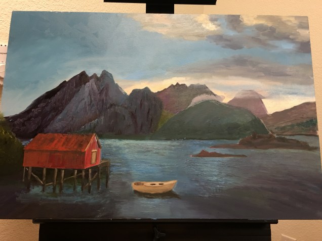
Under the Red Boat house
I didn’t go to my Monday class last week as I was having my first cataract surgery. That also meant I didn’t do too much painting early in the week.
I did do some work on the Red Boat House painting on Wednesday — mainly experimented a bit with some areas of water. Then in class on Thursday teacher (Ed) suggested I spend most of my time fixing the pylons under the boat house. They had been bothering me, as they were not straight. Ed said not to worry about whether they were straight or not but to fix the values and color and get the lighting correct. So I worked on those issues, and while I was at it, I decided to go ahead and try to paint in some of the cross-wood pylons. Then I worked on the water in the area under the boat house. And finally, I repainted the boat to try to get the shape more accurate. The boat will now have to be repainted again, as I’m not crazy about the colors. at home over this weekend, I started reprinting the mountains. I experimented with some different colors. Values not good, so I’ll be redoing that area — the mountains on the left side of the painting. (I didn’t have time to take on the rest of the mountains, but will try to get to them soon.)
Finally, I worked on the water in the lower right side of the painting.
Red boat house and water
Over the past week at home I worked on two things: the red boat house, and the water-which-is-in-shadow. So with the boat house I worked on getting a better color for the roof and for the sides, and also tried to get the door to look more like a door. I wanted more contrast between roof and sides, and also wanted to begin to make the roof look a little more “used”.
With the water in the lower right side of the painting I worked on getting better angles for the ripples and trying to get a color that would work.
Today in class I continued work on the water. So dark water in both the right and left lower part of the painting needed to look like they had some texture and some movement — but not too much of either. I knocked down the texture I’d painted on at home and worked on getting the movement of the waves better aligned.
During the week the more I looked at the texture I’d gotten with the palette knife the less I liked it. I had pretty much decided to scrape most of it off but thought I’d run that idea by teacher, who was fine with that plan. So I scraped away enough of that over-the-top texture and tried to tone it down while still keeping the image of water.
Last thing I did today was re-paint the boat. The upshot of this activity is that I’m going to have to repaint it again! Lost the motor when I enlarged the boat (when I was trying to fix the angles at the back of the boat. And the colors don’t work the way I had hoped. After it dries, in a couple of days, I’ll give it another try.