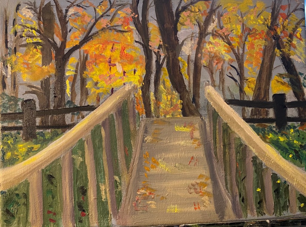
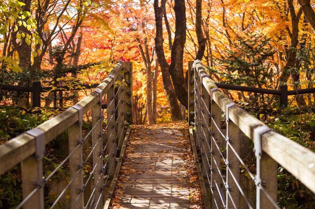
Here is partially completed new painting. This one was part of an assignment to use colors mainly from one end of the spectrum. I chose the red end (if you ignore the greenery, which i did for purposes of explaining the assignment .). Loved the colors in the reference photo, which i got online — i think it’s of a bridge in Japan. I plan to work more on the foliage between the bridge posts and clean up some parts of the bridge. Open to suggestions for what else to do.
- Comment
- Reblog
-
Subscribe
Subscribed
Have a WordPress.com account? Log in now.


You have painted a very inviting place. I would love to walk there.
LikeLike
Thank you, Mimi.
LikeLike
Great composition and I love the colors. The bridge perspective is a little skewed. I would try lowering the end of the bridge about 25% so it doesn’t come up from the bottom edge more than a third of the way into view. You could also move the foreground bridge rails up a little, which should flatten the walkway so it’s more realistic.
Great palette overall, too. Imparts a great sense of seasonality.
LikeLike
Thanks so much for your comments, Bern. I”m studying the painting to see how to make some of the adjustments you suggested. Meanwhile, I’ll send you email about the issue.
LikeLike