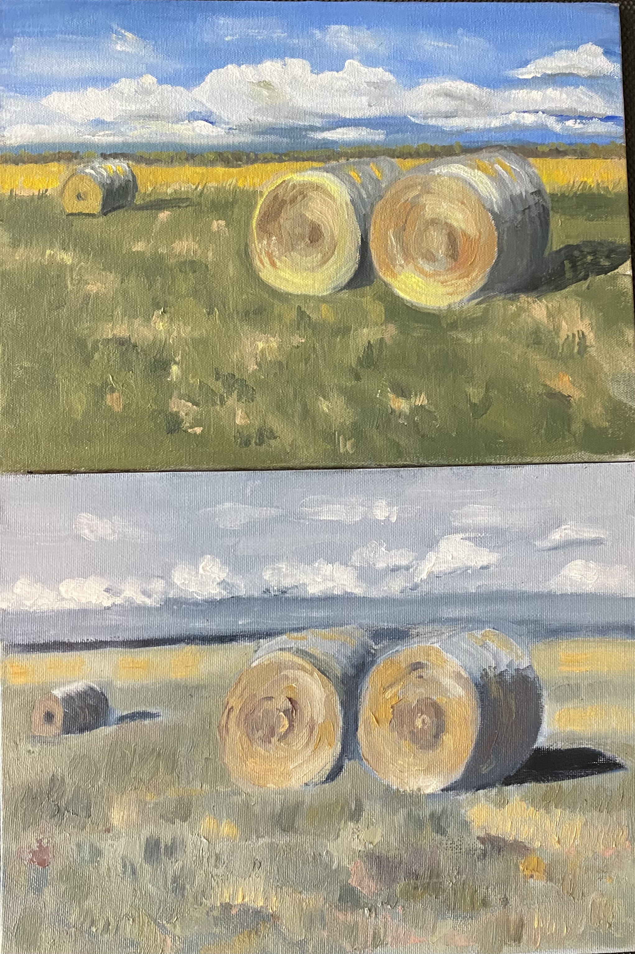
Last time i posted a photo of a painting in which i tried experimenting with a very limited and nontraditional palette. The colors i used were: payne’s gray (in place blue); yellow ochre (in place of a more common bright yellow) and quinacradone red (a dark red); and titanium white.
Following that project, i painted the same scene again, and again with a very limited palette — but this time with more traditional colors. So for the newer one i used ultramarine blue; cad light yellow; and cad red light —- and titanium white. The results are shown below. Notice that i still had to create my own greens and browns and grays, but the overall effect is more vibrant piece.


wow! that’s some difference! what would you think of sprinkling a few indian paintbrush in the foreground? this is altogether a very good job.love,m
LikeLike
I like the latest but I still like the first you posted. Bei nice!
Sent from Yahoo Mail on Android
LikeLike