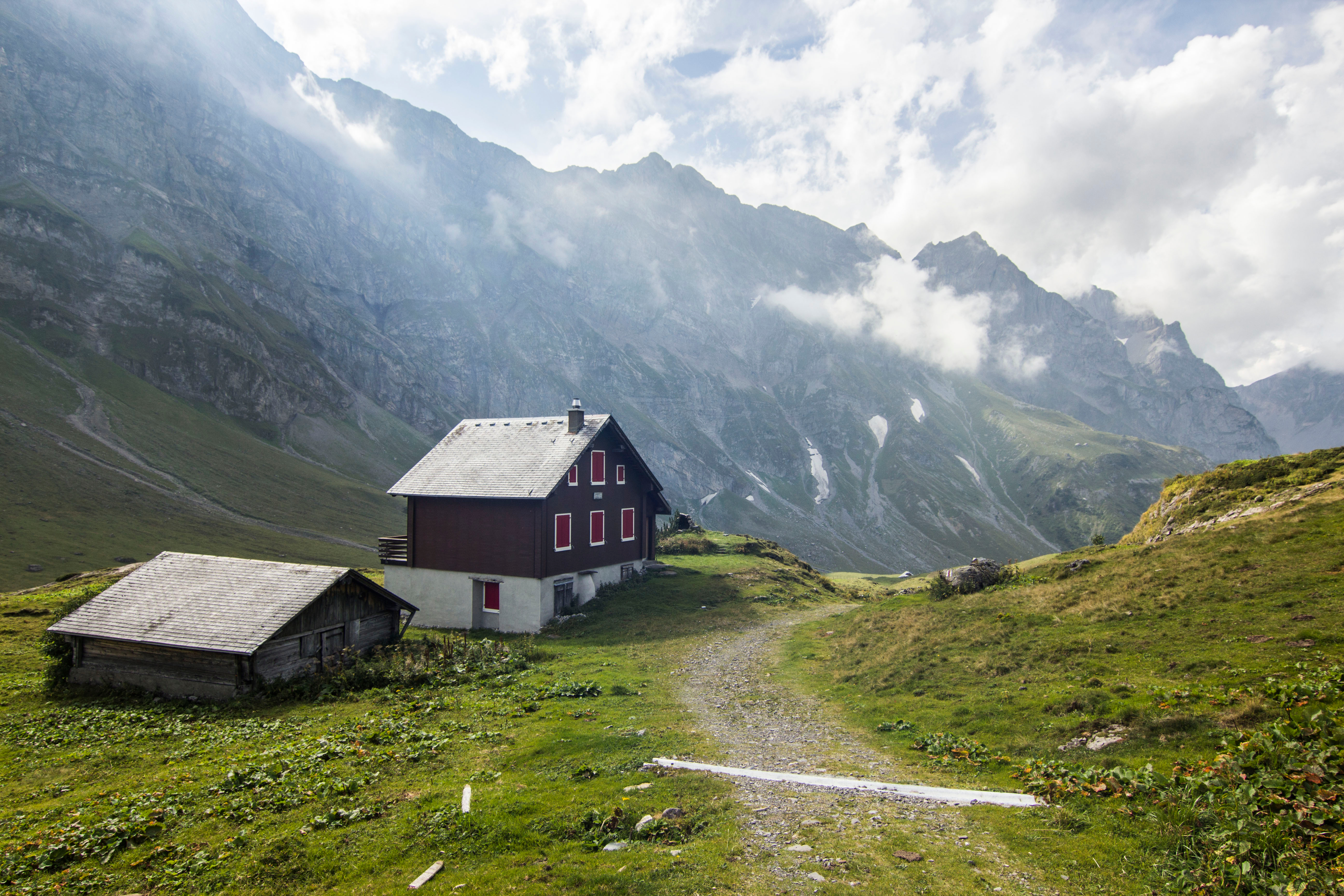
For the past couple of weeks i’ve been working on a small color study with the idea that the work would then be used to create a much larger painting of the same subject. We were also, in class, working with 1- and 2-point linear perspective, and teacher suggested that we select a subject where we could work on the perspective issues as well as developing the color study. I’m attaching below both the reference photo and my little study. I did make some changes to the composition, as i didn’t care for one of the buildings in the reference photo.The color study was painted on a 6” x 8” board. this was a good exercise, especially as the color mixing work is now done if i go ahead and paint a larger painting of the same subject.
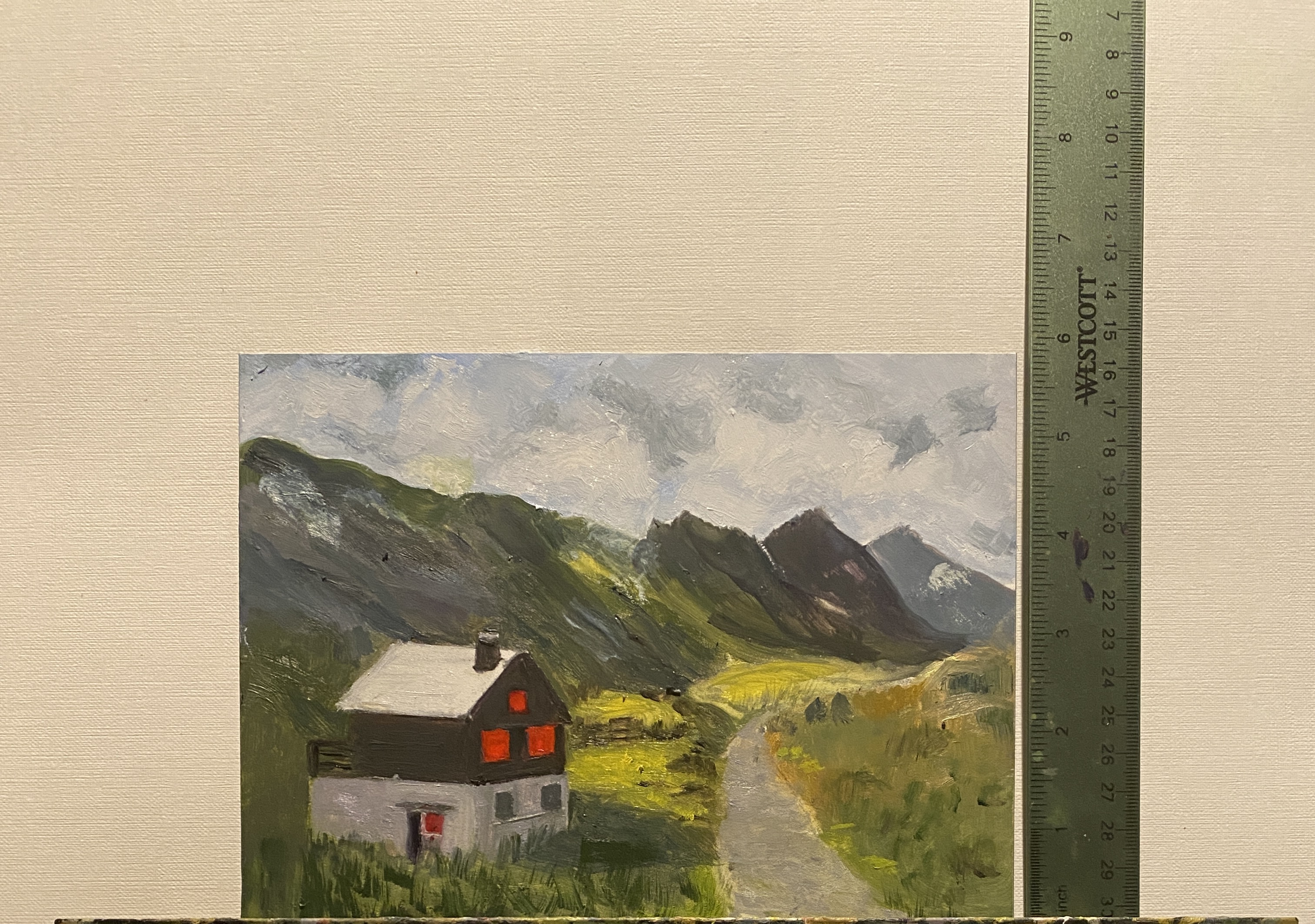


Does the red fill in the windows look a bit too bright? I asked M&M what they thought, but I think their color perception may be different than mine. Otherwise, good job!! m
LikeLike
yes, the red is definitely “off”. windows are also in general unfinished. tune in later today – will try to fix. also noticed angle of side of building is “off”. thx for comments!
LikeLike
Great study! I agree with the previous comment that the red in the windows is too saturated and frankly just plain odd… the light in this reference photo is a bit off, too. Maybe consider lightening the left side of the building to give a better indication of the light direction.
I love the background work, too. You’ve made clear improvements over time with your practice of these types of landscapes.
LikeLike
thx for comments!..see my response to Myra – i will fix windows. long story what happened, having to do with needing to use an opaque red over a much darker but transparent red to straighten out mistake. so now have to fix that mistake! also agree re: values for side of building.
LikeLike
Beautiful painting. Thanks for sending.
How are you?
Love, Rosanne
Sent from my iPhone
>
LikeLike