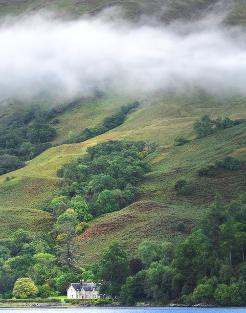
This painting is from a photo taken during our vacation in Scotland last fall. When i began the painting i mixed 7 different hues of green. That turned out to not be nearly enough, and so there was quite a lot more color mixing than i’d originally intended. But what a treat! Reference photo also attached. I didn’t want to emphasize the house, so kept it pretty simple, compared to the original. There are still a couple of things to fix with the hedge/grasses around the house, but i was excited to let you see my first effort of this kind of “Scottish” mist.
Painting is 9” x 12”, on 1/8” panel.
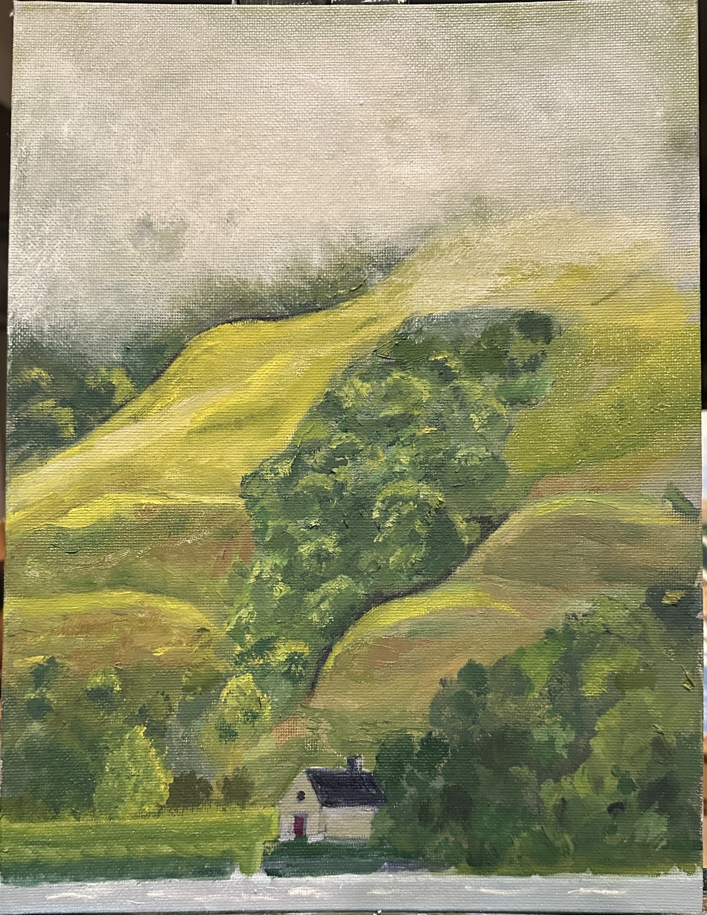


You nailed that mist! It has just the right amount of opacity and transparency, something that I know from personal experience ain’t easy.
LikeLike
Good job! Would adding a touch of blue to the mist do anything interesting? love,m
LikeLike
Thanks, Myra. Yes, i think adding a little blue might be good. Also, more white. What i did was add a little gray., but that mist was really brighter than i made it.
LikeLike