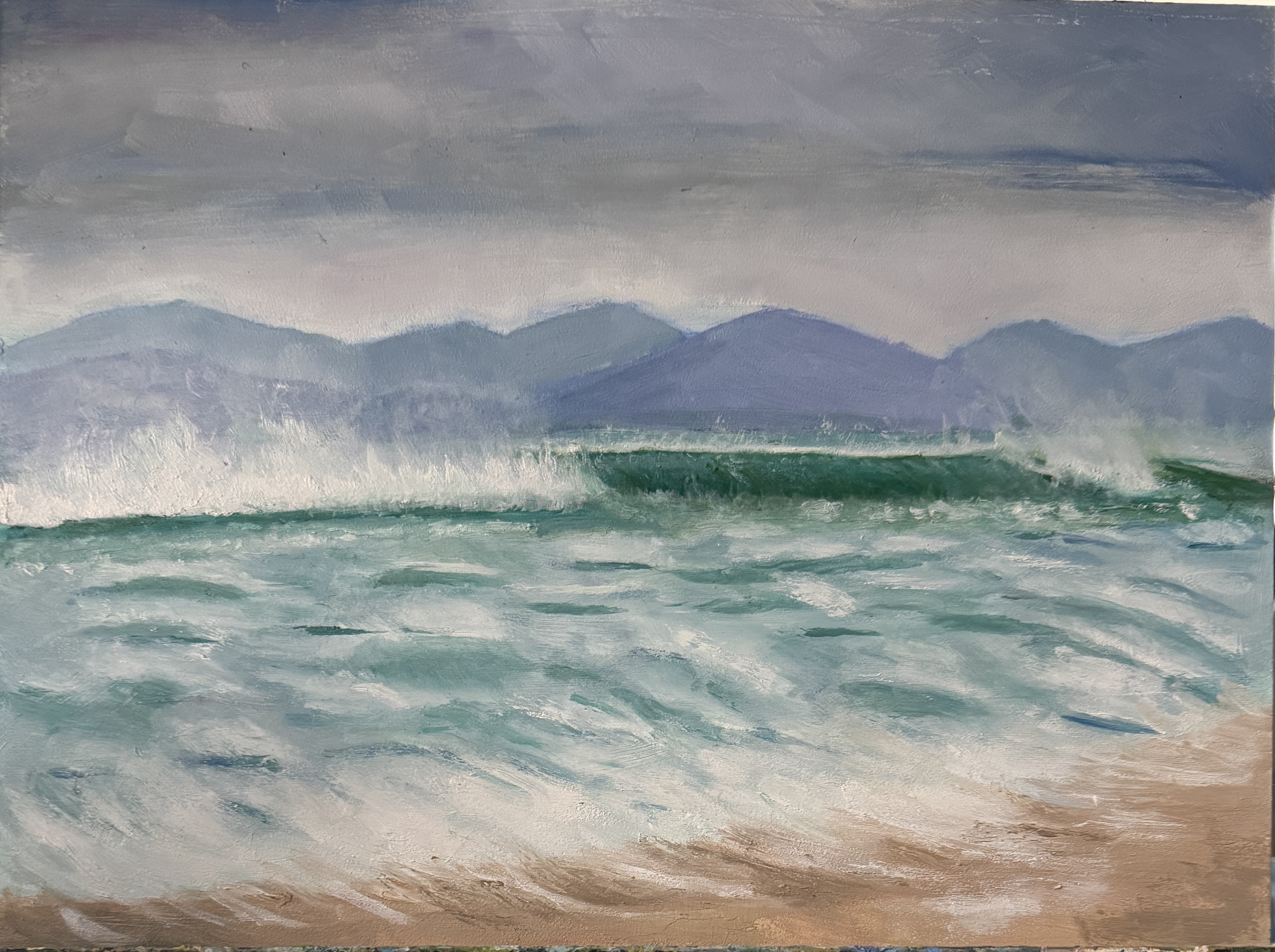
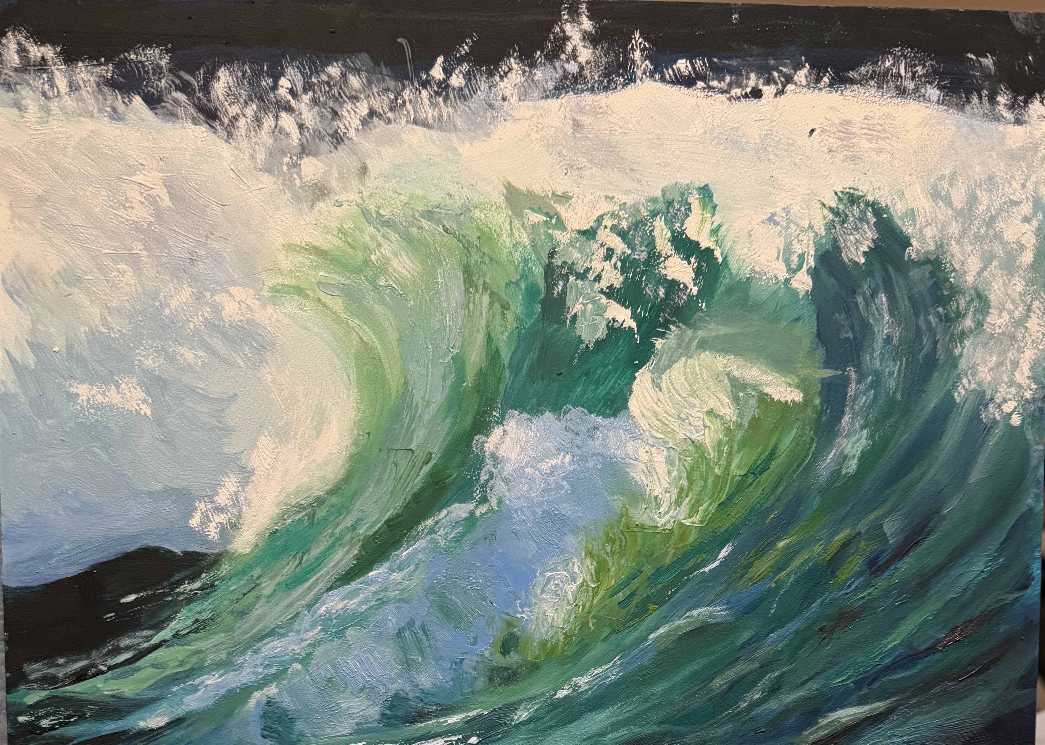
A few weeks ago i posted a photo of a painting i called “ Crashing Wave”. Today i’m posting a companion to that painting, calling it “calmer sea”. This sea is not totally calm; there is quite a bit of wave movement, because i found that much more interesting to paint and to think about than a totally flat glassy calm surface like a lake with no breeze. One of the most interesting things to me about these two works is that the color palette was almost identical for each of them. The main difference in hue between the “crashing wave” and this one was the addition of white to mute the wild greens and blues from the first painting. Not surprising, really, that there is such color similarity, as both paintings derive from photos of the same areas of ocean — off the coast at the Outer Hebrides of Scotland. Photos of both paintings below:


Another good one! I think you might have found your wheel house with these ocean landscapes. I know sky hue and lighting plays a big role in what the water looks like, too, so makes (further) sense that they were color cousins.
LikeLike