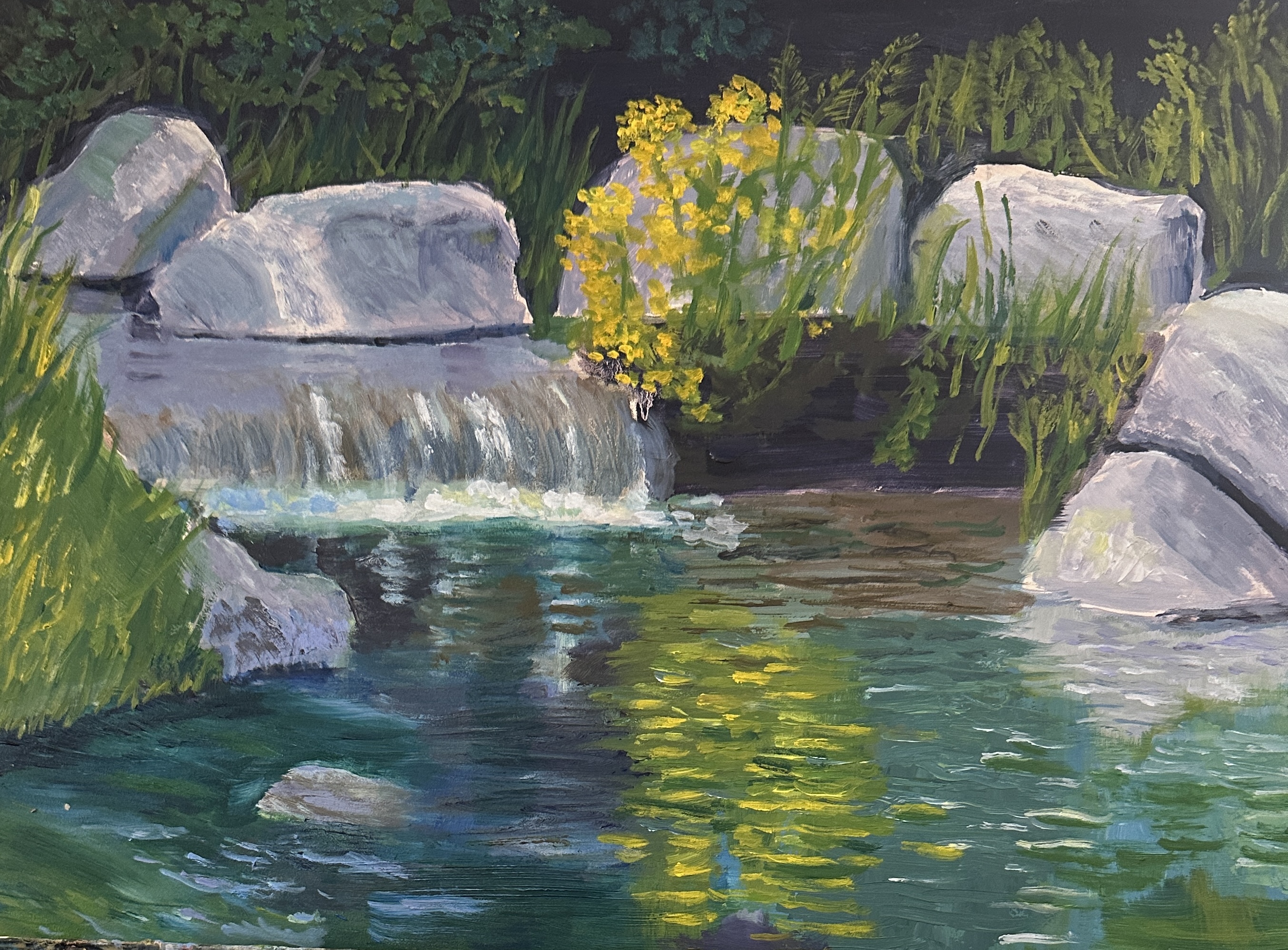
Peaceful Garden

This summer we spent a weekend in Aspen, attending the music festival and enjoying the wonderful scenery. The city has a beautiful garden which was built as a tribute to John Denver, who spent much of his life in the area. The reference photo, above, and the photo of the painting refer to this lovely setting. Painting both water and rocks can be tricky for me, and i changed a few things from the reference photo in order to make the painting “work” better. It’s not quite finished, but is really close. 9” x 12”, oil on panel.
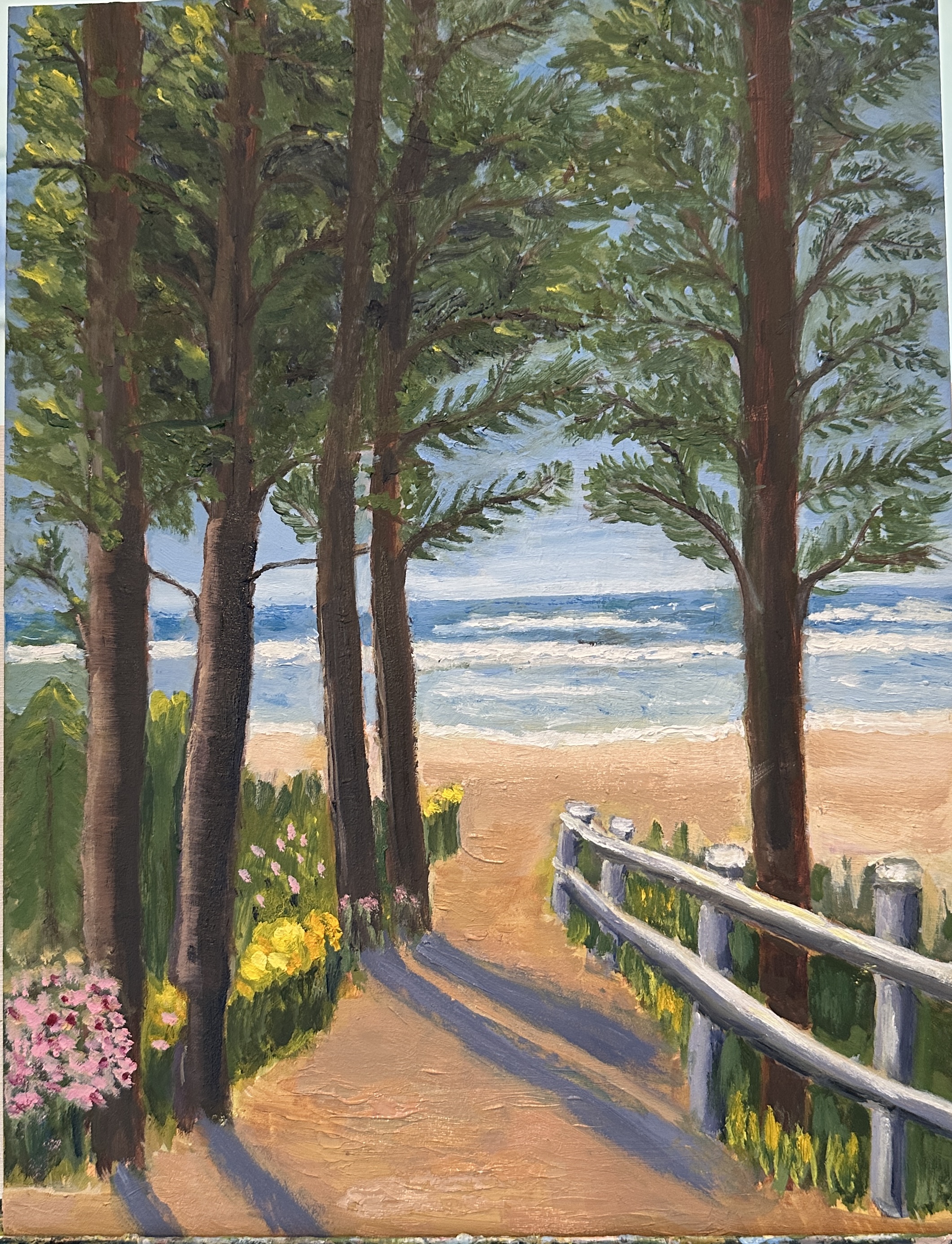
Oregon beach, reimagined

This painting began life with the goal of showing a path to a beautiful beach in Oregon. I didn’t start painting it till i returned to Colorado from a trip to Oregon and so was working from a reference photo that didn’t represent the scene as i’d imagined it. the trees in real life are probably Douglas Firs, but in the photo they are much more bare than i wanted for the painting; and they were in shadow, so it was difficult to figure out the true value variations. At one point — i’ll spare you the example — i had turned them, inadvertently, into deciduous trees. To then re-convert them into coniferous required some considerable rethinking. And my thinking about coniferous trees is pretty closely tied to my repeated experiences with Colorado evergreens, which are quite different. So — what i ended up with was perhaps a fantasy hybrid tree. I was tempted to relegate the painting to the trash heap, but resisted because there are several aspects of it that i quite like. As you consider the various iterations, it might make sense that it’s taken me longer than usual to present a post on this blog. Another interesting learning experience!

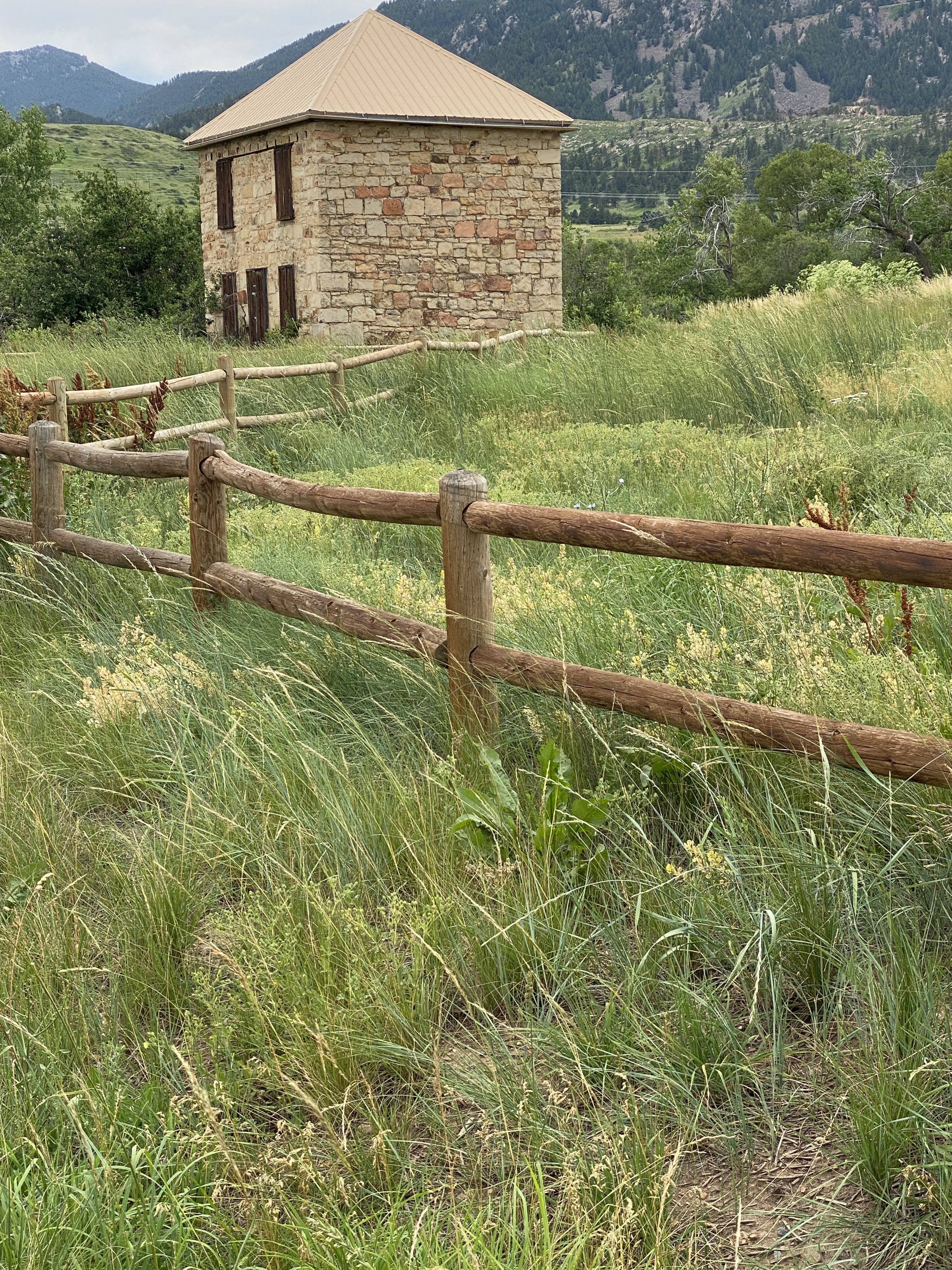
Summer at South Mesa Trailhead

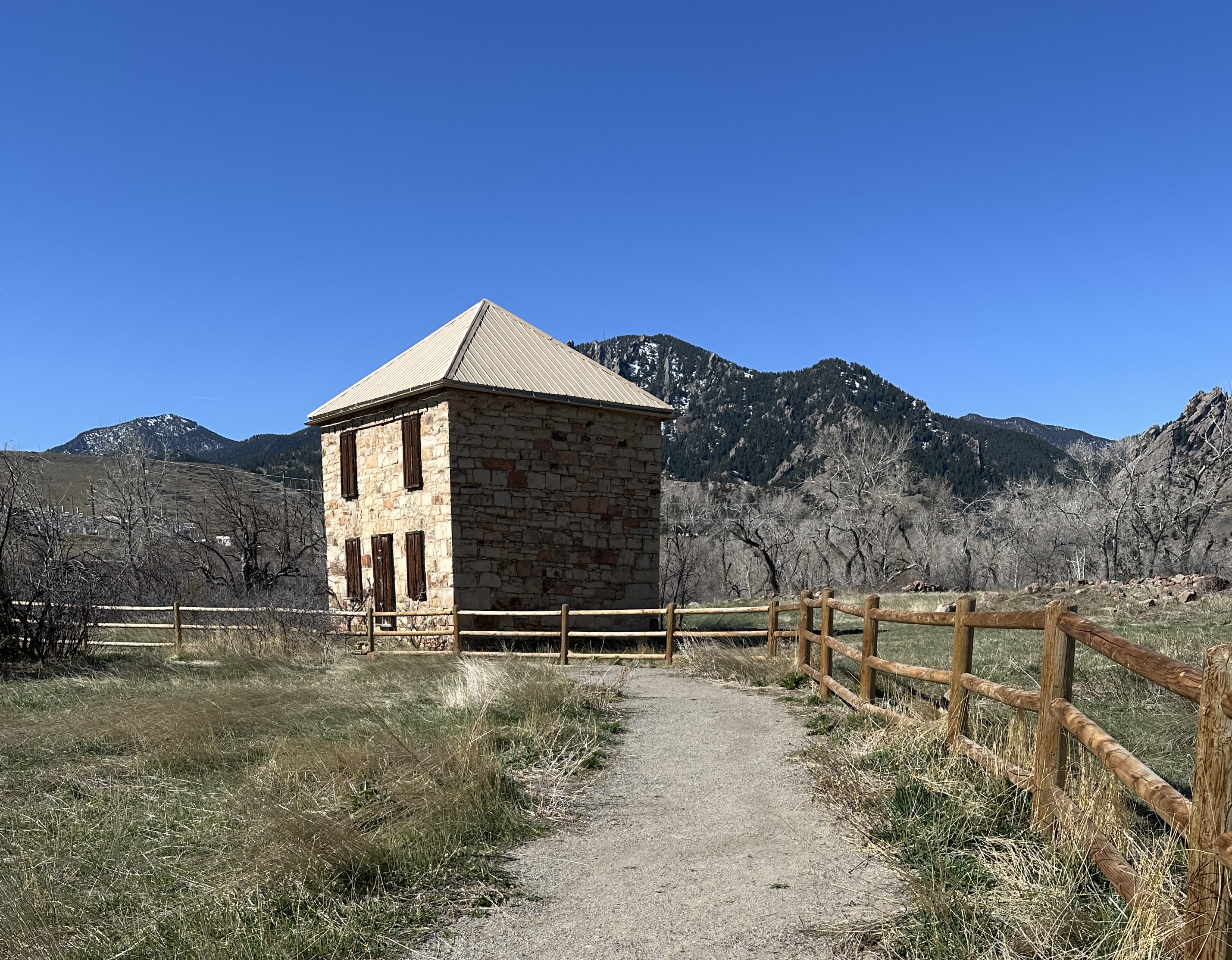
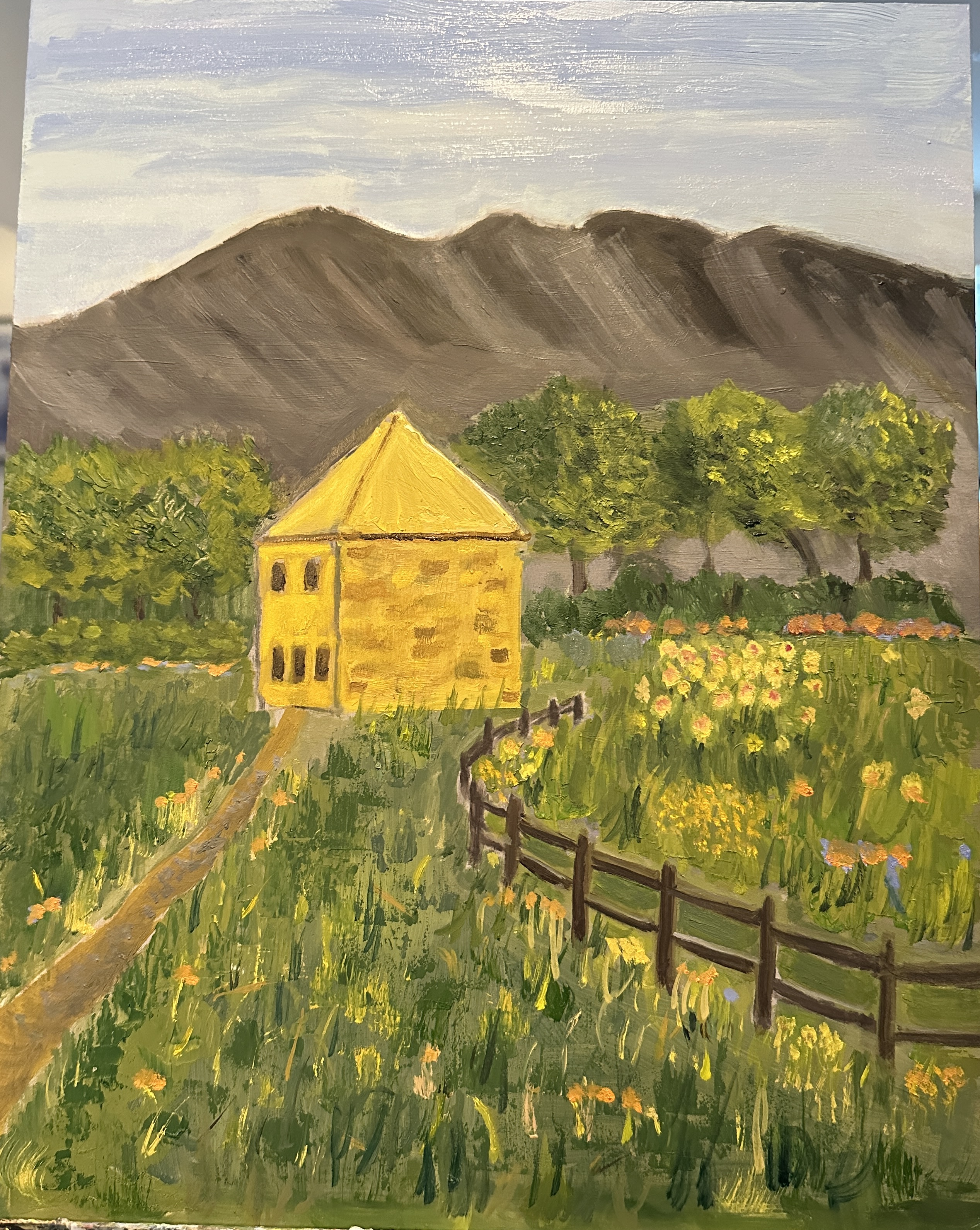
The process involved in moving from start to finish in this painting project was a little more compicated than it usually has been for me. Recently my painting teacher gave us a composition assignment which involved either working from a photo that represented a not-so-great composition, or working from more than one photo to try to put together a good composition. I chose the latter, and so i needed to make up various parts of the composition: rearrange everything from the focus of the piece to the season being shown. Below are two of the photos i used for reference. the third photo is of the painting . The top photo was taken last summer, in July, and the composition is not good, mainly because the roof of the building touches the hillside; and the sky is cut off. The second photo was taken this spring, before any of the trees had budded and before the grasses turned green. I wanted the painting to be a summer one; but didn’t want quite so much green In the painting; that is why i added flowers. The colors of the hillsides underwent several iterations because the values were too close to the green of the trees;; and i didn’t have much choice about the trees. I also ran into trouble trying to get enough variety in the grasses without making the whole thing too busy. In any event, a challenging experiment which was a good learning experience!

Scotland landscape — revised

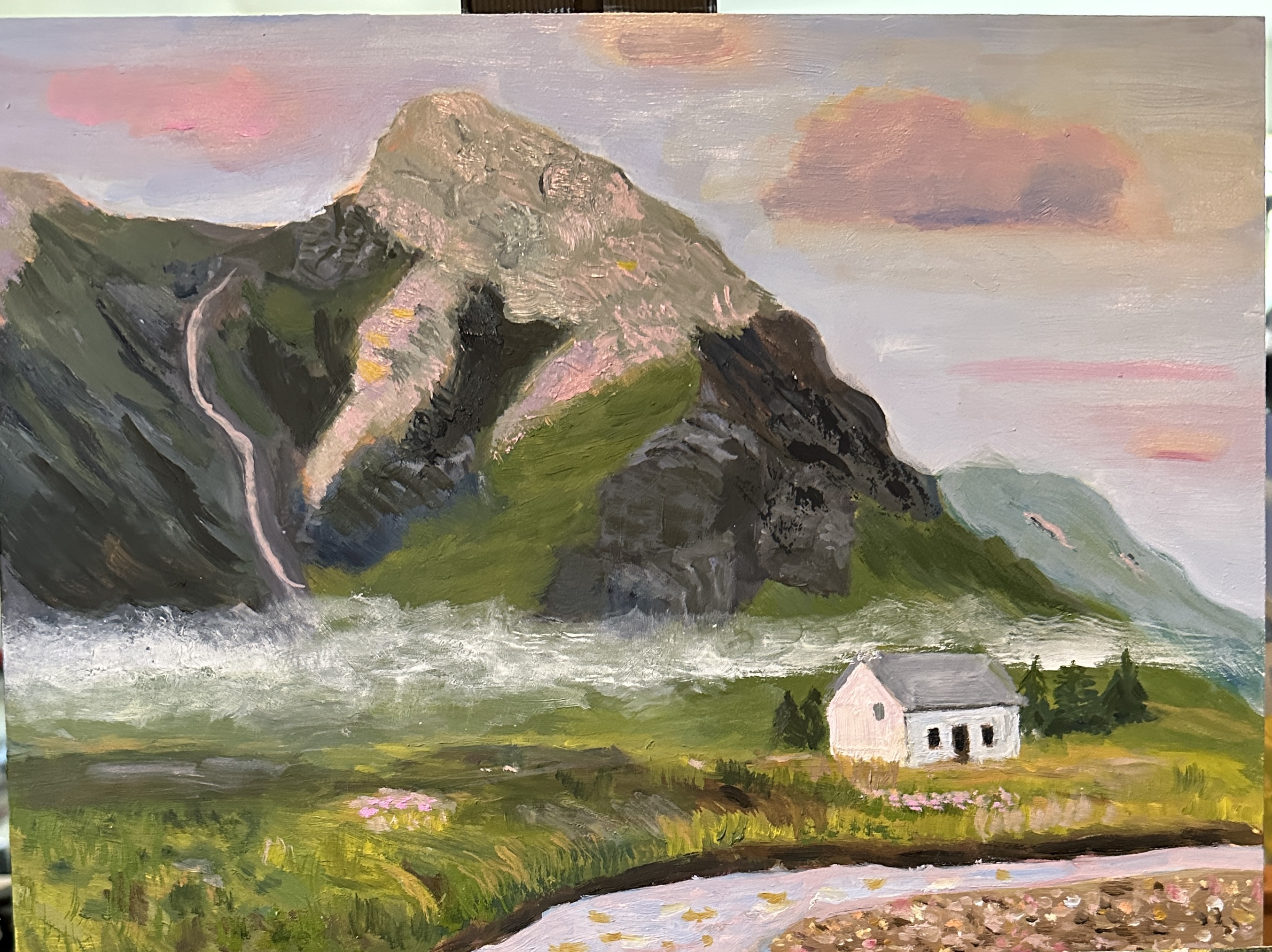
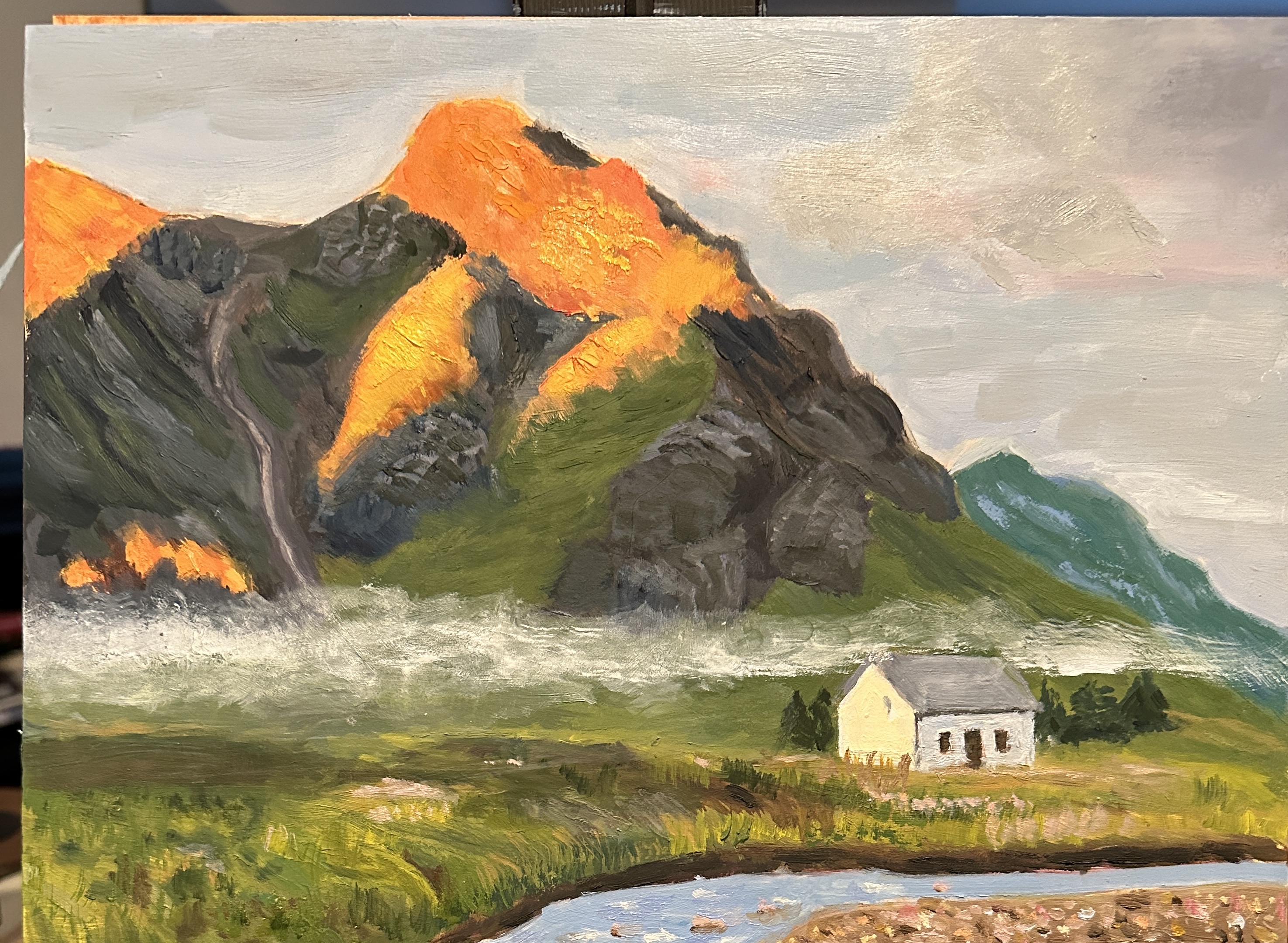
In my last post i mentioned that i had struggled with getting the color to “work” — especially all that orange. Both before and after the posting i kept trying to figure out just what all that orange was actually doing. Was it in part part of the rock, or was it all reflected light from the sun? Following the posting, i continued to try to meet the challenge, but eventually i took a good look at the reference photo and the painting and decided, “enough! “. It was clearly just not going to work. So i took a different approach — decided i would make the painting with a softer touch, replace the oranges with muted pinks, add plenty of color to the sky, show pinkish reflections in the water and especially on the mountain face, add some pink to the lighted side of the house, and basically pretend it’s now about a sunset where the light is beginning to fail but where there is still lovely color from the setting sun.

Scotland landscape

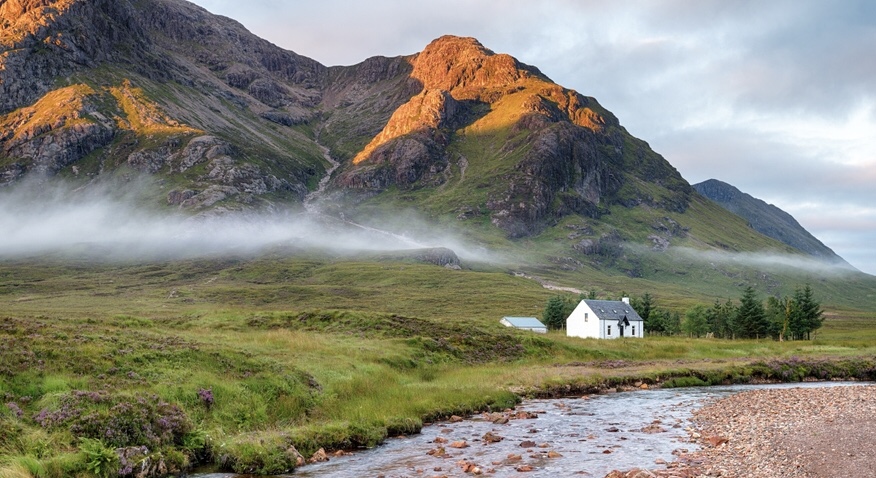
I haven’t posted for a while, mainly because the two projects i’ve been working on have had their challenges for me — lots to figure out. With this one, the most difficult part was getting a sense of depth/3 dimensionality in the mountainsides. After that there were issues of balance with hue. The painting is not quite finished, but it’s far enough along for you to get a pretty good idea of where i’m going and where i need to go.

Light and Shadow

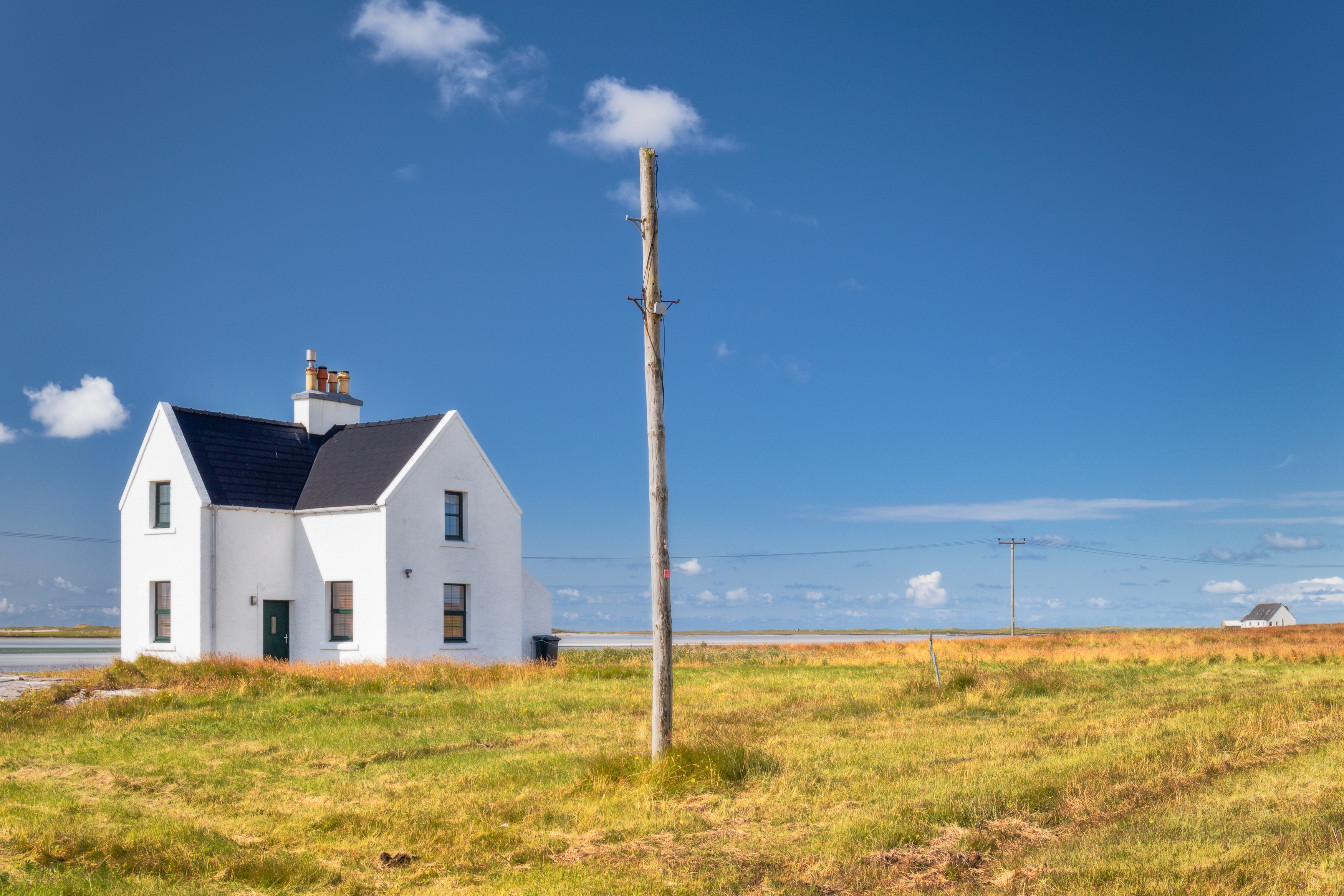
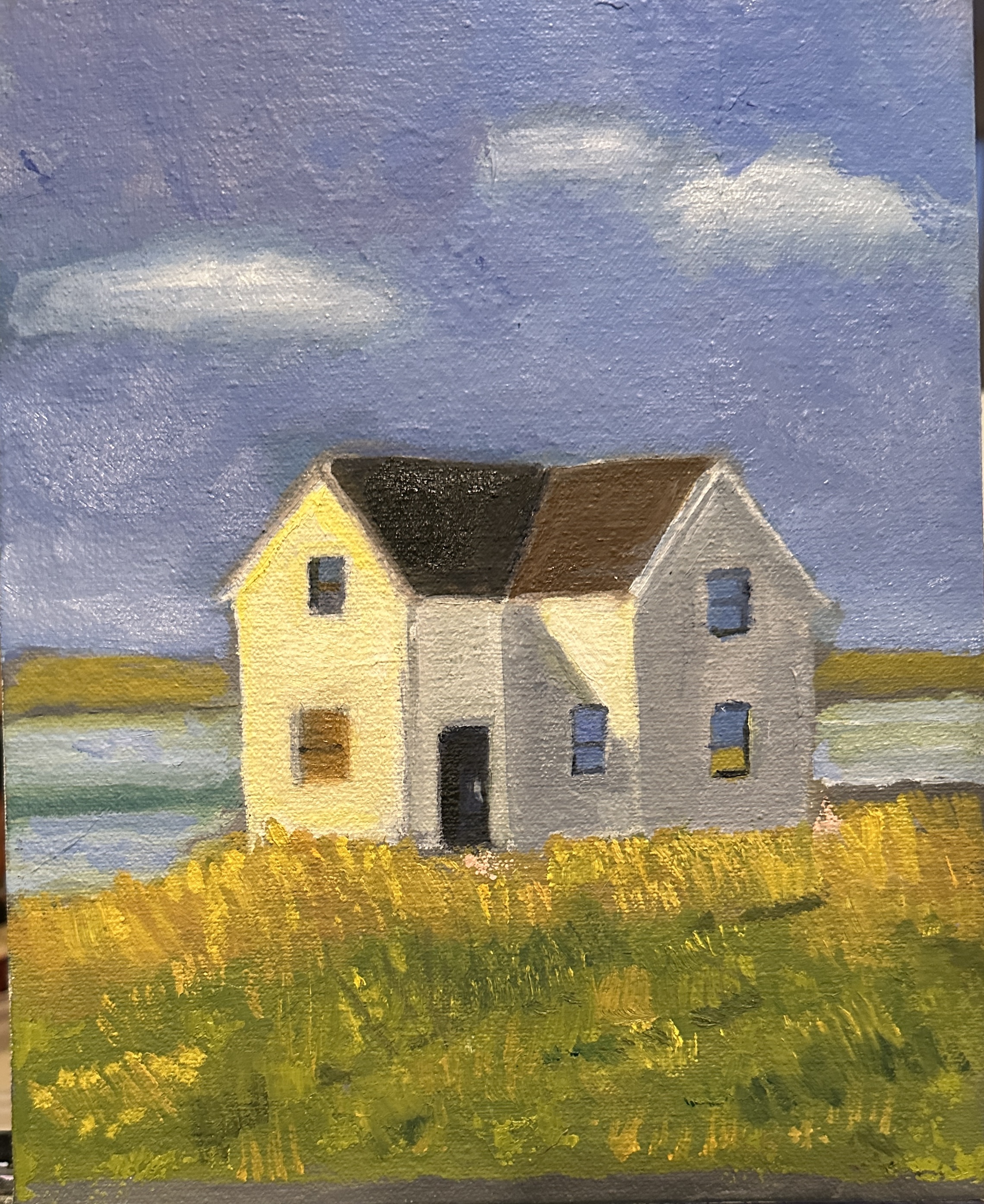
In one of my recent painting classes the topic was light and shadow, with an emphasis on how light affects the value and color of shadows. We had an assignment to find a photo of something that was white and in daylight and then paint from that photo reference. I found a photo of a white house set in the Scottish highlands (very common there) . I changed the photo a bit to make the house clearly the focus and then painted from the revised photo. The result was a painting that is pretty stark, but that’s how the area actually looks. I’ve thought some about how to improve the composition and may tackle that challenge in a bit. In the meantime, what i tried to convey in this subject was the clear representation of the saying — “warm light, cool shadow”. “cool light, warm shadow” may appear in a future post.

Snowy Day

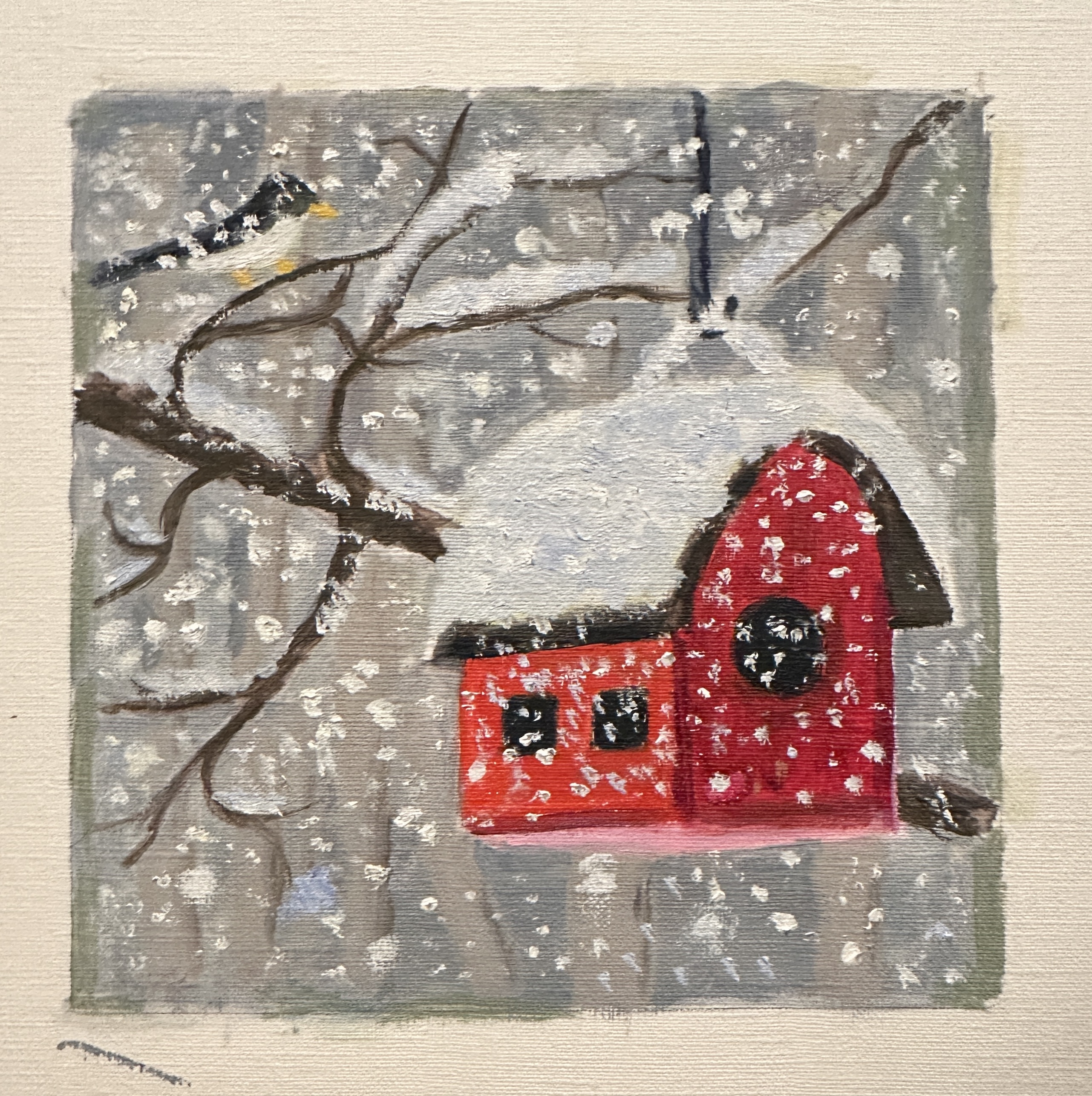
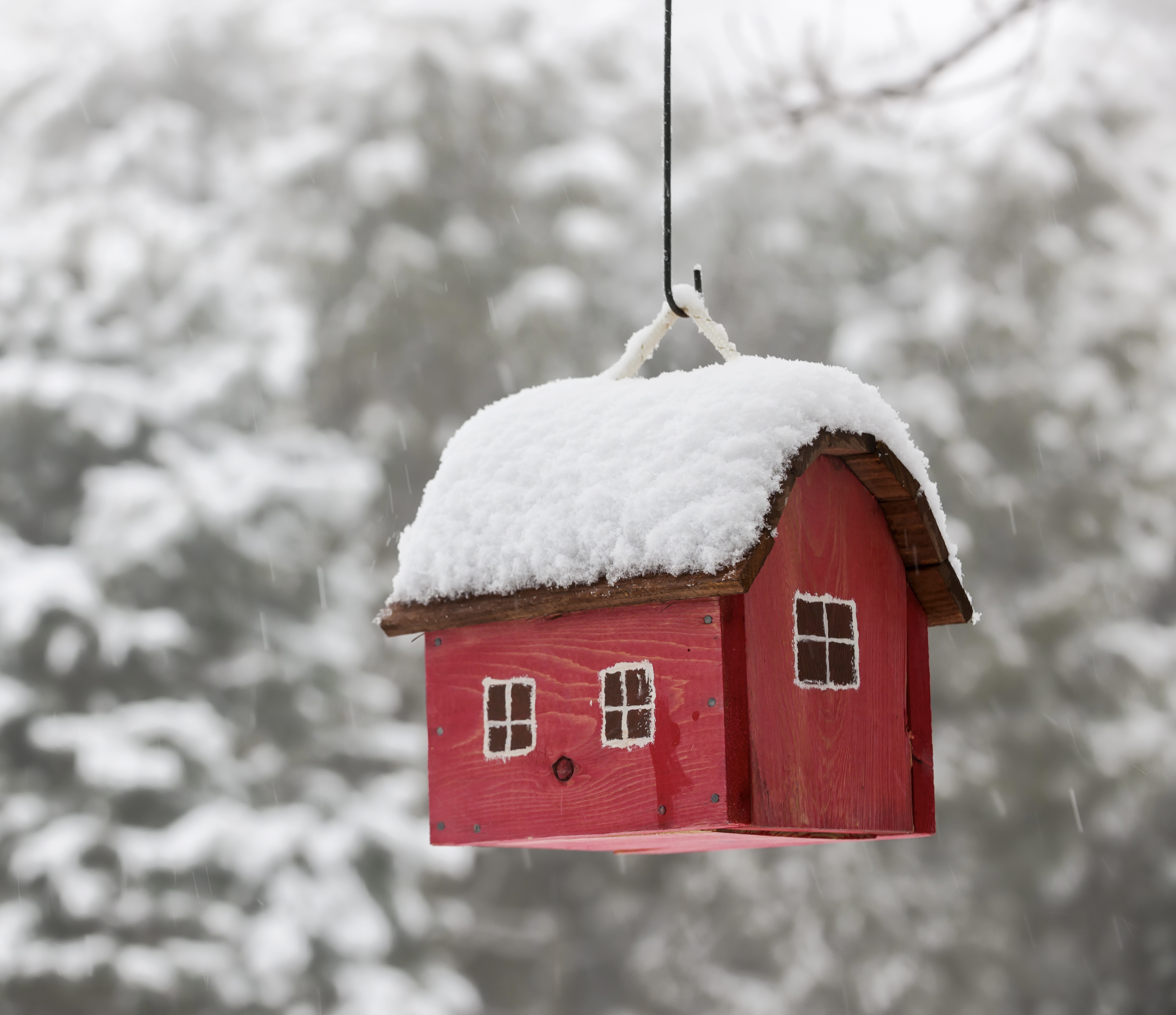
Finishing up this little 6” x 6” piece tonight is pretty timely as we are expecting a massive snowstorm to hit here in most of Colorado tonight through tomorrow. The painting is done on canvas paper and will be cut to size and glued to a cradled board which measures 6 x 6 on its face and probably close to 2” on the sides. Twice a year several of the galleries in our area offer a show open to anyone in the community . You pay for the board and then do whatever you’d like — can be painting, drawing, fabric, multimedia, etc. Before this i’ve always just painted directly on the face of the board. This time i decided to try doing it a little differently. So what you see here (below) is the painting on the canvas — prior to cutting and fitting it on to the board. The reference photo is attached below the painting. In the reference, the bird house really stands out. I was after something more muted — thus all the snowflakes. also wanted to provide a little more visual context, which is why i added a bird and all those branches.

News

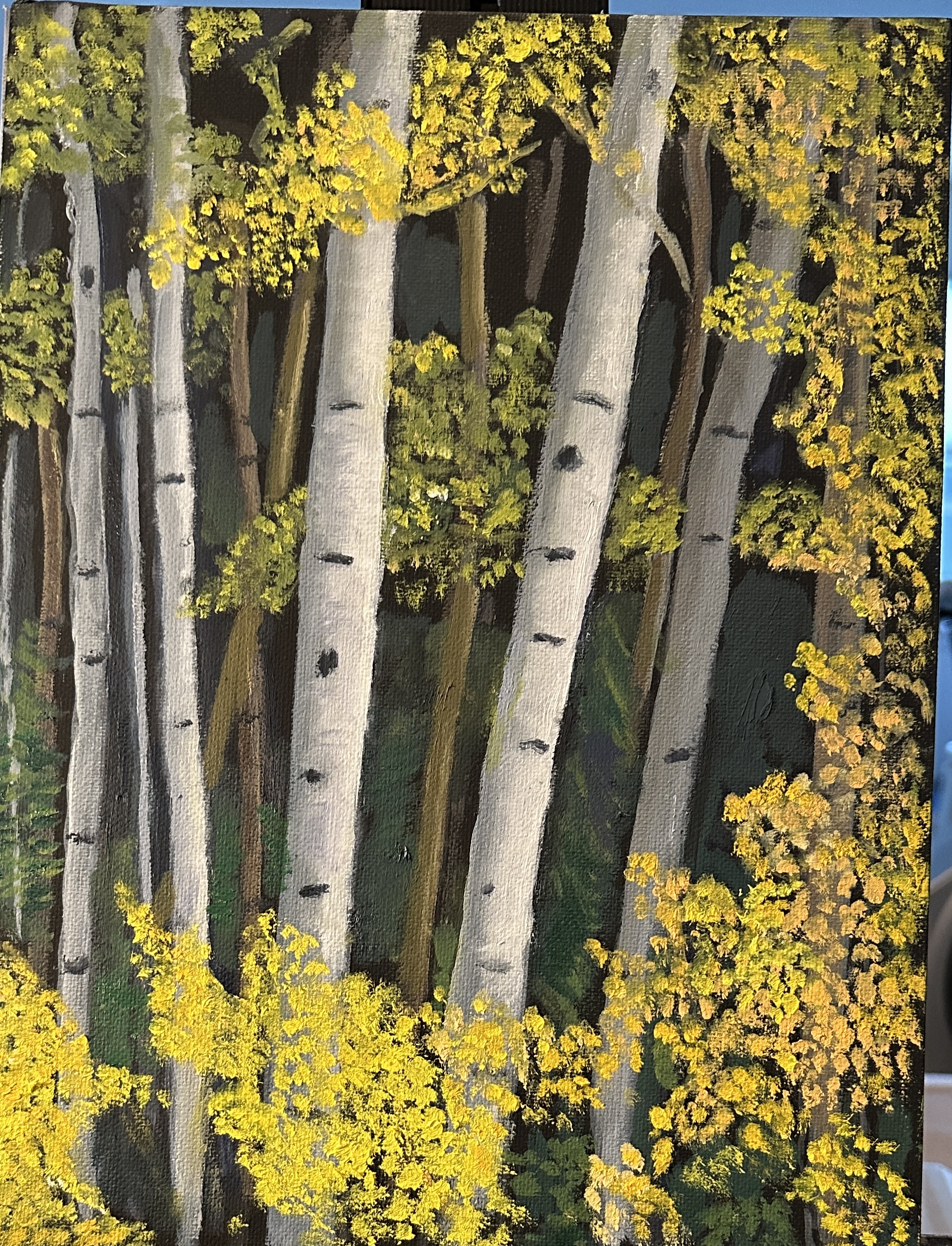
I’ll be adding a new painting in a couple of days, but in the meantime i wanted to let my blog followers know that one of my recent paintings — the Aspen Forest — see below — was awarded third place in the annual student art show at the gallery where i take oil painting lessons.

Mist Lifting

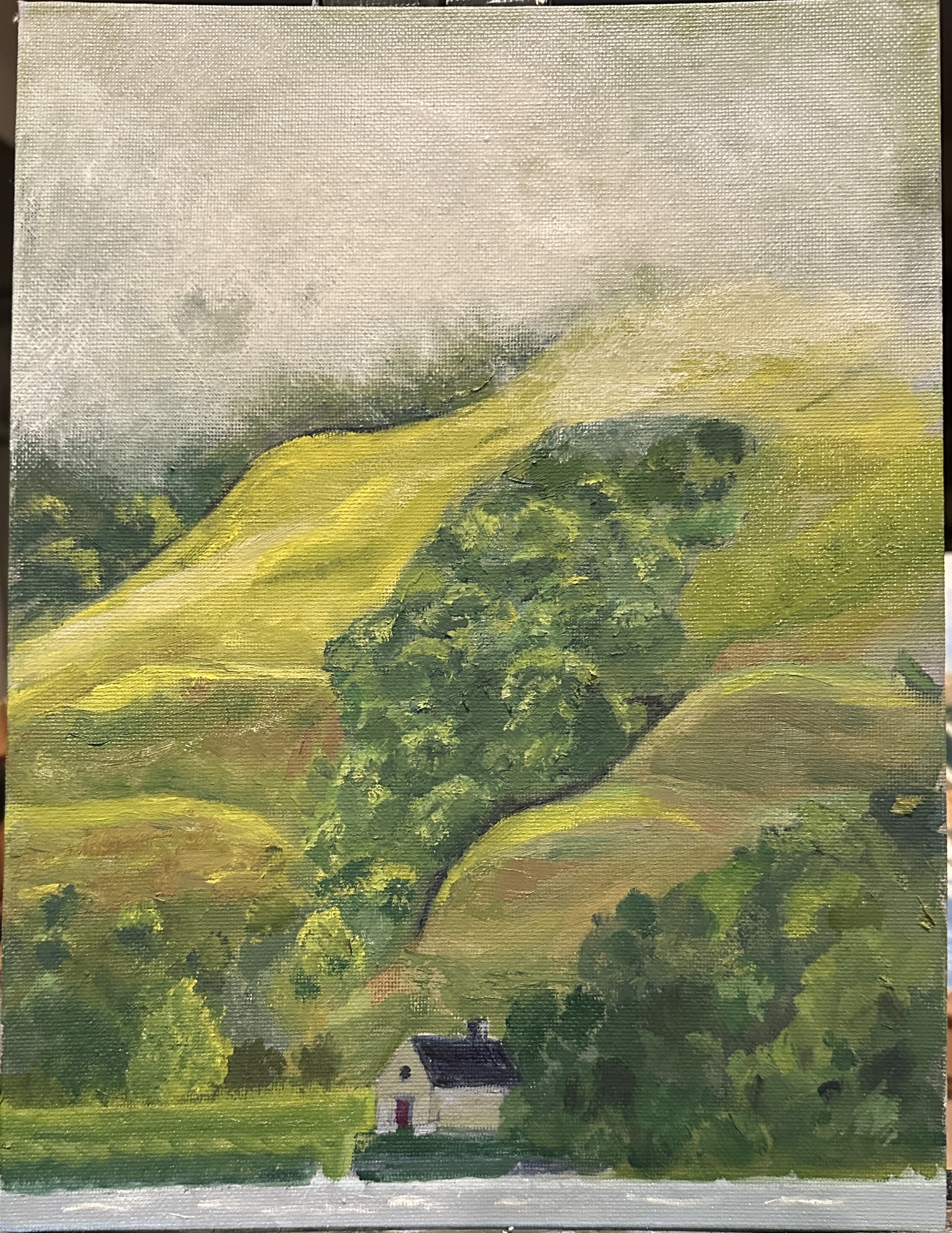
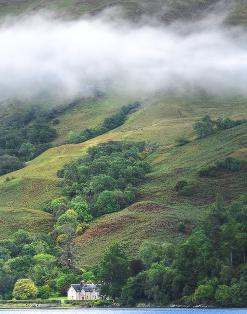
This painting is from a photo taken during our vacation in Scotland last fall. When i began the painting i mixed 7 different hues of green. That turned out to not be nearly enough, and so there was quite a lot more color mixing than i’d originally intended. But what a treat! Reference photo also attached. I didn’t want to emphasize the house, so kept it pretty simple, compared to the original. There are still a couple of things to fix with the hedge/grasses around the house, but i was excited to let you see my first effort of this kind of “Scottish” mist.

Painting is 9” x 12”, on 1/8” panel.