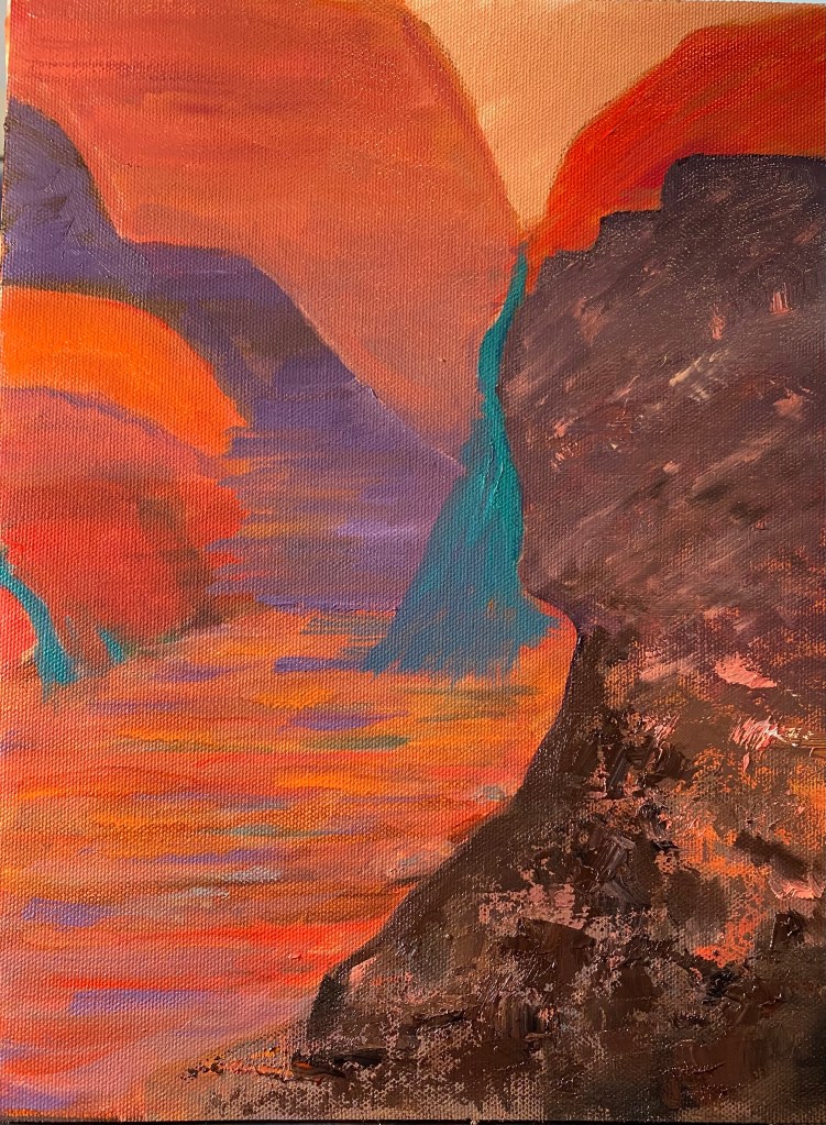
From “The Badlands”

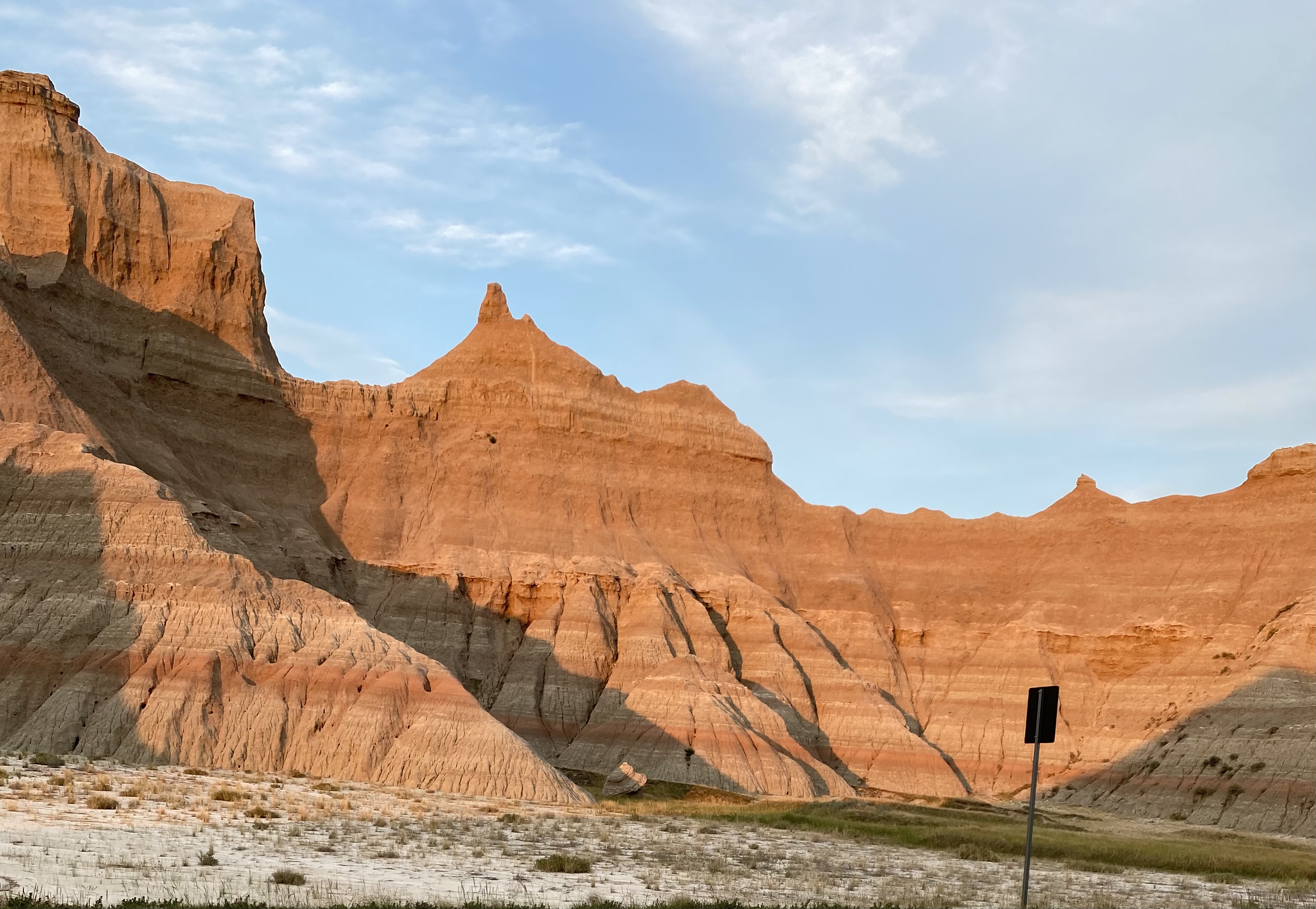
This painting is from a photo i took during our visit this summer to the Badlands in South Dakota. It was evening, a little before sunset, and i was looking for a spot that would be just off the road where i could pull out my plein air stuff. At the time i parked, the rock formation that interested me was in shadow. Then, all of a sudden a little while later , the sun hit it full on and it just lit up, and that’s what i tried to paint.

Painting not finished yet, but the ideas are all there.
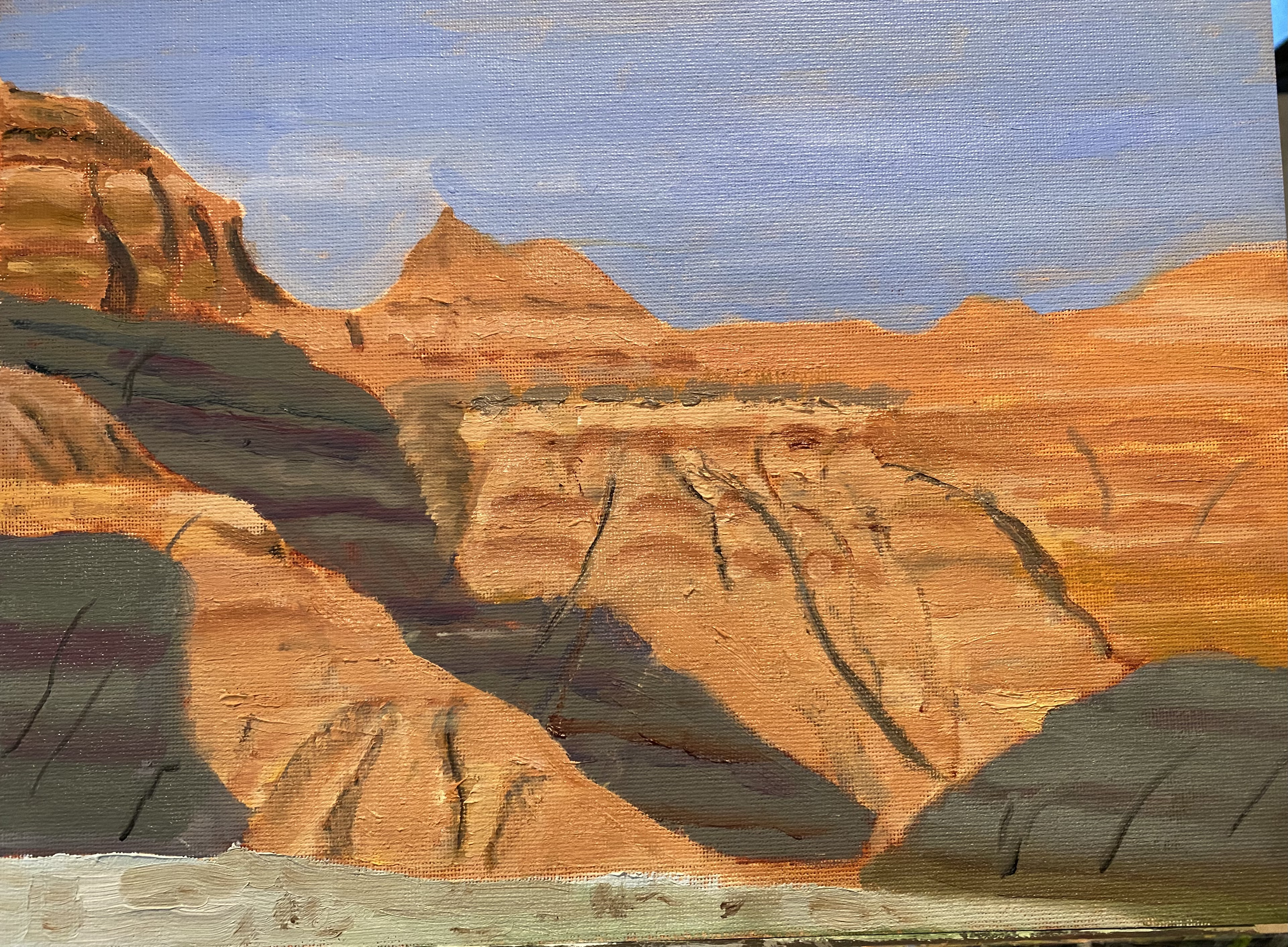
Painting is somewhat simplified from the original (below).
Reference photo. Light is coming from directly behind me and overhead. I was standing across the road from this formation.

Finishing On the Trail

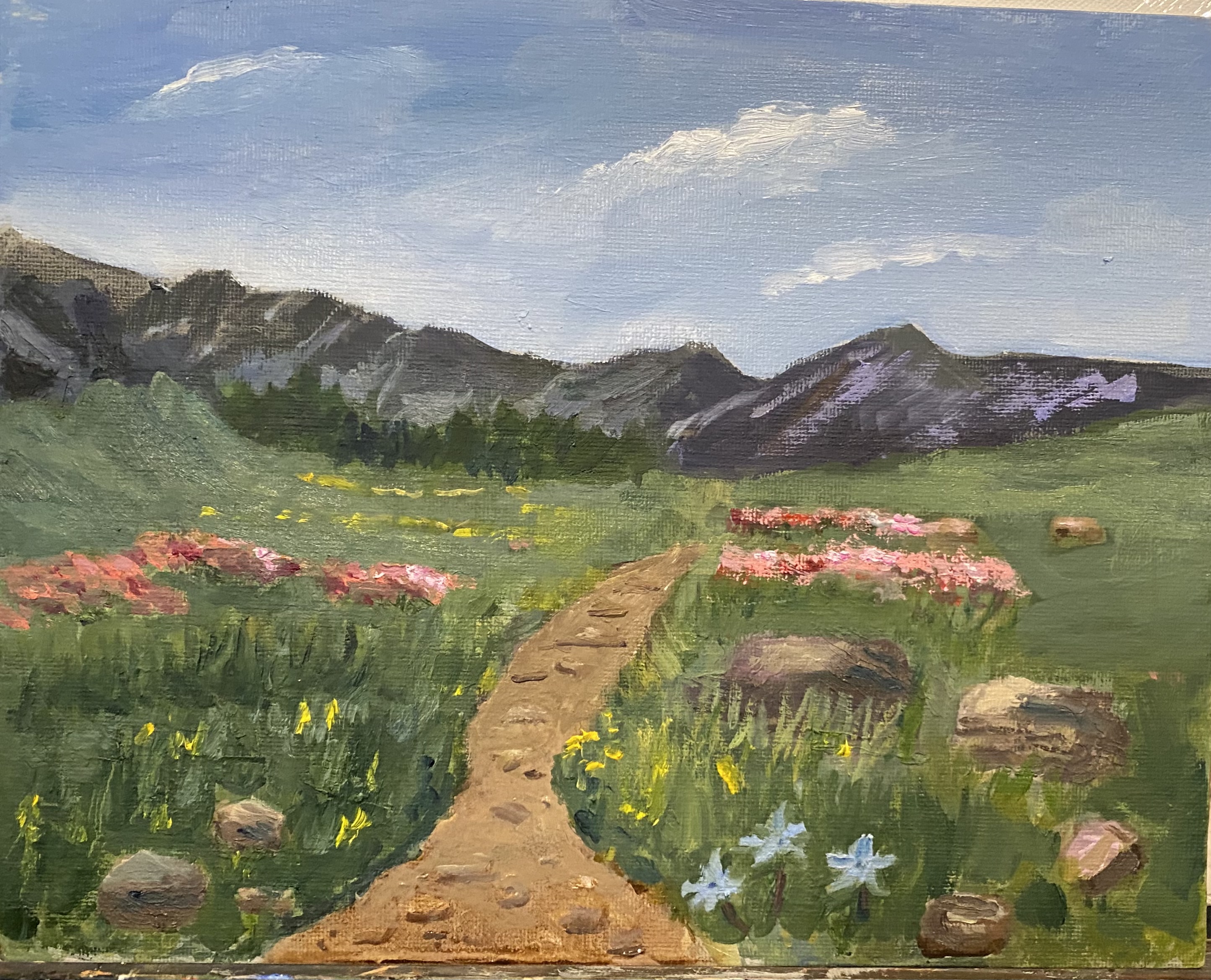
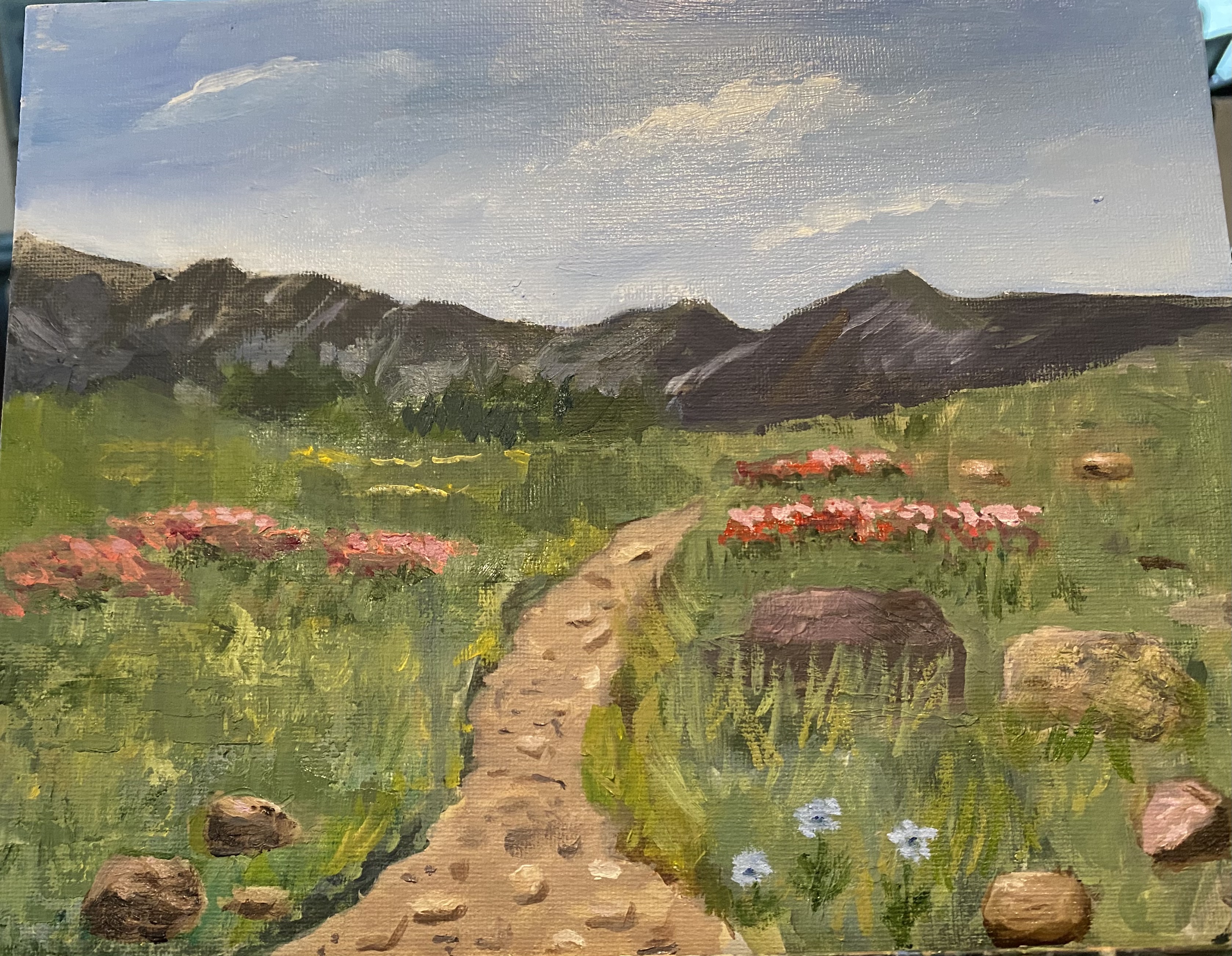
Have been out of town quite a bit the past few weeks, but in between trips I’ve worked on this little painting. Had some perspective issues for a while but i think they are now ok. One question i had was how to paint the mountains in the background. In many photos/paintings , when you see mountains in the background they are really far away, as in really background. I painted and repainted these mountains until i decided there was no reason to move them far into the distance, as in real life, as in when i was on this trail, those mountains were actually quite close. So i moved them back to their original placement. In one phase of this work i used palette knife, which looked fine, but it didn’t match very well with the rest of the scene. So i painted over those spots. Also had to do some work on the green hills in the middle distance. Changed the value and color of the trail a few times. I think it’s now pretty ok.

Starting on the trail

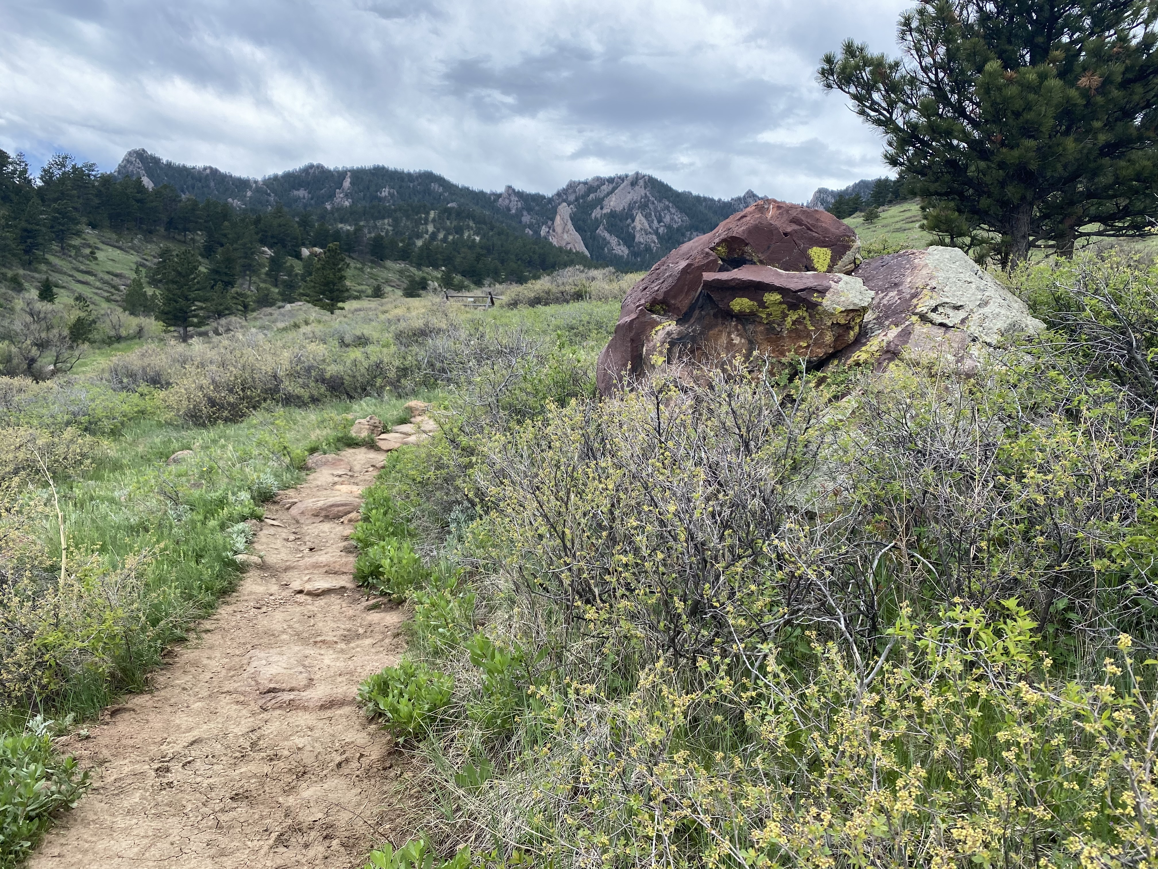
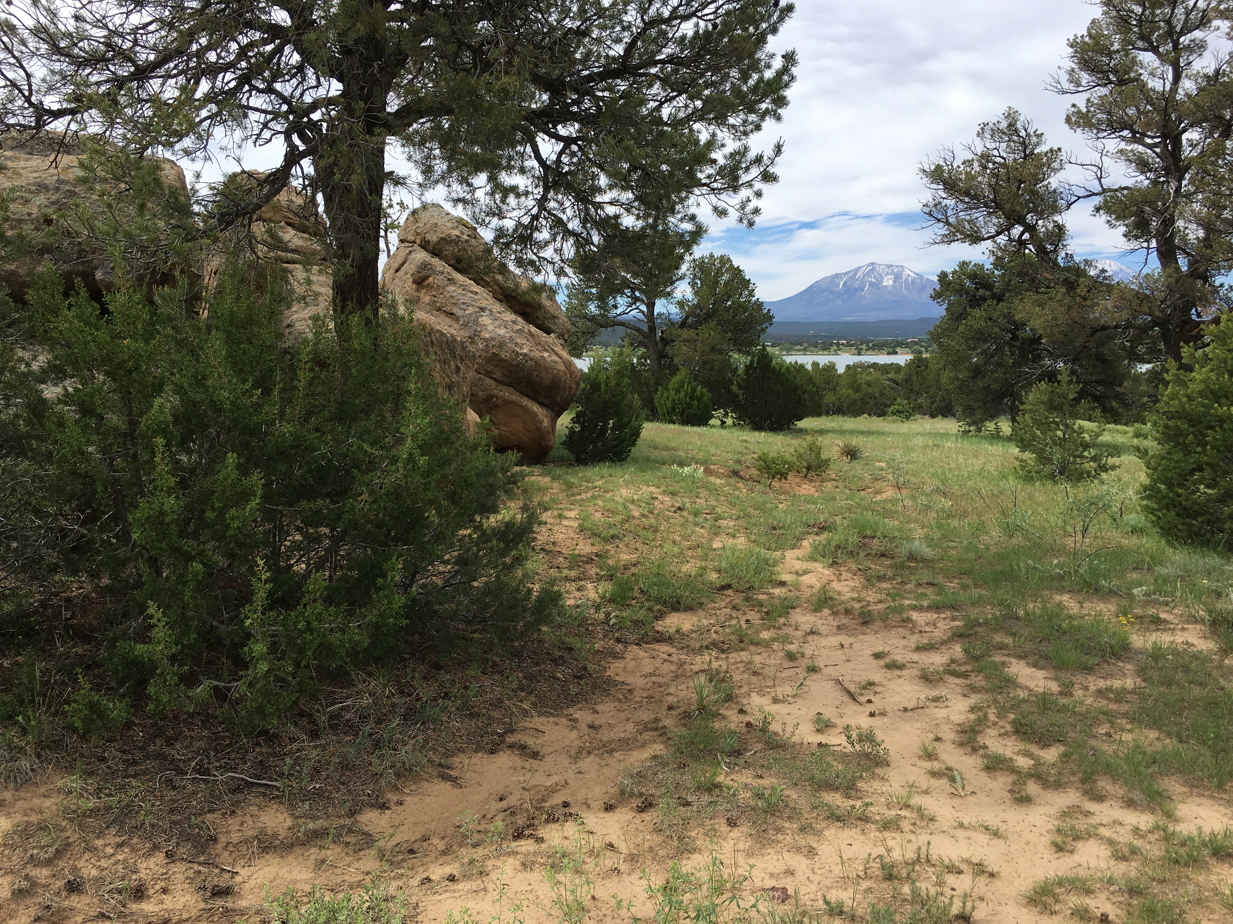
The reference photo for this painting was just a quick iPhone shot along a trail near our home where we were hiking a few weeks ago. As usual, i was taken with the big rock. When it came to start painting, however, that particular rock had to go — otherwise it would have overshadowed anything else in the painting. So i altered it a good bit and then added more rocks, both on the right and on the left. I added the flowers for variety (some break from the greens) and perspective. Among the issues that remain to be addressed are: the path/trail needs to be muted in color and value, i think; the grasses need at least one more layer of paint; the sky still needs some work. Anyhow, here’s the progress to date.

Calling this one done

IN the past day i received a suggestion to give up on the notion of having the grasses on the left mid-painting be in different horizontal positions (as that was clearly not working) and just have them stand up vertically. I tried this and things seemed to improve. Then the only other thing i did was to apply several different values of green to try to simulate some perspective for those grasses. Finally, on another topic, i lightened up the sky, adding more color to match some of the reflections in the water.

Grasses

Since my last posting I’ve been working mainly on the left side of this painting, trying to improve the look of the grasses. I got rid of the “tops” and repainted quite a number of the stems. Then i tried to figure out what to do with the areas further back. For starters i wiped out the whole area, covering it with a brown base. At that point i could see that it was going to be very difficult to fill in that whole area — too big. So next i moved the mountains, adding a couple of sections. that seemed to work pretty well, so then i was just left with the dilemma of how to fill in the background grasses. That dilemma will hopefully be solved in the next day or two with some additional and contrasting layers.Might work; might not.

New Project

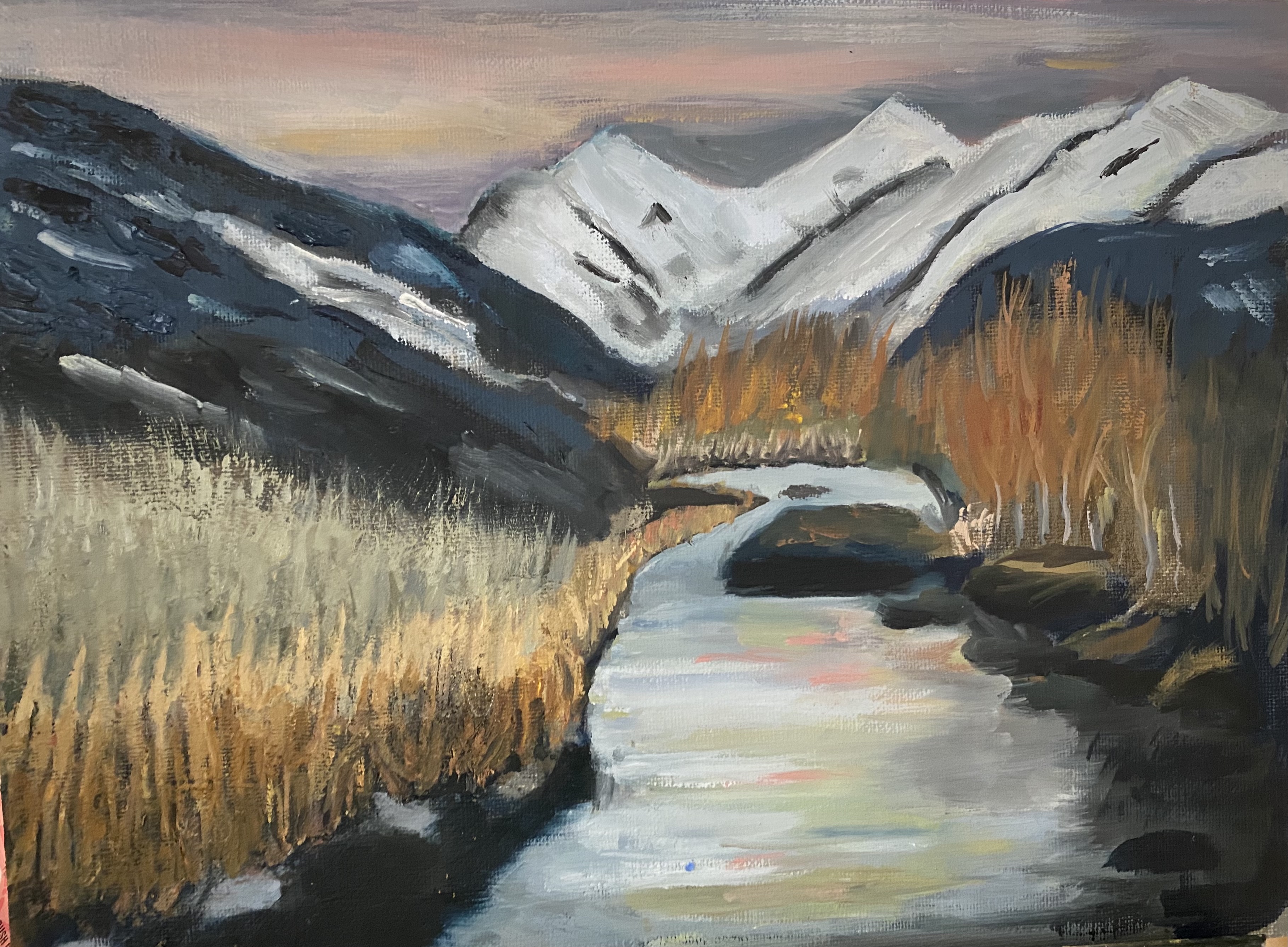
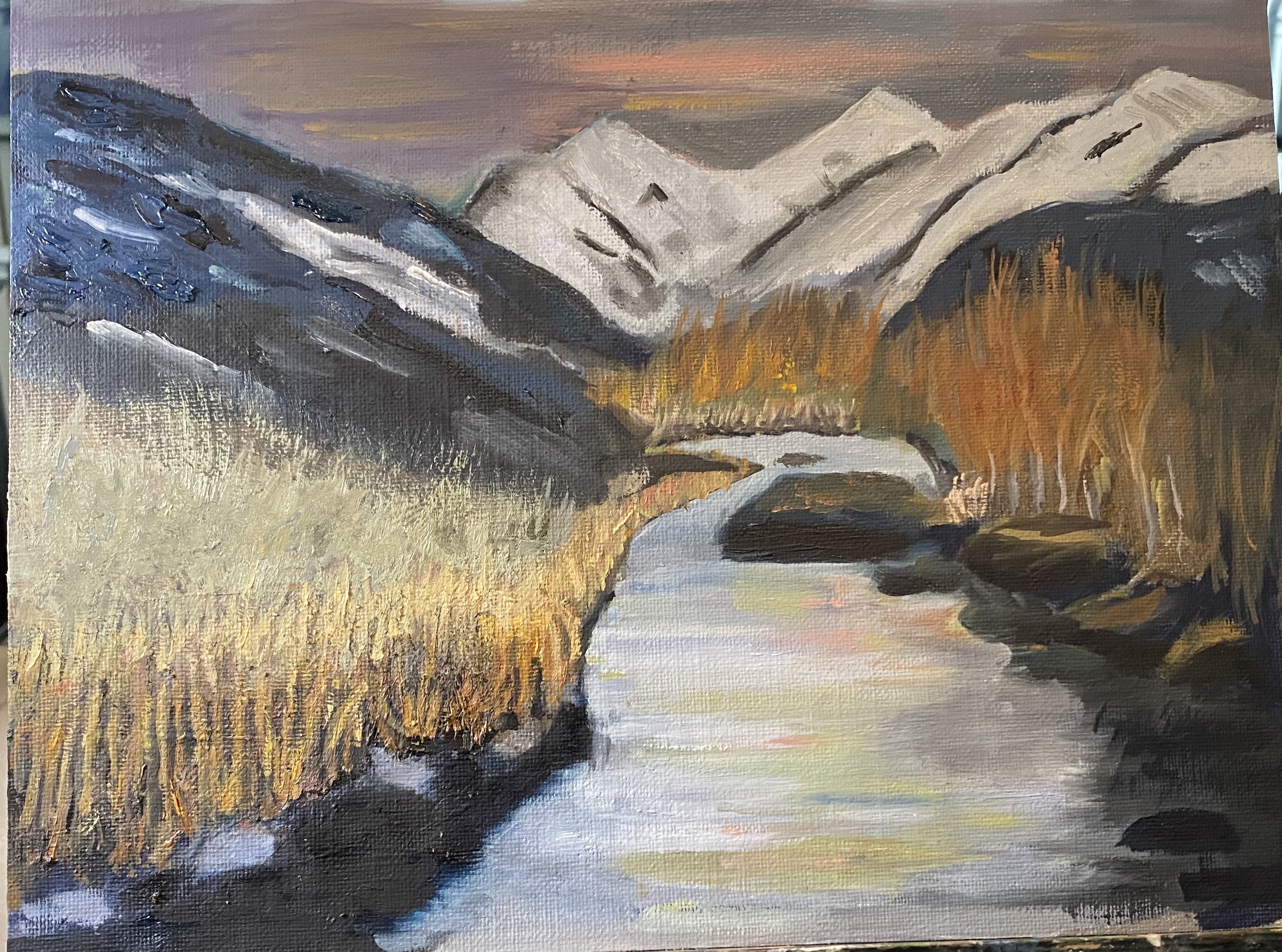
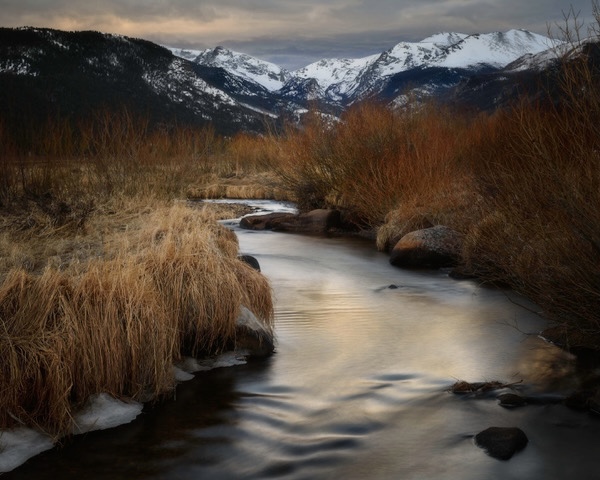
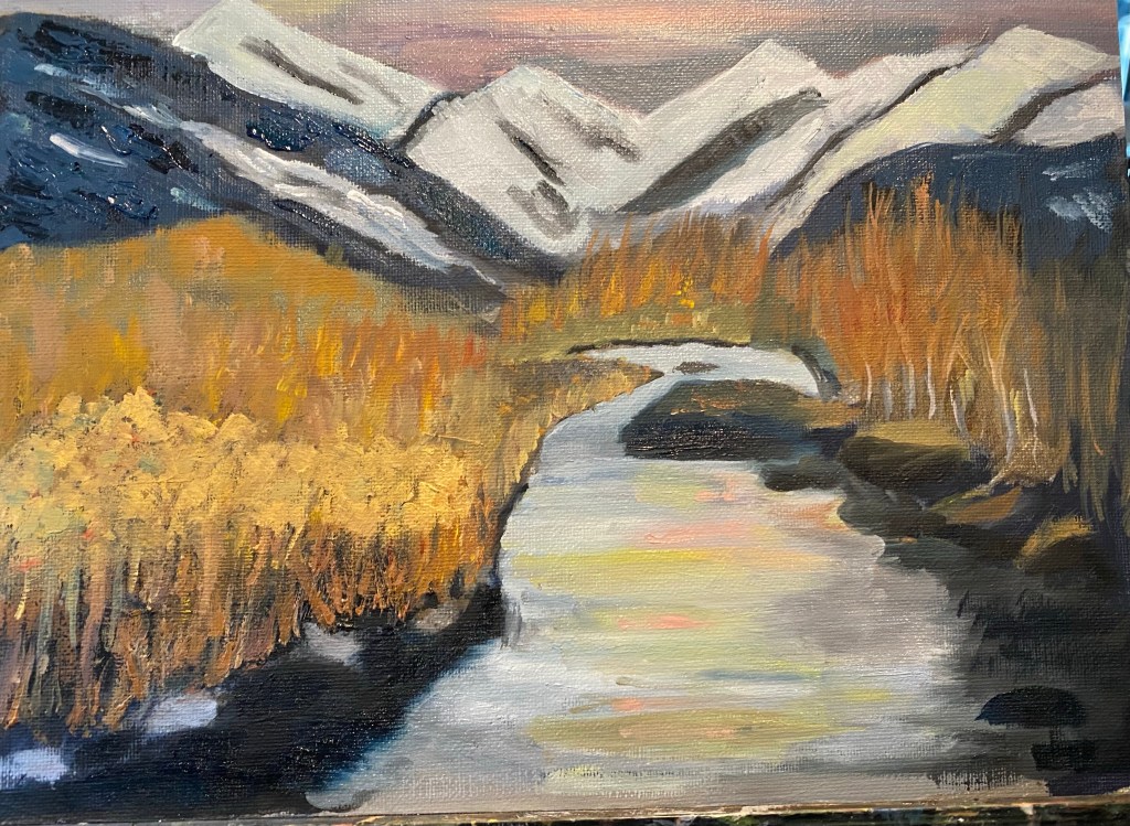
Started a new painting a couple of weeks ago. It’s about half done, most likely. It is quite different from the original reference photo, which is beautiful but kind of darker than i wanted the painting to be. Photo was taken at sunset in winter. So the feeling of the painting, once it gets completed, is going to be maybe a bit less peaceful than the photo.

How not to do a composition

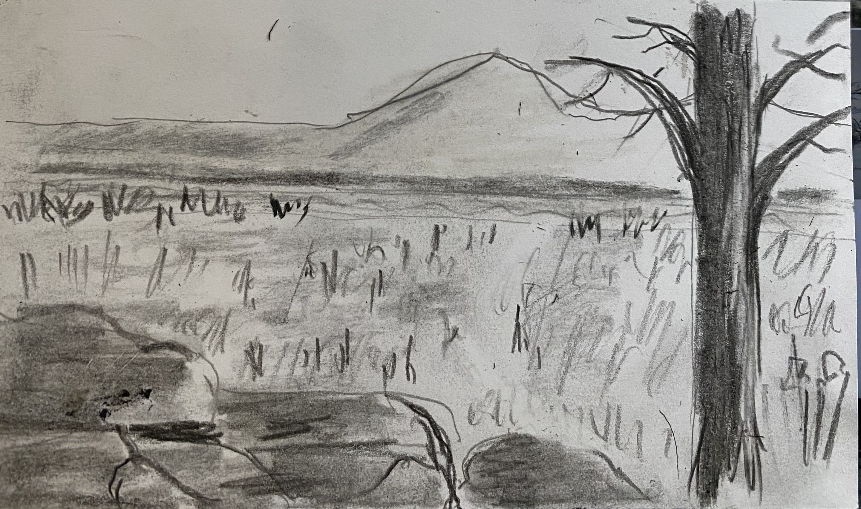
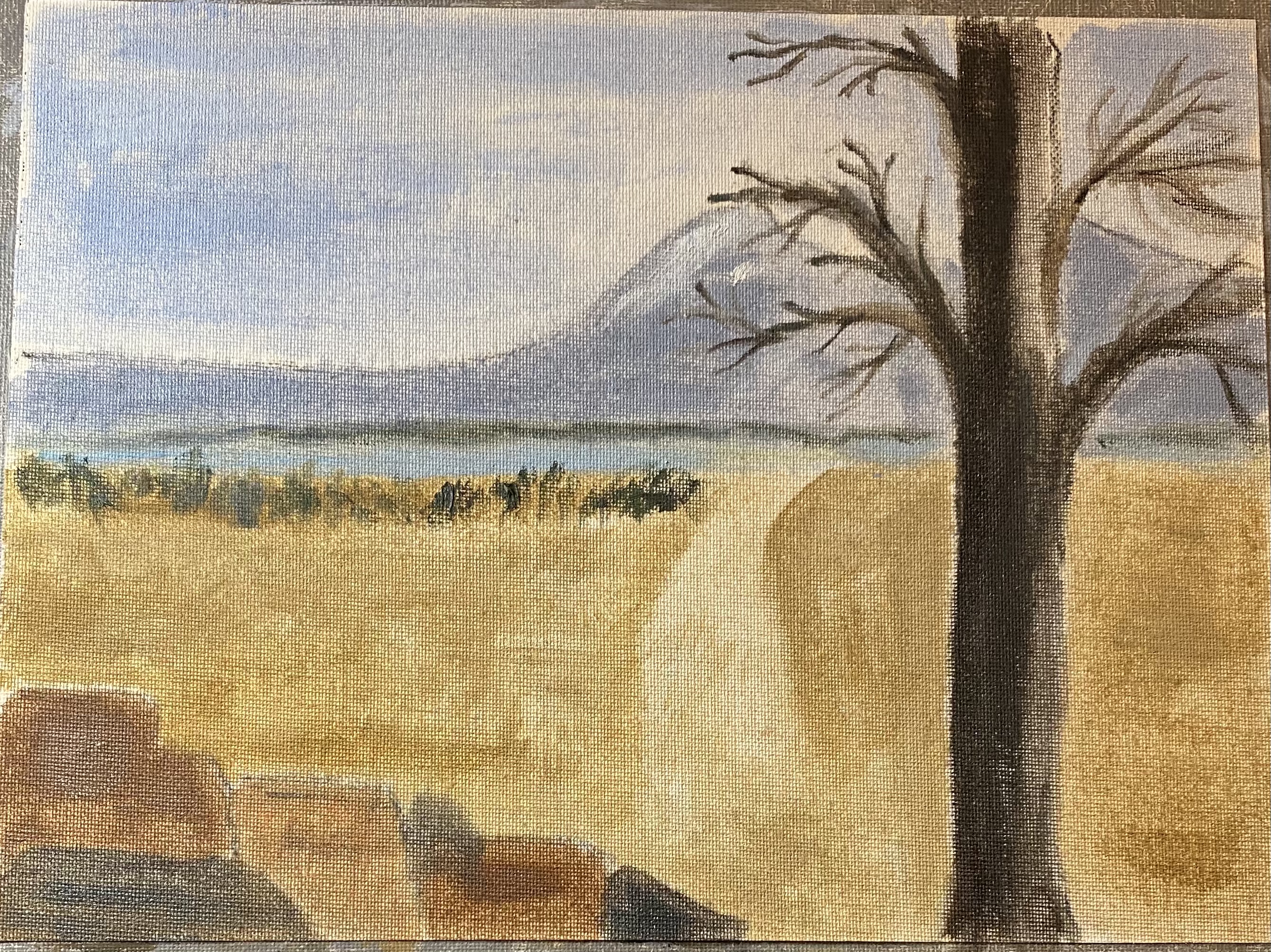
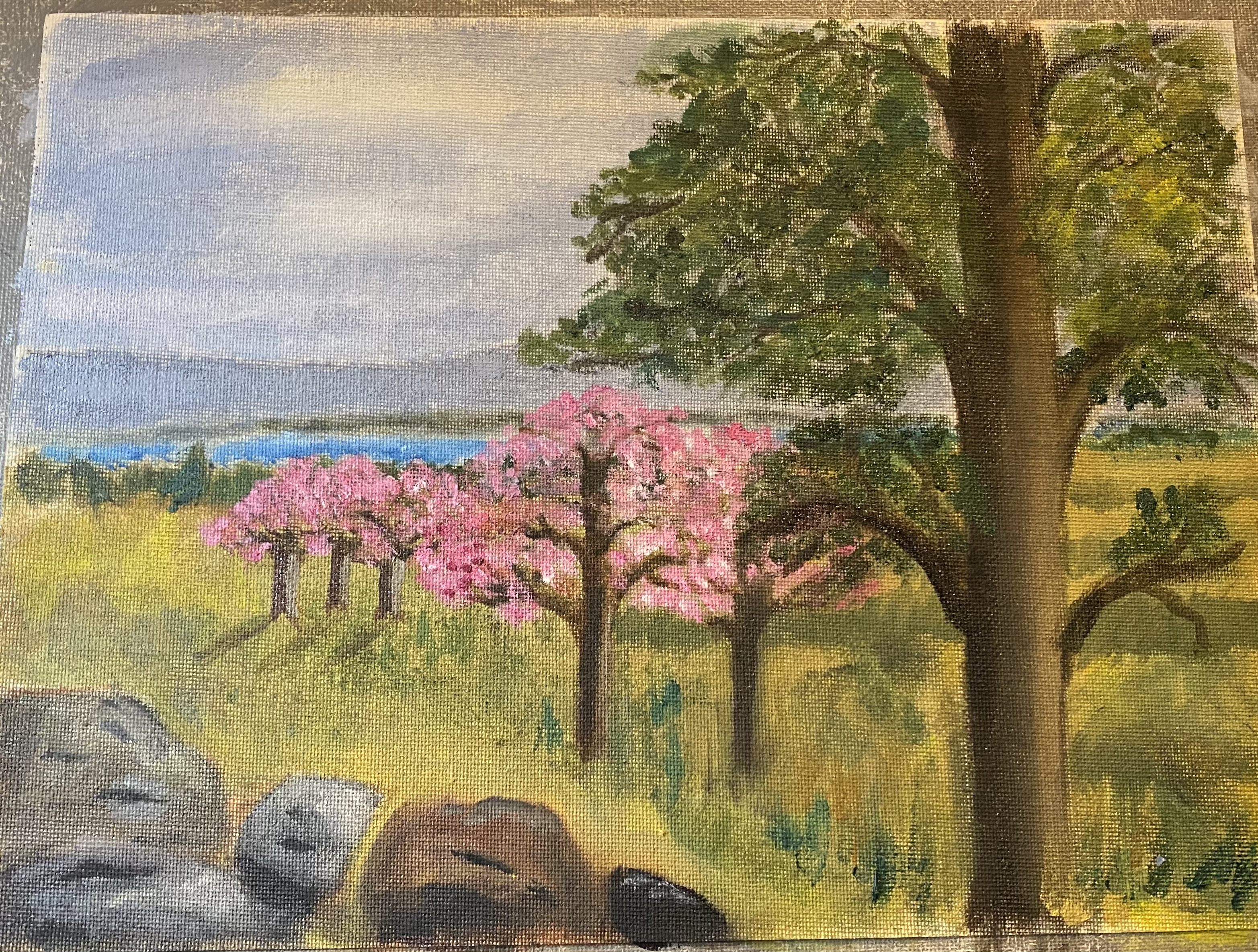
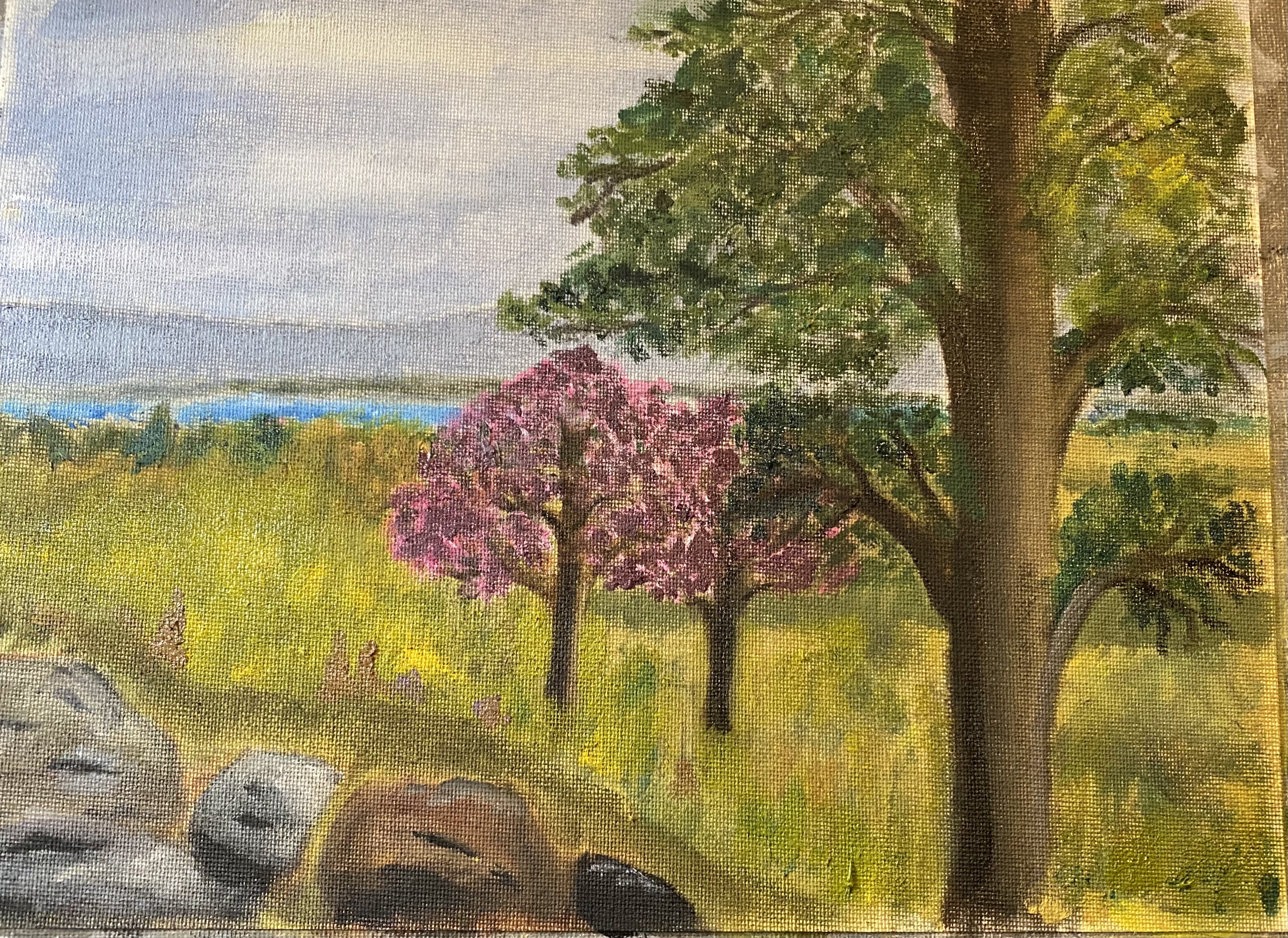
A few weeks ago as a homework assignment, my teacher suggested we take one of our photos which did not have good composition and try to rearrange some areas to improve the composition. I chose a photo which represented a place i wanted to remember from a trip we had taken. I took the photo without giving too much thought to the composition and so thought maybe i could fix this one up before trying to paint it.

I didn’t like the big open space in the middle of the photo. So i started with moving some rocks and trees around. That didn’t work too well. so i moved on to changing a number of other variables. None of these efforts gave me a good outcome. Bottom line is, as teacher has preached: you need to know before you start what your composition is supposed to be. Fixing it, even with oils which are very forgiving, often just makes things worse.

The latest effort is the photo just above. Somewhere along the path of this experiment i decided i would just play with some design and color properties and in the process see if i could end up with something that would work as a little painting. Crabapple trees are in bloom in CO and i thought maybe they would add some cheer. (They added too much cheer.) I may go back in and fix some of the brightness/shadow issues, but on the other hand, i think this project has maybe had its day.

6 x 6’s

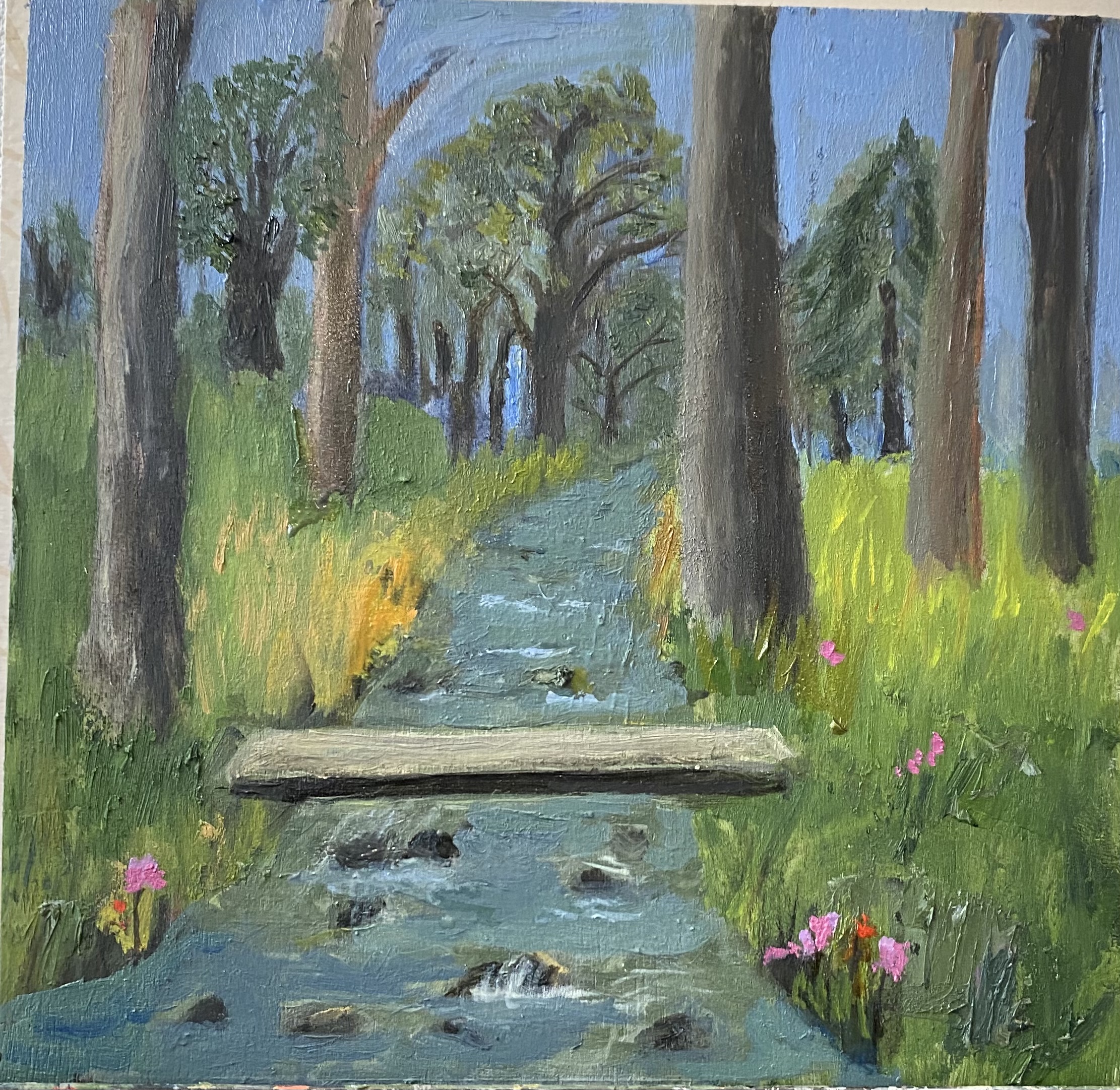
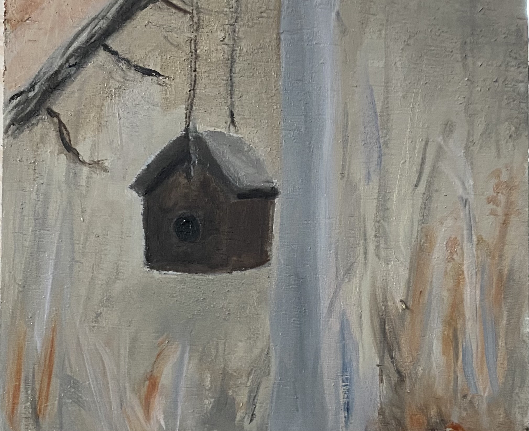
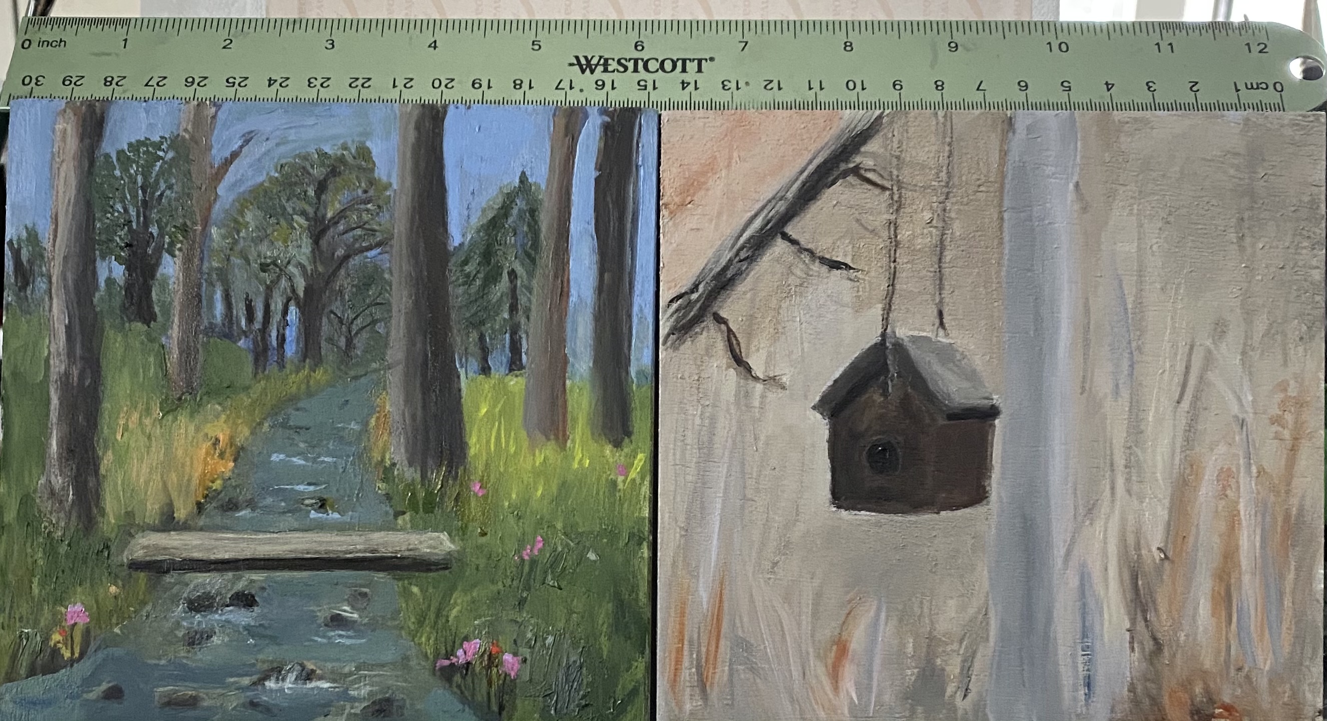
The gallery where my painting teacher works is putting on a little show, open to anyone. It’s called the “6 by 6” because the only rule is that all entrees are 6” x 6”, on a panel that you purchase from the gallery. You can do anything you want with the panel — draw, paint, do mixed media, sculpture, etc. I painted on two of these little panels. Results are shown below. I still have a bit of work to do on them, but can’t do too much as they have to be turned in by next week; and oils take a while to dry. In the bottom photo below I’ve indicated with a ruler that these really are small paintings.

A couple of updates

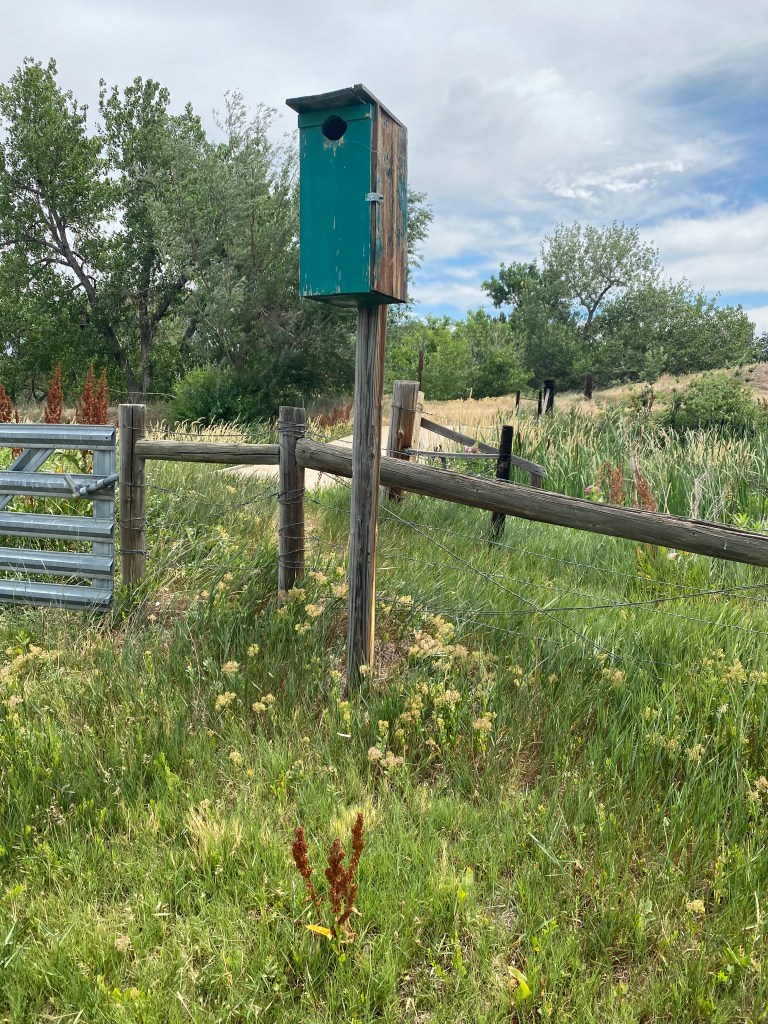
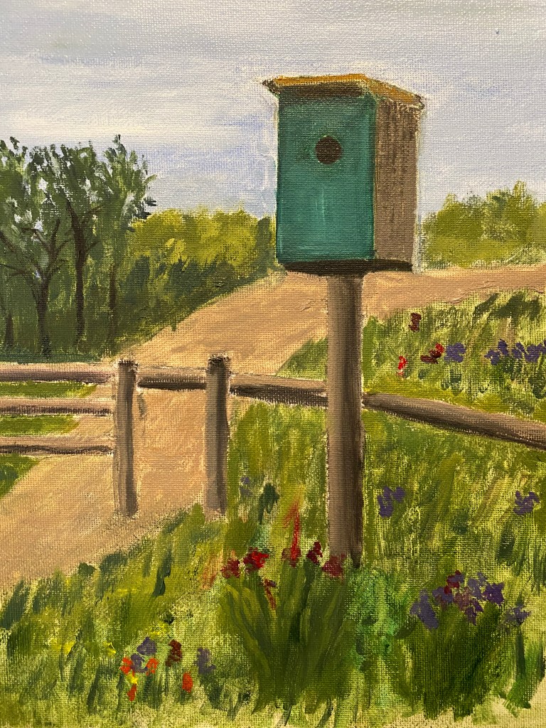
The past couple of weeks i’ve been working on several different projects — mostly related to issues that came up in painting class. In the photo below, which i took on a bike path not far from my home, the unusually colored and shaped bird house appealed to me. I decided to try experimenting a little more with split complementaries — in relation both to the blue-green of the bird house, and also the more yellow-green of most of the grasses. Not finished but thought it was worth an update.

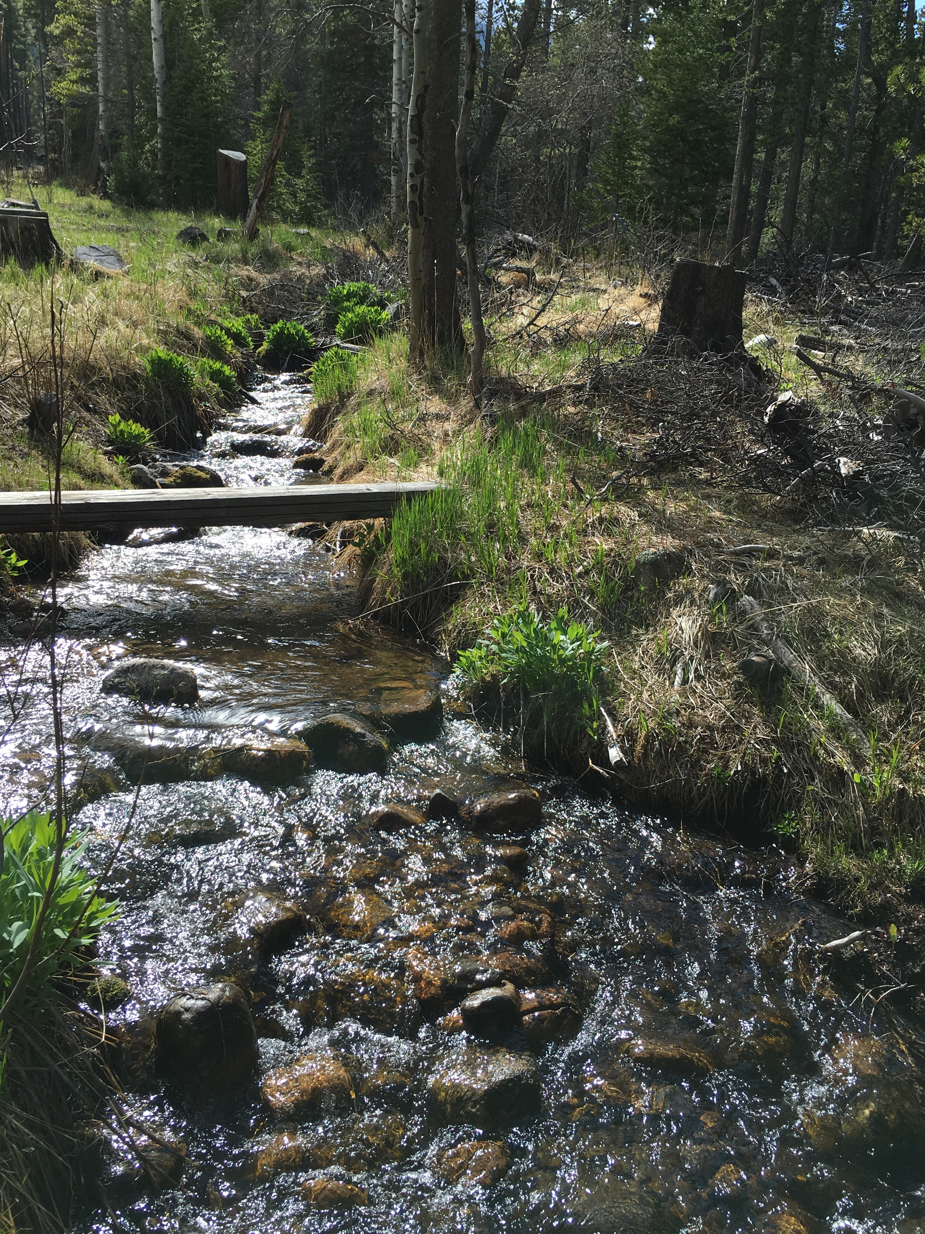
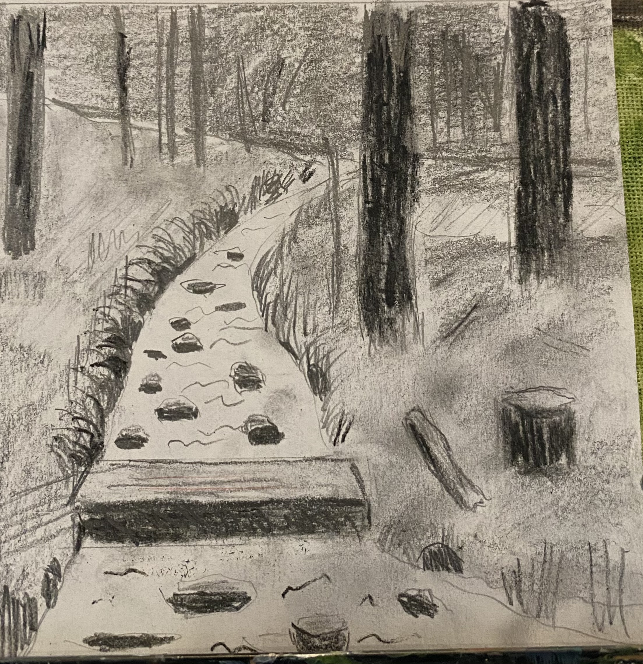
Second update is a rough drawing of a scene in the woods in the mountains near Estes Park. Here i played with redesigning part of the original photo while doing a values drawing.

the idea is to make a fairly impressionistic painting with dark tones looking kind of vague in the background. We’ll see what happens when I actually start painting.

Added Abstraction

Over the past couple of days i played around with several ideas on how to make my “Abstracted painting” more appealing, at least to me. Experimented quite a bit with color, of course; but also with lines, direction, varied brush and palette knife strokes. I got rid of the large shapes that looked like rocks — because that is how they began their artistic life. Did that because I’m trying here to be abstract, so didn’t want too many images that could be realistically identified. Here’s the result: quite different from what i posted a few days ago.