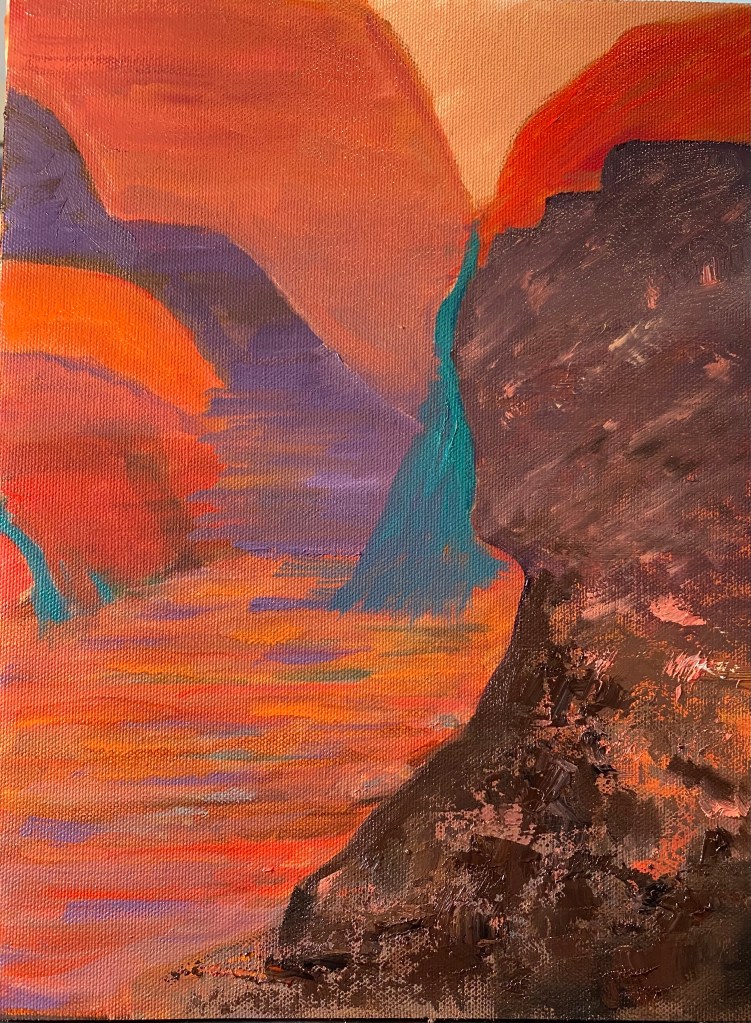
Over the past couple of days i played around with several ideas on how to make my “Abstracted painting” more appealing, at least to me. Experimented quite a bit with color, of course; but also with lines, direction, varied brush and palette knife strokes. I got rid of the large shapes that looked like rocks — because that is how they began their artistic life. Did that because I’m trying here to be abstract, so didn’t want too many images that could be realistically identified. Here’s the result: quite different from what i posted a few days ago.
- Comment
- Reblog
-
Subscribe
Subscribed
Have a WordPress.com account? Log in now.


Glows like lava!
LikeLike