In painting class a couple of weeks ago we were given assignment of using a photo of something realistic and turning it into an abstract painting. I chose a scene from the mountains along a river .
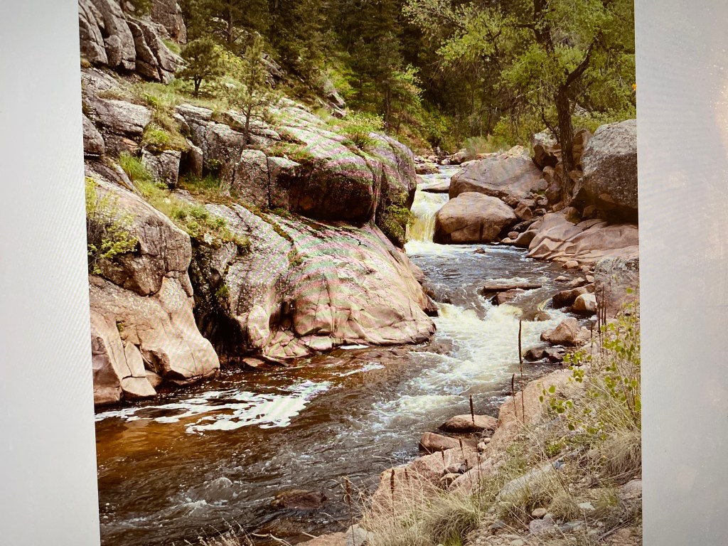
I first decided I would use colors mainly on red end of color spectrum- in keeping with the work we had just done on analogous colors. I did add some grays ( the browns really are part of red family) but soon decided that rocks were too close to really looking like rocks
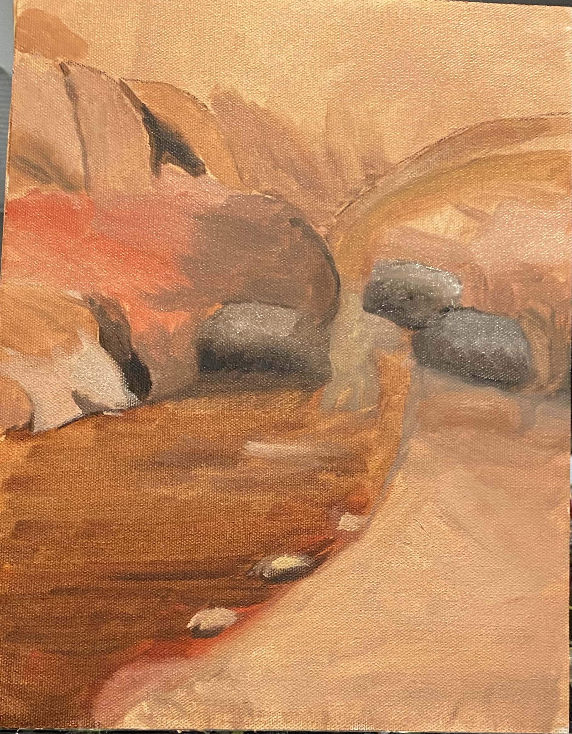
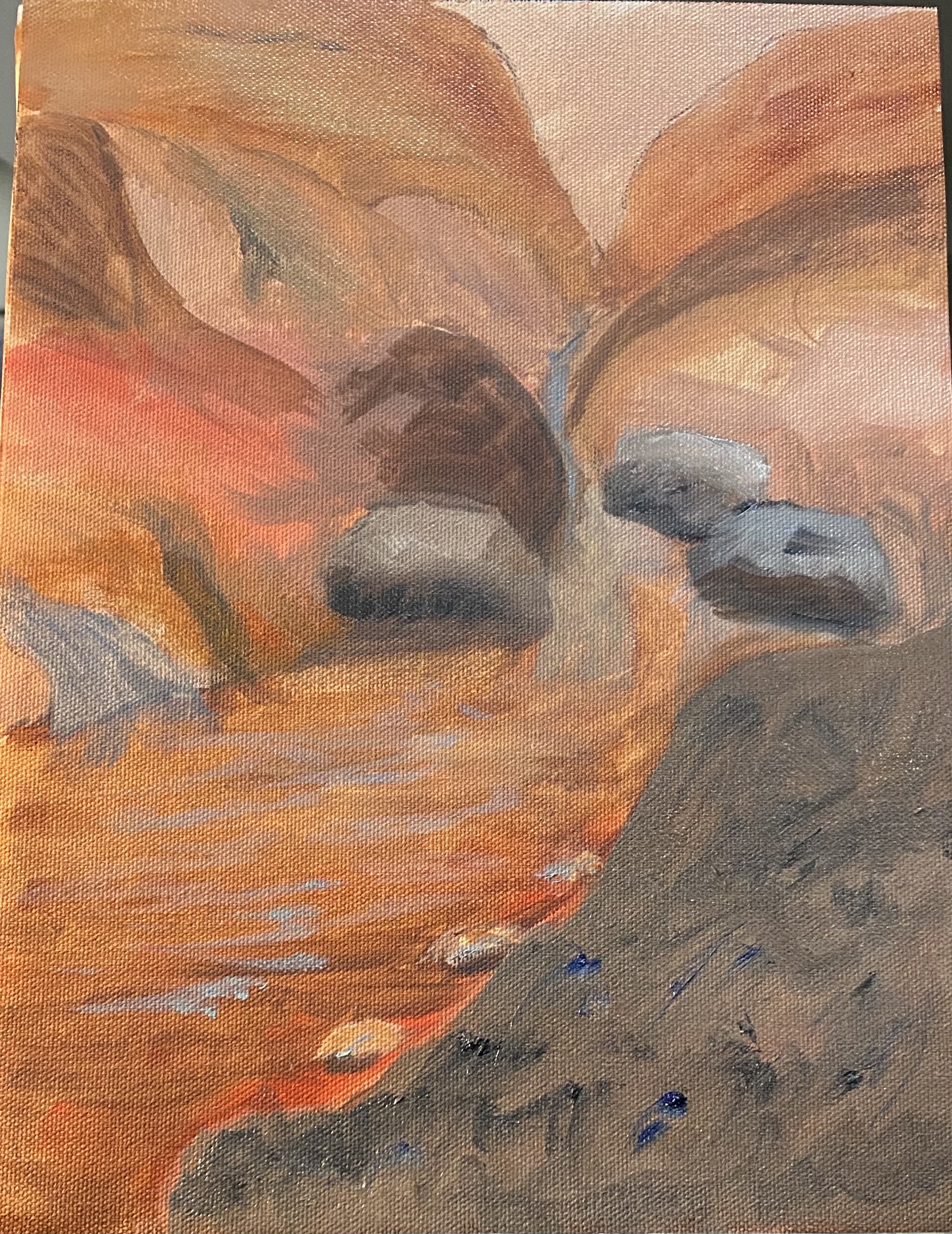
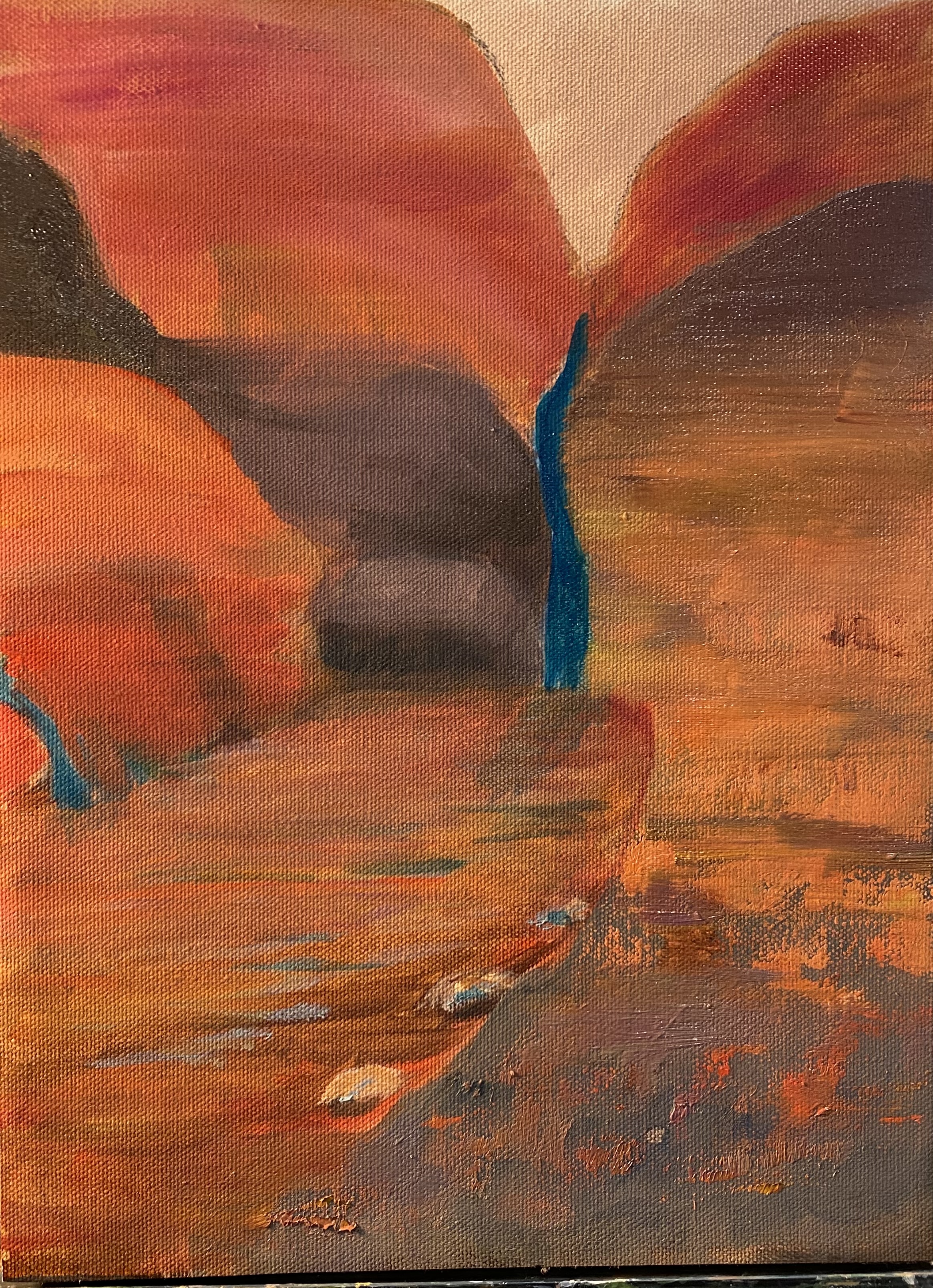
Eventually i decided i wanted more variety. Thought about adding contrast by using complementary colors, but really don’t like green and red together. So settled on a turquoise which i mixed up (i know — it doesn’t look turquoise in the photo, but it is), as this is supposed to be “harmonious” with the reds. Used palette knife in some parts on the right hand side of the painting to give some texture and tried using brush strokes going in different directions for same reason. Anyhow, teacher has not seen any of this, so i look forward to hers (and yours) comments.
 LJ and NJ