My sort-of-impressionist painting experiment is getting close to being called done. I think if i keep at this one too much longer i’ll Be overdoing it. So — i think one or two more sessions. I need to fix up some parts of the water and the reflections. the boats obviously need some work, but I don’t think that will be too big a deal. The past week (prior to last posting) I re-painted the sky yet again a couple of times. Also worked on trying to get still softer edges on the houses.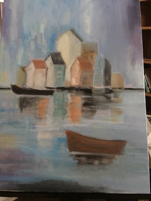
Painting update – Icelandic houses
Still not a great title for this painting, but at least it’s one way to identify the work. So in the past week I’ve worked on several parts of this painting. The sky has been done and redone several more times. Still needs more work, but i think it’s on the way to being ok. I repainted several of the houses and also added a couple for some balance. I painted in both boats. they (boats) have also undergone a couple of transformations — from black to a slightly lighter black-tinged with burnt sienna. When the bottom boat was all black it was too prominent in the picture.In class last week teacher wanted me to work on getting the edges of the houses softer. I’m not there yet, because when i tried what he suggested i lost the edges entirely, and i didn’t like that effect. So, repainted the roofs, and still need figure out how to do the rest of it all.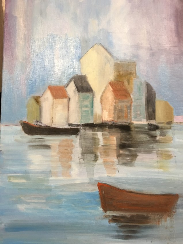
“Houses” painting.
Need to come up with a better title for this new painting. I was out of town for several days, so just got back to it. Last week i realized i needed to increase size of the houses — they were way too short for the long canvas. So i painted over what i’d Had there before, and now they are taller. I also added a few buildings that are not in the original, because needed to take up more space horizontally on the canvas. I played with colors and values, and that part is for sure a work in progress.
Today repainted the sky. ( I had repainted it last week but that effort didn’t work, so tried again.). then i tried to paint in beginning effort for the reflections in the water.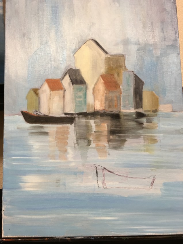
Sticking with my plan
Back to my self-imposed drawing challenge: 1-hour sessions. So today i tried drawing a wine bottle. Didn’t want to stop after an hour, but i did. I can see that the bottom is “off” but hopefully next time i won’t make the same mistake. 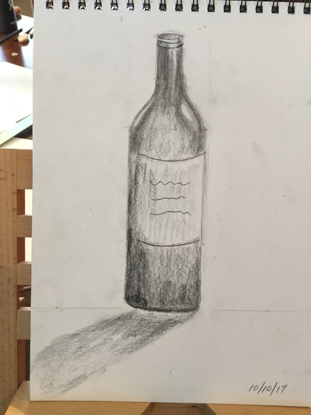
Once more….
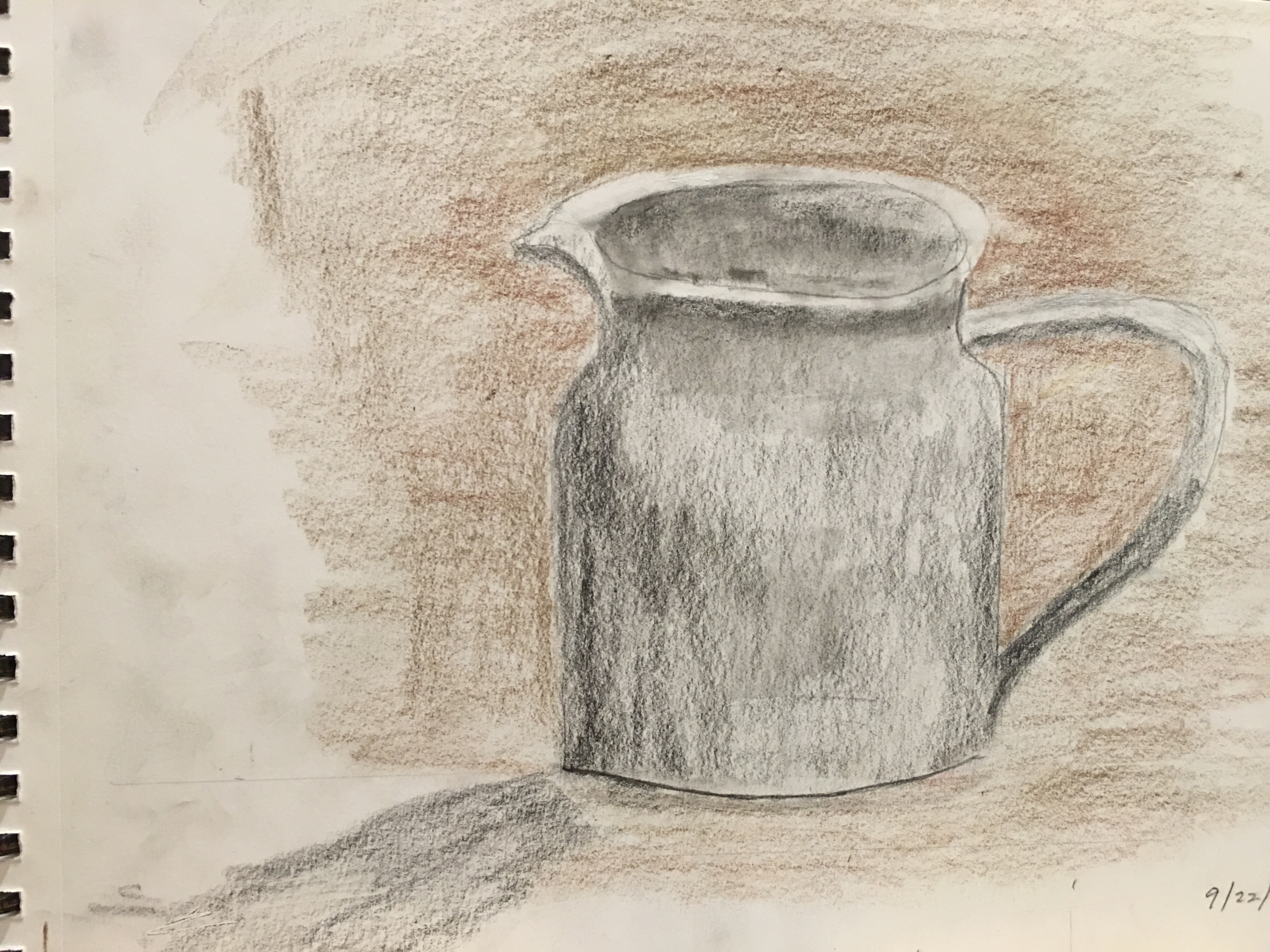
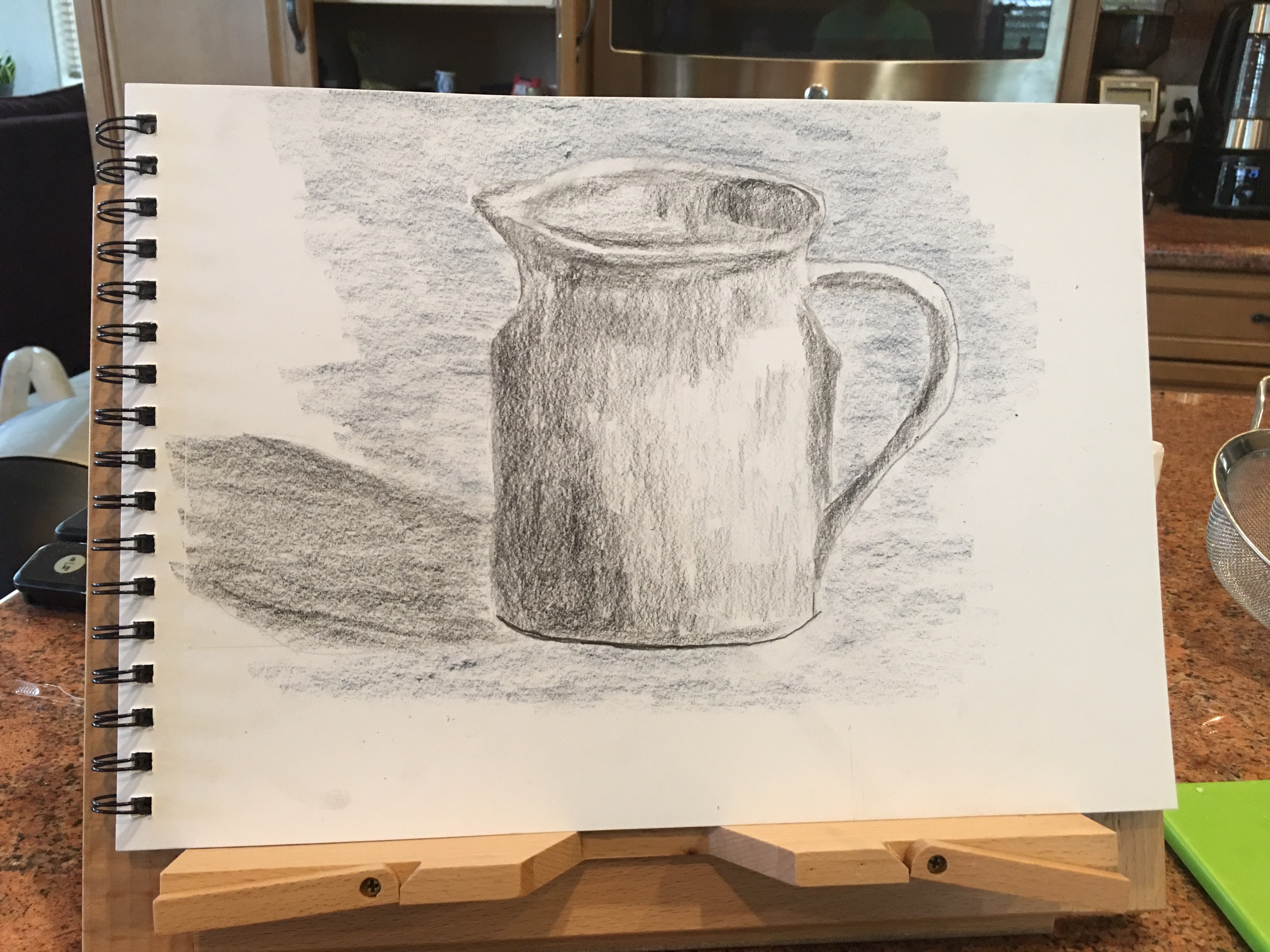
Ok so i know i said i was done with that pitcher. But i just couldn’t let go of trying to get it right. I think my one-hour challenge spread into about 8 with this one. I’m only giving up now because the paper is so messsed up from all the erasures and re-drawing that it just can’t take any more. I have surely learned a lot from this exercise!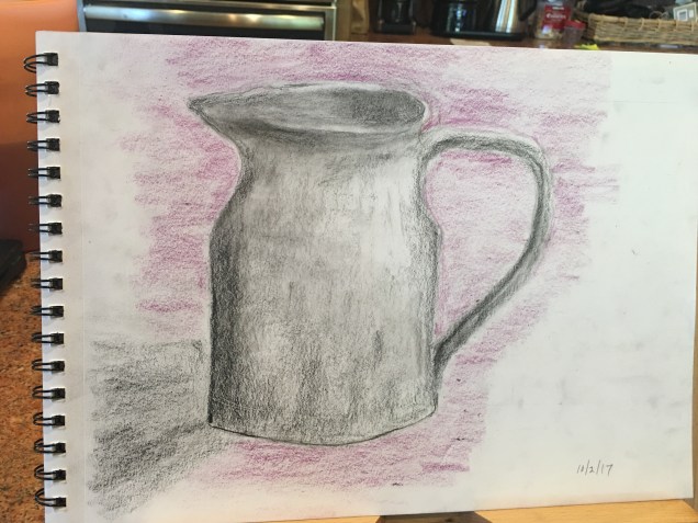
And now for something new —
When we were in Reykjavik this summer i was quite taken with the work of an Icelandic artist by the name of Birna Smith. I want to try to learn how she creates the effects (kind of semi-but-not-quite impressionistic). So this week I’ll do a beginning layer of thin paint and see what happens next. I’m attaching a couple of photos from this artist’s portfolio.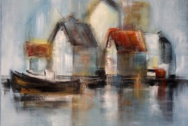
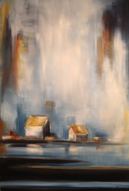
Moving on — from this painting
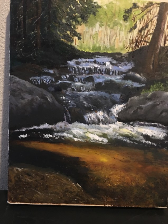
Well, i’m ready to let go of this painting. This week i put on a layer of oil over parts of the top half that were looking kind of flat. (That helped some other parts of this painting a couple of weeks ago.). I also worked a bit on the very thin branches on the left side of the painting. Teacher thought i should give them a “dappling” effect, so tried to do that. And finally, i used a new technique: the corner of a small fan brush and a very light stroke — to give some “sparkle” to some of the water, and to show some droplets. That was fun — never tried that before.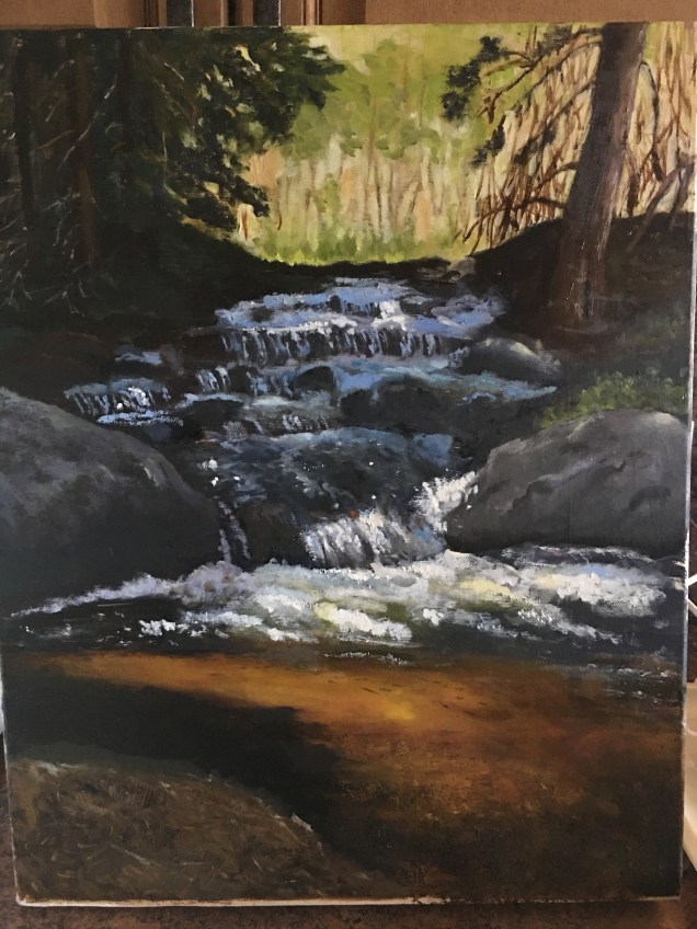
new photo of pitcher
Here is the pitcher, reflecting more the angle at which i was working. Mimi’s and Bern’s comments also made me realize that i kept changing MY position during the drawing sessions to see some little area better; followed by distorting some other area!!!Thank you both!!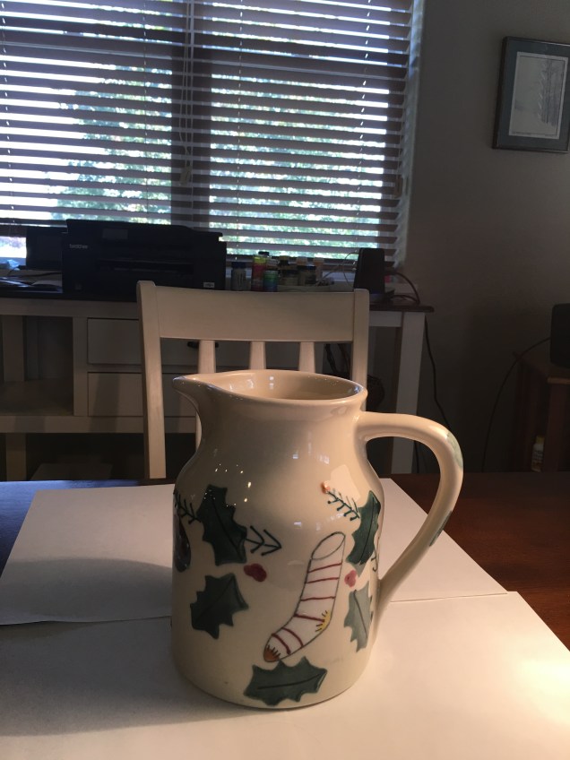
Drawing: 3 tries
Last week i decided to try drawing a pitcher. My first attempt looked nice but not much like the subject. So i tried again a couple of days later. The shape was a little more realistic, but i still couldn’t figure out how to draw the highlights. (Note: For each session I set up the pitcher on a table, sitting on top of white paper. I shined lamp light on the pitcher so i could practice drawing shadows and highlights — and there were quite a few of each.). For the second session i thought maybe if i added in a darker background around the pitcher the highlights would show up. but no. Anyhow, so i decided to try yet a third time — today. It’s a little better: the highlights on the body of the pitcher are beginning to come through; but the ones on the lip of the pitcher do not. I’ve had it with this pitcher at this point. I’m going to try something next that is not so light, and perhaps I’ll be better able to figure things out.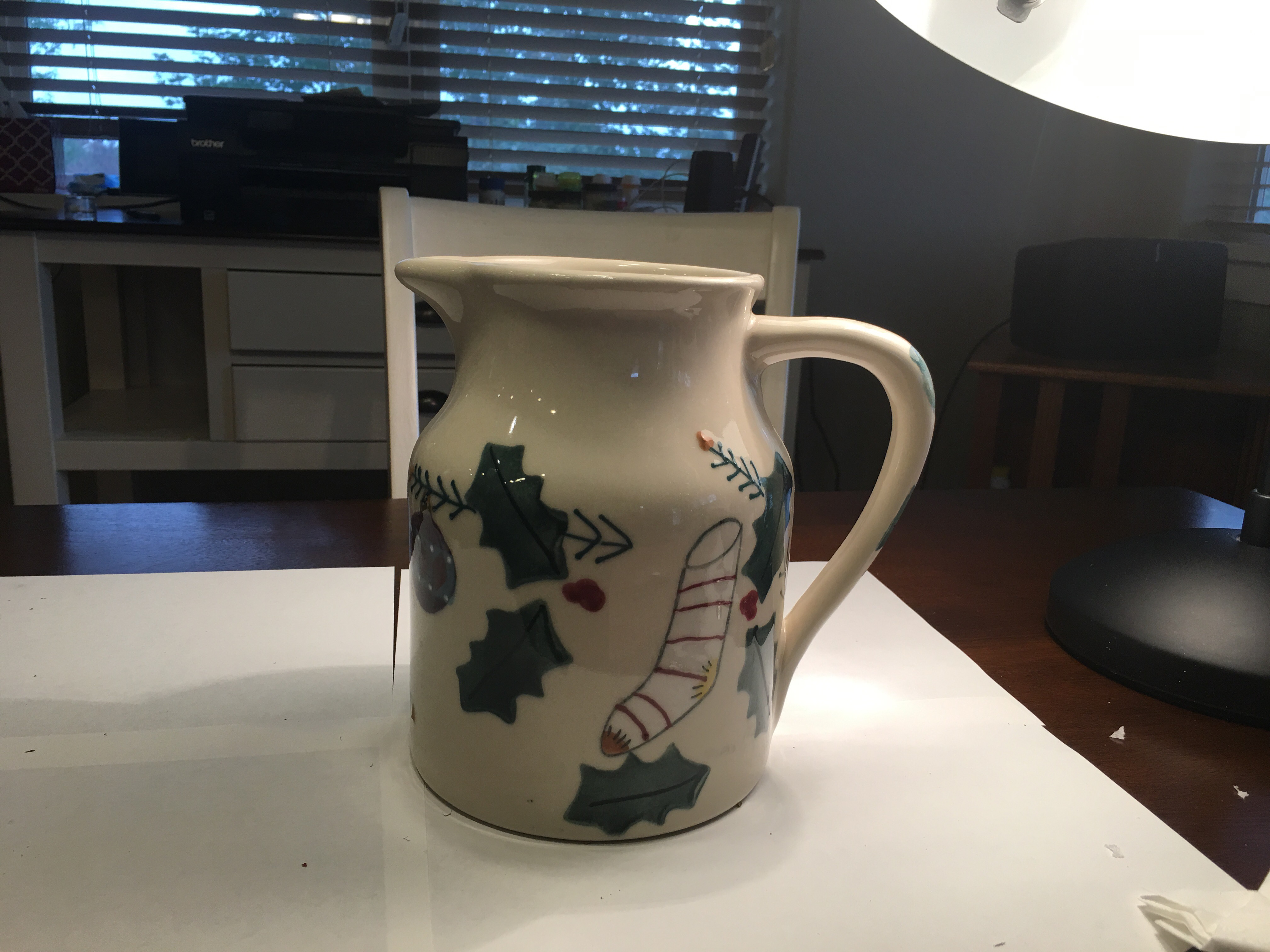
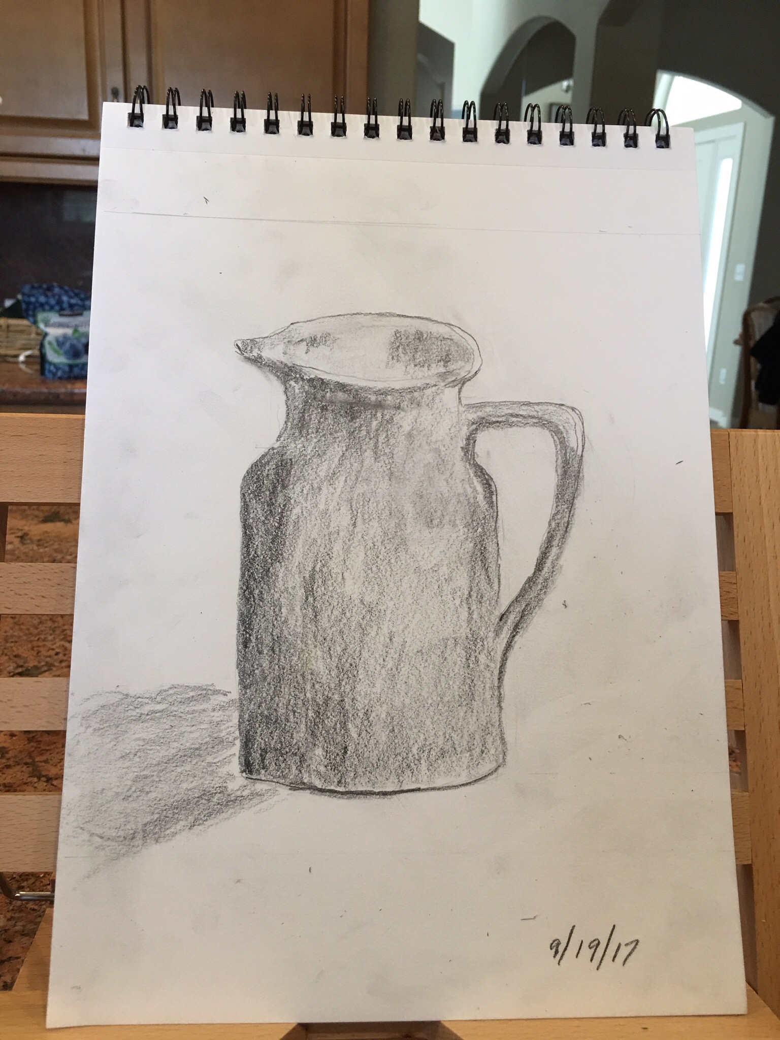
Getting close to done
This week i worked on several different parts of this “water” painting. I added highlights to some of the branches on the left side of the painting; made a couple of edges softer so they would be more realistic; added some bright areas to the waterfall – areas where water is more active and where sunlight is reflected in the water; also repainted some of the background. In class (yesterday) teacher had me repaint the plant vegetation and also fix the big tree trunk so it fit in better into the painting. Still a few more minor things to do, but in the next week i’m calling this one done.