Winter color

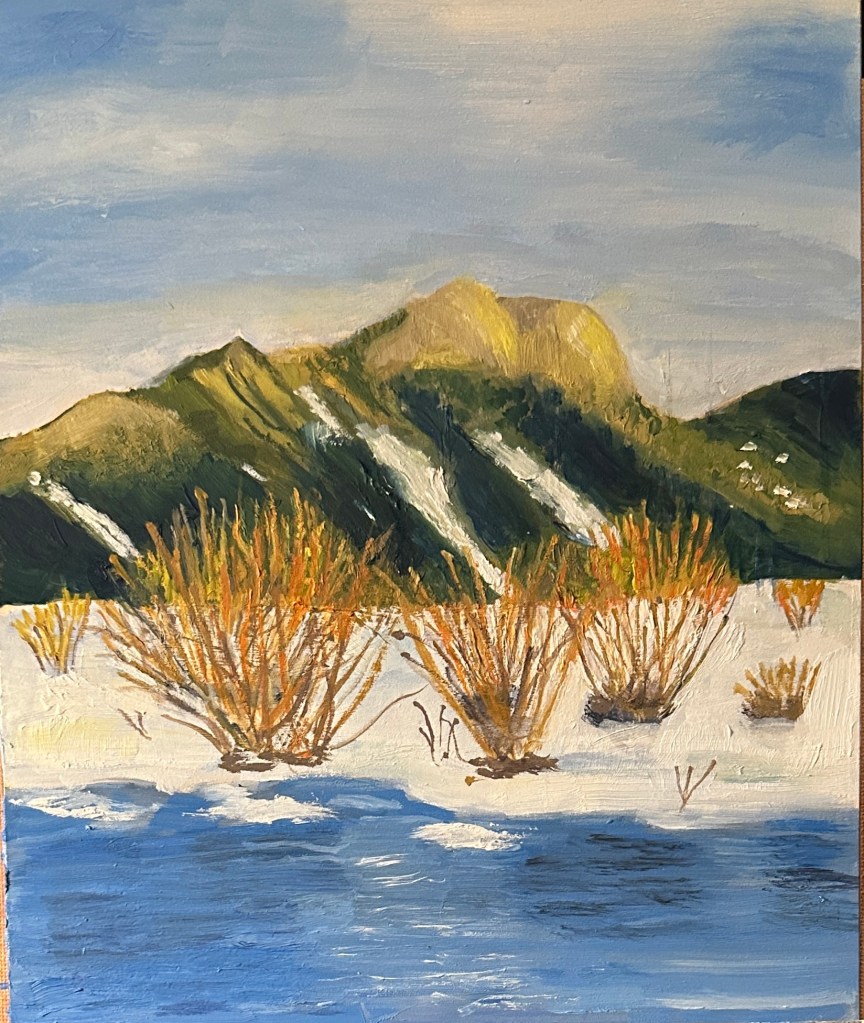
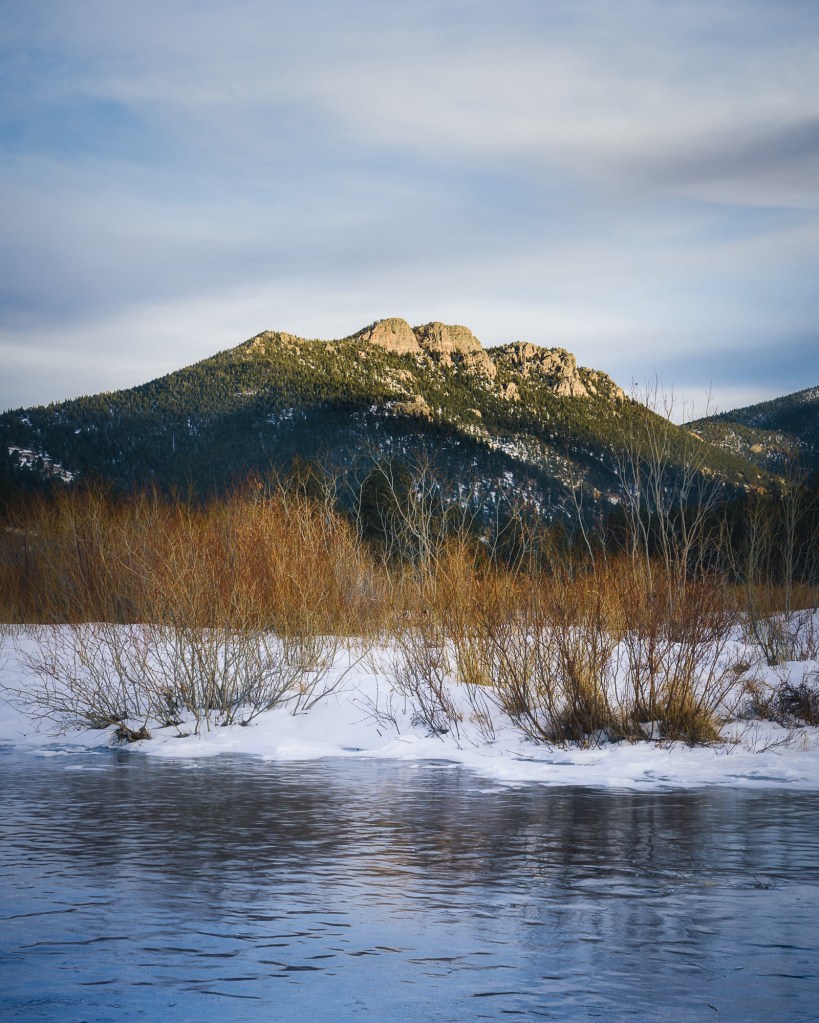
The reference photo for this painting is of a scene in Rocky Mountain National Park (Moraine Park) from an outing last February. Norma took the photo late afternoon that day. What drew me to the composition was the contrast between the colors of the willow branches and the surrounding snow. I didn’t want this to be a big project or take too long, so the painting is on a small panel (8” x 10”). The most challenging part of the work was those branches — had to go out and purchase a new Rigger brush to get some of those very thin lines. Also a lot of negative space painting, when lines started out being too thick.
Knife painting

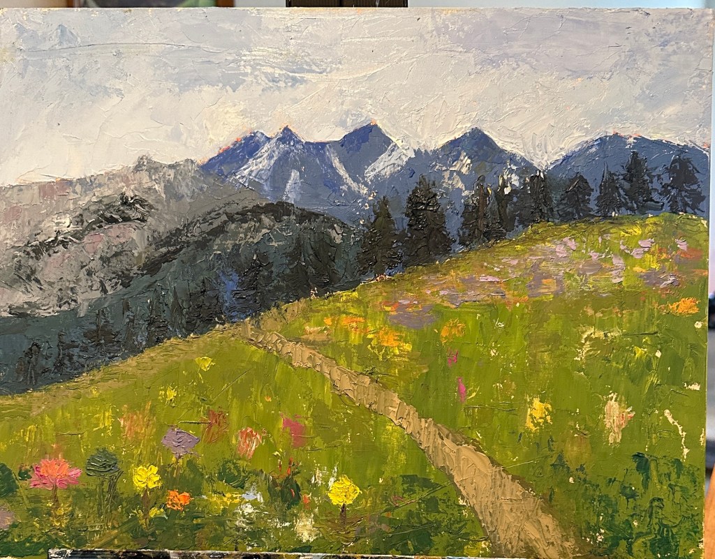
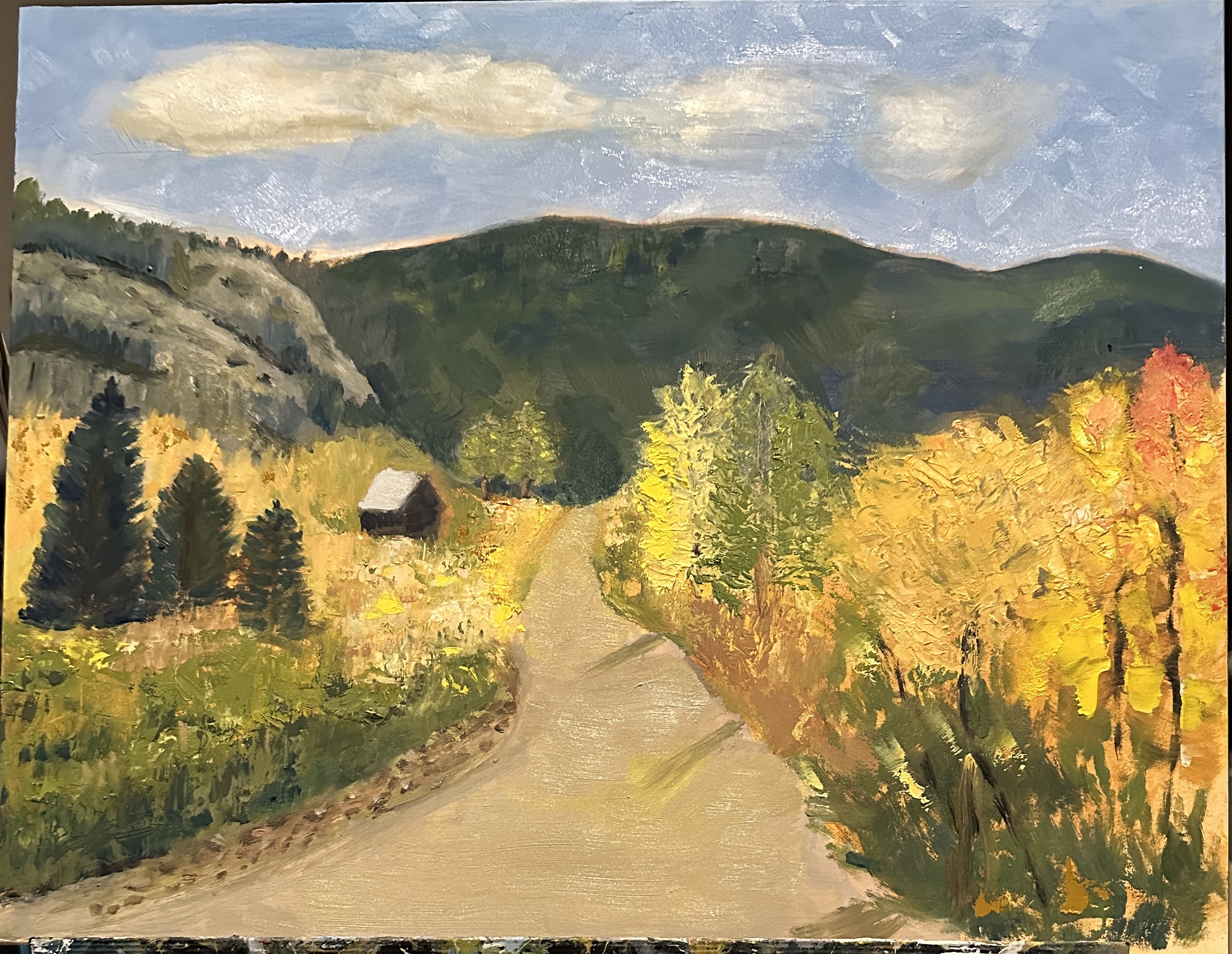
Using a paint brush to create a painting has almost always my tool of choice . Every once in a while i use a palette knife to add in a few features like highlighting texture. A few weeks ago, though, my oil painting teacher suggested that we (the class) paint a scene from start to finish with a knife. Painting with a knife requires using a lot more paint than with a brush; and the resulting product is much thicker and, at least potentially, more texture-rich. It also requires learning new skills to manage and control the strokes.

the painting i’m attaching to this post is the result of that experiment. The reason it’s been sitting around for several weeks is that i was very ambivalent about presenting it in its fairly rough form. I really wanted to refine the flowers in the front of the painting; give them more detail. Also would have enjoyed adding detail, such as small rocks, pebbles, to the front part of the path. However, in order to pull that off i would have had to use a brush, and i did want to be able to present this work as a 100% knife effort —- just because. (!)

knife painting — Colorado mountains
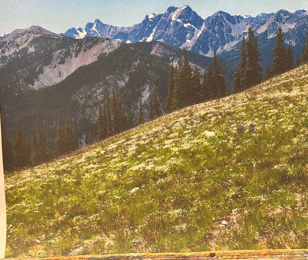
Reference photo for knife painting

Aspens, again

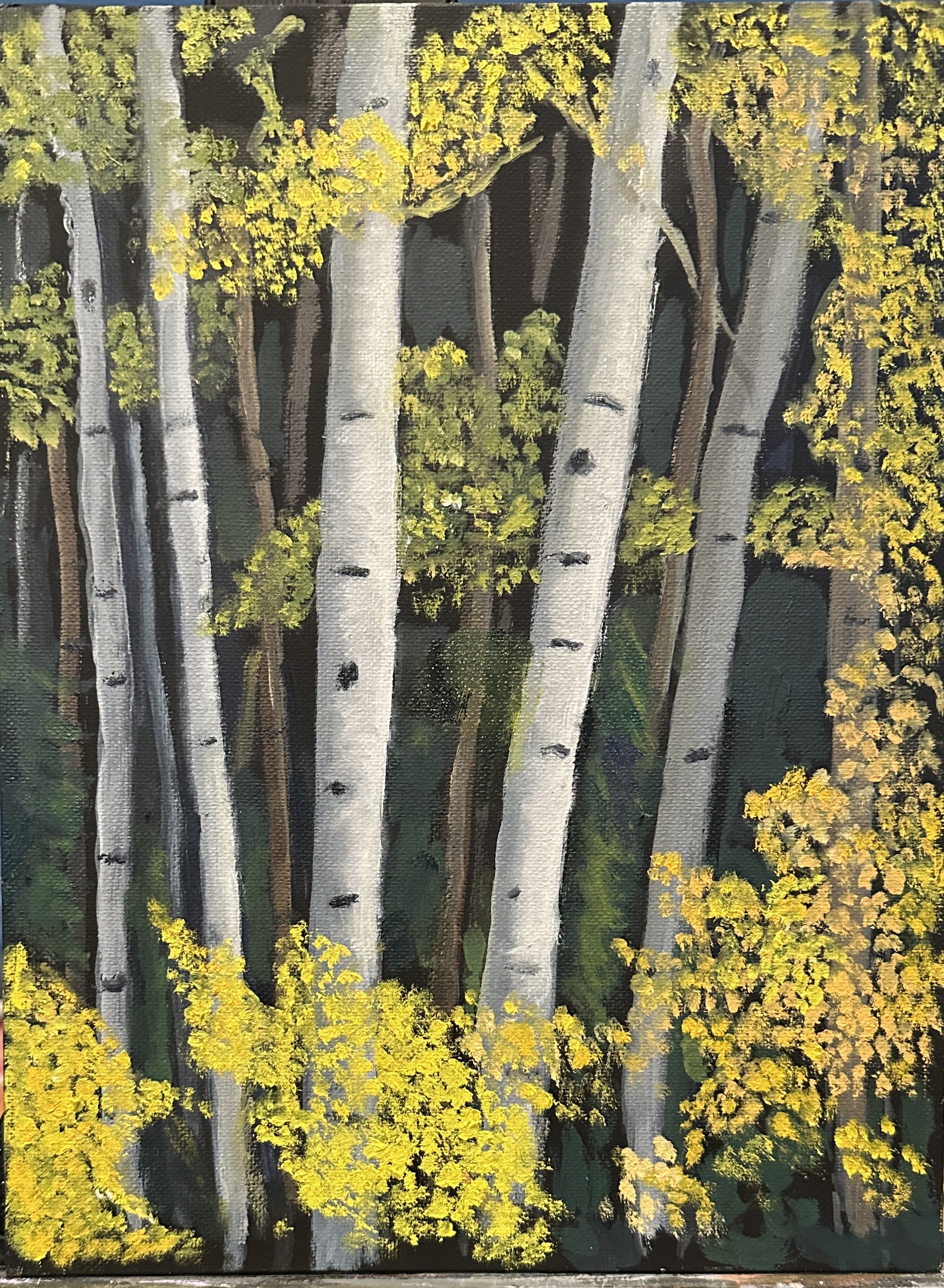
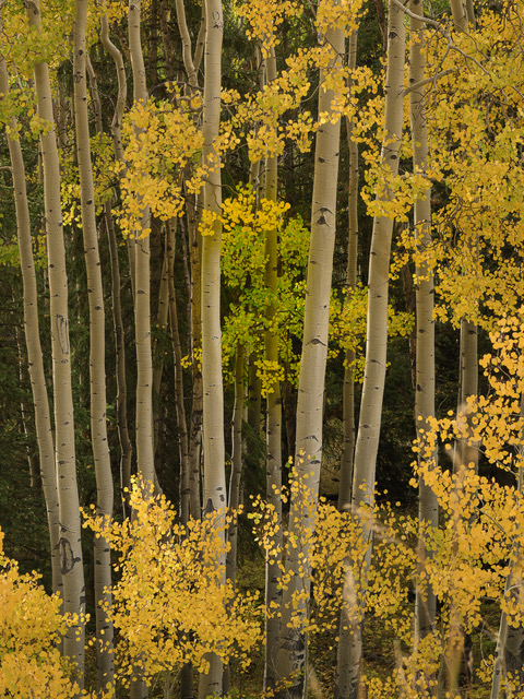
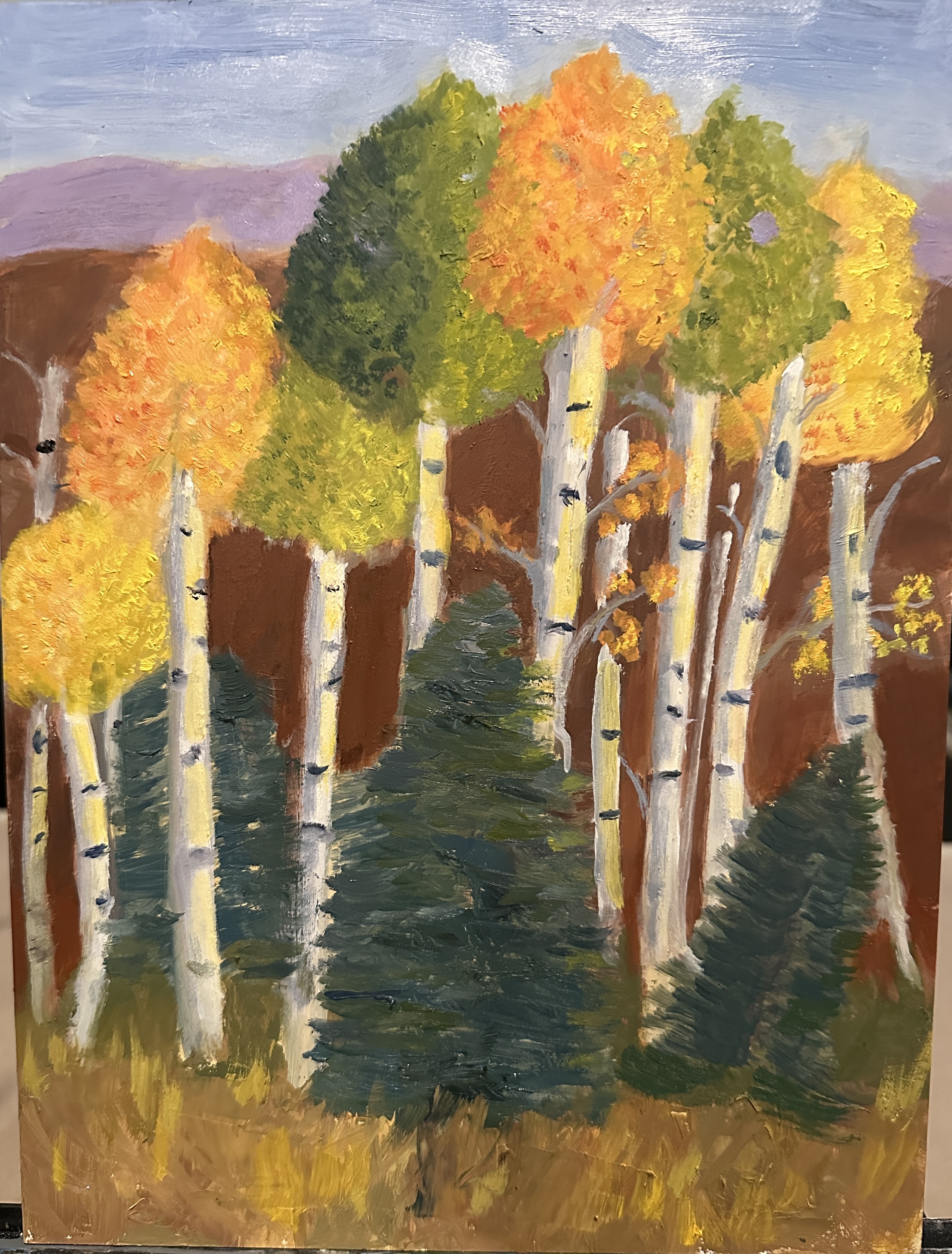
As some of you already know, i’ve been trying to get a better grip on painting aspen trees. They are so common in Colorado, and so interesting and lovely, in all seasons. Especially in the fall, though, is when they just shine. With this painting, because the background is so dark, i decided to use a black panel (canvas). I haven’t yet finished painting the dark trees in the background forest, but i think you can get a good idea of where i’m going with this one — almost there! Location is near Wolf Creek Pass in Colorado, in September, at almost the peak of color for the Aspens (see reference photo, below).

Colorado Color

This painting depicts a scene from a plein air painting trip i took in early October of this year, to the southern mountains in Colorado — about a 4-hour drive from my home. It’s a beautiful mountainous area very close to Wolf Creek Pass. We had hoped to be there when there would be a lot of fall color from the Aspens and other trees, and we really lucked out — hit the peak of the color season! I did a value study first and spent more time than i wanted to on blocking in phase. So then i wanted to get going a little faster and decided to play with painting with a palette knife instead of with a brush. My goal was to get the feel of the place without getting too caught up in details. I’m not experienced enough with the knife to worry about detail, so that issue worked out fine. This is all studio work.The painting is still wet, which is why there is some distortion throughout, especially in the sky. In terms of the knife vs. the brush — almost everything on the right side of the painting was done with the knife. The mountains, hills, evergreens and building on the left side of the piece were done with brush. 11” x 14”, oil on panel.

ICELAND SUNRISE

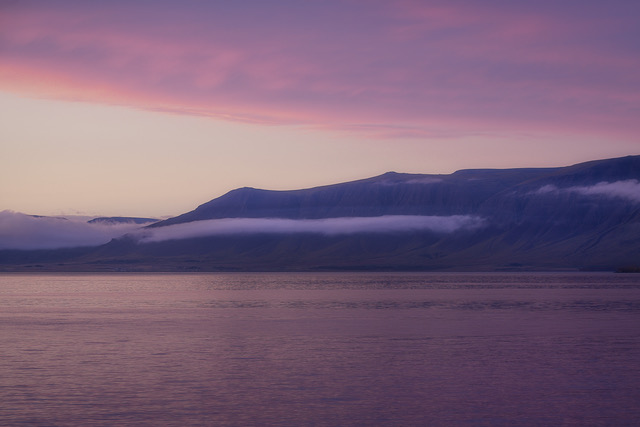
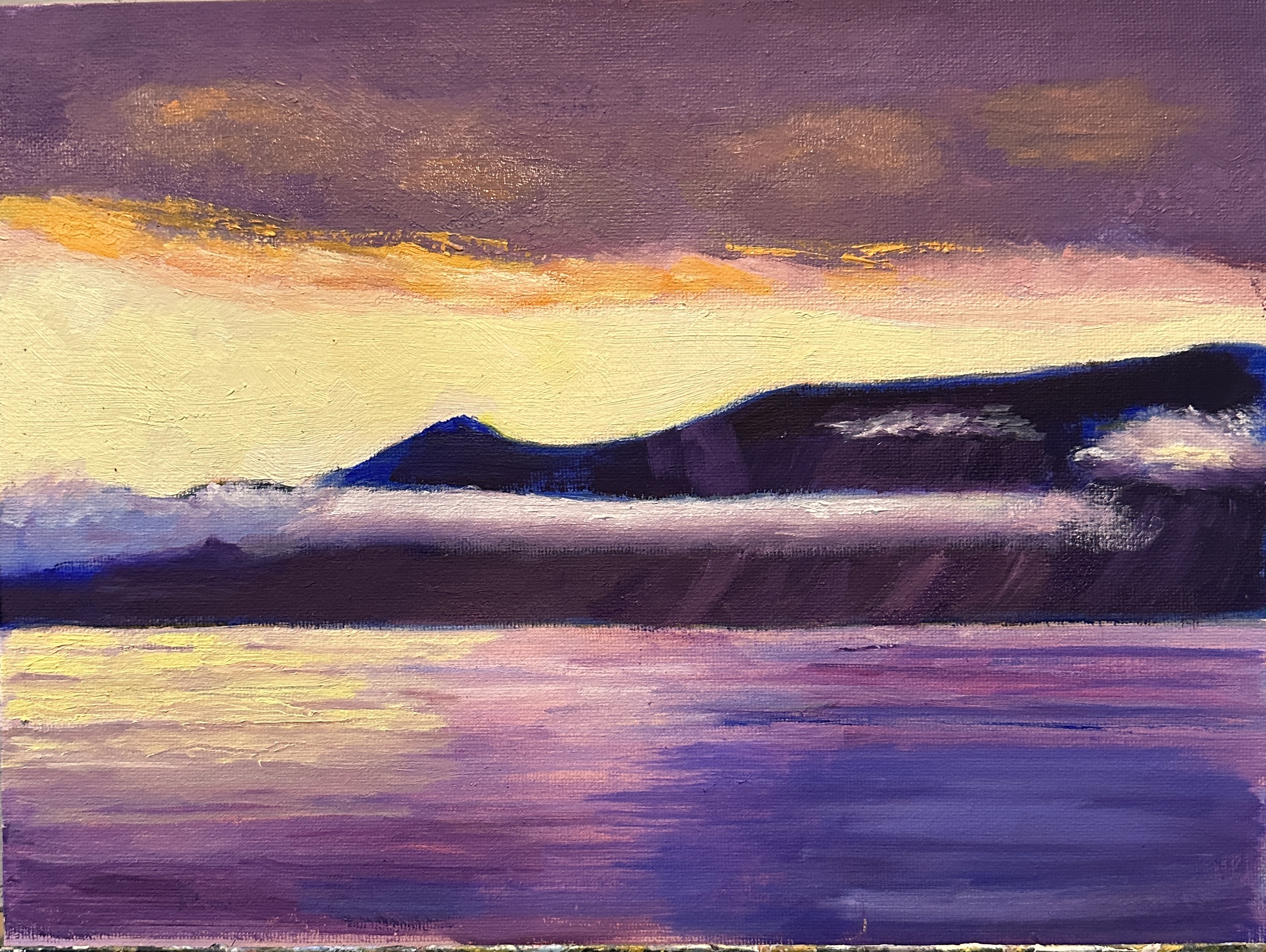
This is a painting of a sunrise in Iceland. Reference photo was taken by Norma on her trip there last year. The painting is going to be part of a project which combines both visual art and music. I wanted to paint something that would project a calm mood — to go with a piece of very calm music. I lightened up the painting purposely, as in addition to the calmness i also i wanted it to project a sense of the positive— thus the brighter yellows. I might still adjust the color of the clouds, to make them just a little lighter — will decide that soon.

Aspens in Colorado

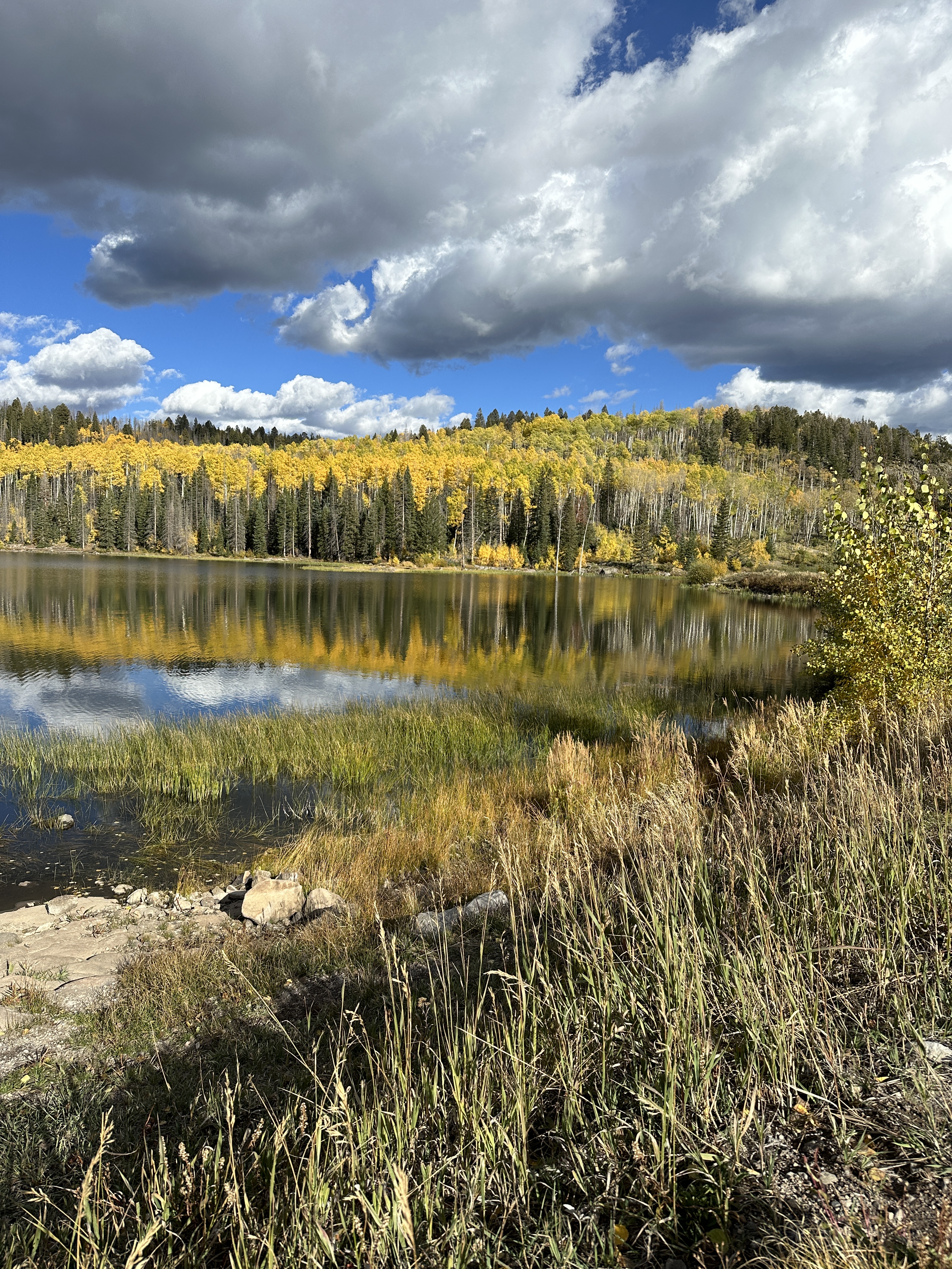
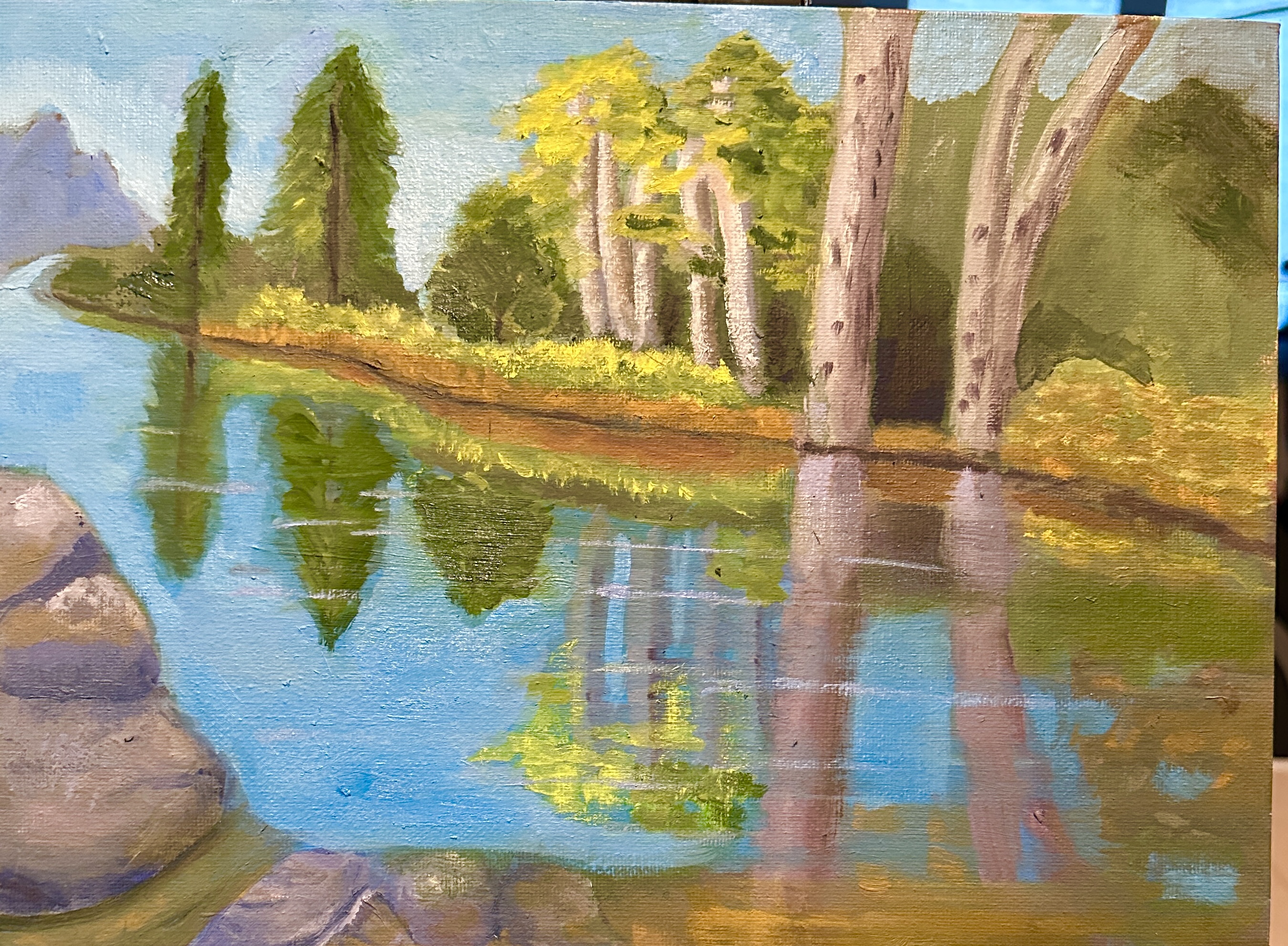
A couple of weeks ago i spent several days with a small group of painters in the southern mountains of Colorado (near Wolf Creek Pass). We went out to a different location each day and spent several hours painting fall in Colorado. We hit the fall colors at their peak. Weather was great — altogether a very lucky experience. I came home with 3 very unfinished paintings from the field. Set to work on one of them which i’m attaching here. Unfortunately the reference photo was lost at some point, but i can give you an idea of the area. (see below). It was very tempting to go for one of the water scenes, as the reflections were amazing; and perhaps i’ll do one of those in the studio at some point. But for this exercise i wanted to get a feel for how the Aspen trees are put together, so i chose to do something with them more close-up.

Watercolor pencils, cont.

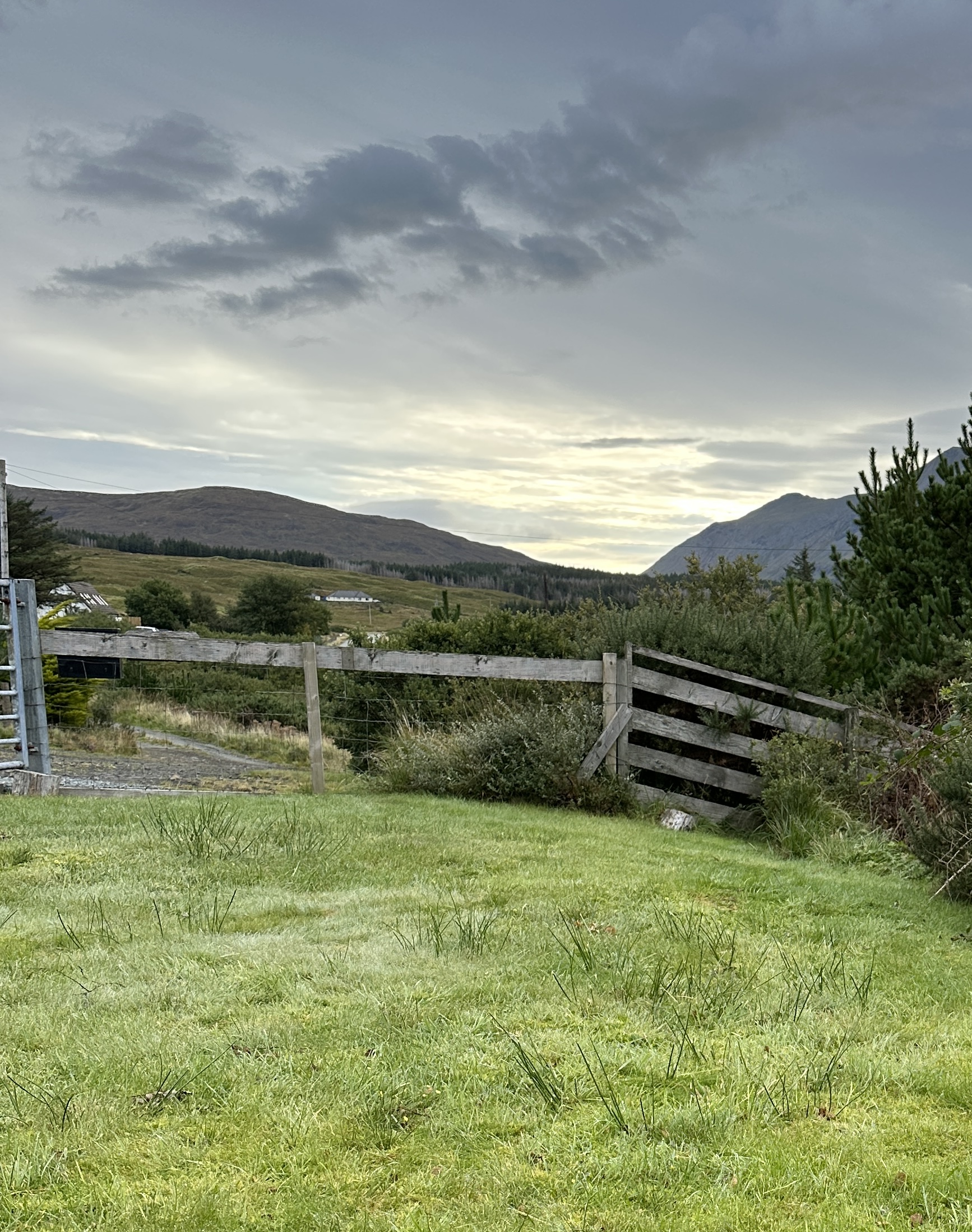
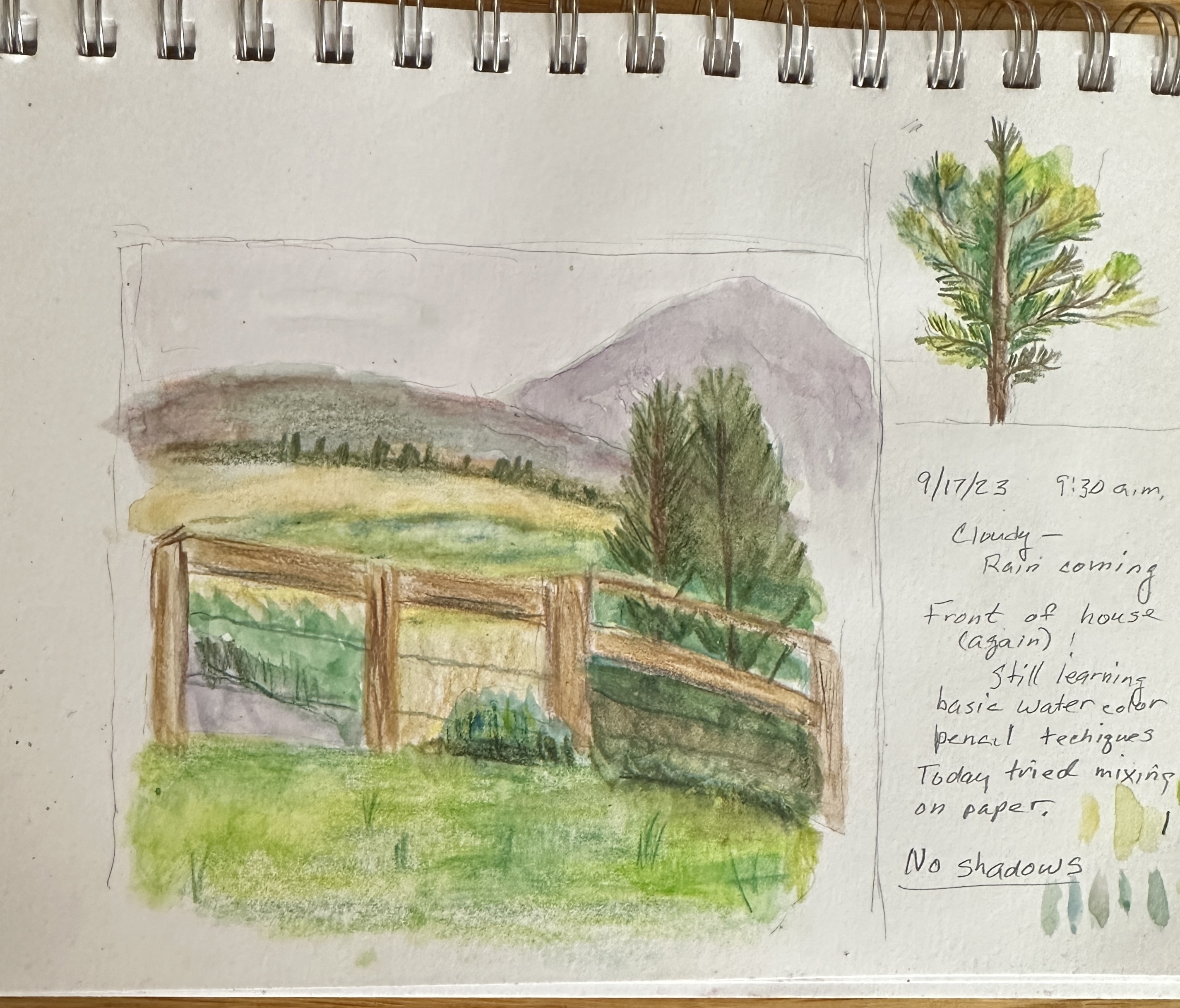
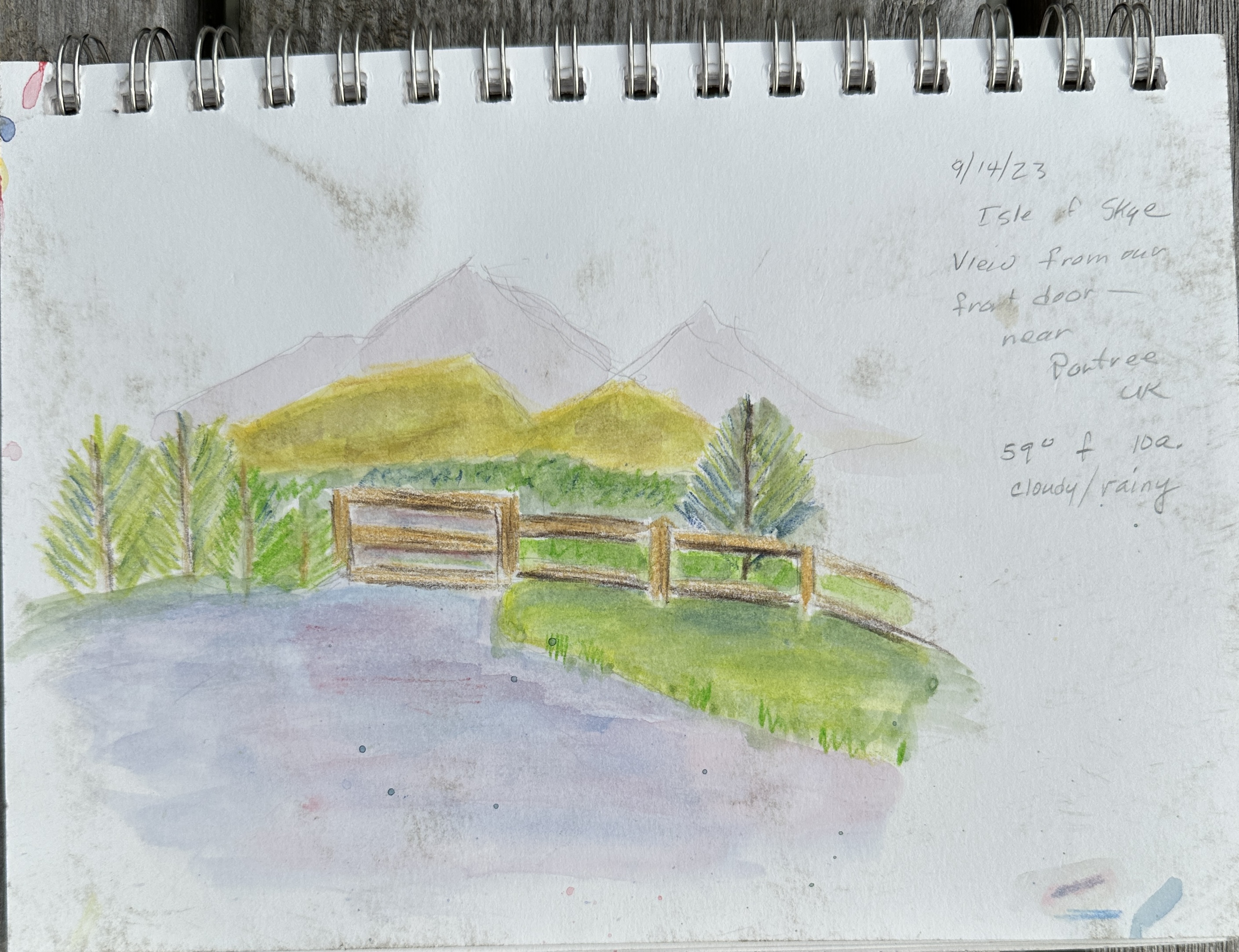
Today it’s raining all day, so good opportunity to practice with my watercolor pencils. Can’t say i’ve got the hang of it yet, but all practice is good practice. So — another view from the house, taken just prior to the rain starting. I was sitting at a picnic table outside, facing the fence i wanted to draw/paint. Life with watercolor very different and requires very different way of thinking from doing oils. And of course with the total cloud cover there are no shadows and light source is very nonspecific since don’t have the direct sun as light source.

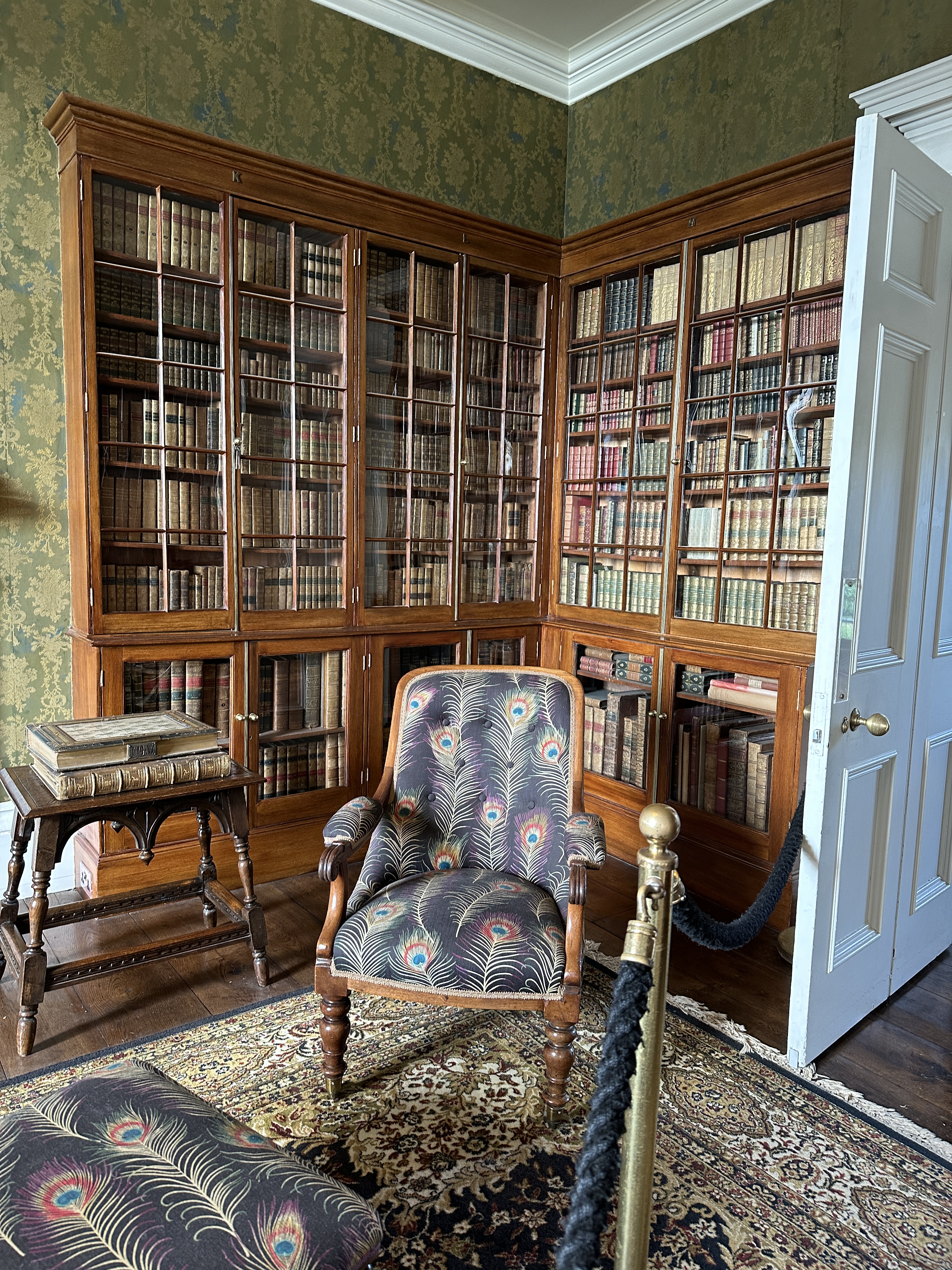
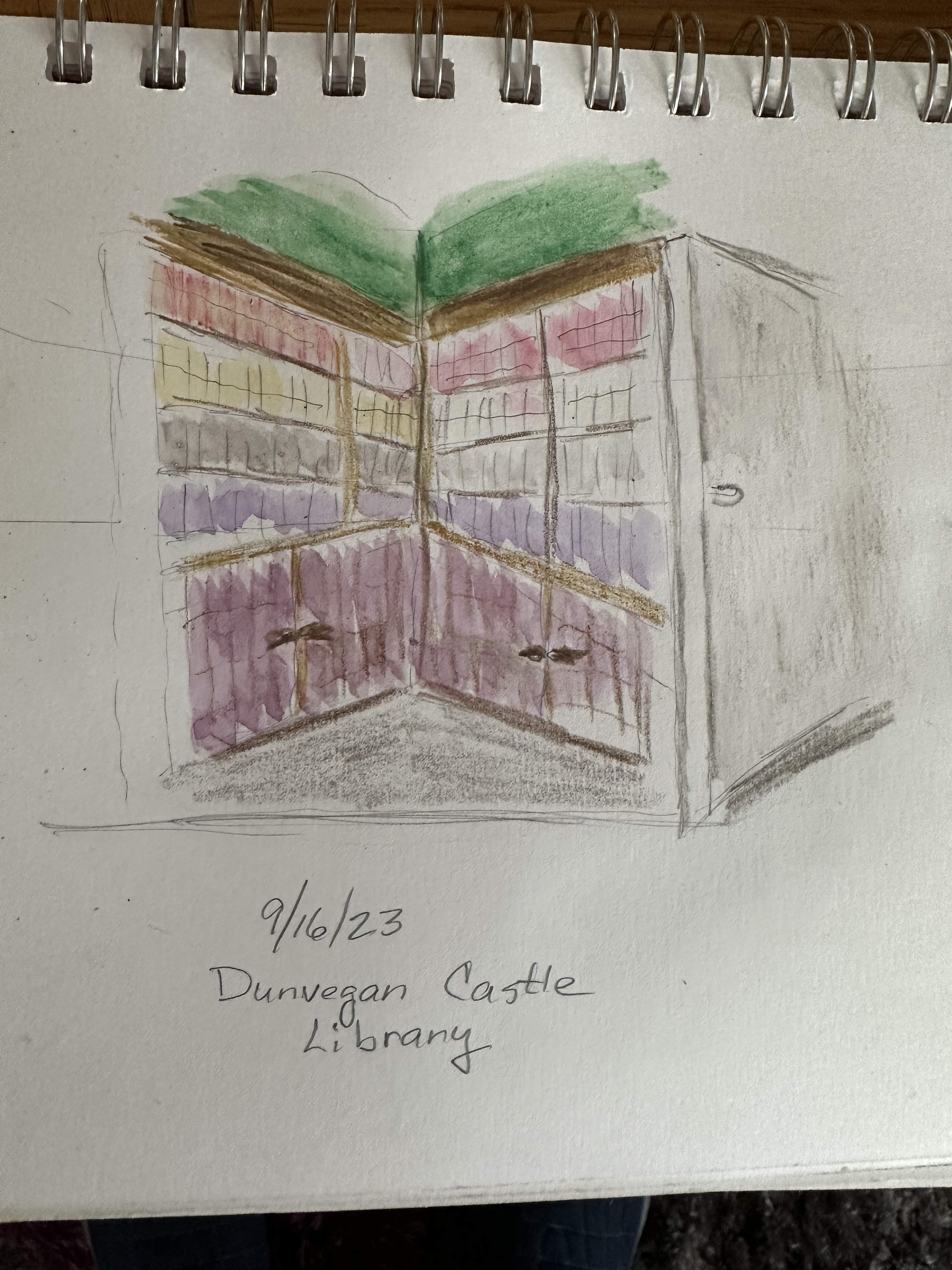
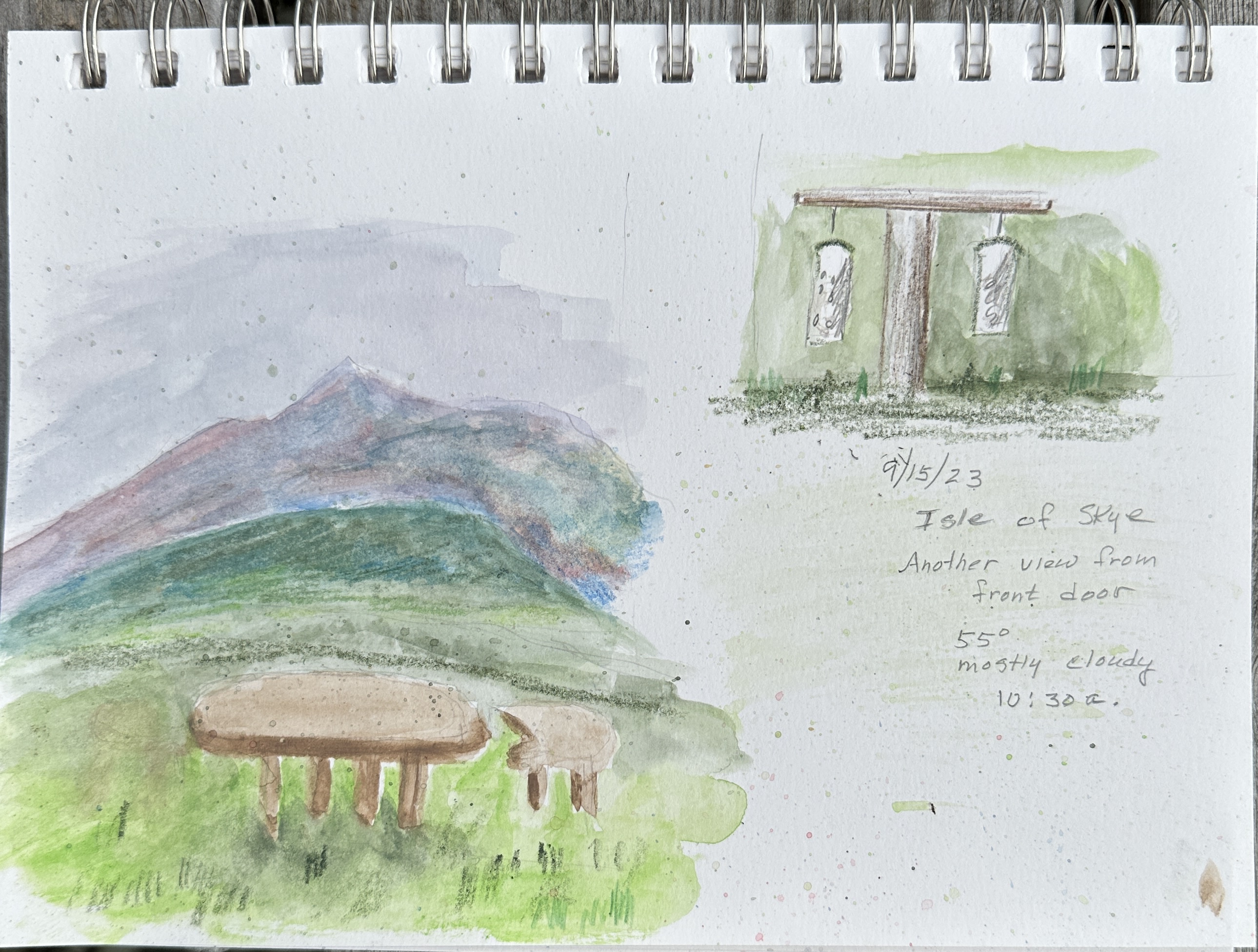
Second painting is from a photo i took yesterday during our visit to Dunvegan Castle. Photo is of the library. Obviously i’ve really simplified —- skipped the table, the chair, etc. just wanted to focus on getting the perspective close to realistic.

Note: the reason i keep painting from the house in the morning is because it’s not been convenient to bring along the art supplies while we are on a hike (e.g, Fairy Pools, Talisker Bay, etc.)

In Scotland

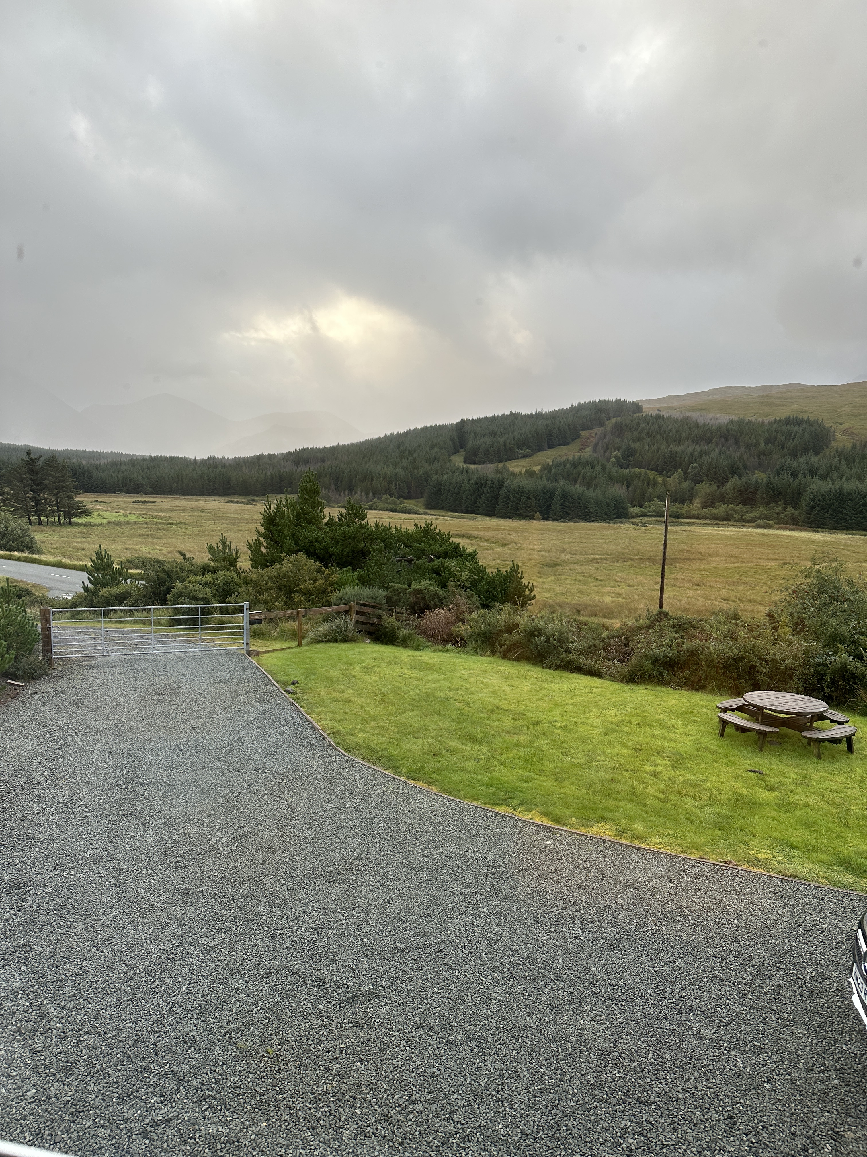
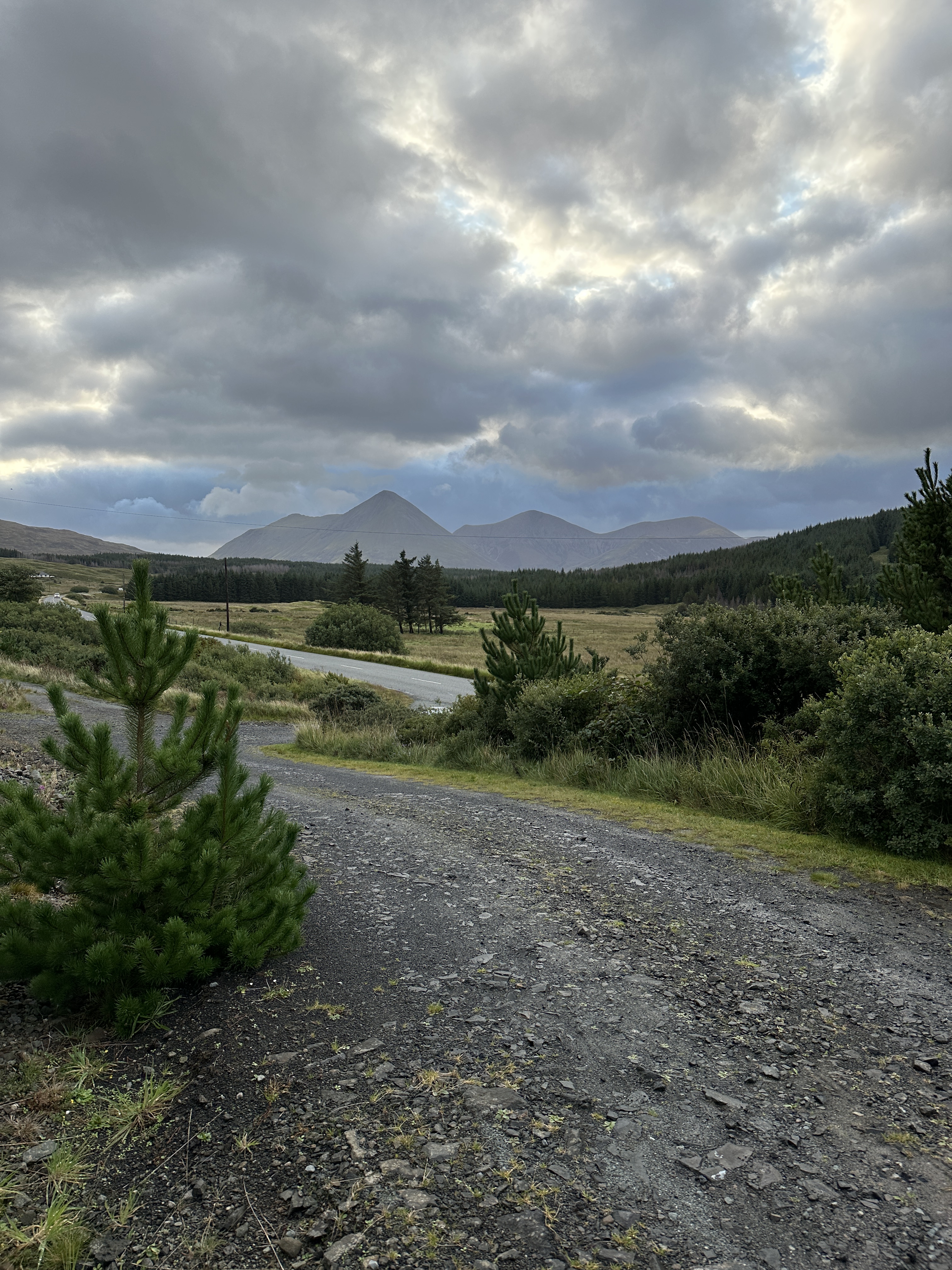
We are in Scotland for two weeks. Spent a few days in Glasgow; now here on the Isle of Skye for a week. The area is incredibly picturesque and although i could not bring my oil paints on this trip, i did want to have a travel journal with some kind of visual art. Decided to try watercolor pencils — an entirely new medium for me. So far i’ve over the past two days i’ve been giving this very different kind of making art a try. Below are two views from the front door of the house we are renting. I don’t have good reference photos, but you can get an idea of the immediate and surrounding area from the other two photos, below. I don’t know much about watercolor techniques, so am learning on the fly. Stay tuned for improvements in texture, color mixing, shading, etc…..

I should add that what i’ve learned lately about doing an art journal is that the goal is to get a sketch and the painting done quickly — don’t be too concerned with accuracy. What you are after is a little painting that can serve as a visual memory of the day.

Learning to Simplify

This post is about an experiment in trying to simplify a scene i was planning to paint on an outdoor outing. A friend and i found a lovely spot to try to paint, but the scene was really quite complex. Here’s the reference. Part of what i was drawn to was the way the sun shined on the grasses on the opposite side of the stream.

I wanted to create a composition that would capture some of the most striking features of the scene but without all the complexity. It’s not quite finished — needs more work in several areas, but thought i’d go ahead and post, as you can figure out the main points. the reason i thought this was worth discussing is because when you paint en plein air, unless you are just focused on painting a single building or one big tree, you are faced with a huge number of possibilities for composition, and you have to narrow the choices. And you have to make these decisions quickly, because minute by minute the light is changing, and so the composition you thought you were going to do is no longer the same.