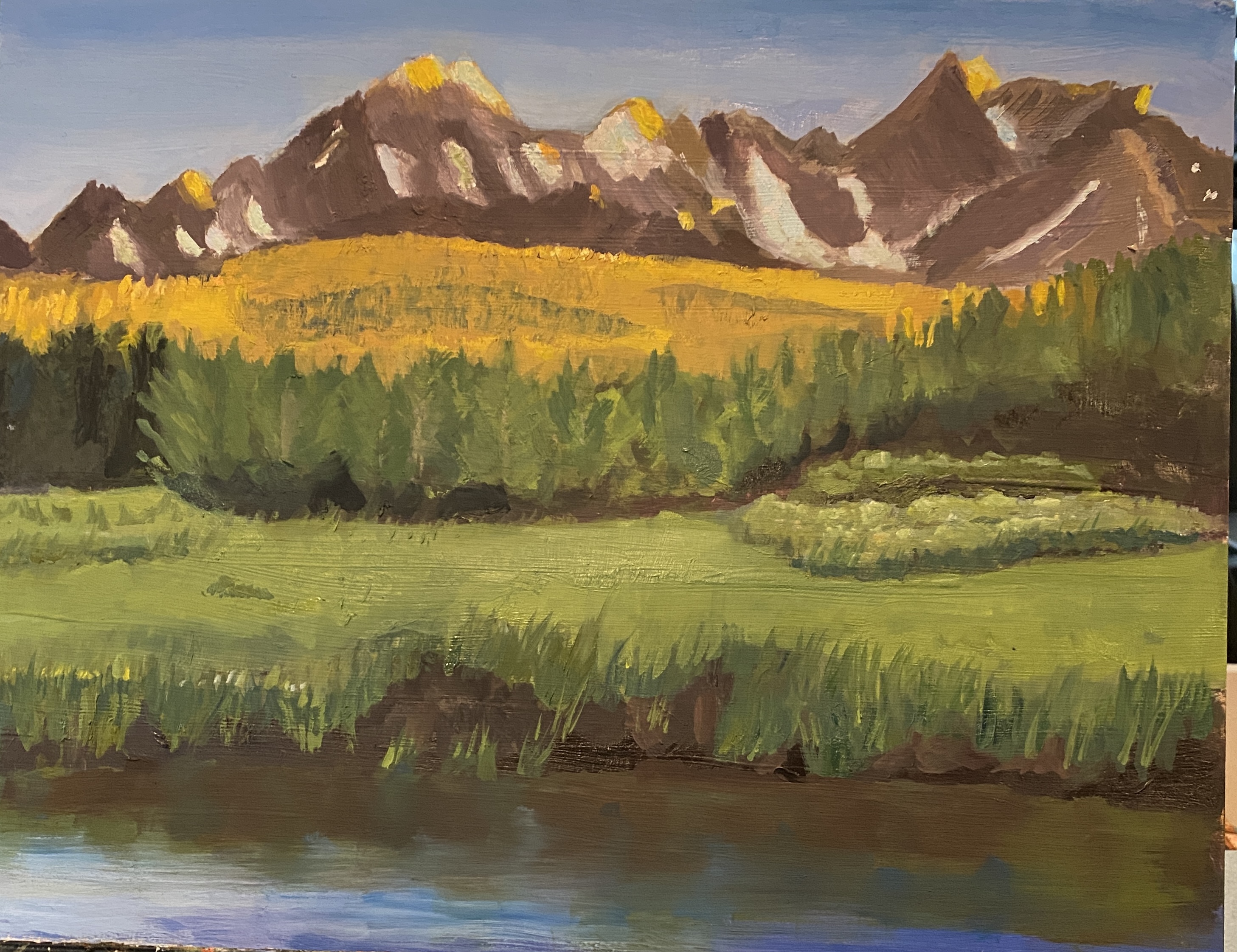
Impressionism — experiment

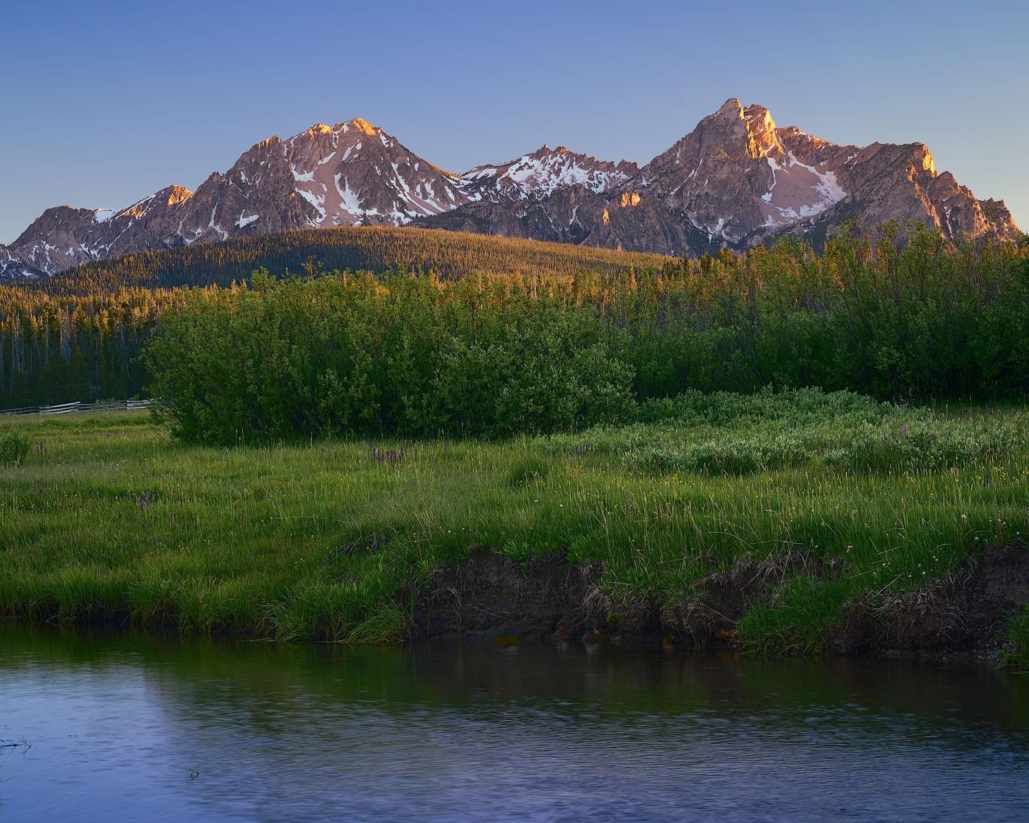
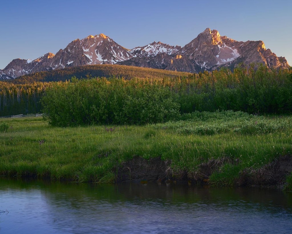
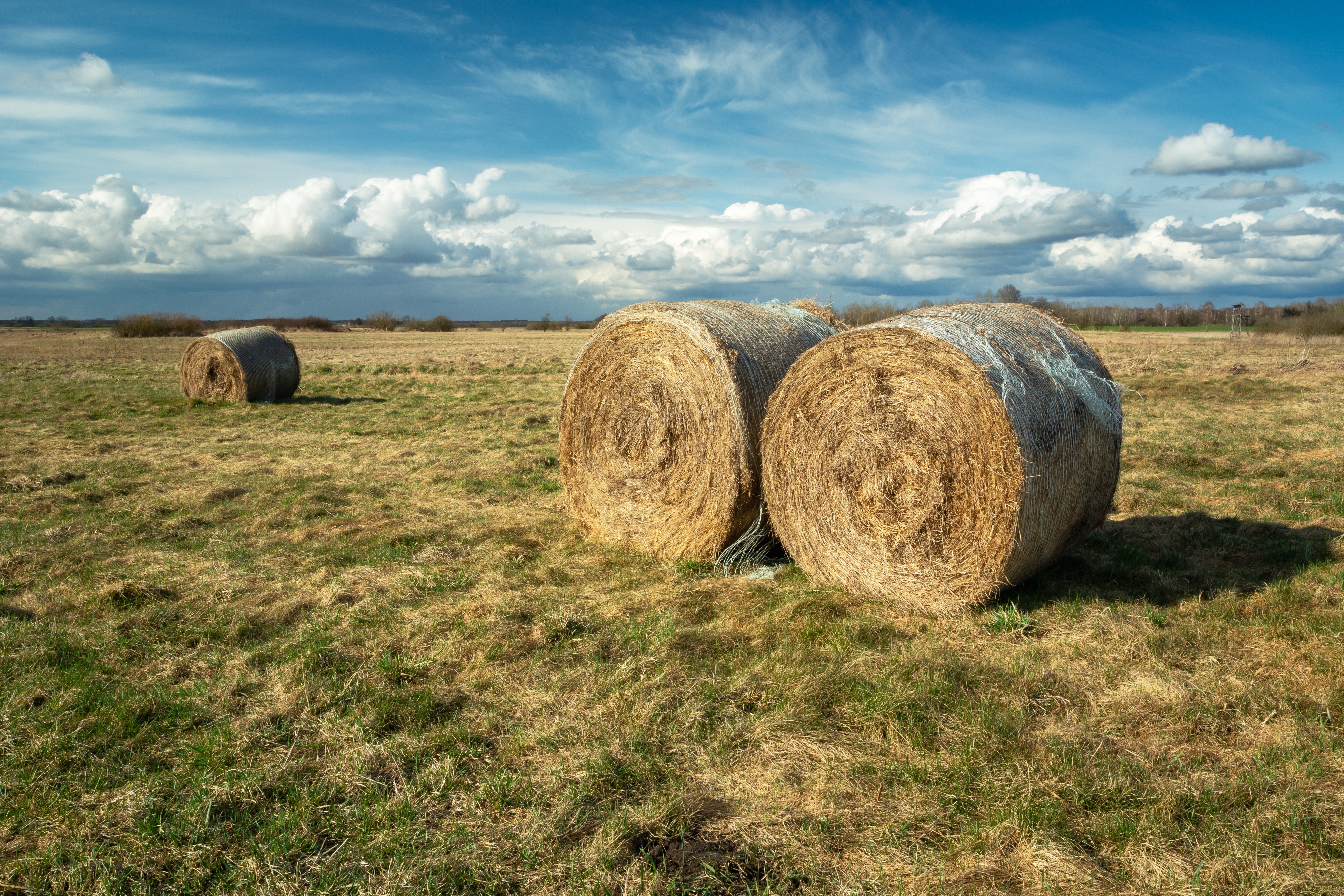
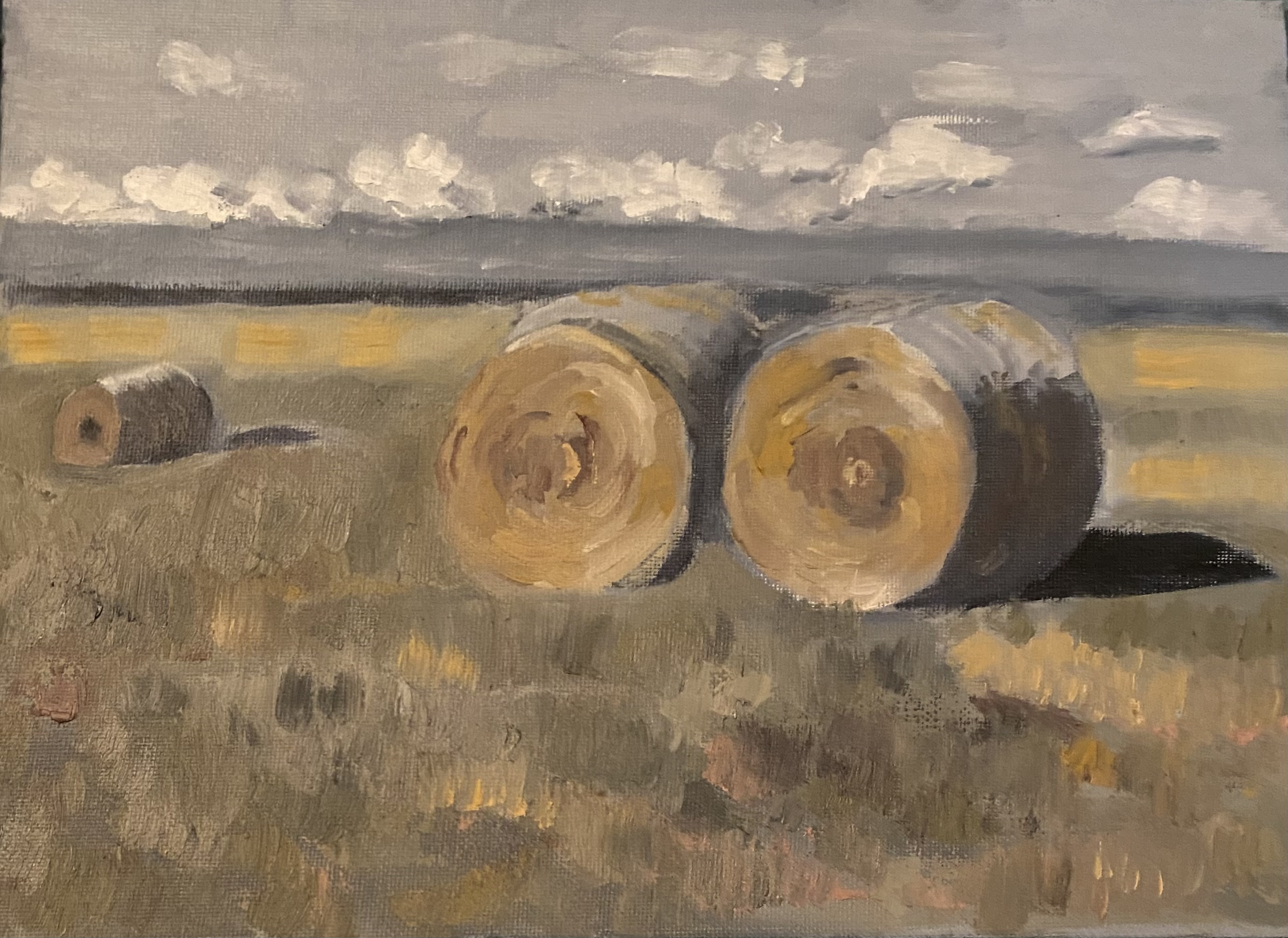
So as i indicated in my last post, i’ve been wanting to play around with painting in a more impressionistic fashion — at least for this experiment. That would mean painting in a much looser manner than is usually the case for me. Also would mean experimenting with different brush strokes; at times different brushes; and working with thicker paint. The original reference is shown in my last post. I didn’t want to try to copy that in an exact fashion, but i love the colors, and wanted to try to replicate some of them. Had a good time with all of this, although i had to force myself to not go after too many details!

I used bristle brushes instead of my usual synthetics. Also had to pay attention and use much thicker paint than i usually do, as that was required in order to “get” some of the brush strokes.

Calling it done

Most artists i know struggle with when to say enough is enough, because there is always more to do. Nevertheless, sometimes it’s clear that if you persist, you get into the land of diminished returns. That’s where i am with this painting. I’m pleased with much about the way it’s come together. But some parts — namely those trees (!) just don’t fully cooperate. So i’m going to give the whole thing a break. I’m going to make it a priority that over the next few months i will study how to improve my painting of trees.

What i worked on the past couple of days was: (1) the snow/sun reflections on the mountain tops — toning down that yellow; and (2) tried to make some of those trees in the front row have more of a sense of depth.

Meanwhile, i’m switching gears for my next project. I want to try doing something that is much more impressionistic than usual. I found an artist on one of my painting Facebook groups whose work i really like. I”m going to copy one of her (pastel) paintings to try to get a feel for how she does what she does. This is kosher protocol — copying — as long as i don’t attempt to sell my work without permission.

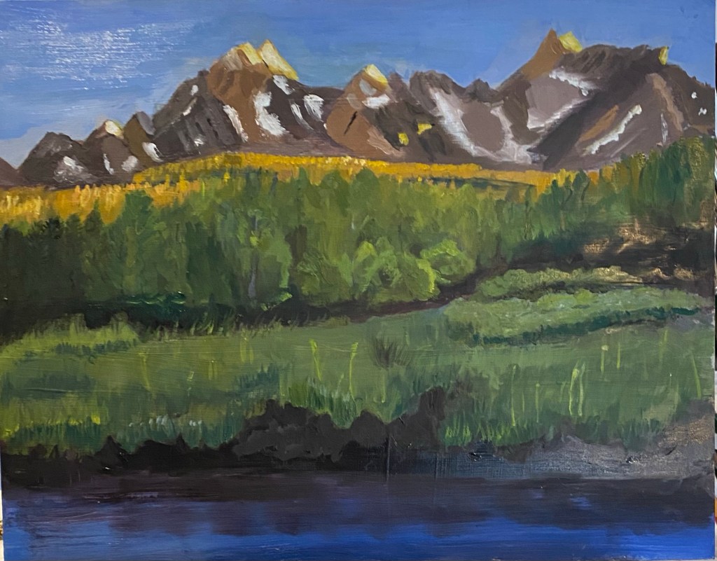
Summertime in Idaho -getting close

I was away for a couple of weeks, so just got back to this painting over the last week. The break was helpful, as at the end of it i and when i returned to the painting, i could see a number of things that needed work. So — repainted the trees. Re-did the shadow in the meadow. Did quite a bit of work on the mountain faces to try to give them more depth. Changed the shrubbery on the right side of the painting as it looked too left-brainish—-i.e., too regular – looked like two rows parallel to each other. I also added a few spots of light yellow to the tops of some of the grasses to suggest wildflowers.

Revisions – Summertime in Idaho

It’s taken a while to make much progress on this painting because i was away for 3 weeks, so got nothing done during that time. Meanwhile, since i returned,

the project has undergone some pretty significant re-doing, although it is still not done.. At one point i was going to start over with a fresh canvas, but then i decided to at least make an attempt to make corrections/revisions on the original canvas. So — i repainted parts of the mountains and also changed the color to something more in the direction of red. i painted out the whole bottom half of the field and also most of the trees and reworked that large area. then i tackled the bottom front of the painting, reworking the water and the plants.

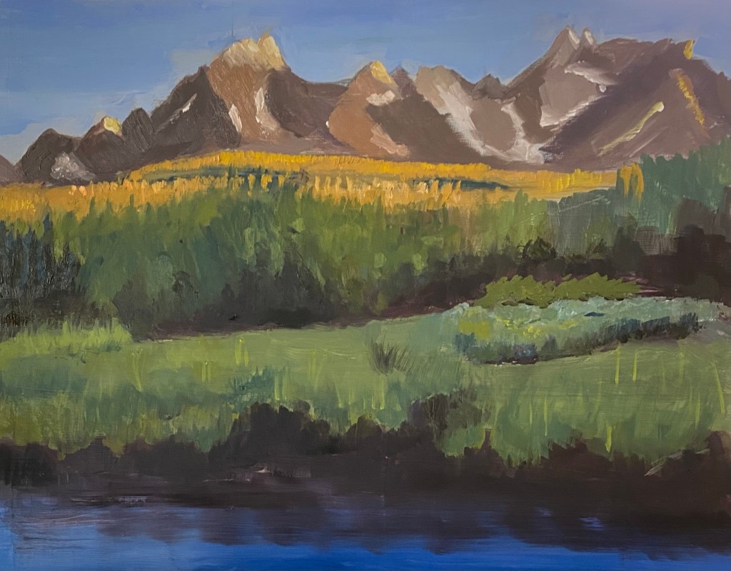
Some Progress

I was hoping that i could finish this project by this week, before we leave town (and country) for almost three weeks — partly because my palette will have pretty much dried up by the time we return even though i keep it in the freezer . But — that is not to be. So — i worked on almost all parts of the painting over the past week or two. The most challenging part for me has been trying to get the bushes to look more realistic without resorting to too much detail. the mountains got a couple of doses of more layers and more snow; still could use more lines to indicate depth.

Summertime in Idaho

I think it’s been close to a month since i posted anything on this blog. We were away for close to two weeks, and before and after the trip i did a couple of small class projects.

This week i began a new painting, and its “in progress” state is attached below. The block-in is done, and some of the detail. We’ve been learning about the Spanish artist, Sorolla, and his use of color with a limited palette and values. I’m experimenting with some of these ideas here, trying to “push” both the warms and the cools.

Completing the experiment

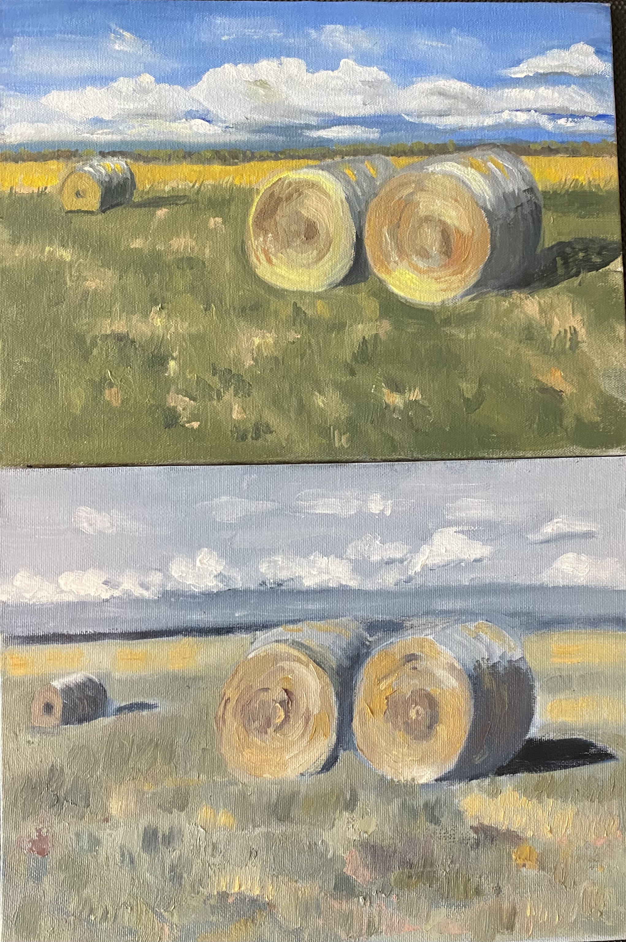
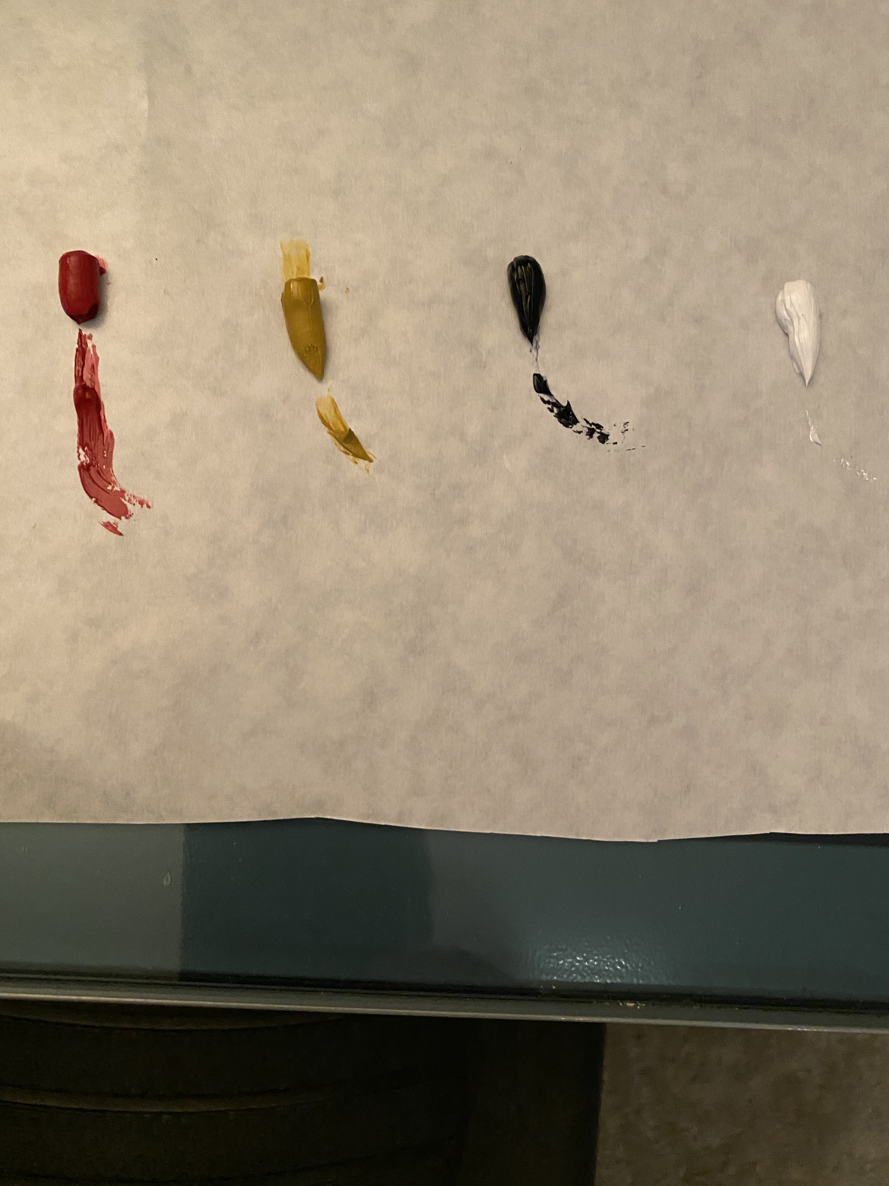
Last time i posted a photo of a painting in which i tried experimenting with a very limited and nontraditional palette. The colors i used were: payne’s gray (in place blue); yellow ochre (in place of a more common bright yellow) and quinacradone red (a dark red); and titanium white.

Following that project, i painted the same scene again, and again with a very limited palette — but this time with more traditional colors. So for the newer one i used ultramarine blue; cad light yellow; and cad red light —- and titanium white. The results are shown below. Notice that i still had to create my own greens and browns and grays, but the overall effect is more vibrant piece.

6 x 6’s

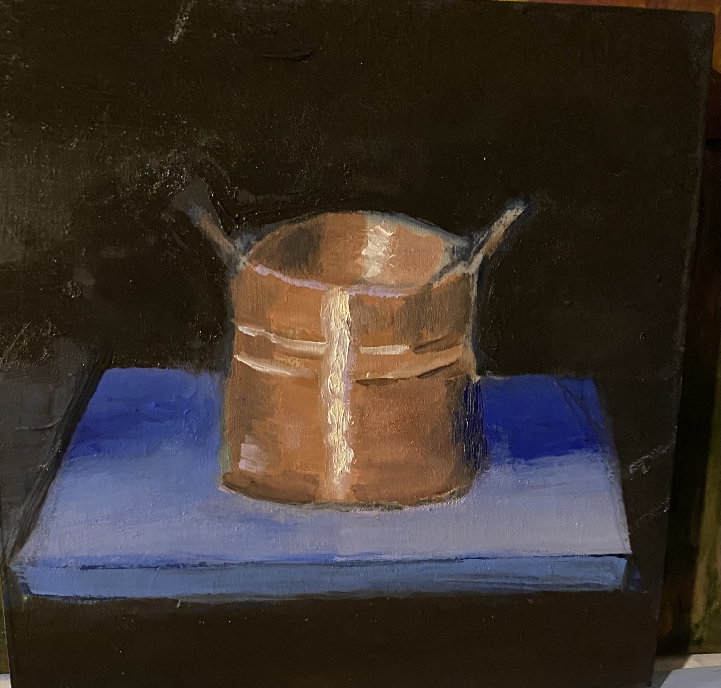
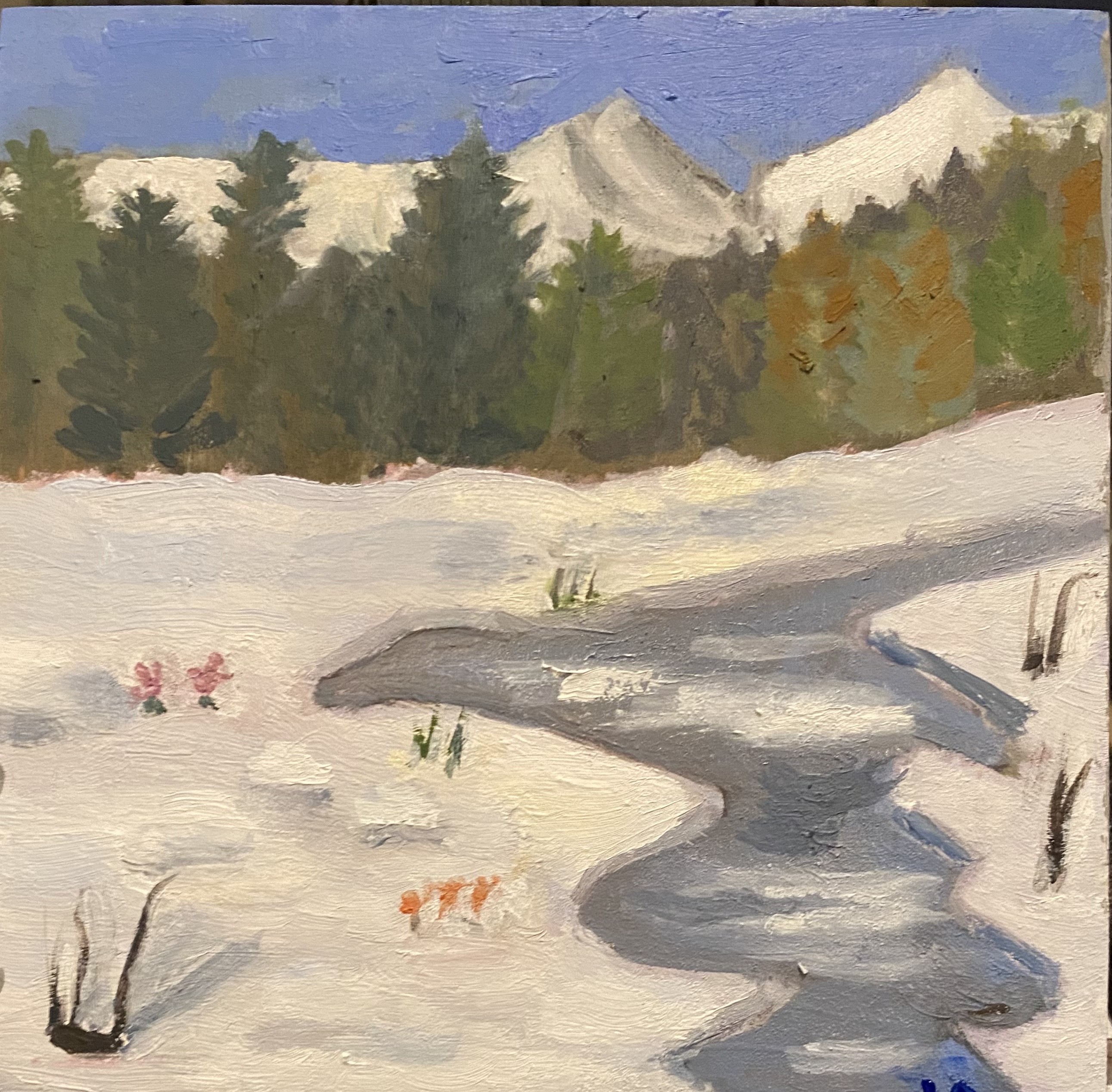
Here are two recent little paintings, each 6” x 6”. the gallery where i take lessons offers a community show twice a year. Anyone can enter, and you can do a painting, fabric art, whatever. Only limitation is you have to use these small cradled panels. This time i decided to try for one landscape and one still life.

Copper Kettle

After an early spring snow.

Experimenting with nontraditional limited palette

Over the past couple of weeks i’ve been playing around with using a limited palette. For quite a while, now, i’ve tried to limit myself to using the three primary colors —- red, blue and yellow; and white. From these colors you can create almost any other color. This past week, following a discussion in our painting class, i decided to try doing a painting using only three colors plus white, but not the traditional primary colors. I chose Quinacradone Red, Payne’s Gray, and a yellow ochre, plus a titanium white. I knew going into this experiment that i could forget about getting a true blue or a true green. And my teacher had said to expect to feel a good deal of frustration at the limitations. Actually, though, i had quite a good time with this one. So below i will show the palette, the reference photo, and my not-quite-done painting.

Reference photo

Still Life

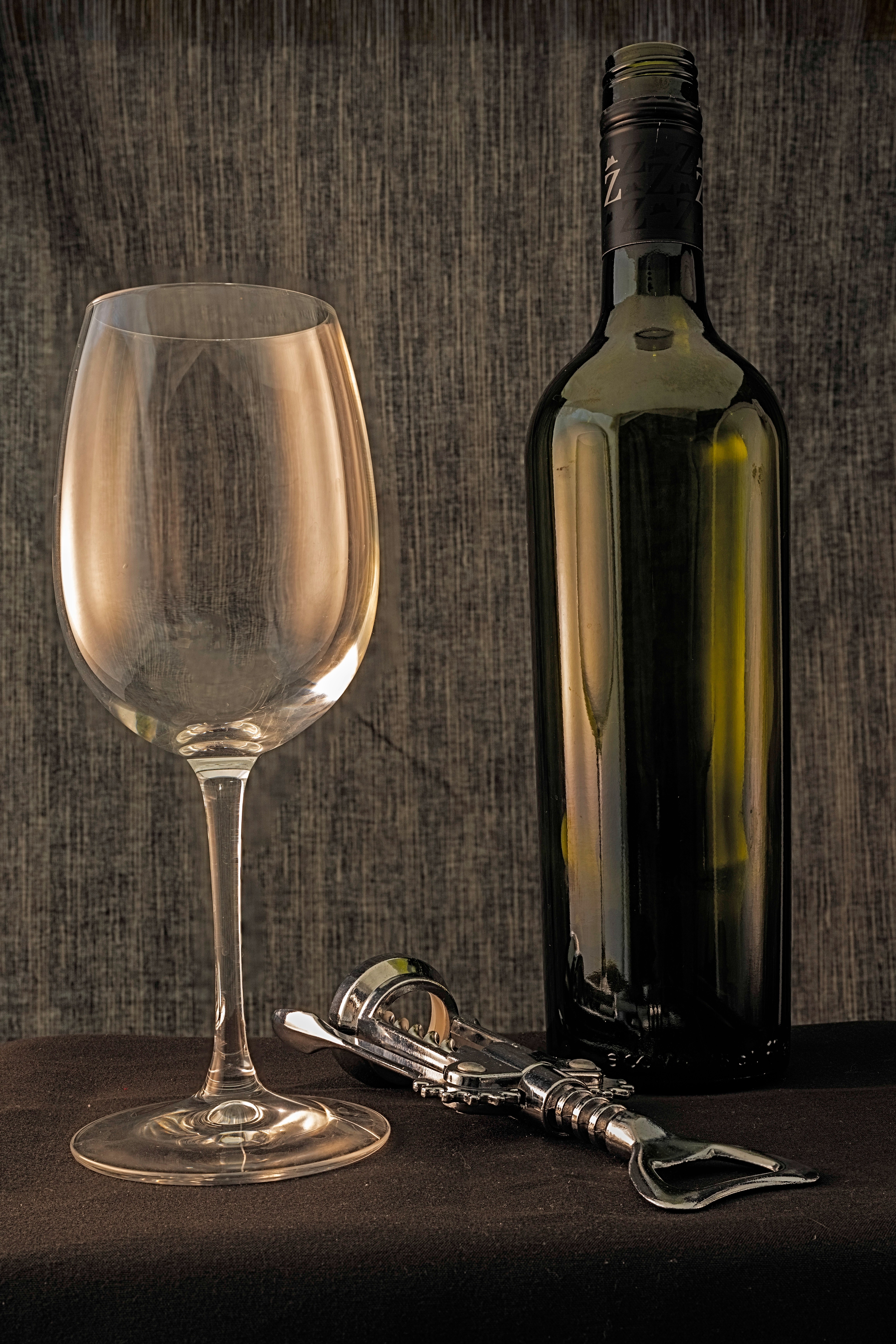
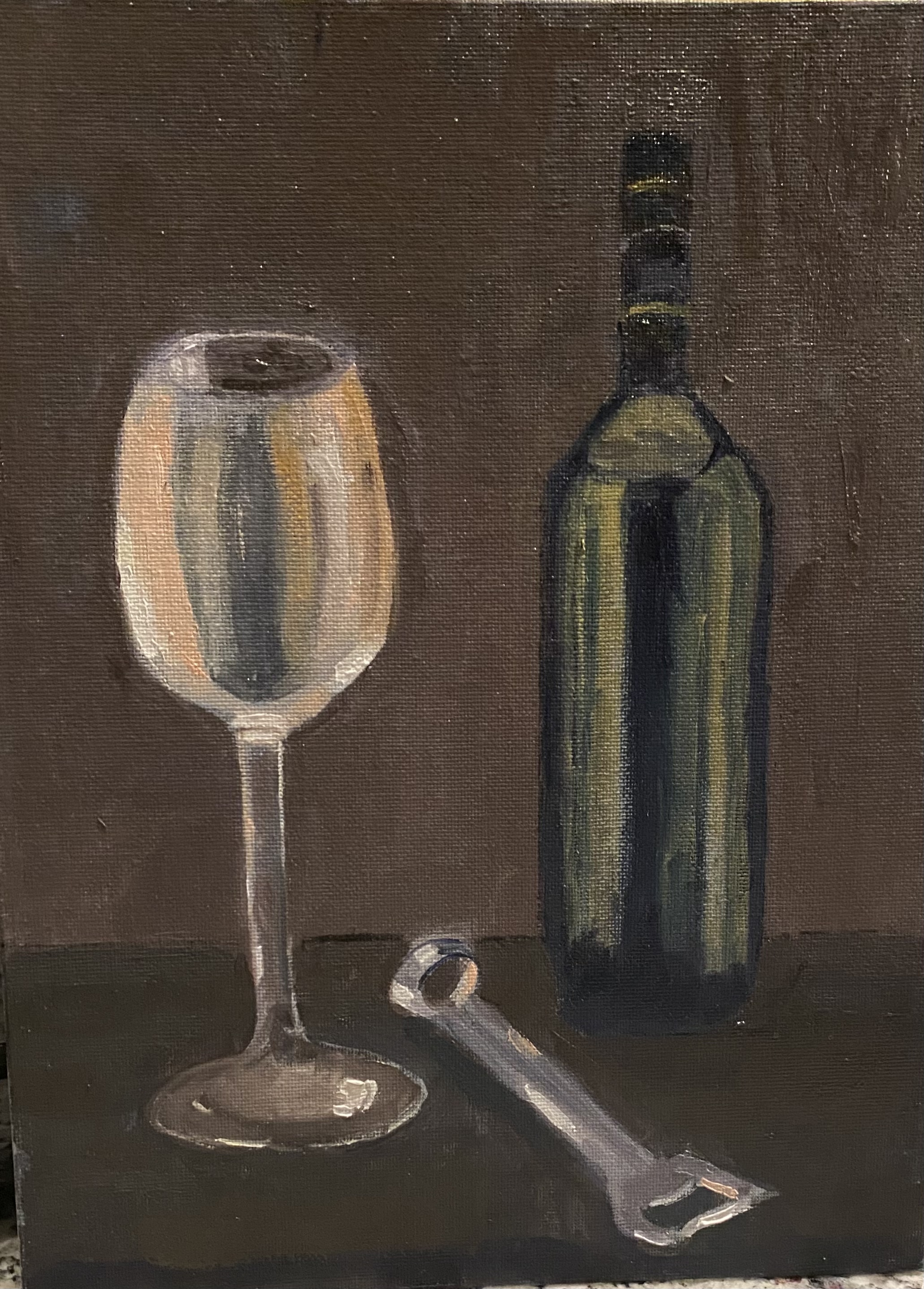
Recently i’ve been playing around with a few still life setups, to try to learn a bit about painting glass and metal. teacher talked about relevant issues in class, and i did a couple assignments with glass bowl and copper mug. Then i decided to try one at home on my own. Norma had equipment for a set up with a light box, and i used that. Dark material surrounding the ”subject”: a wine bottle, a bottle opener and a wine glass. With focused light source the reflections were everywhere and it was not going to work to try to take a photo. So ended up with much more diffuse light source. You can see that there are almost no shadows showing. Also, note that when you look at the reference photo, the bottle opener is quite different from the painted one. That’s because the ”real” one was just too complicated to pull off — would’ve taken me a long, long time to get that one with all its parts.

Reference photo for still life