“Beating the heat”

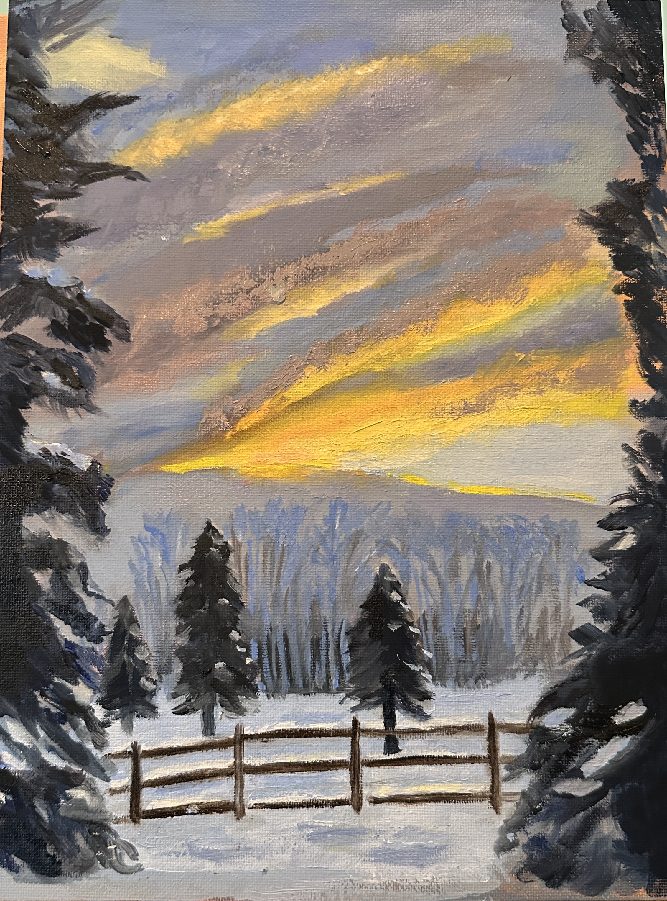
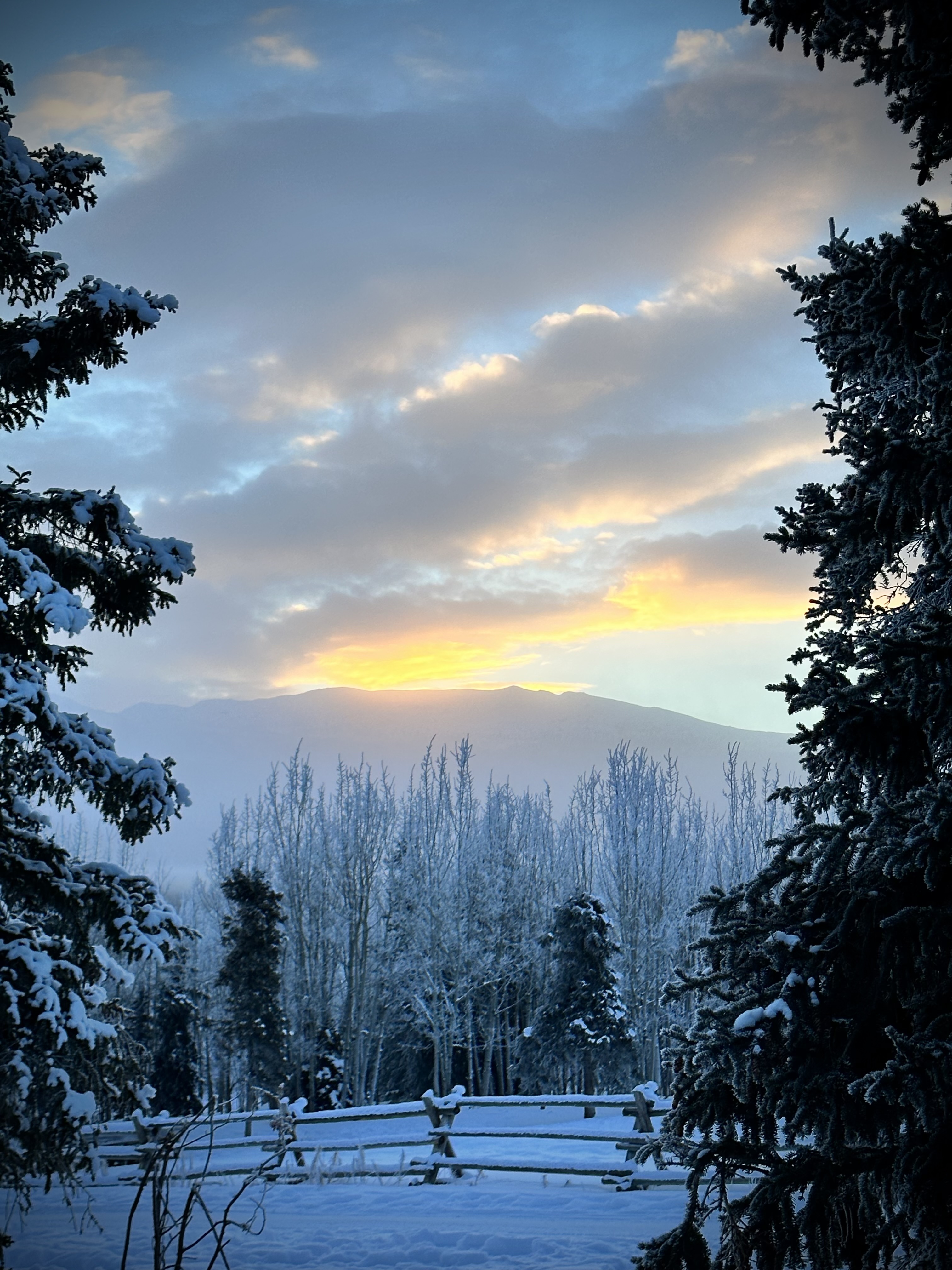
It’s the end of July and that means it’s hot. Here in Colorado we do not have the same heat issues that are literally killing folks in Texas and some of the other southern states. Nonetheless it is certainly hotter than it used to be here, even in the mountains. So i decided it would feel good in this weather to at least be thinking about snow on a canvas. So i painted a scene from a reference photo Norma provided from her photography workshop in January in the Yukon. So — Yukon in January vs. most of U.S. in July. Painting not quite finished, but close enough, i thought to post. I’m titling it “beating the heat.”

There are always technical issues and challenges when painting snow. One of the most frequent is the fact that snow, which we see as white, is actually a combination of colors, esp. blue. For this project, there was the challenge of the snow, the mountain and part of the sky all sharing similar values. So i had to figure out how to delineate the trees in the background from the mountain behind, and then not have the values of the snow, the mountain and the trees not be too similar but also not be too contrasting. My “solution” for the trees is perhaps a bit fantastical, but for now that’s the story.
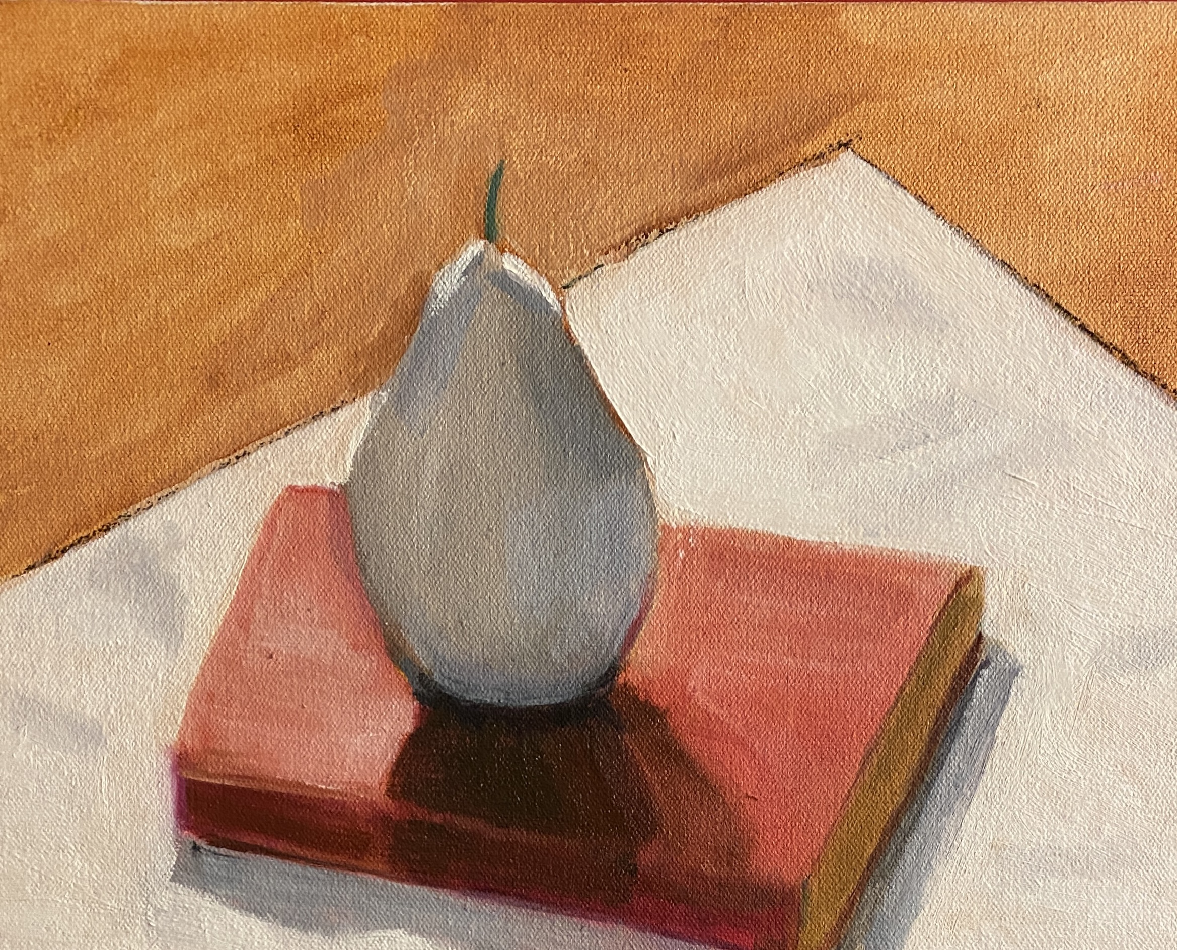
Light and shadow practice — a still life.

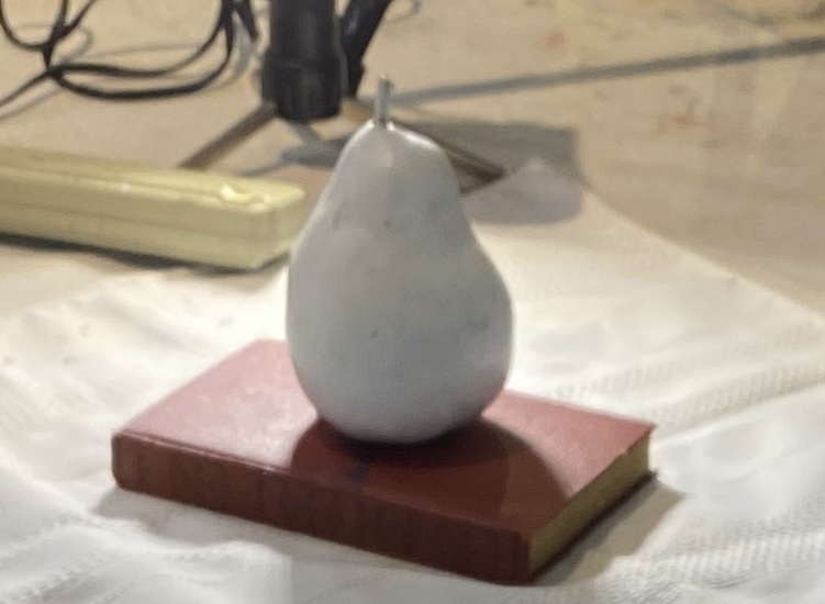
This month our focus in oil painting class is on light and shadow. Teacher set up a still life for anyone who wanted to work on the composition. I did the initial drawing in class and then brought it home to paint. Among other things, we needed to pay attention to direct and indirect light; reflected shadow lights and cast shadows, half tones, etc. etc……. I attach my reference photo and my painting.

Note: Teacher had painted the pear white.

9” x 12” —Oil on board.

Plein air- plus

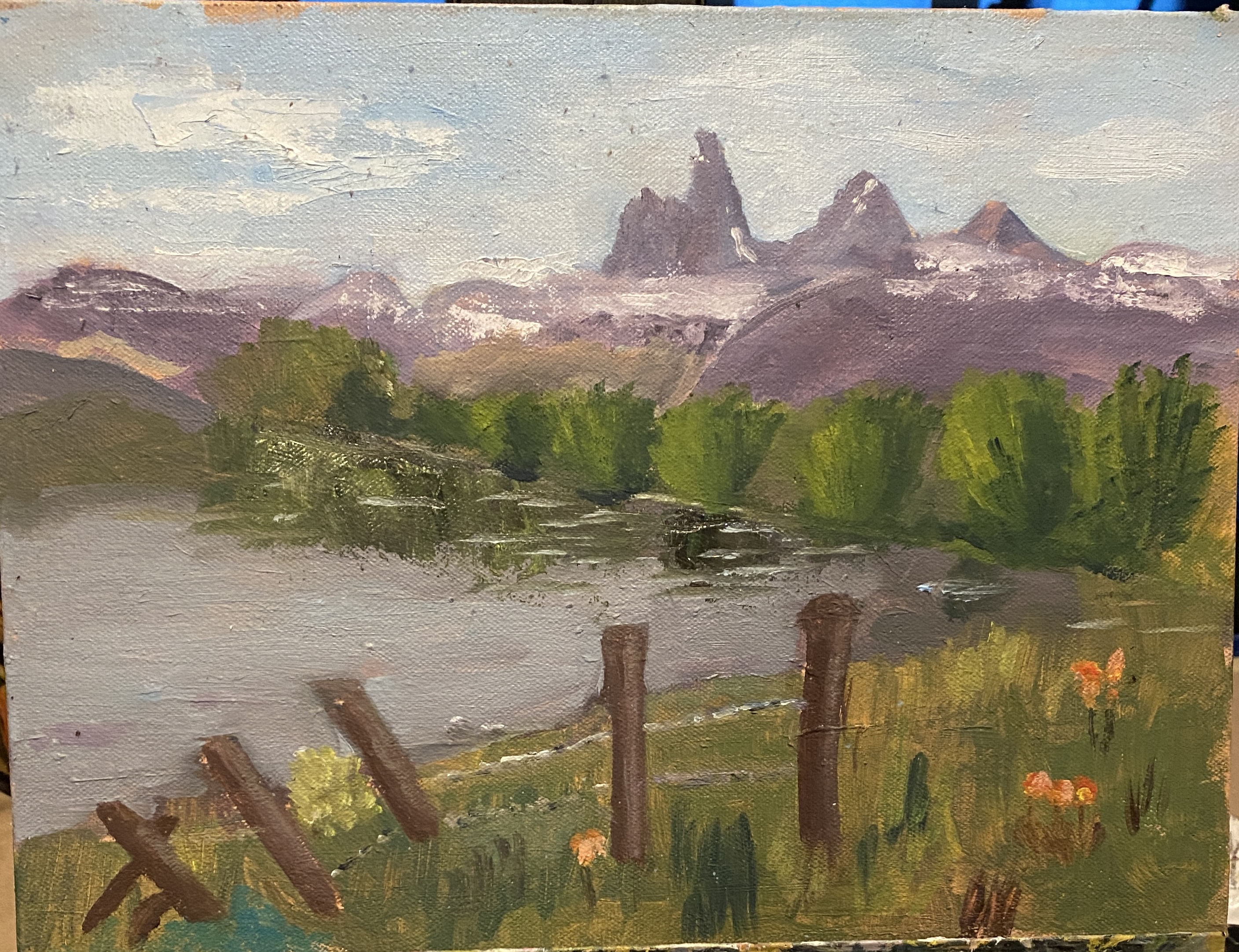
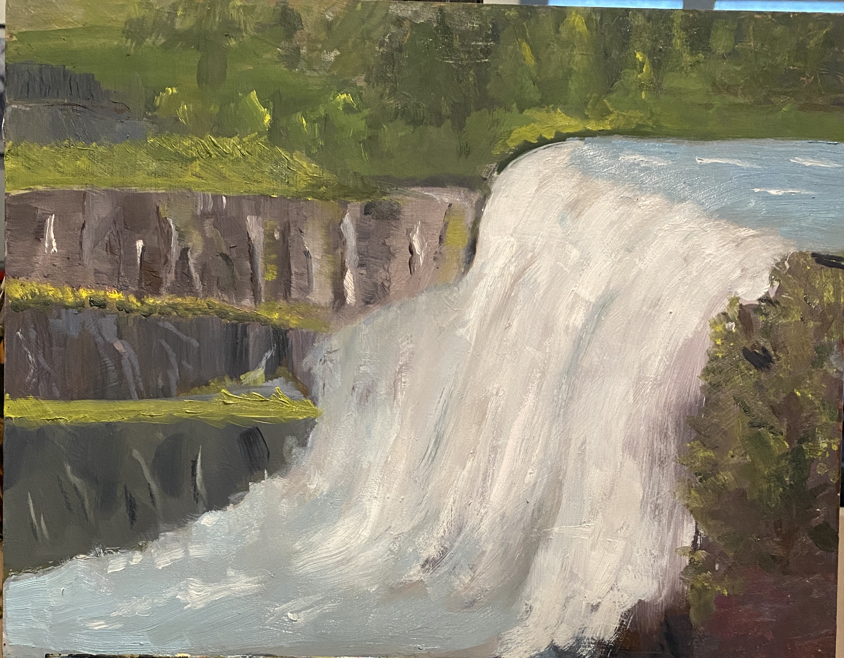
A couple of weeks ago i participated in a Plein Air workshop (oil painting) in Idaho. The original idea was that we’d be painting the Tetons. It was a 3-day workshop, and for days 1 and 2 we never saw the mountains as we were socked in with clouds and rain. So one day we went to a beautiful forested state park where we painted a fabulous waterfall. On day 3 the sun came out, we saw the mountains, and found a lovely place from which we painted. So here i attach two paintings from that adventure. In the one where you see a lake in the foreground and the back of the Tetons in the background, the painting is result of 3 or 4 hours’ work, all outside and on the same morning. (9” x 12”, oil on panel).In the other painting (the waterfall) the project was more complicated. I worked on it on site for a couple of hours and then spent a few more hours in the studio. (11” x 14”, oil on panel). It still needs some work but i decided to go ahead and post since it’s been a while.

It’s been tempting to do some work on the mountain painting. Most parts just have one layer of paint. All sections could use some careful attention. However, i wanted to post just what i did in the field that day.

In Rio Rico, AZ

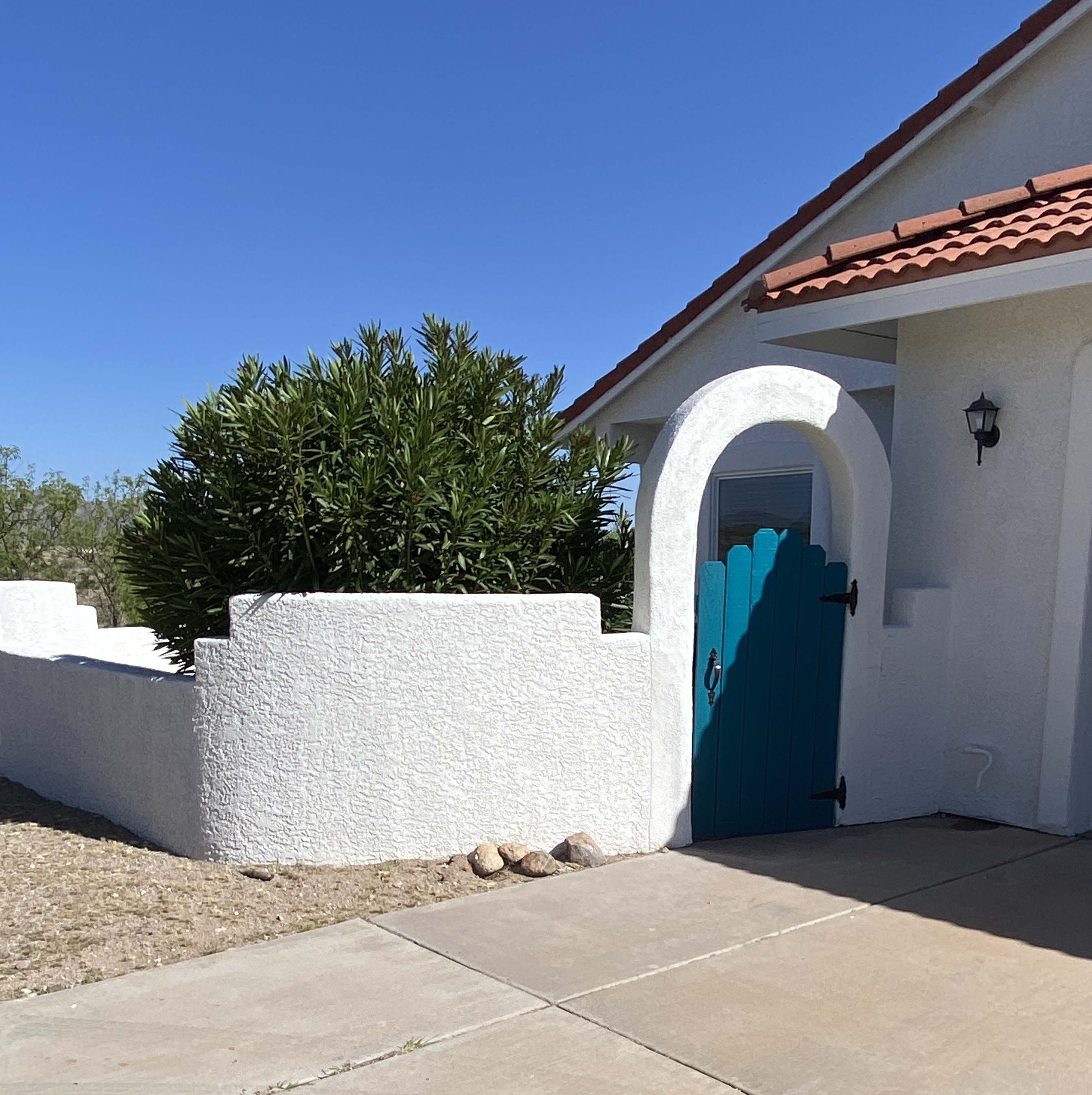
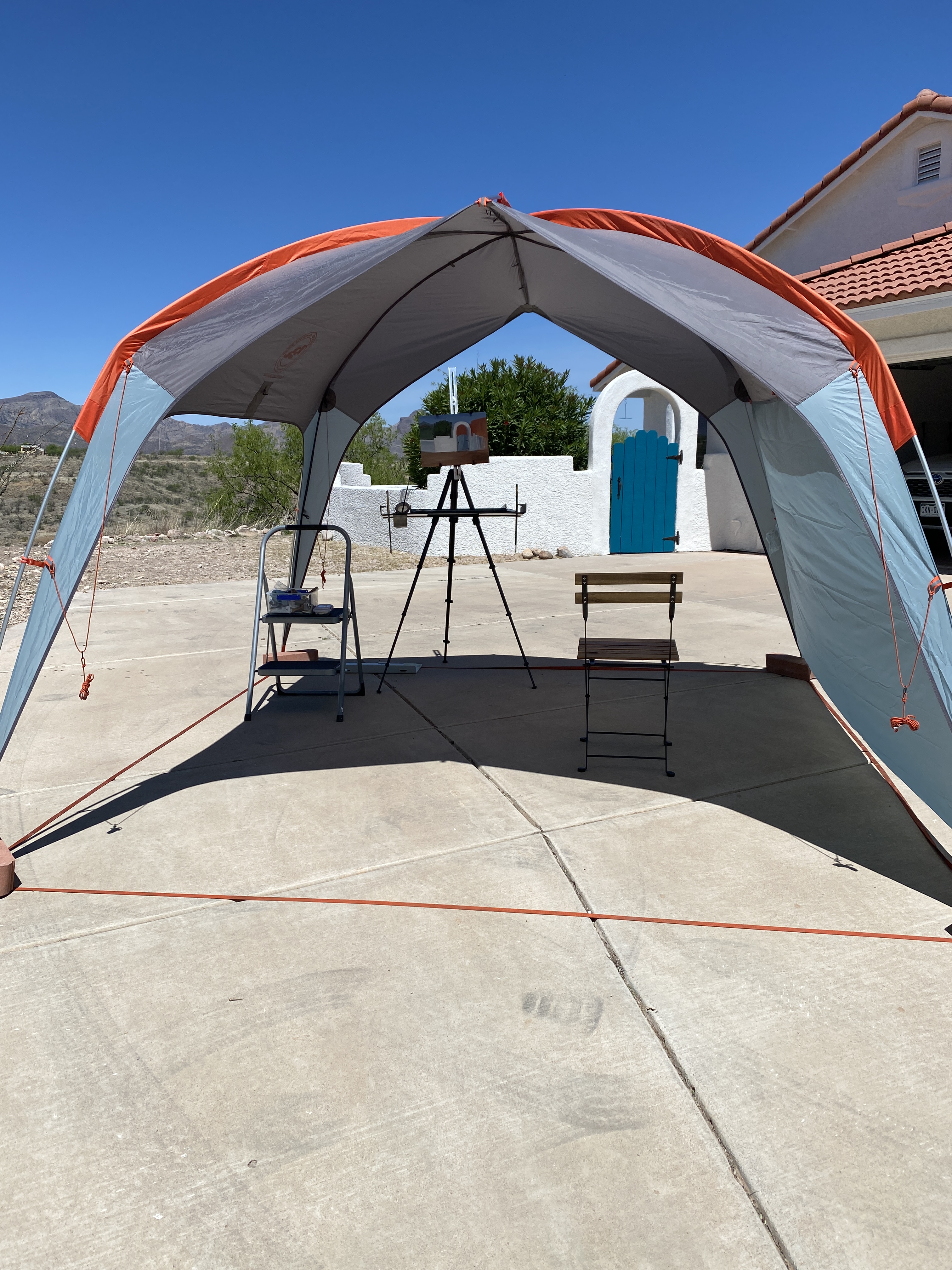
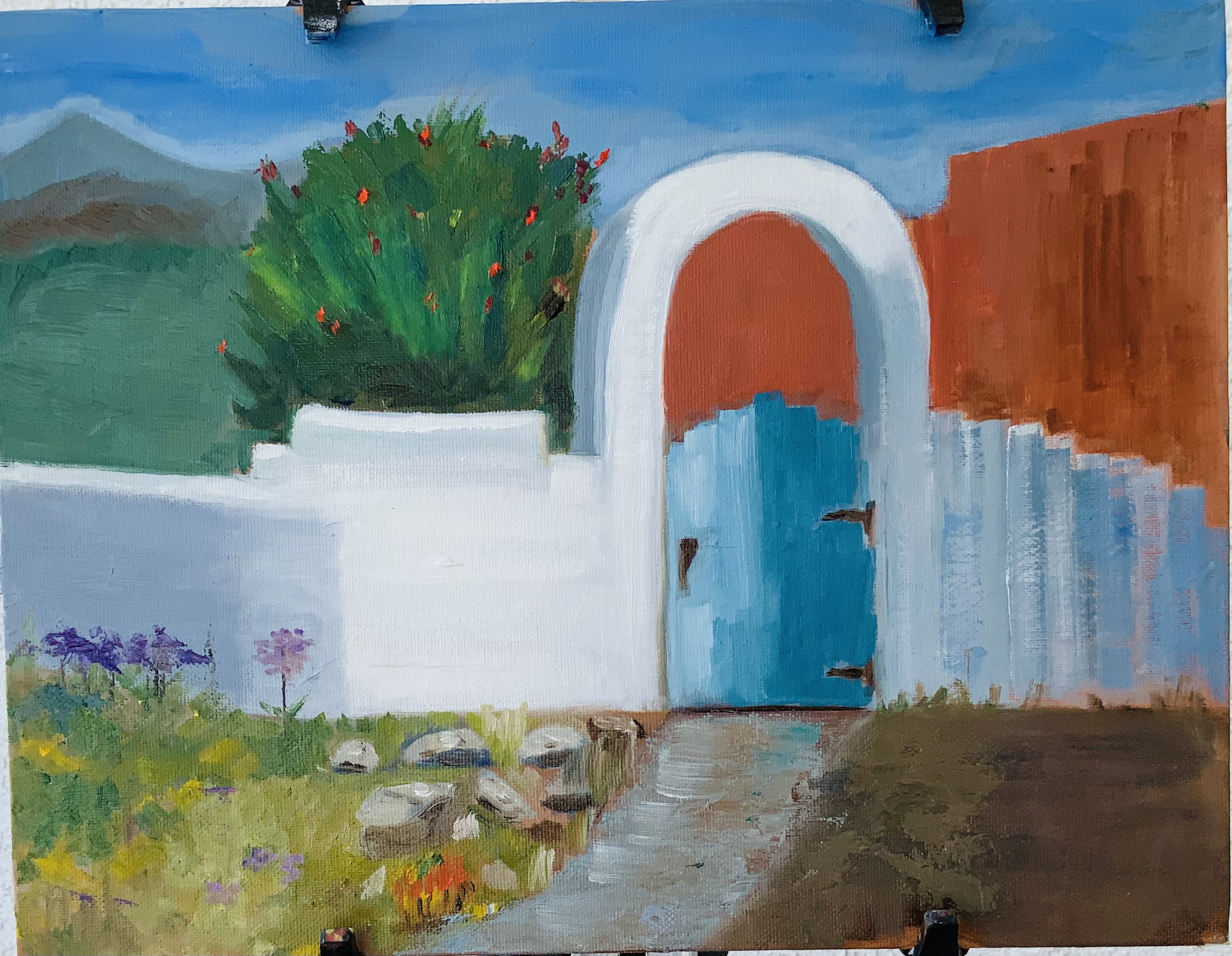
Last week and this week we are in a little town in Arizona called Rio Rico, which is near Tubac and also just north of the border with Mexico. It’s a long way from Colorado, both in miles and in weather. We are staying in a lovely rental home. I really like the colors of the entrance to the house and decided to paint that scene. I did make a number of changes, thanks to artistic license, but still focused on the gate and surrounding fence area. I’ll attach both the reference photo and the tent/shelter Norma set up for me as protection from the Arizona sun.

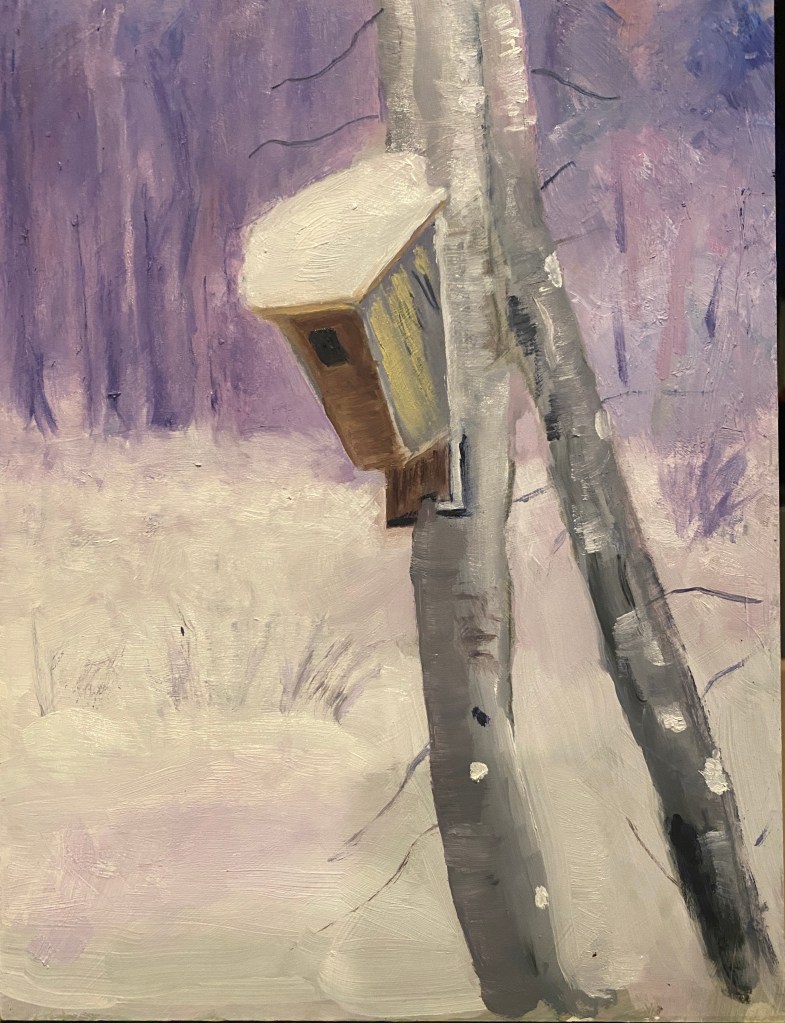
Bird house in the snow

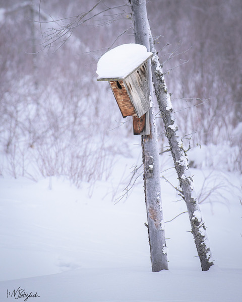
I’ve been working recently on painting with a combination of realism and some impressionistic ideas. This little bird house is from a photo Norma took in the Yukon a few months ago. (Reference photo appeared in my last blog post — the one about abstractionism. So here i was practicing soft edges in parts of the snow, the trees and bushes; and hard edges for the bird house and the tree to which it is nailed.

Bird house in Yukon

Experiments in Abstraction

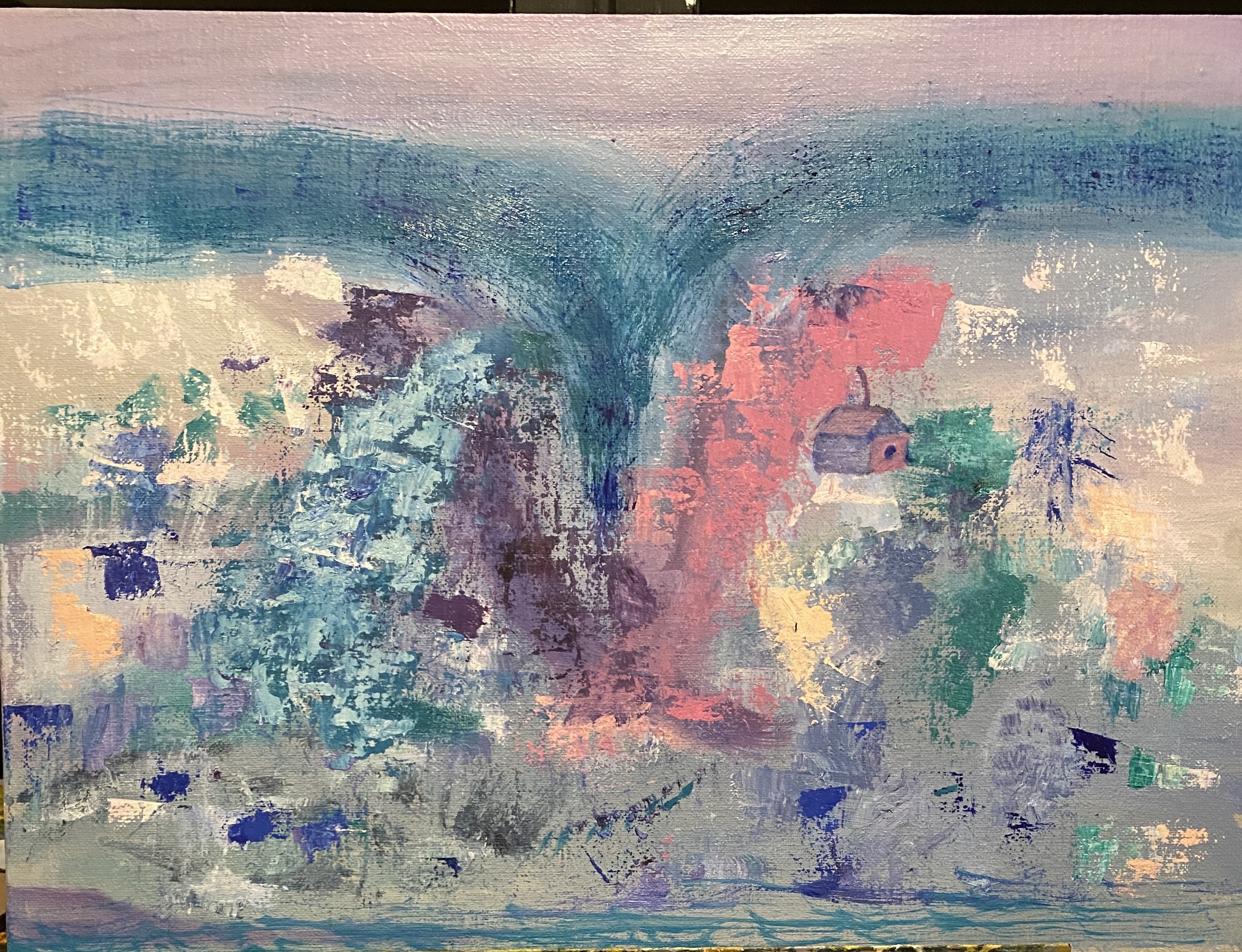
Recently, based on a suggestion made by my art teacher, i tried out a couple of different ways of doing an abstract painting. In the first, i started with an idea from a photo and then moved very far away from the object (s) in the photo. I wanted to experiment with using pretty much only colors that were close together on the color wheel — analogous colors. The colors i chose revolved around blues: purple, blue-green, etc. The more i played with the colors and the more i departed from the original shapes, sure enough: the more abstract the painting became. By the end of the experiment, i threw in a little bird house — the one piece of realism remaining. The process here was fun, but i have no interest in being an abstract purist. I do really like the original photo, though — one from Norma’s Yukon trip — so will probably try to do a more realistic painting of it sometime soon. Meanwhile, the first two photos below refer to this first experiment.

In the second, i tried something called Abstracted Realism — which to me looks like Impressionism. So in this case the idea was to take a realistic reference source and do a painting in which details are blurred and attempts at being too realistic are avoided.

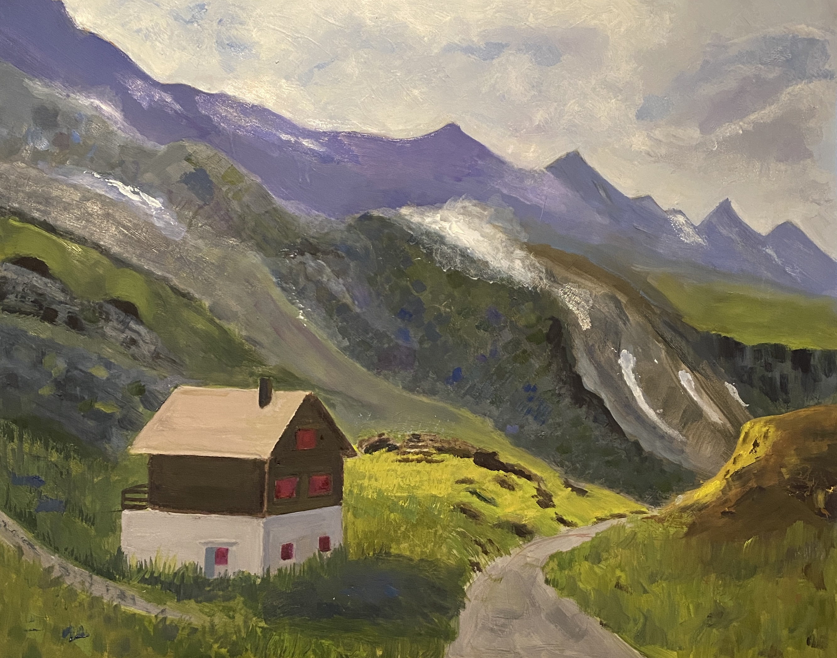
Swiss house — finishing touches

In the past week or so, since i last posted about this painting, i’ve done quite a bit of touching up and repainting some areas. I repainted the sky with a thicker layer of paint and with shapes that hopefully represent clouds with more accuracy than previously. The mountains also got another paint layer, as did the grassy hilly areas. The house itself needed some cleaning up of angles and lines. It’s not perfect, but it is better. The final challenge was adding mist to the mountain and hilly areas. I tried a couple of different techniques. Nothing worked in quite the way i’d imagined, but i think it’s close enough for now.

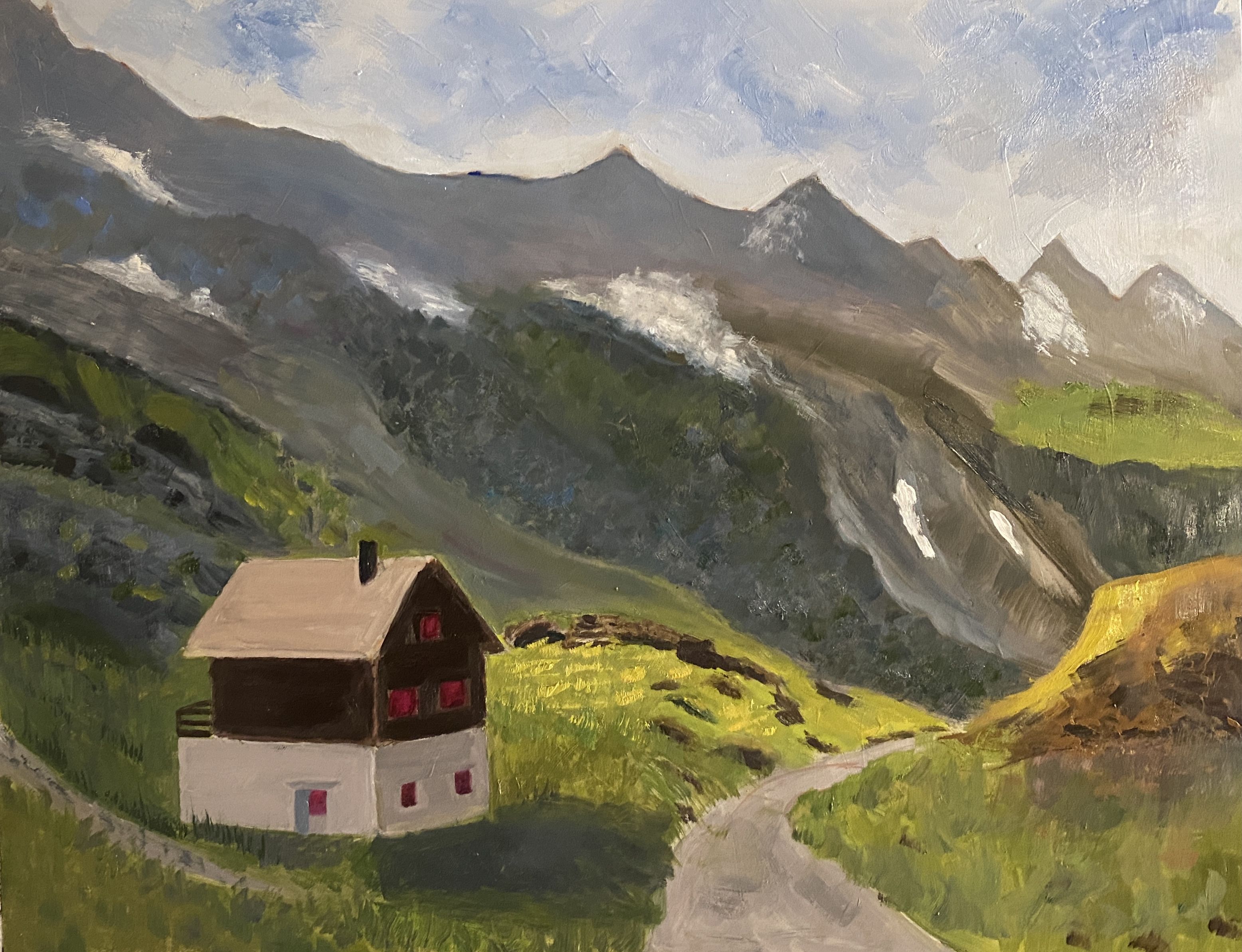
Swiss House

A few weeks ago i posted photos of a small color study i’d done in preparation for a larger painting. The color studies were 6” x 8”. In contrast, the larger painting is 16” x 20”. I’ve attached a photo of it below. The painting is not finished, but it is far enough along that you can see what some of the challenges have been. In the beginning of the work i focused first on just blocking in big shapes and then gave most of my attention to painting the house. It was kind of a shock to be working on a panel so much larger than those i’ve been doing for the past year, so i had to think differently about getting all the dimensions. After the house seemed to be off to a good start i gave a lot of thought — and a lot of paint (that’s another thing i’d forgotten about while doing smaller pieces) to the mountains, and how i wanted to present them. Anyhow, most parts of the painting still need work, so i’ll probably post again when i deem it finished — or at least as finished as i can make it.

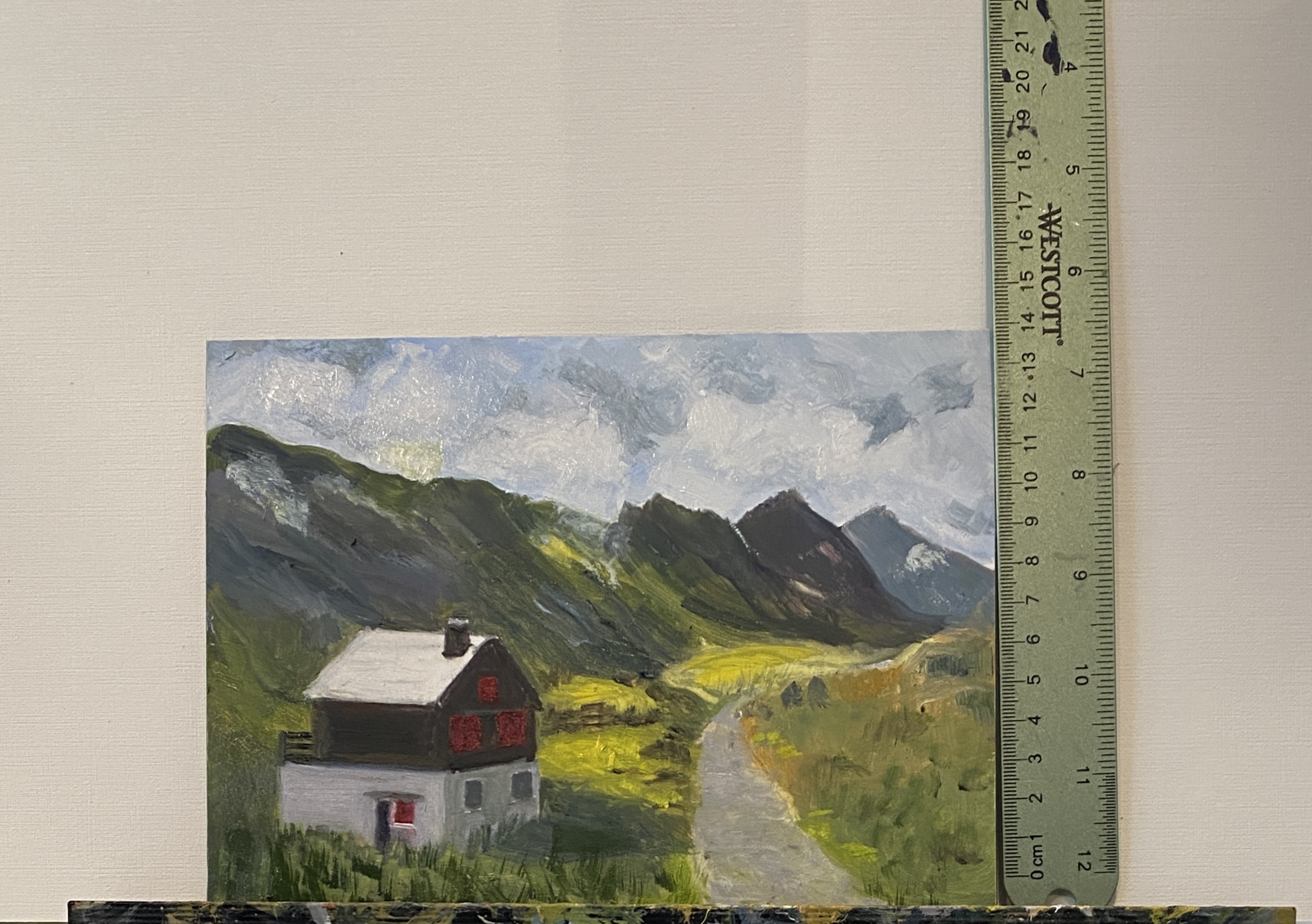
Color Study — Corrections

Thanks again to my viewers who pointed out some problems with my little color study. I’ve tried to correct those. Here is the corrected version. I”m aware there is still work to be done, but i need to decide whether or not i’m going to proceed to make this into a larger piece.

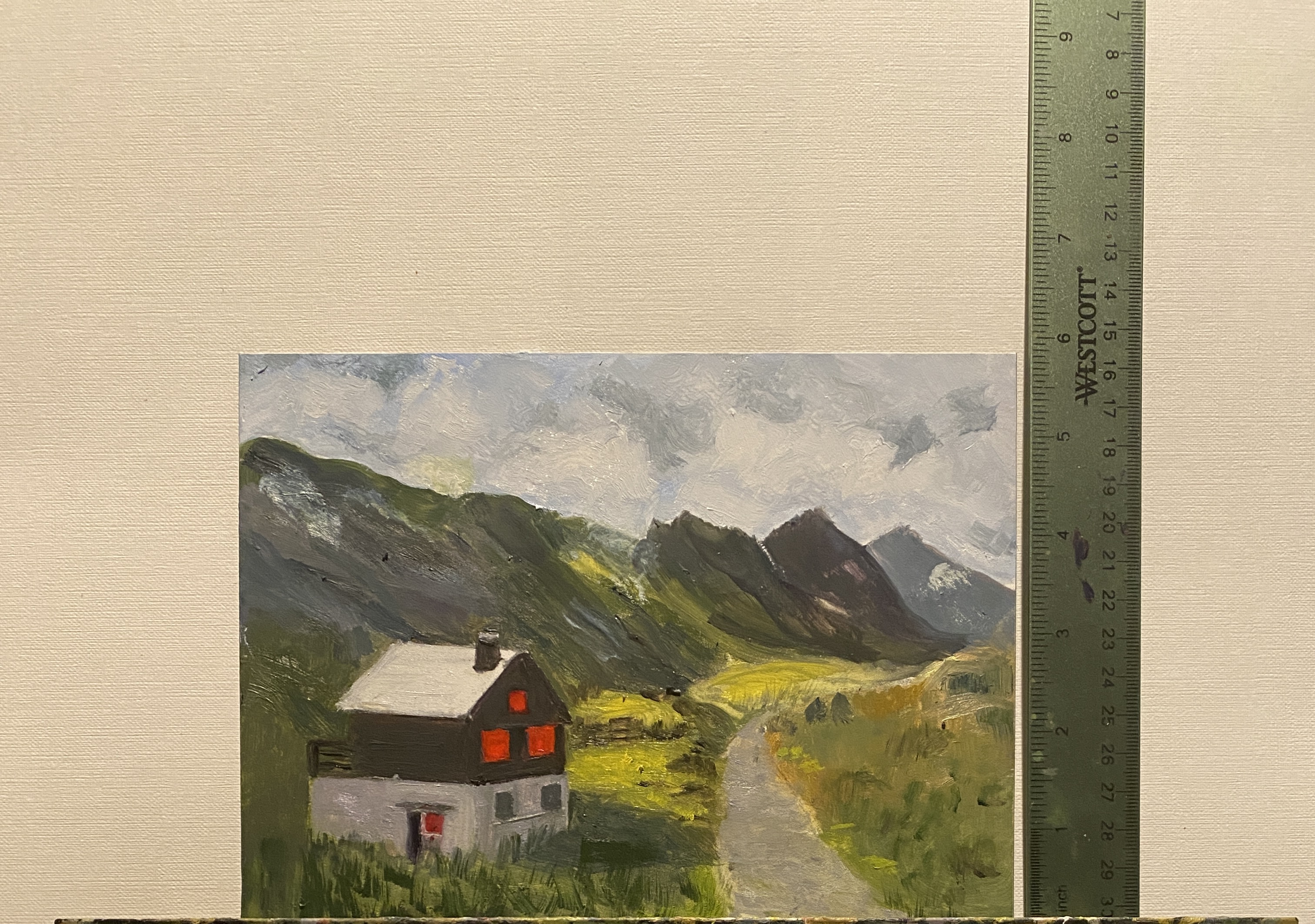
Color Study

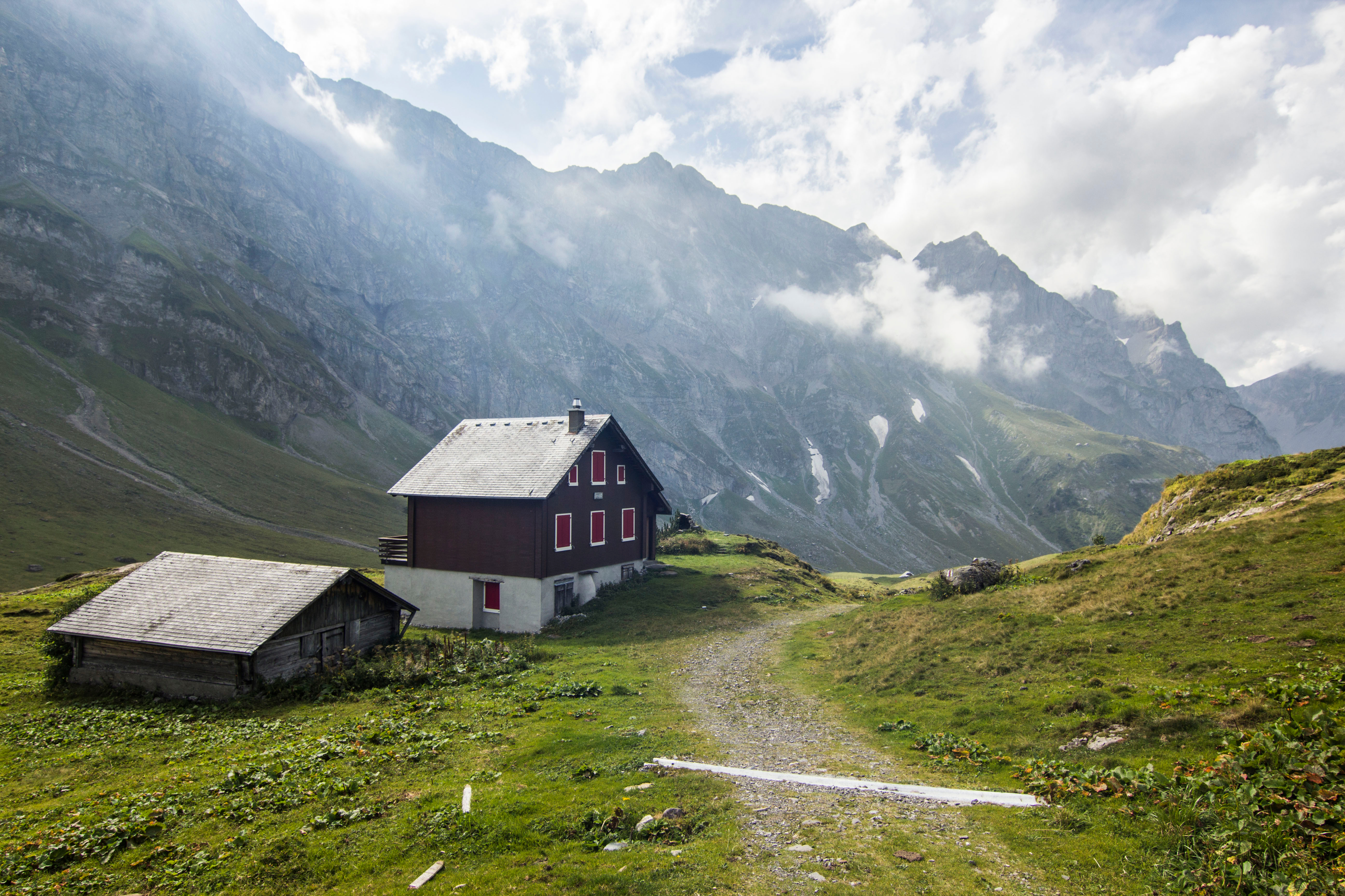
For the past couple of weeks i’ve been working on a small color study with the idea that the work would then be used to create a much larger painting of the same subject. We were also, in class, working with 1- and 2-point linear perspective, and teacher suggested that we select a subject where we could work on the perspective issues as well as developing the color study. I’m attaching below both the reference photo and my little study. I did make some changes to the composition, as i didn’t care for one of the buildings in the reference photo.The color study was painted on a 6” x 8” board. this was a good exercise, especially as the color mixing work is now done if i go ahead and paint a larger painting of the same subject.