Experiment in Abstracting

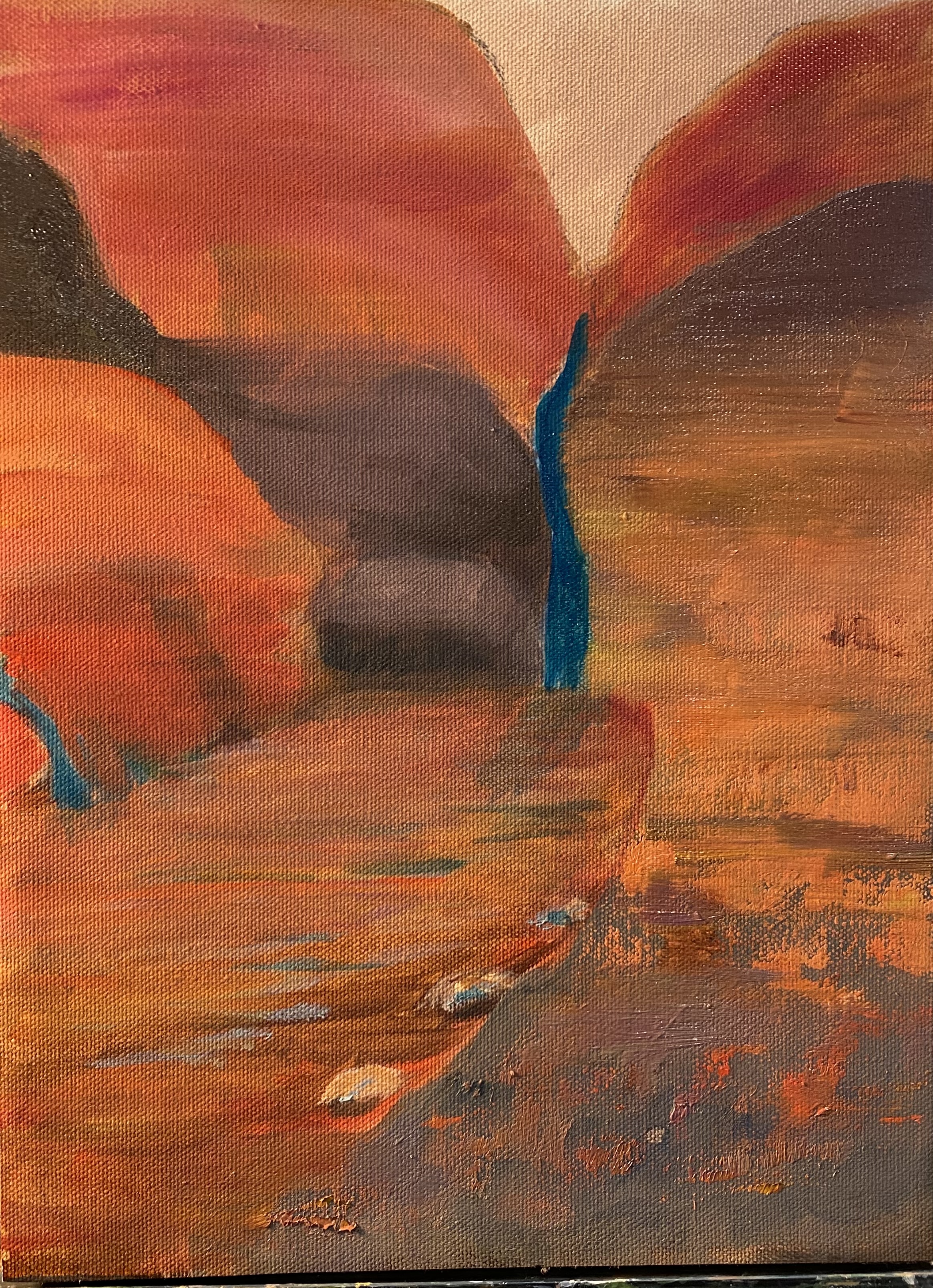
In painting class a couple of weeks ago we were given assignment of using a photo of something realistic and turning it into an abstract painting. I chose a scene from the mountains along a river .
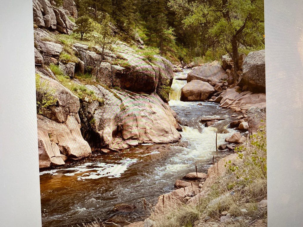
I first decided I would use colors mainly on red end of color spectrum- in keeping with the work we had just done on analogous colors. I did add some grays ( the browns really are part of red family) but soon decided that rocks were too close to really looking like rocks
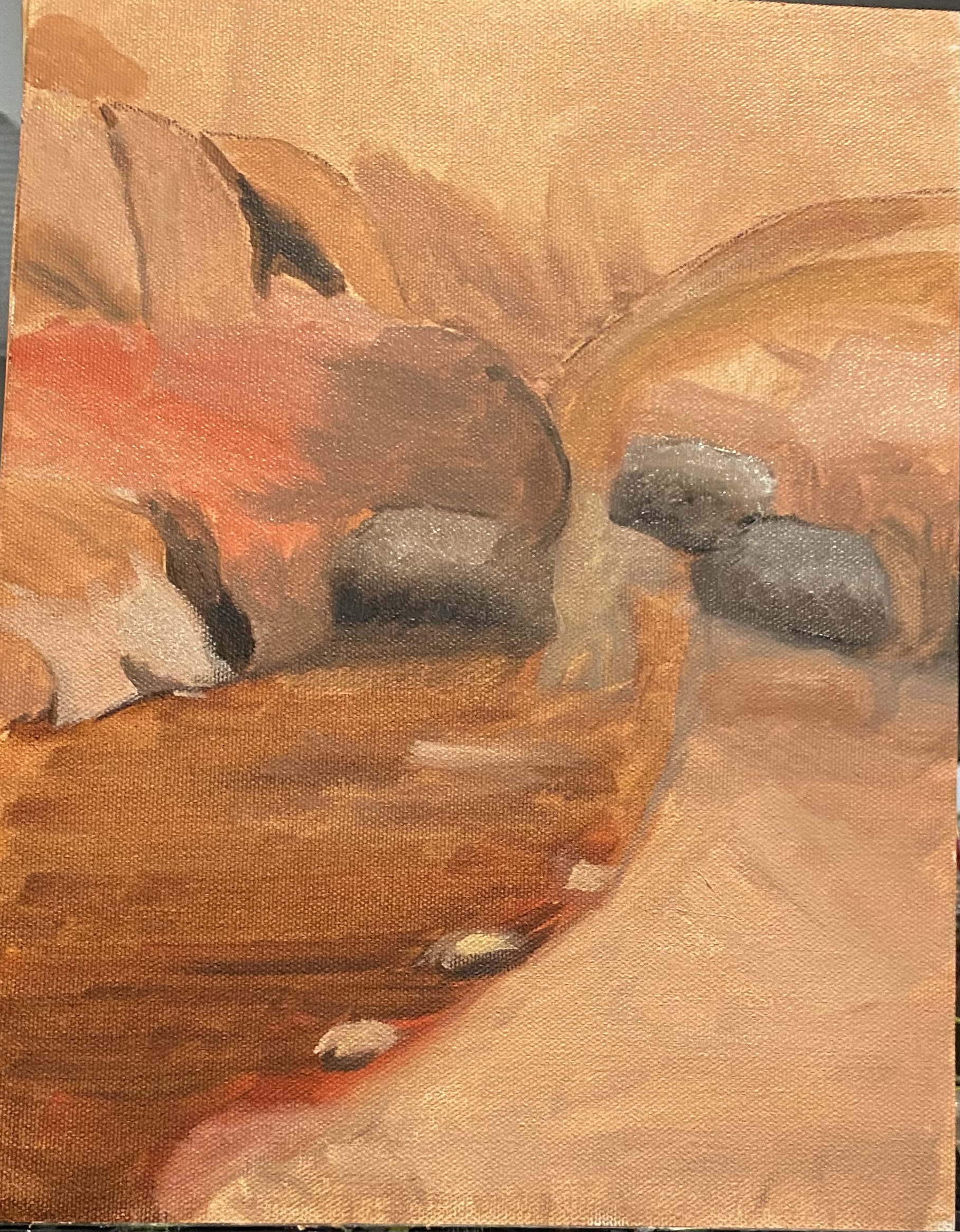
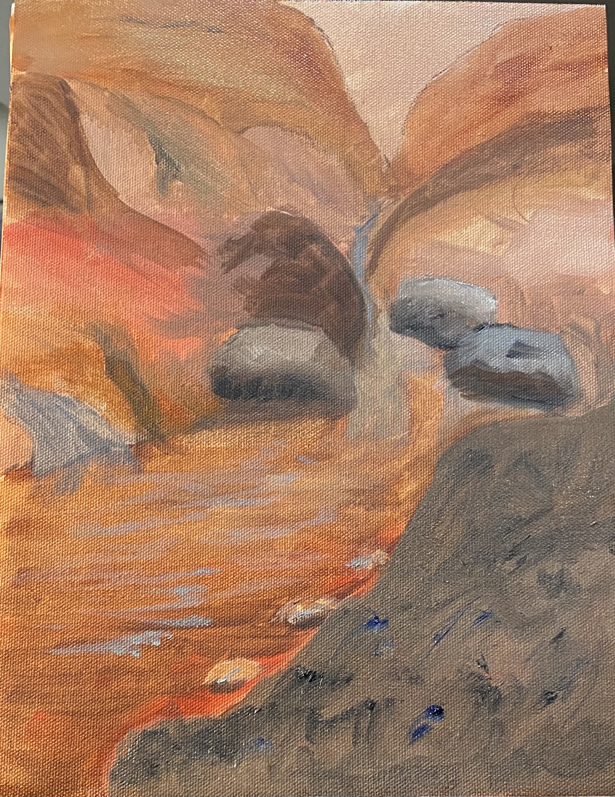
Eventually i decided i wanted more variety. Thought about adding contrast by using complementary colors, but really don’t like green and red together. So settled on a turquoise which i mixed up (i know — it doesn’t look turquoise in the photo, but it is), as this is supposed to be “harmonious” with the reds. Used palette knife in some parts on the right hand side of the painting to give some texture and tried using brush strokes going in different directions for same reason. Anyhow, teacher has not seen any of this, so i look forward to hers (and yours) comments.
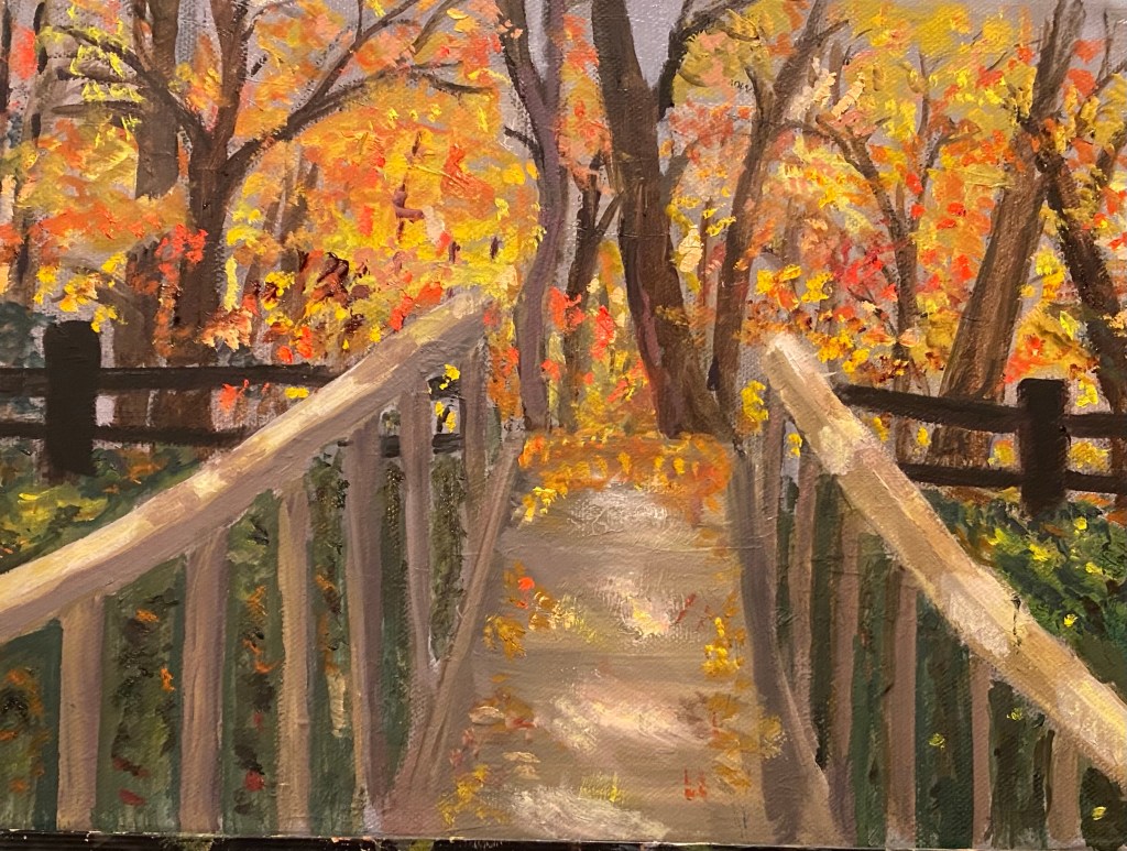
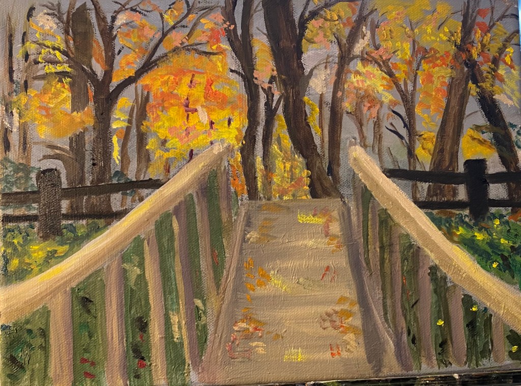
Progress on bridge

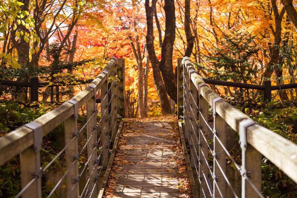
Since i last posted about this painting, I’ve mainly worked on adding foliage all over the place — in the trees, on the ground, on the bridge itself. Also repainted the bridge poles and tried to improve the sunlight-shadows on the bridge path and posts. (Bern suggested I repaint parts of the bridge closest to the viewer, in order to improve perspective. This is a valid suggestion which I nevertheless decided against at this point. Perhaps later – for now I’ve had enough of this one.)

Colorful Bridge

Here is partially completed new painting. This one was part of an assignment to use colors mainly from one end of the spectrum. I chose the red end (if you ignore the greenery, which i did for purposes of explaining the assignment .). Loved the colors in the reference photo, which i got online — i think it’s of a bridge in Japan. I plan to work more on the foliage between the bridge posts and clean up some parts of the bridge. Open to suggestions for what else to do.

More on barn in field, etc.

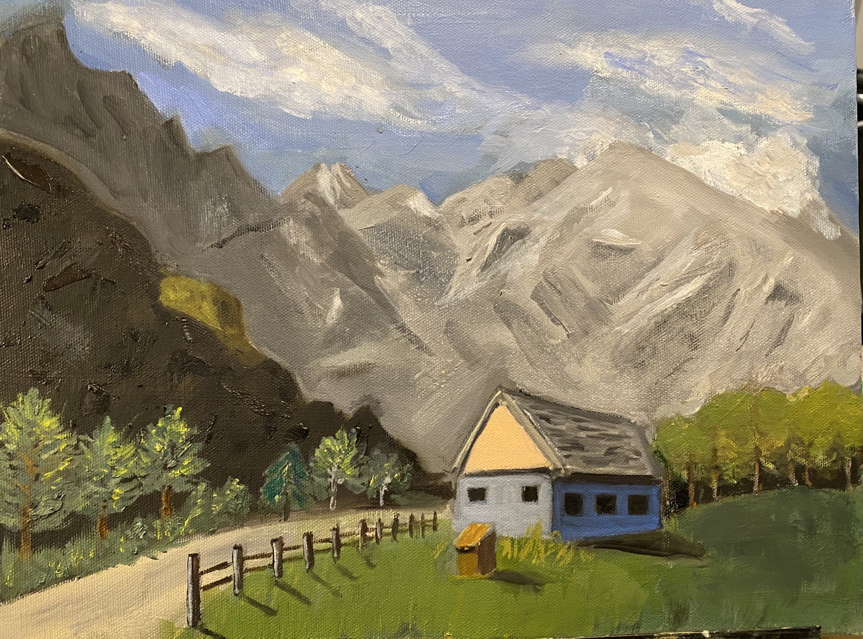
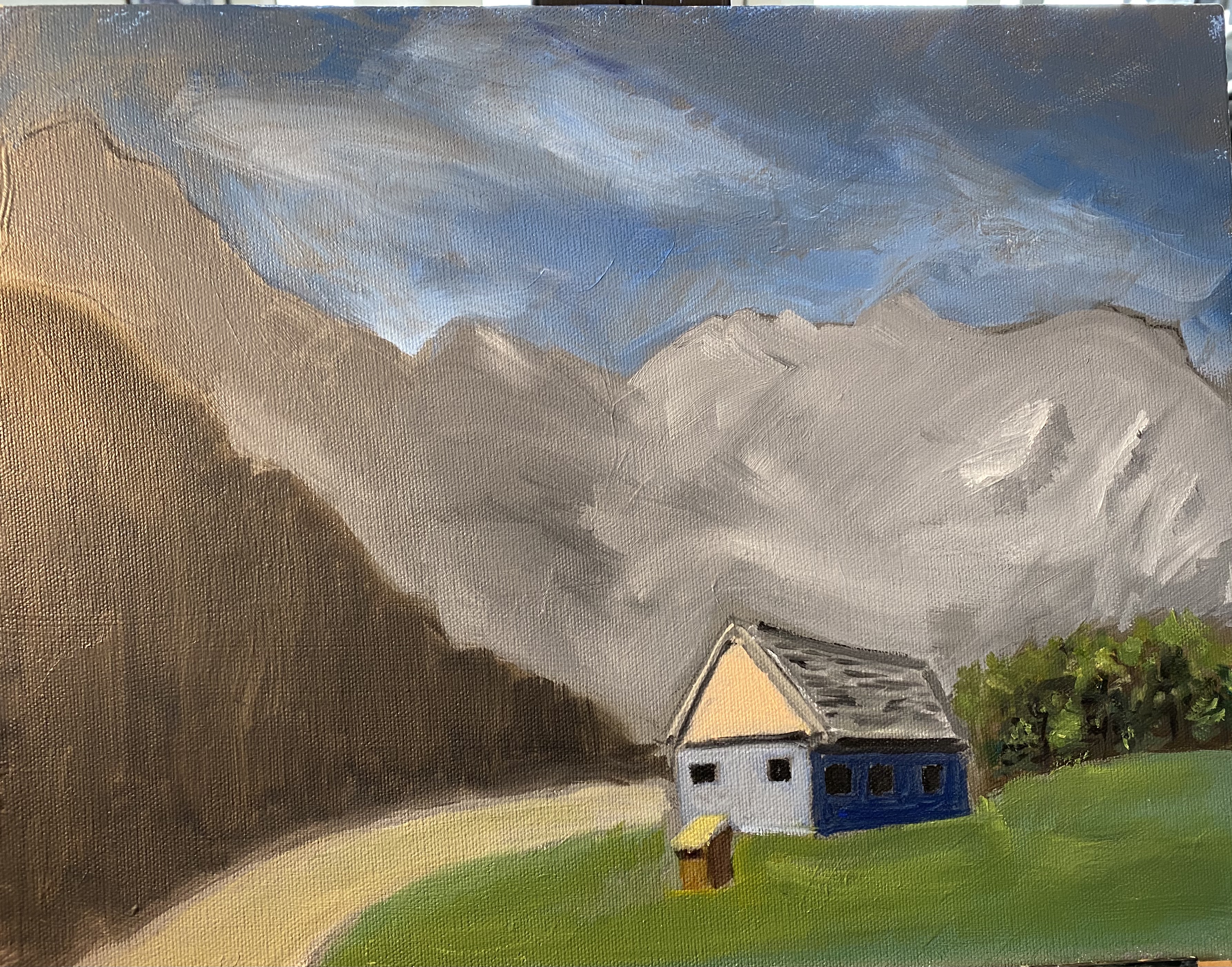
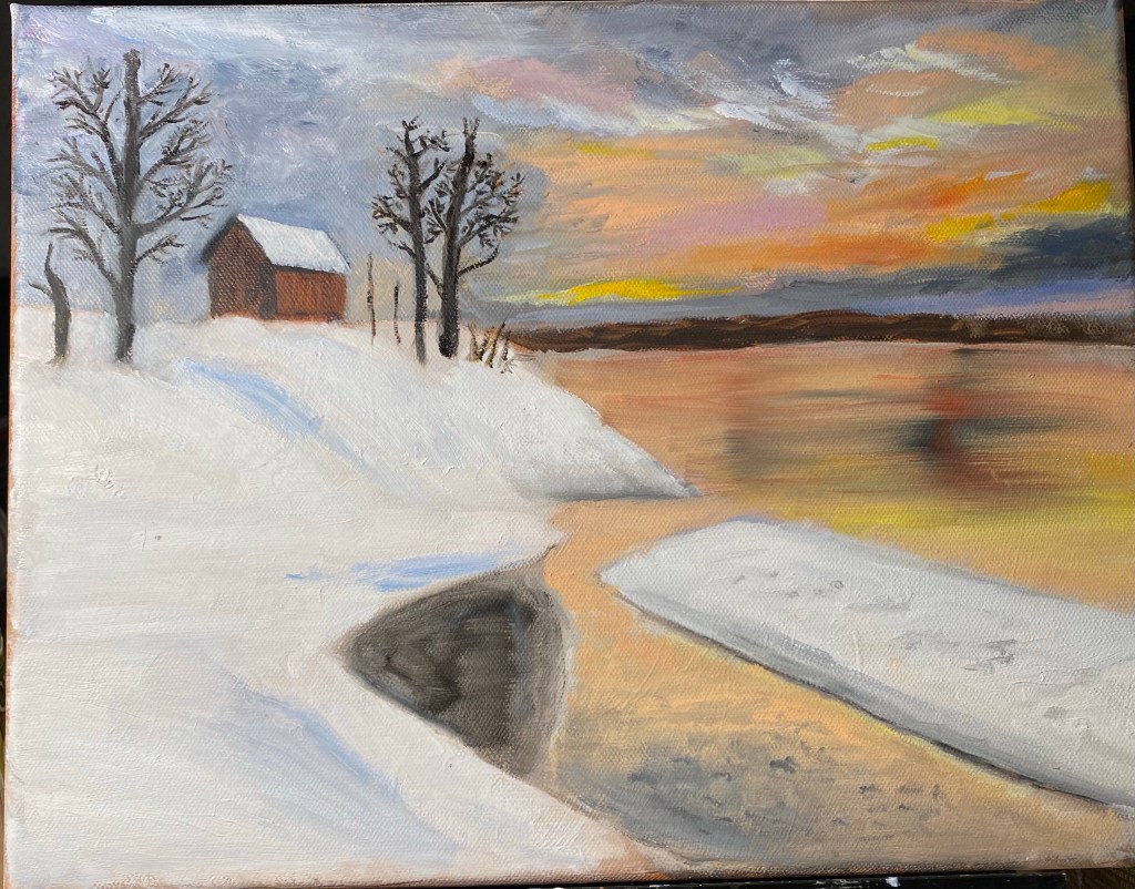
I’ve been working kind of all over the place on this little painting since I last posted. I tried to soften some of the craters in the mountains; added fence; worked on trees both in the front on the left and also on trees in background on the right. Trees need more work — I was trying to get light-shadow orientation improved but I know the trees themselves still look a little “off”. Added another layer of paint to the barn and also to the grass. With the grass I was trying to brighten the grass in the front as it is in sun. Added shadows to fence posts and deepened shadows coming from the side of the house. Did some softening of the clouds, but would like to do a bit more with the sky and the clouds. this has all been at home — teacher really hasn’t seen it yet, as she’s moved us on from perspective and color mixing to color temperature — assignments sound fun and will post about them after I do them.

More on perspective

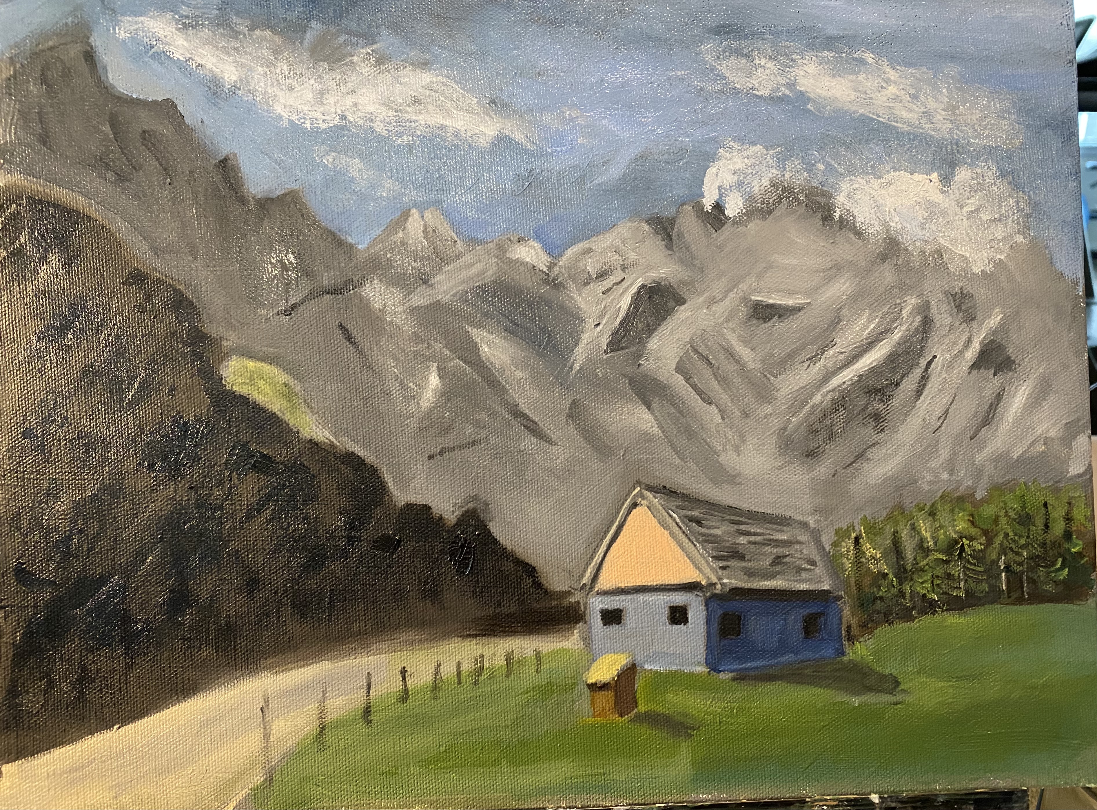
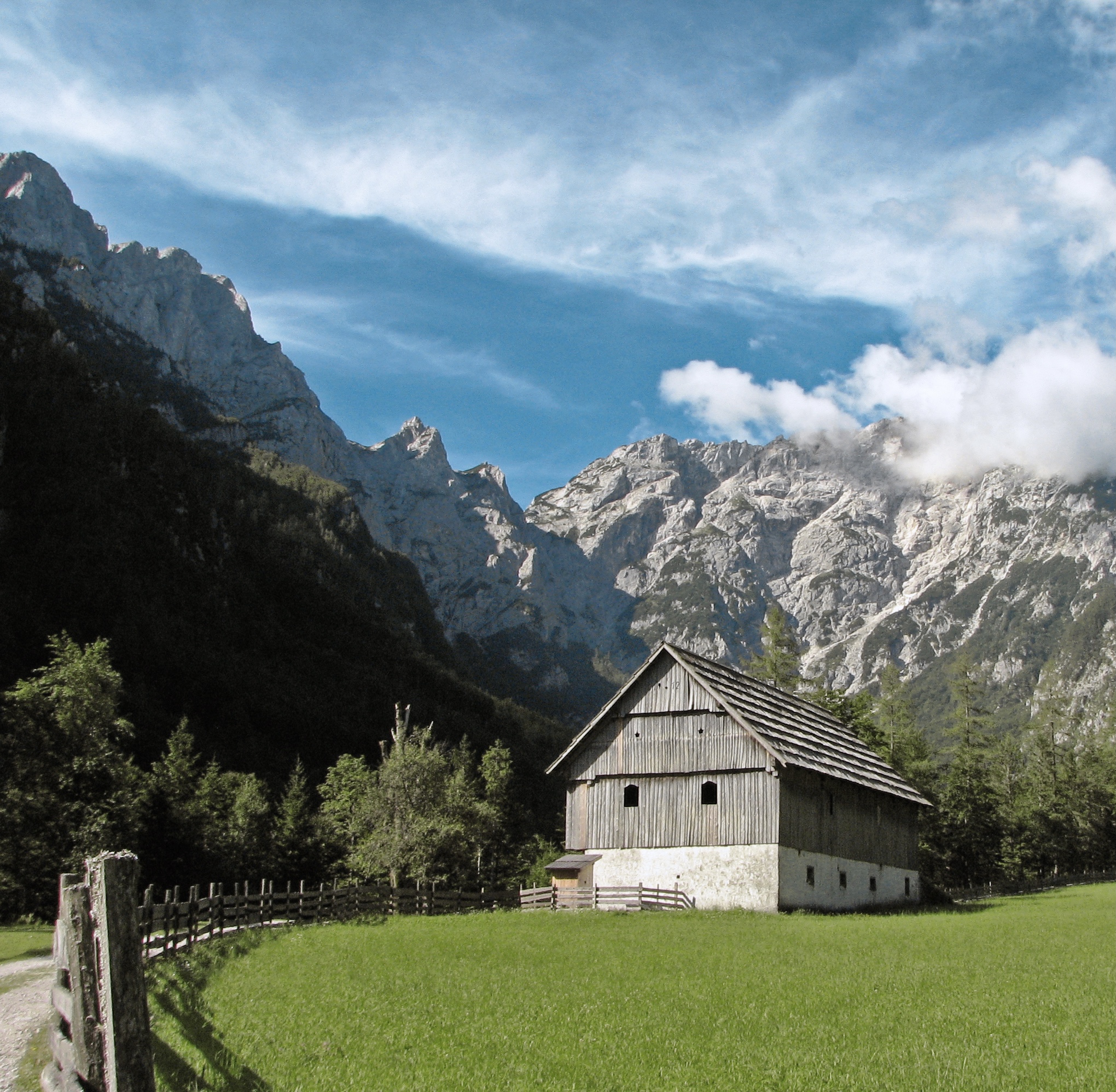
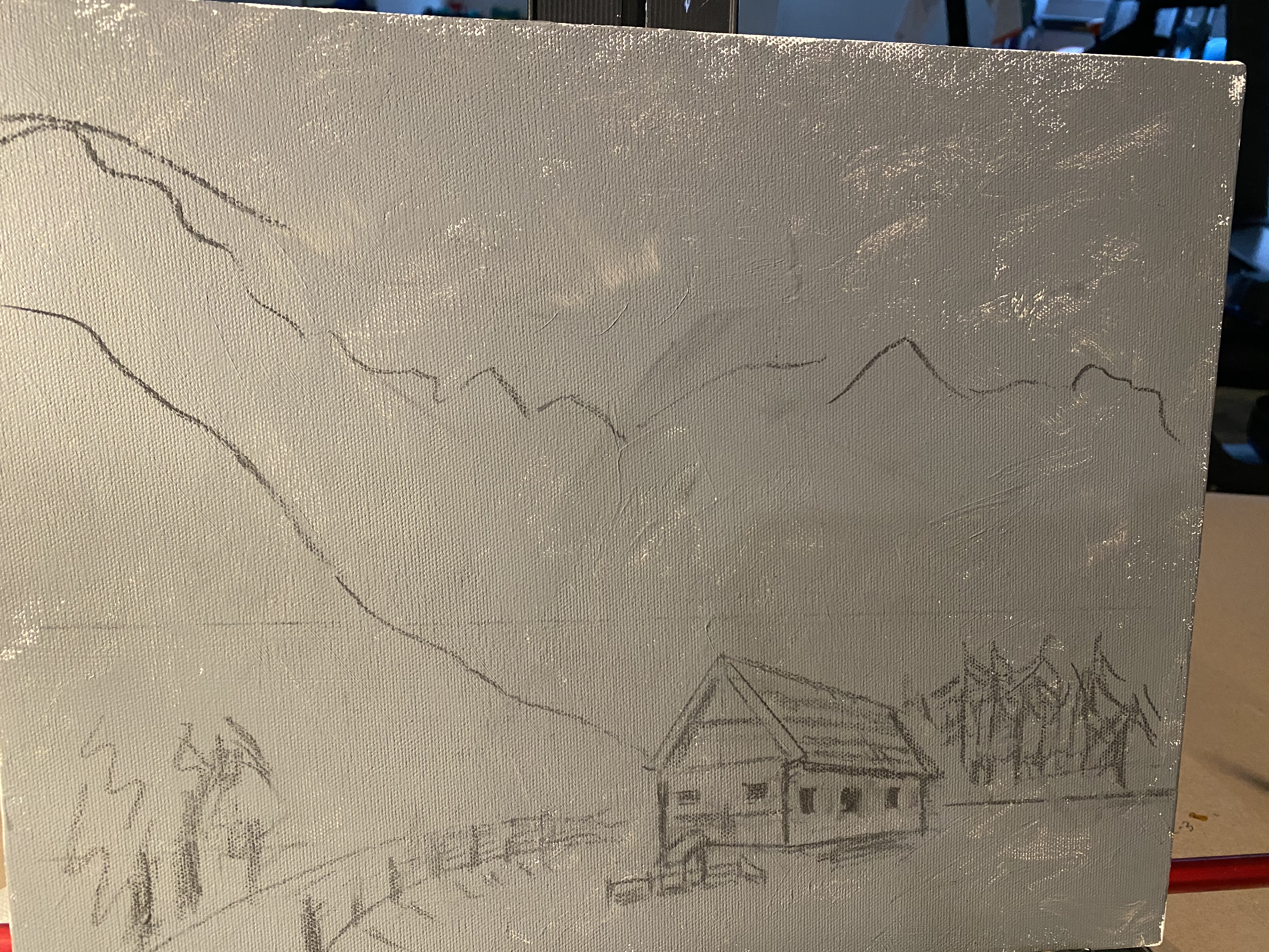
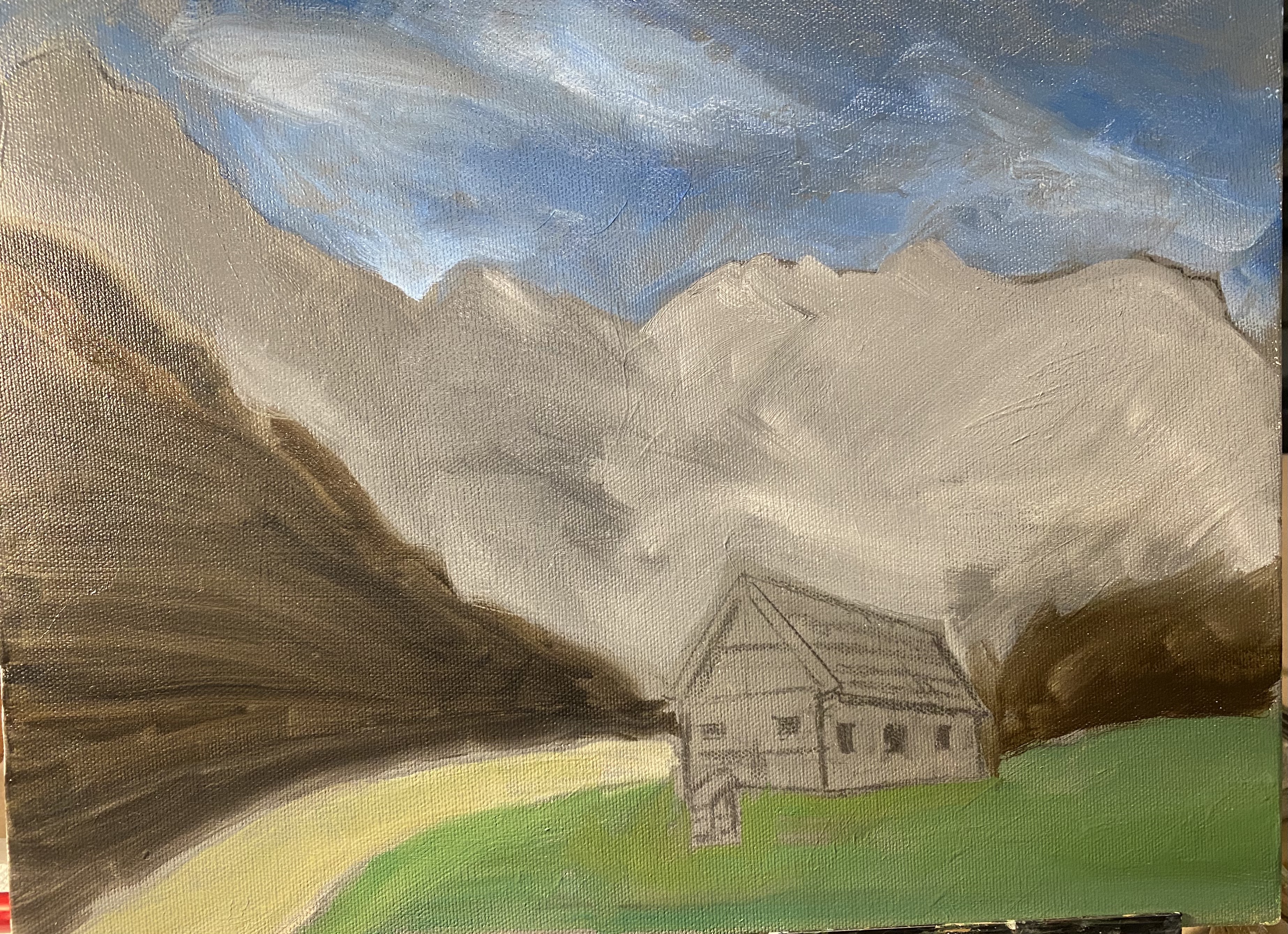
I’m continuing to select projects that encourage me to keep practicing two-point perspective. This last week I selected a reference photo which I found online of a barn in — Slovenia (!) — set against a beautiful mountain backdrop. I’ve pretty much blocked in the painting and have done some of the initial layers on the barn . Now working on adding details to the mountains to make them look three-dimensional. Started with the large shapes but soon will have to make some decisions about how much detail — not too much — to add. I will add the fence and trees after the paint on the grass and that big brown area on the left are dry.

I dd alter the perspective of “my” barn, so that I’m not looking up at it, as is the case in the reference photo. That was partly because I didn’t want to have so much grassy area in the front part of the painting but still wanted to keep the fence.

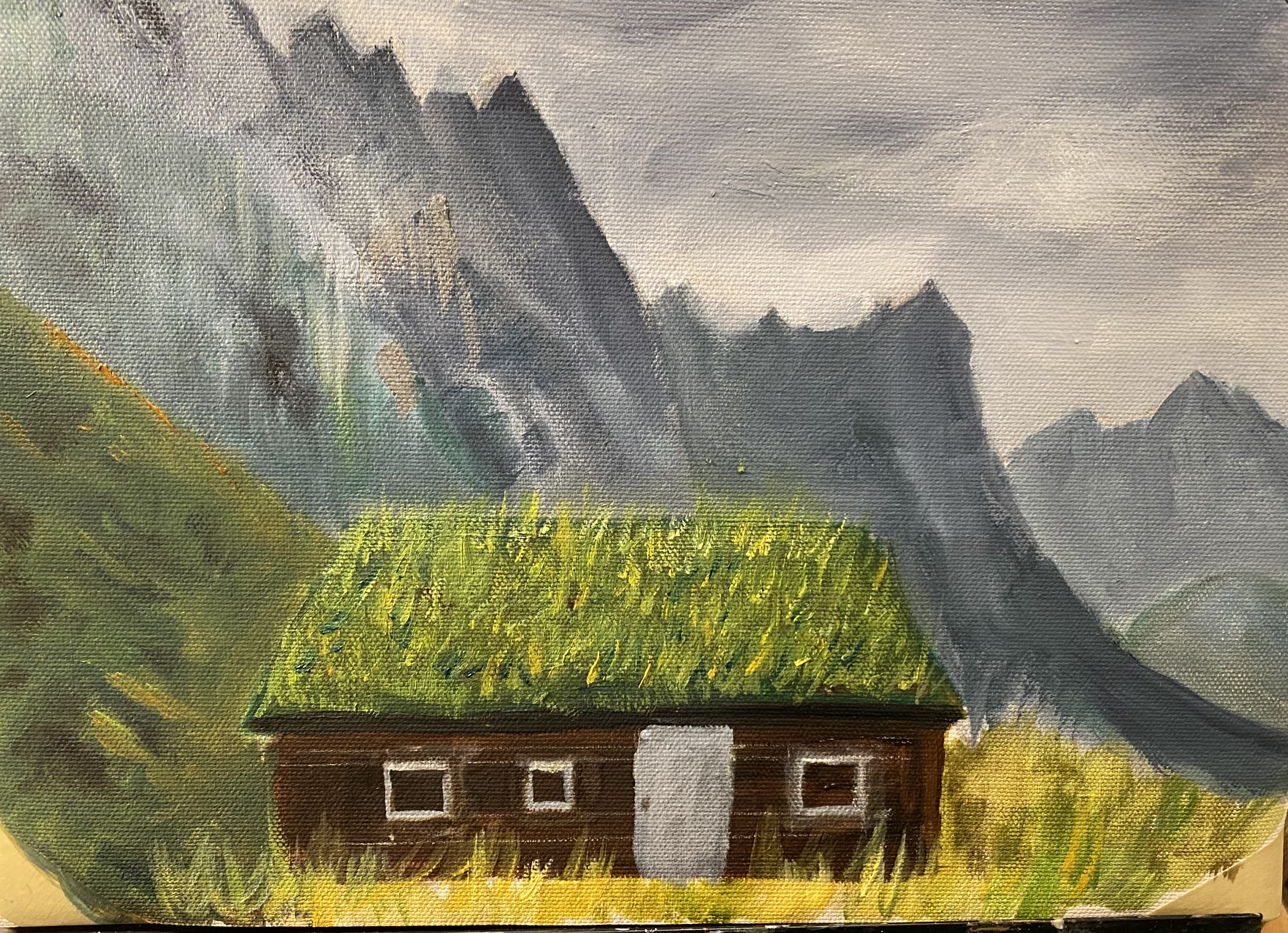
More Grass on grass roof — and other progress

Past couple of days i worked kind of all over the place on this painting — adding grass to roof; trying to improve the windows; adding vegetation, etc. Showed painting to teacher yesterday in class. She had not seen it yet and as she was lecturing on “shape drawing” she suggested i try to find interesting shapes in the sides/faces of the mountains. You won’t be able to tell by this photo, as i painted, brushed out, painted again, working on that assignment. Still part of the work in progress! I guess i did the most work on the mountain side closest to the front — the one with the most green. I kept some of those changes; not so much on the one next to that.

And finally, for Bern: chimney + smoke!

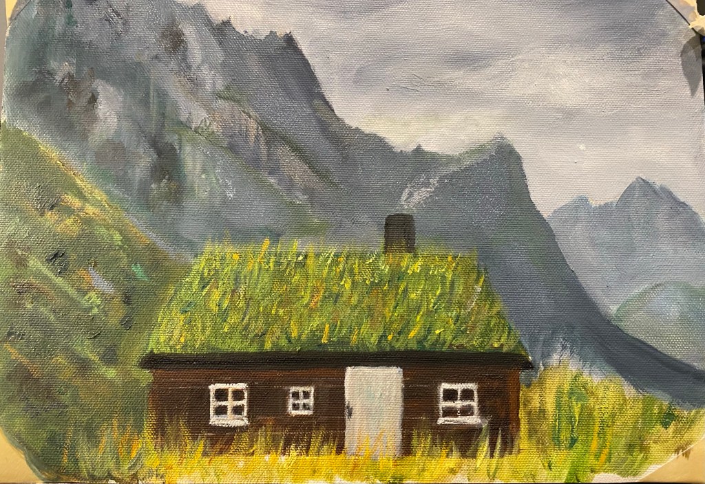
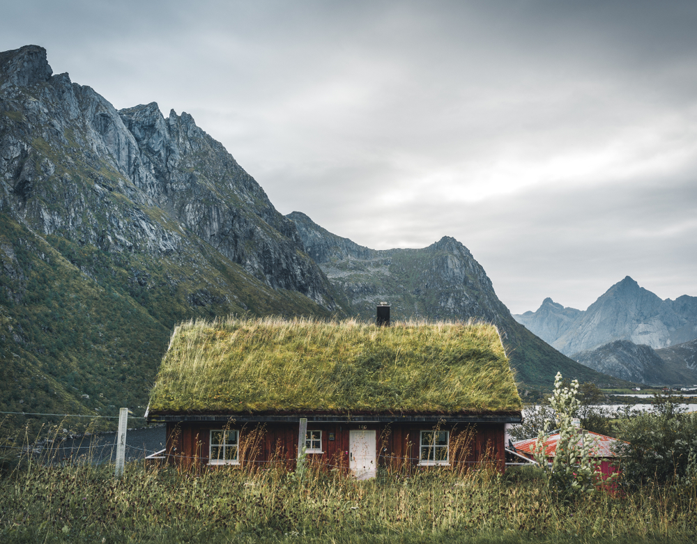
House with grass roof

This is a new project, partially painted, based on a class assignment on composition with perspective. On a trip to Norway a few years ago we saw several of these grass-roofed houses in little fishing villages in the Lofoten Islands. This photo, though not one we took, is representative of those we saw. The perspective part of the painting is the mountains ranges in the background. There’s plenty to fix here, and a few more layers to lay on, so consider this definitely a work in progress.

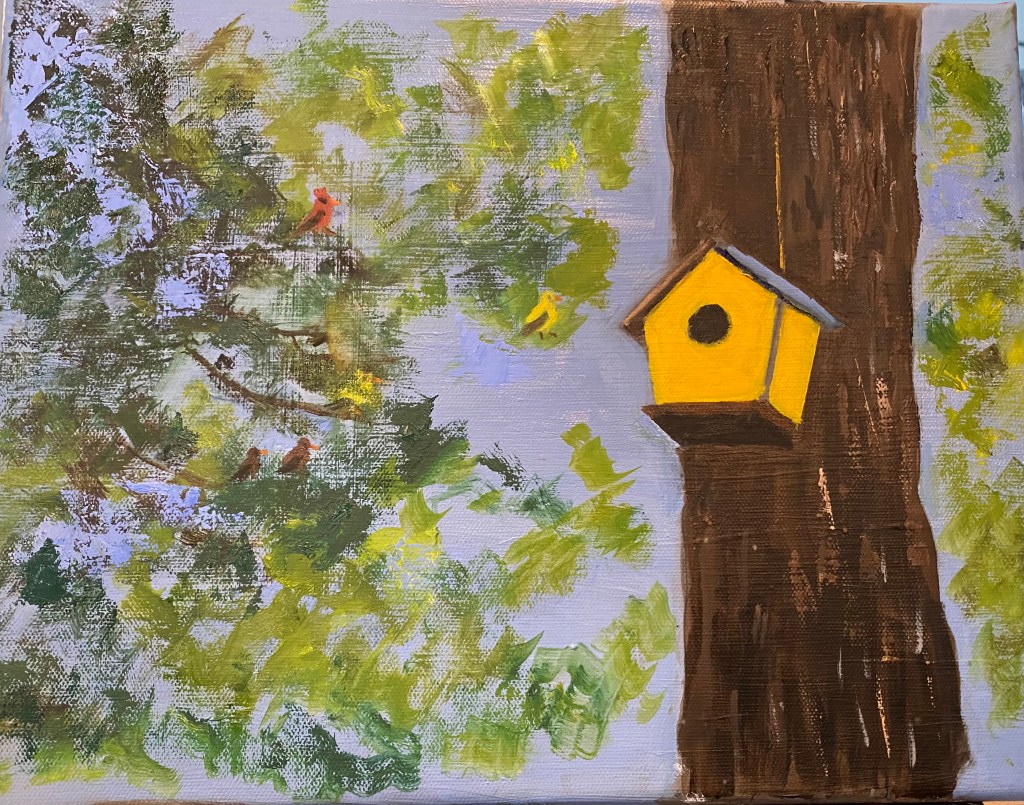
Bird House do-over

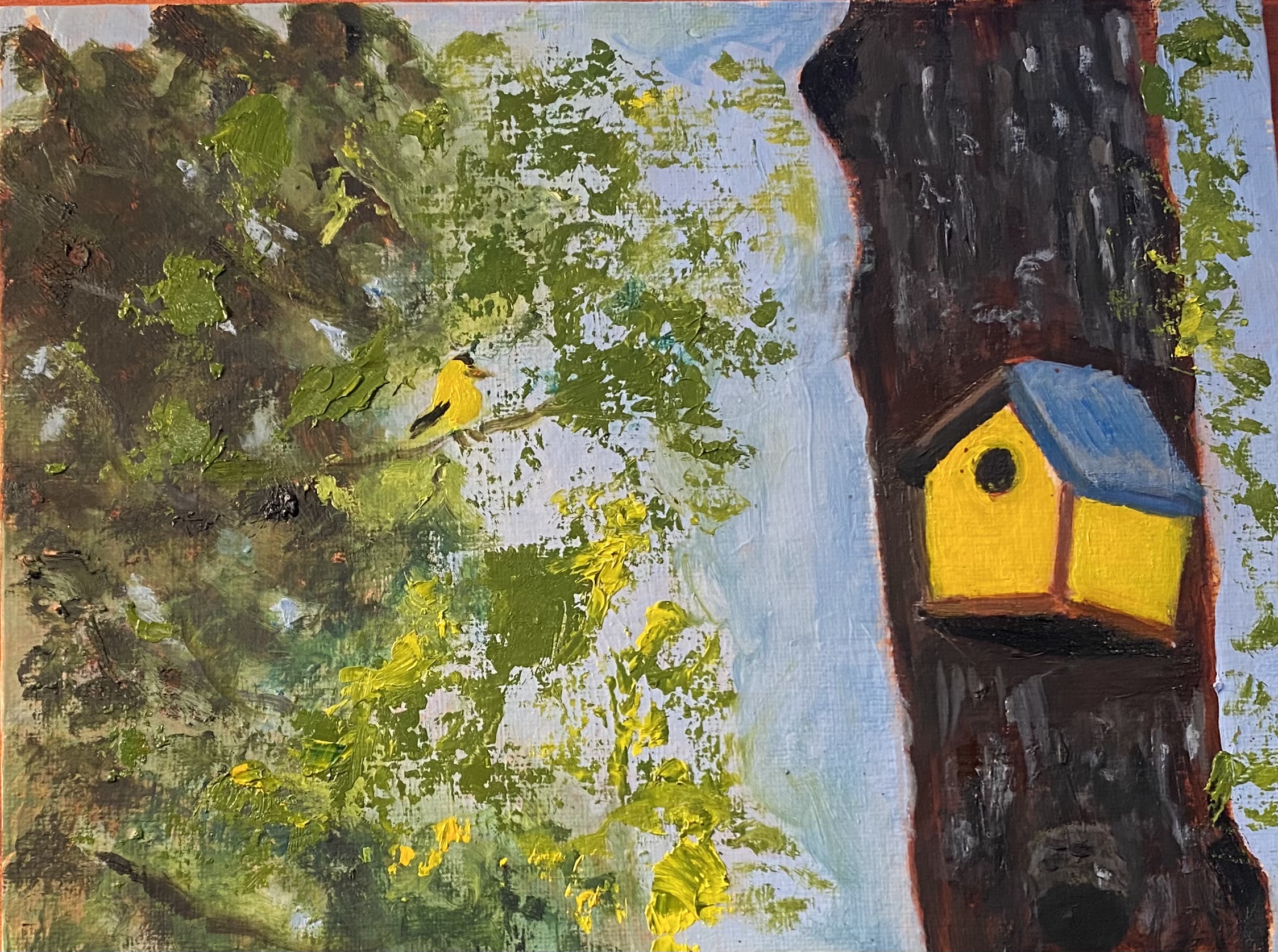
I decided to start fresh and redo the latest bird house painting. the angles were not right on the bird house, and i wanted to move it over to the left. I also wanted to give myself more practice with painting the foliage in the loose way I’ve been trying in the past couple of weeks. also, i had the foliage to the right of the tree going in front of the tree when it should have looked like it might be behind the tree. And then i had some fun playing with putting birds in the tree. There are 5 birds — one of the yellow ones is supposed to be partially hidden behind the foliage. Feel free to let me know if you think this works!

Bird house with additions

A few weeks ago i posted an underpainting for a bird house. As it happened, just as i was beginning to add color, etc., we had a lesson in painting class about hints for learning to paint more loosely. One of teacher’s suggestions was that we work to make part of a painting realistic and other parts more impressionistic— and that we work fast, not worrying too much about details. So i decided to take this bird house project and make the bird house hopefully look like a bird house. But then take the foliage — basically the left side of the painting — and be more casual with it. I used several different brushes and also did some work with a palette knife. It’s not really finished, but i thought i’d go ahead and post what i’ve got.